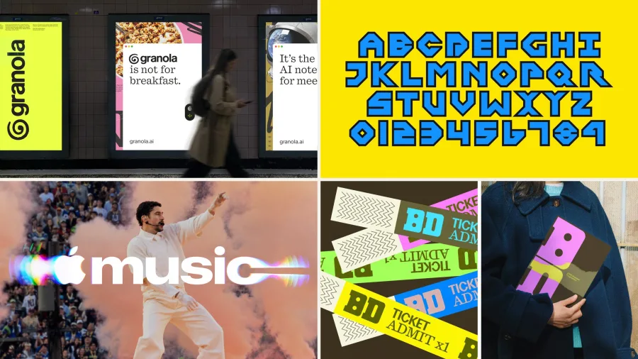
For three years, design chased the polished look that AI tools made easy. In 2026, the best work went the other way: hand-drawn logos, real glass filmed in camera, scanned paper and type you can almost touch. Those choices are where graphic design trends 2027 are heading.
We looked at the year's strongest launches from studios in the US, UK, Europe and Australia, plus the 2027 forecasts from Envato, Canva and Dieline. Below are nine shifts, each shown in real, named work, and what they mean for a growing brand. If you want the bigger identity picture, read our branding trends 2027 report too.
How We Picked These Trends
Trend lists often guess. We followed the work instead. A shift only made this list if it appeared in several 2026 projects, by different studios, in more than one country, and if at least one 2027 forecast backed it with data. Where a number comes from a company's own platform, such as Envato or Canva searches, we say so, because those figures measure what their users look for, not the whole market.
One thread runs through all nine. After years of AI-smooth images, designers and clients now want proof that a person made something. That is why so many of 2026's best projects were drawn, printed, filmed or collected by hand.
1. Made by Hand, and Showing It
The clearest reaction to AI images is work that shows a person made it. Envato says searches on its platform for hand-drawn assets are up 25%.
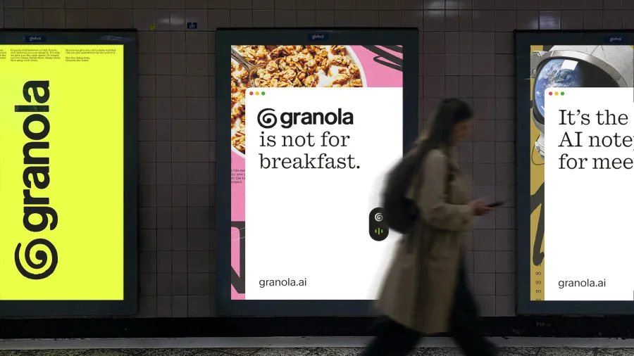
In February, Ragged Edge rebranded the AI notepad Granola with a deliberately imperfect "G" and a script built with the foundry NaN from hundreds of letters handwritten by co-founder Sam Stephenson. An AI company chose a human hand on purpose.
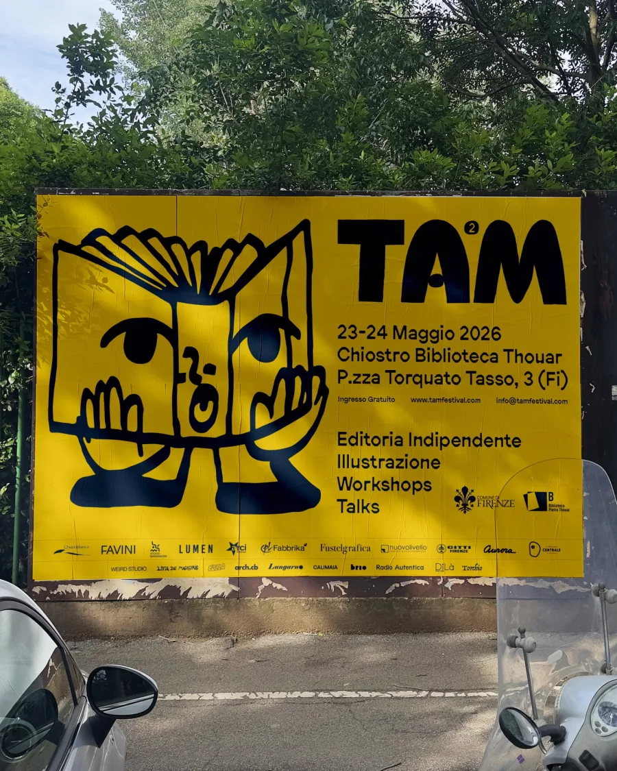
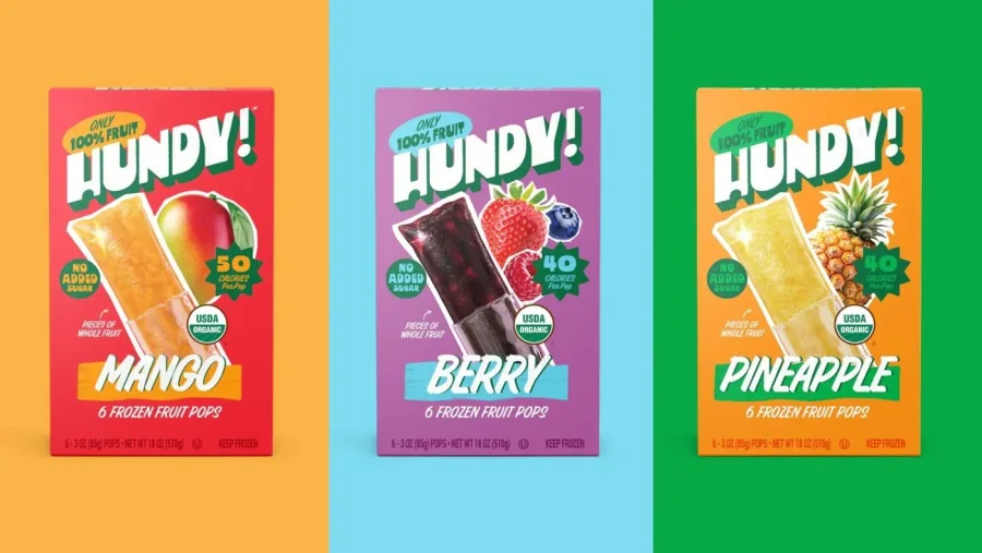
In Florence, Weird Studio and illustrator Livia De Magistris drew every letter for the Tam publishing fair with brush and marker. Packaging is following: Dieline's 2027 report names sign-painting lettering, like the Hundy! fruit pop boxes, as a trend to watch.
The takeaway: a drawn mark, a handwritten line or a painted sign tells customers a person cared. It is hard to fake and easy to remember.
2. Real Materials, Shot for Real
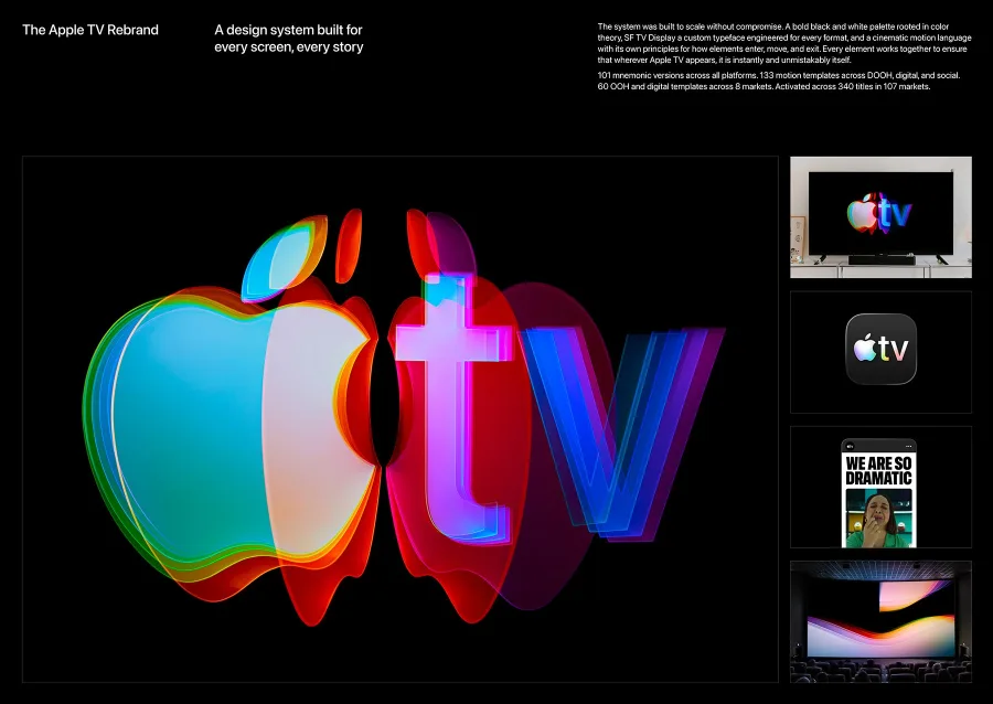
The most awarded identity of 2026 used no CGI at all. For the Apple TV rebrand, TBWA\Media Arts Lab and Optical Arts filmed light through real glass slabs on a dark stage. It won the Design Grand Prix at Cannes Lions 2026.
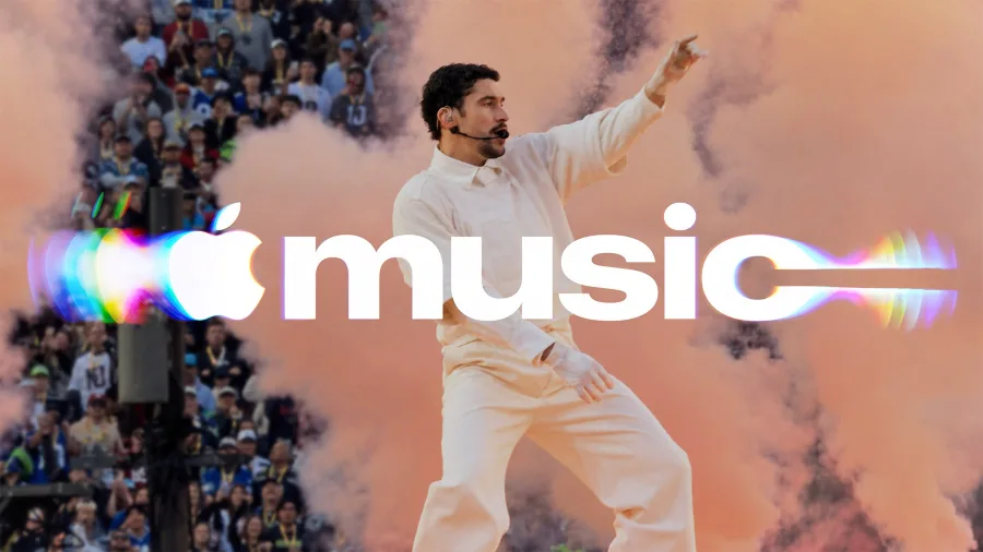
In October, the same agency launched Apple Music's new look, made by playing music into a shallow bath of oil and filming the ripples. Apple says it was captured entirely in camera.
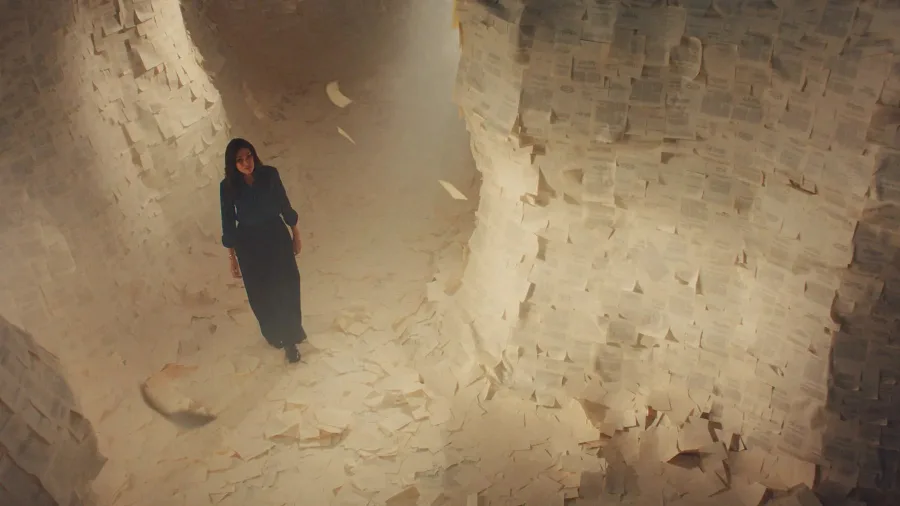
Oura filmed its Ring 5 campaign inside a one-tenth scale city built by 35 model makers in Prague, and said it chose not to use AI. For St. James's Place, the agency Isobel built a canyon from stacked sheets of paper.

The takeaway: photograph real things. A product shot on real paper, wood or glass now feels more premium than a perfect render.
3. Scanned and Printed Texture
Grain, ink spread and photocopier noise are back. Envato reports paper texture searches up 16% toward the end of 2026, and It's Nice That's 2026 forecast called out designers "turning back to scanning".
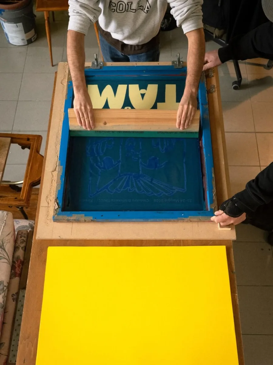
The best version is printed for real. Tam's posters and totes were screen printed, risograph printed and letterpressed by local Florence printers, so the texture is honest.
The look started building in 2025: Louis Garella's logo for Sonata Electronica has a worn, low-ink photocopy finish, and How&How gave Big Cartel rough printed textures.
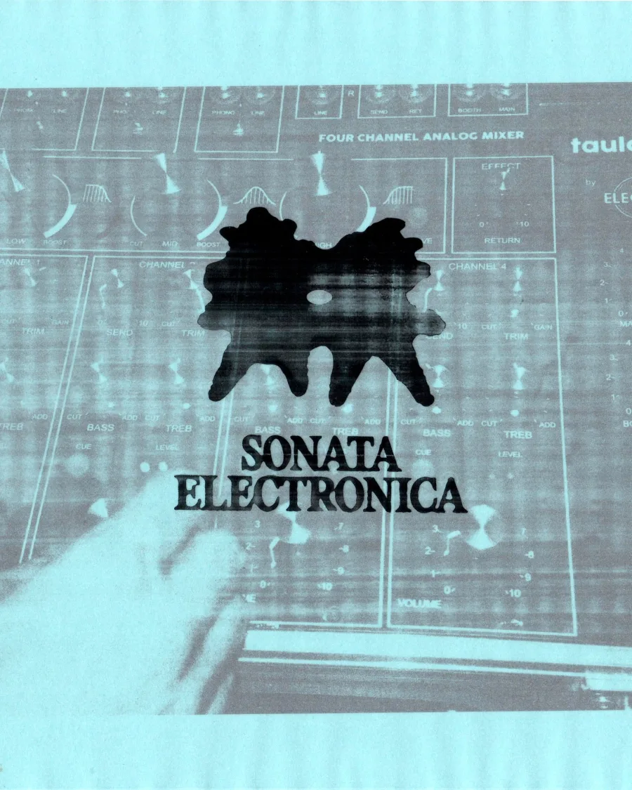
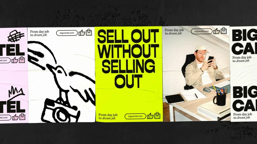
The takeaway: a fake riso filter is easy to spot. Print one real test, scan it, and build your texture from that.
4. Collage and Keepsakes
Canva's 2027 report calls this "Archive Era": tickets, letters and photos turned into design. It says searches for "keepsake" are up 123% and "scrapbooking" 94% on its platform.
How&How built the new Bristol Dockyards identity from collaged archive photos, type fragments and objects from the docks, down to the ticket wristbands.
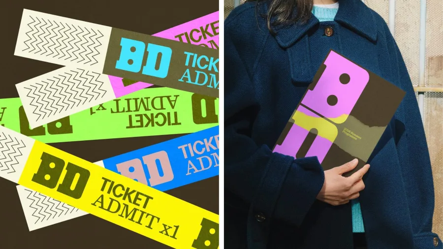
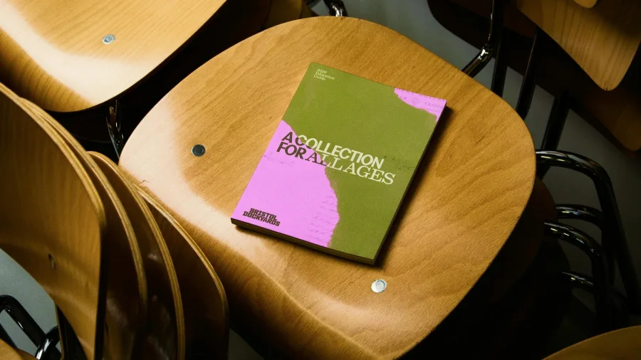
The Atlantic's in-house team scanned borders and mastheads from issues going back to 1857 for its 2026 festival. For The New York Times' 175th year, Matt Dorfman paired event photos with the original newspaper pages.
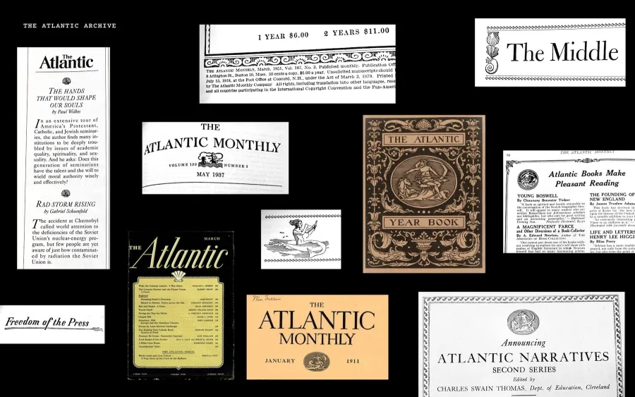
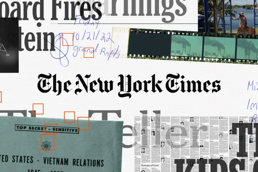
The takeaway: your history is material. Old menus, first receipts and early photos can become a brand world no competitor can copy.
5. Type That Fills the Page
In many of 2026's best posters, the letters are the picture. Envato says searches for condensed and tall fonts are up 28%.
For the Storefront Gala, Pentagram's Natasha Jen drew a whole alphabet from Rudolph de Harak's Grand Central Oyster Bar logo, and made it "the central image of the identity".
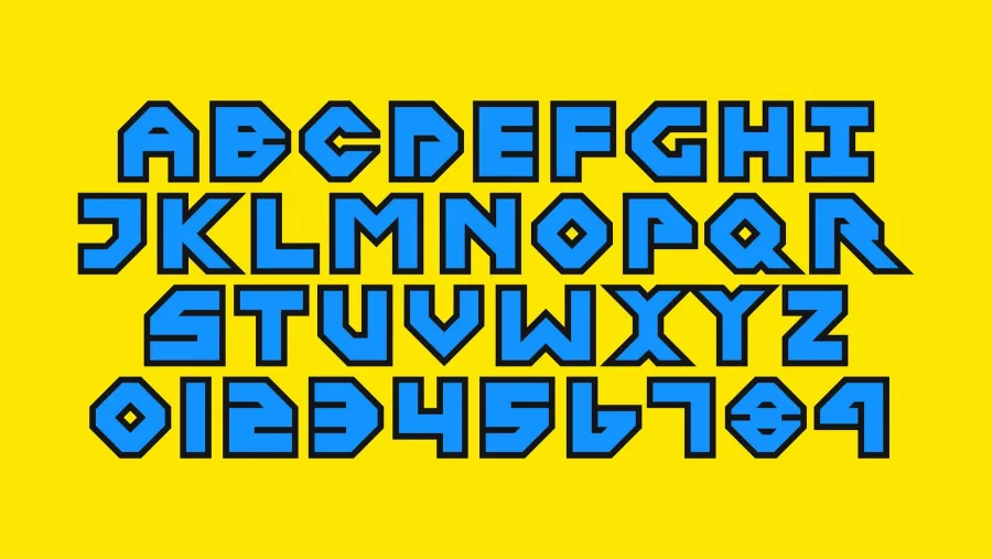
Paula Scher's Shakespeare in the Park posters were, for the first time, drawn entirely by hand. In São Paulo, Porto Rocha gave the gallery Almeida & Dale a condensed custom typeface used large enough to act as a graphic.
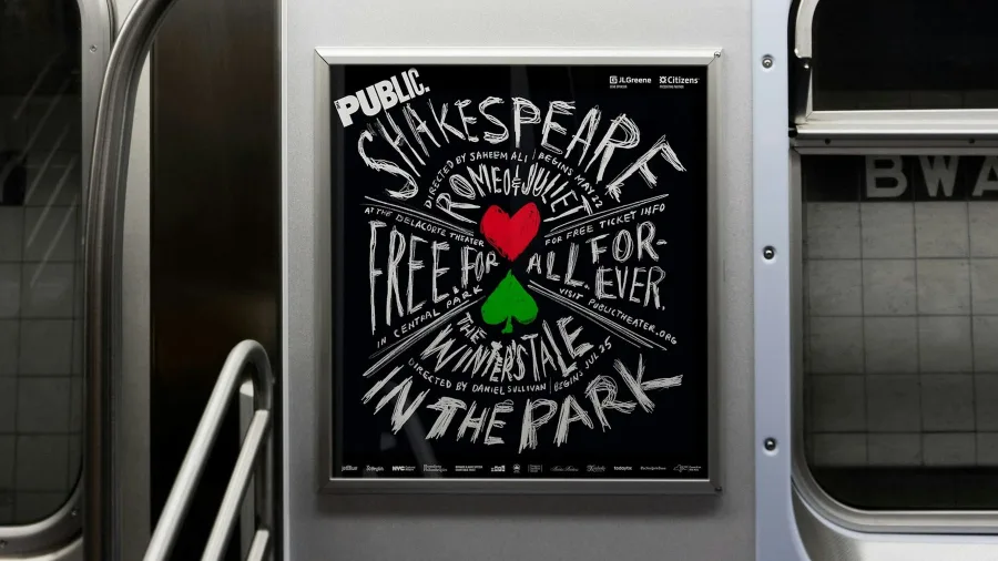
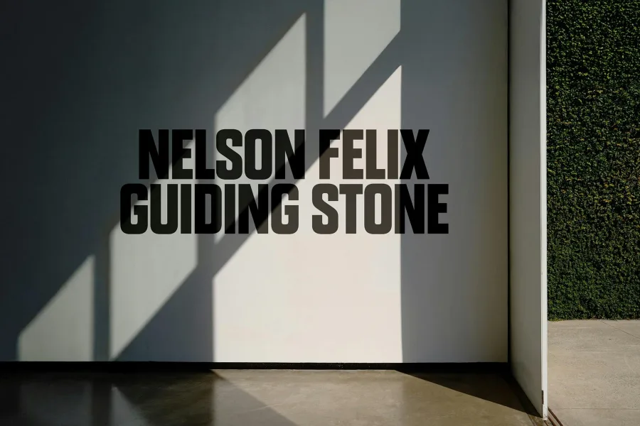
The takeaway: big type is cheap and loud, but keep it readable. Envato lists over-stretched, illegible fonts as already on the way out.
6. Typewriter and Pixel Letters
Monospaced and pixel type bring a raw, made-by-machine honesty. Envato says typewriter and monospace font searches are up 22%, and Canva's "Codebreaking" trend puts bitmap fonts back on screen.
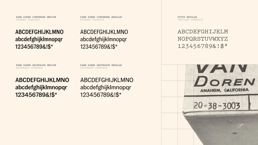
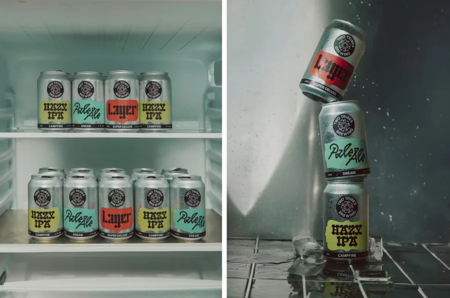
Accept & Proceed's new Vans identity uses Klim's typewriter face Pitch next to its main sans. In London, All Purpose set Two Tribes Brewing's cans in OCR-X, a monospace revival of a 1960s machine-reading font.
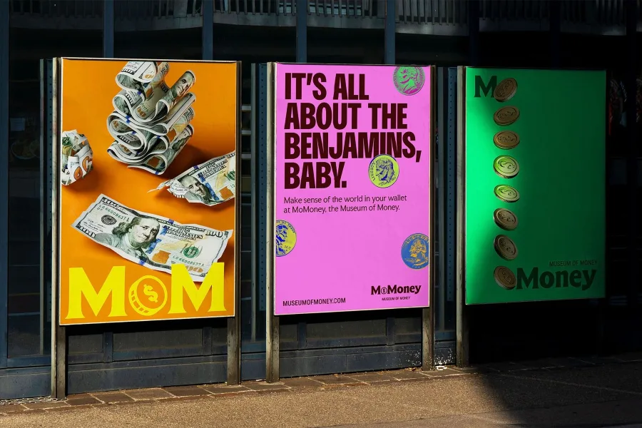
In Dallas, Studio Chong mixed engraved banknote flourishes with pixel lettering for the money museum MoMoney. Even Instagram added a mono typeface in its August refresh.
The takeaway: use mono for prices, labels and small details. One mono line next to a warm serif instantly feels considered.
7. Warm Earth Colors With One Bright Accent
Paint brands chose greens and earth tones for 2027: Benjamin Moore's Webster Green, Sherwin-Williams' Celery, Behr's olive Grounded and Dulux's Soulful Sage. WGSN picked Luminous Blue as its 2027 color, and Pantone reveals its pick in early December.
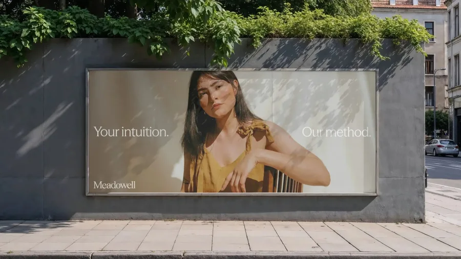
The 2026 work pairs a calm base with one loud color. TinyWins gave Meadowell bone, olive and brown with a saturated yellow, which works, the studio says, because everything around it is quiet.
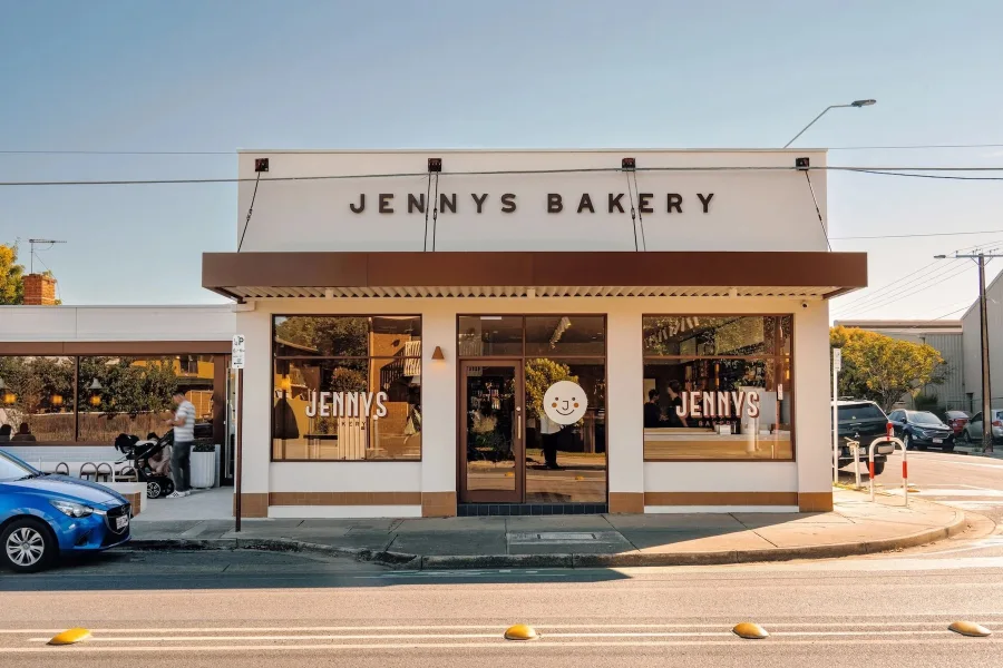
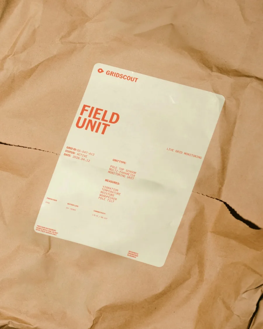
Divide gave Adelaide's Jenny's Bakery chocolate brown and cream with a little cherry red. Skogen kept GridScout olive and cream, saving high-vis orange for alerts.
The takeaway: pick one accent and ration it. Our color palettes for 2027 show nine ready-made combinations.
8. Glass and Soft Depth on Screens
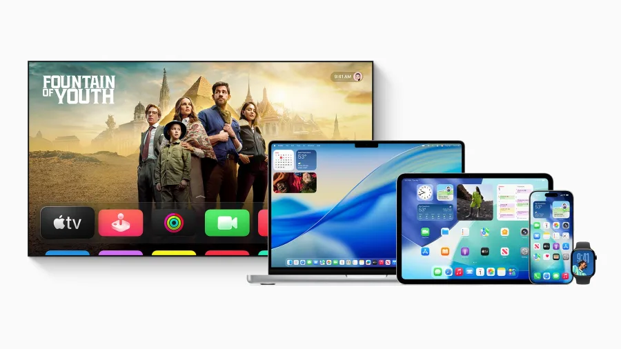
Apple's Liquid Glass, launched in 2025, made translucent, layered screens the default on a billion devices. In iOS 27, Apple added a slider from fully clear to fully tinted, after complaints about readability. Glass panels also gained darker edges, so text sits more clearly on top.
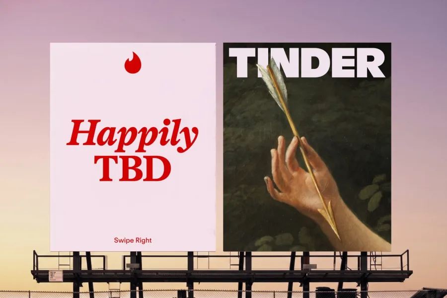
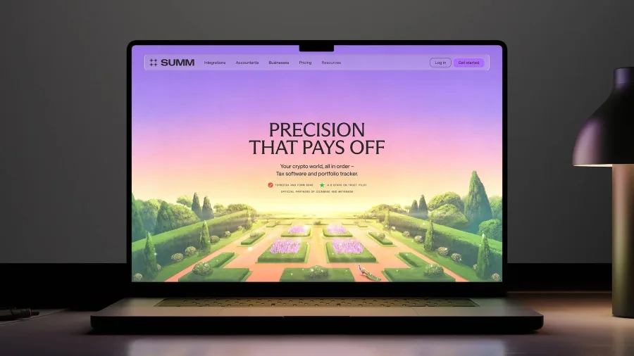
Brands are borrowing the idea with restraint. Porto Rocha's Tinder rebrand uses glossy, translucent icons, and Accompany gave the crypto tax platform Summ soft glass-style graphics.
The takeaway: use glass as a detail, not a theme. A Creative Boom reader poll in April named glassmorphism one of the trends creatives are most tired of.
9. Magazine Layouts and Visible Grids
Brands are borrowing the confidence of print magazines: columns, captions, rules and numbered sections. Kittl says searches for editorial layouts on its platform nearly doubled in a year.
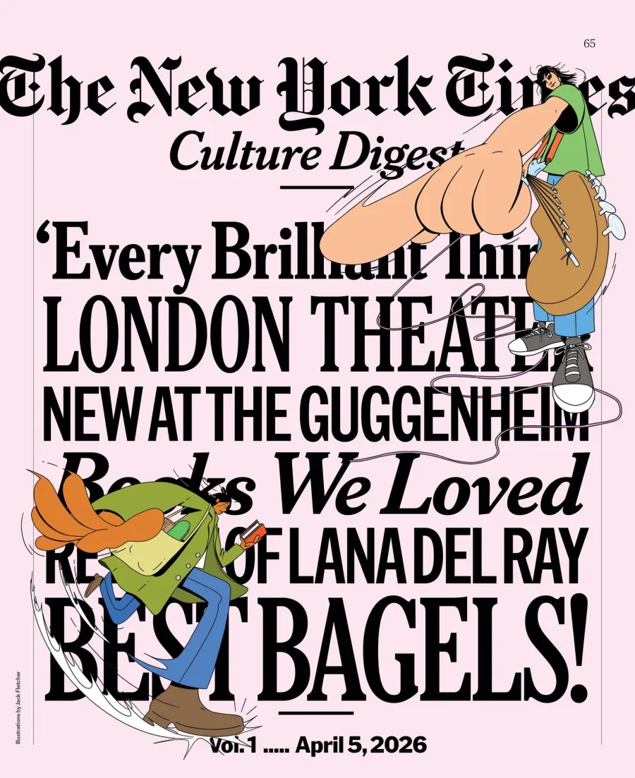
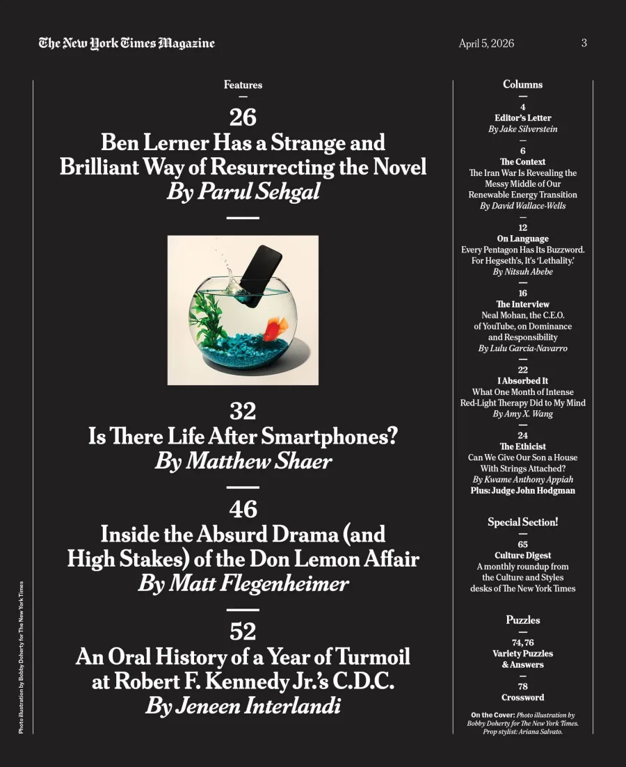
The New York Times Magazine's April redesign kept its seven-column grid, standardized captions and rule lines, and moved folios and dates to the top of the page.
Packaging is doing it too. Oliver Grace rebuilt Redheads matches on a Swiss-style grid where every name and quantity snaps to one structure.
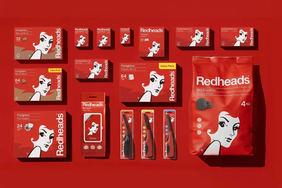
The takeaway: a clear grid makes a small brand look established. Apply it to your menu, website and social posts.
What's Fading in 2027
The same sources agree on what is wearing out:
- The "AI look": glossy generated images topped Creative Boom's 2026 list of tired trends.
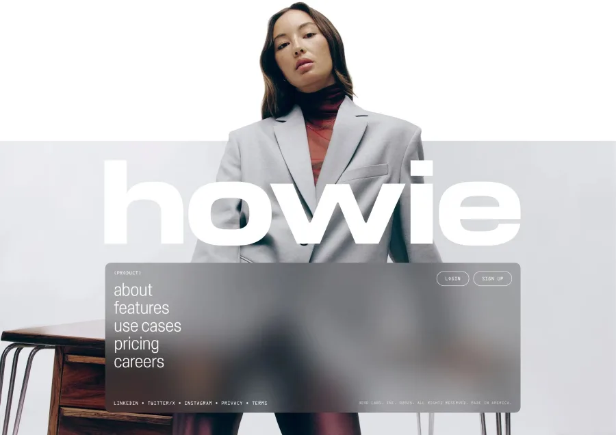
- Purple-blue tech gradients: newkid's Howie identity was built as an answer to gradients and glowing orbs.
- Flat, interchangeable minimalism: Envato calls the era of flat design over.
- Day-glo brights everywhere: shelves full of neon now look the same.
None of these disappear overnight, but using them now makes a brand look like it was built in 2023.
What Graphic Design Trends 2027 Mean for Your Business
You don't need a Cannes budget. Every one of these shifts works for a café, a clinic or a startup:
- Add one human element: a drawn mark, handwriting or a real photo.
- Shoot your real product on real materials instead of using mockups.
- Use your history: old photos, receipts and first menus.
- Choose a calm base color and one accent you use sparingly.
- Set a grid and use it everywhere, from menu to Instagram.
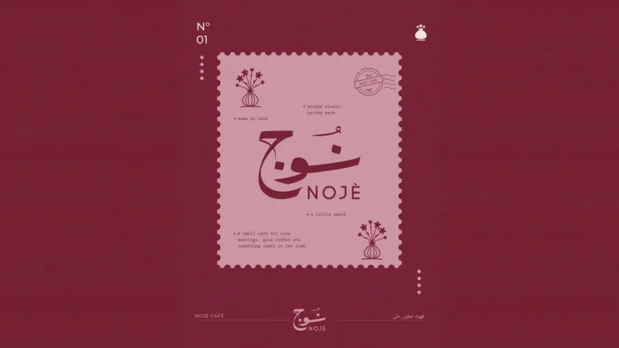
For the café NOJÈ, we drew the name in Arabic and English by hand and paired it with a hand-painted vase, a small-business version of several shifts above.
Frequently Asked Questions
What are the biggest graphic design trends for 2027?
Work that looks human-made: hand-drawn marks, real materials shot in camera, scanned texture, collage, big type, typewriter and pixel letters, earthy colors with one accent, restrained glass on screens and magazine-style grids.
Is minimalism over in 2027?
Not entirely, but flat, generic minimalism is. Clean layouts now need texture, character or a strong grid to stand out. Simple is still good; anonymous is not.
How is AI changing graphic design trends?
Mostly by pushing designers the other way. Because AI makes polished images cheap, visible craft and real photography now signal quality.
What colors are trending for 2027?
Earthy greens, olive, clay and cream, usually with one bright accent. WGSN chose Luminous Blue, and Pantone announces its 2027 color in early December.
Should my brand follow 2027 design trends?
Borrow the ideas that fit your story, not all nine. A trend should make your brand more itself, not like everyone else.
Final Thoughts
The thread running through graphic design trends 2027 is simple: show the making. Hands, materials, archives and honest type all prove a real person built the brand, and that is what customers trust in an AI year.
Planning a new look for 2027? Talk to Brandlic about an identity built by hand, for your business.
Looking for expert support in branding, design, or packaging? Discover how Brandlic turns creative ideas into powerful brand experiences.
Explore our services →

Comments
Leave a reply
Your email address will not be published. Required fields are marked *