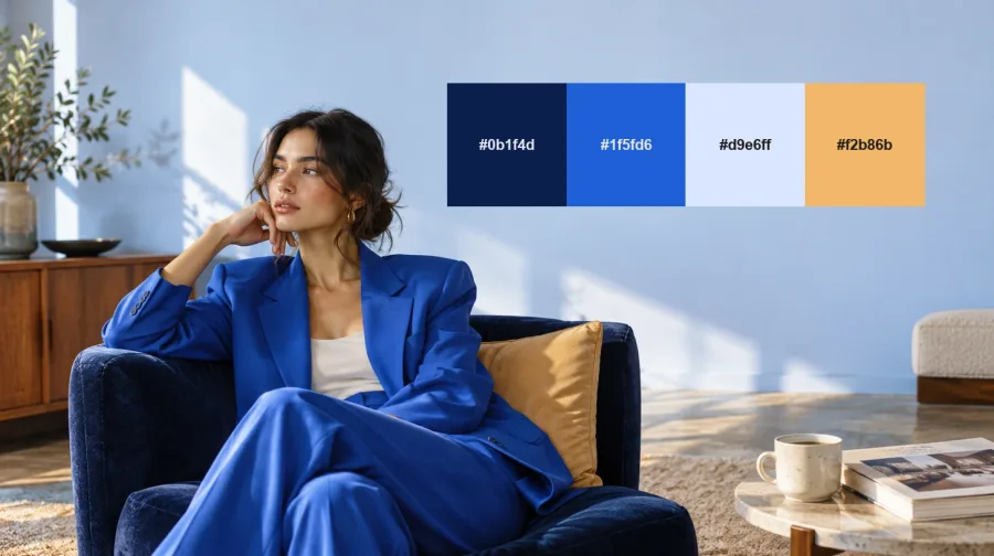
Every autumn the color forecasts arrive, and every brand has to decide what to do with them. If you are choosing color palettes for branding in 2027, this year's signals are unusually clear. WGSN and Coloro have named Luminous Blue their Color of the Year, paint brands from Behr to Benjamin Moore have gone earthy and green, and Pantone's choice of a white for 2026 left many designers wanting color with more life in it.
We've turned those signals into nine palettes. Each one comes with hex codes, the industries it suits and a real brand or forecast behind it, so you can see the idea working before you commit to it. Like our luxury color palettes from last year, every palette is built to work across visual identity, packaging and digital.
What's Shaping Brand Color in 2027
Three forces run through almost every 2027 forecast we studied while building these color palettes for branding.
- Blue becomes the anchor: WGSN and Coloro named Luminous Blue (Coloro 125-28-38) their 2027 Color of the Year, a shade they connect to lapis lazuli and to the cobalt inside batteries. Valspar's Cottage Door and Glidden's Artifact are muted blues too.
- The ground gets greener: Behr chose Grounded, a mossy olive. Sherwin-Williams picked Celery, Dulux went with Soulful Sage, and Benjamin Moore announced Webster Green on October 14. Earthy oranges and pinks, such as Dutch Boy's Deep Rooted and Graham & Brown's Rose Earth, complete the mood.
- A reaction against blank white: Pantone's 2026 pick, Cloud Dancer (PANTONE 11-4201), was the first white in the program's history. Plenty of designers saw it as another sign of "blanding", and the counter-move is already visible in WGSN's Energy Orange and Pop Pink and in Premiere Vision's electric brights for Spring/Summer 2027.
How We Chose These Palettes
We started with the official 2027 announcements from WGSN and Coloro, Pantone and the major paint brands. Then we looked at the identities design media debated most this year, from Coca-Cola and McLaren to the Brisbane 2032 emblems. Finally, we tested each combination the way we would for a client: on a logo, a pack and a screen.
Where a brand has published official hex values, we use them and say so. Everywhere else, the hex codes are Brandlic's own interpretation, tuned for contrast and real-world use. Each palette below shows four colors from darkest to lightest, followed by how to use them.
The brands in our mood images are fictional concepts styled by Brandlic: Kova, Meadowkind, Clayfold, Olivine and Halde.
1. Luminous Blue Hour
Hex Codes: #0B1F4D | #1F5FD6 | #D9E6FF | #F2B86B
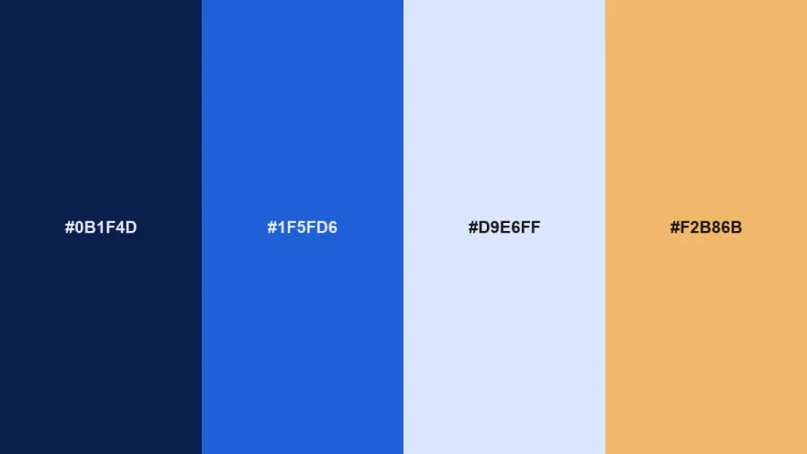
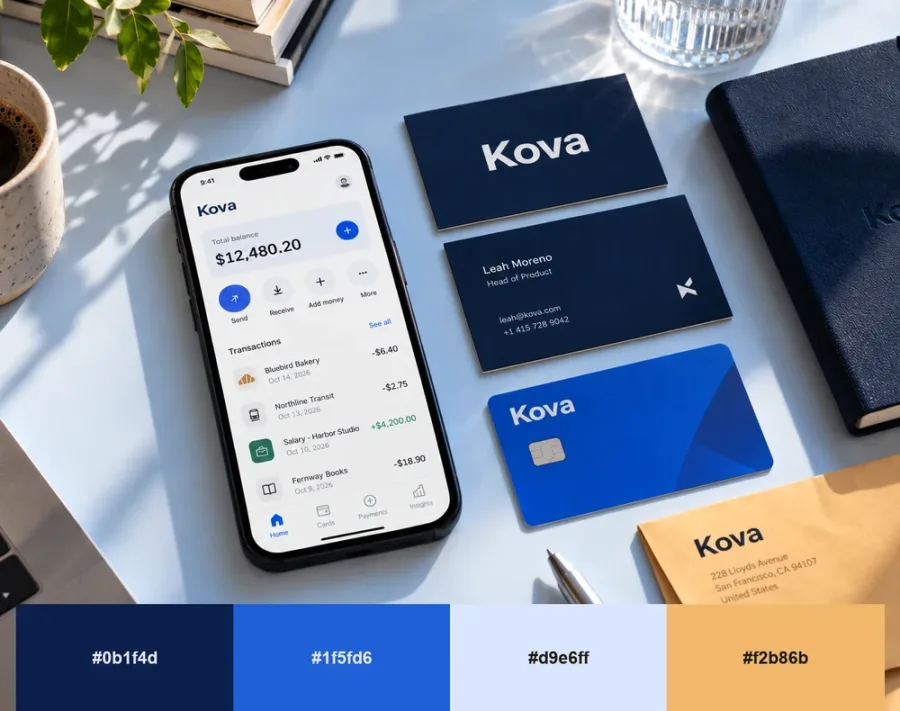
Built around WGSN's Color of the Year, this palette pairs a bright lapis blue with deep navy, a pale ice tint and a warm sand accent. Blue has long been the safe choice for banks and tech companies, but Luminous Blue has far more energy than corporate navy. WGSN describes it as gender-inclusive and trans-seasonal, which makes it useful for brands that sell to everyone.
Use the navy for type and structure, let the bright blue carry buttons, packaging and campaign moments, and keep the sand for small highlights. It suits fintech, healthcare, mobility, energy and wellness brands that want to feel trustworthy without feeling dull.
2. Energy Orange
Hex Codes: #2A1B14 | #FF6A13 | #FFB37A | #FFF3E6
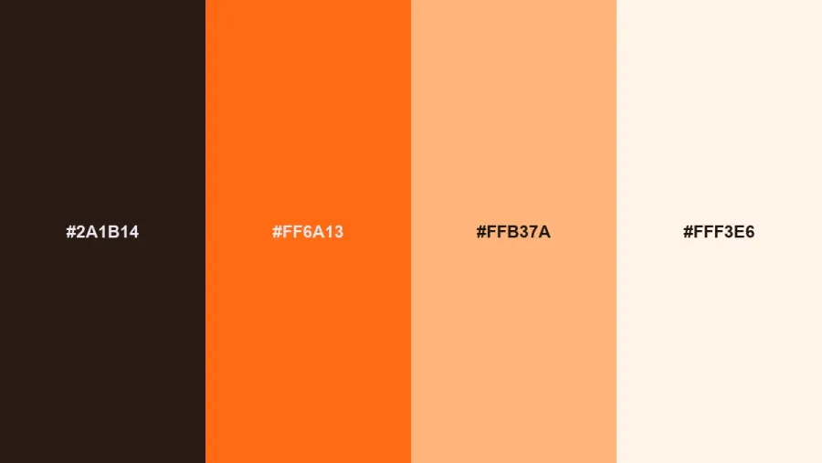
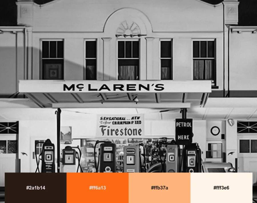
WGSN calls Energy Orange a high-vibrancy shade about resilience and adapting to change. On a brand, orange reads as confident, warm and hard to ignore, which is why it keeps winning attention on crowded shelves and screens.
McLaren shows how much an orange can carry. When McLaren refreshed its identity in September 2026, with a new wordmark based on the sign above Bruce McLaren's family garage, papaya stayed at the center. Pair the orange with an espresso brown instead of black for a softer, more current feel. It works for food and drink, sport, travel and challenger brands.
3. Pop Pink
Hex Codes: #3A0F2B | #FF4F9A | #FFB3D1 | #FFF0F5
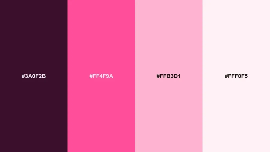
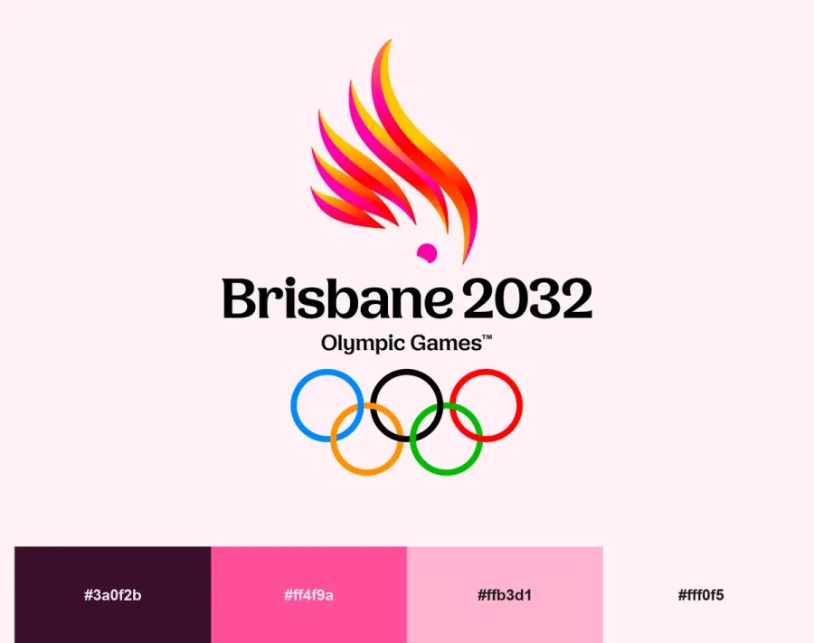
Pop Pink is WGSN's joyful, carefree key color for Spring/Summer 2027, and it's the most playful palette on this list. The deep plum keeps it grown-up, so it can stretch well beyond beauty and fashion.
The Brisbane 2032 Olympic and Paralympic emblems, revealed in October, are built around the crest of a pink cockatoo, proof that pink can hold a serious, global identity. Use this palette for beauty, entertainment, events, confectionery and youth brands that want to feel generous rather than polite.
4. Meadowland
Hex Codes: #1E3B24 | #5E9C4C | #A9CC7A | #EFF5E4
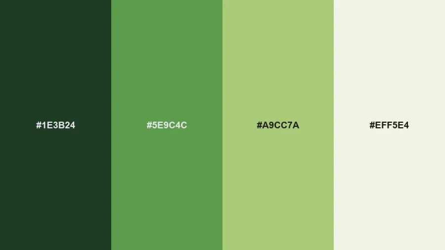
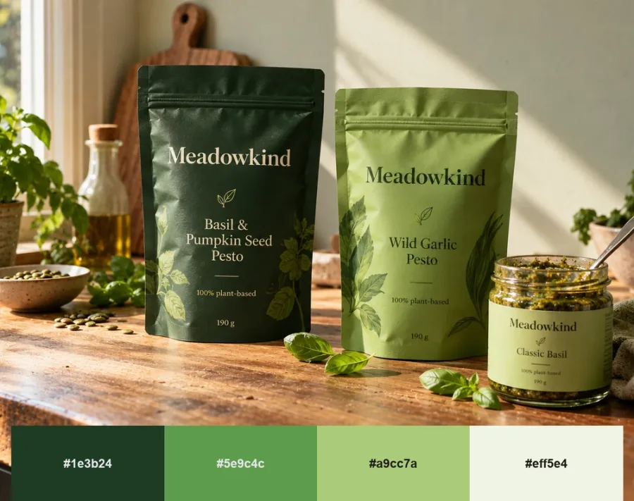
Green appears in more 2027 forecasts than any other color. WGSN's Meadowland Green is a nourishing mid-green about rest and slower living, Dulux chose Soulful Sage, and Benjamin Moore's Webster Green is a classic mid-tone green.
This palette runs from forest to a pale meadow tint, so you can build a complete system from a single hue. It fits wellness, plant-based food, outdoor and sustainability brands. Keep the forest shade for text and save the brighter greens for accents and illustration.
5. Rose Clay
Hex Codes: #3B2A26 | #A8664F | #D4A08A | #F1E3D8
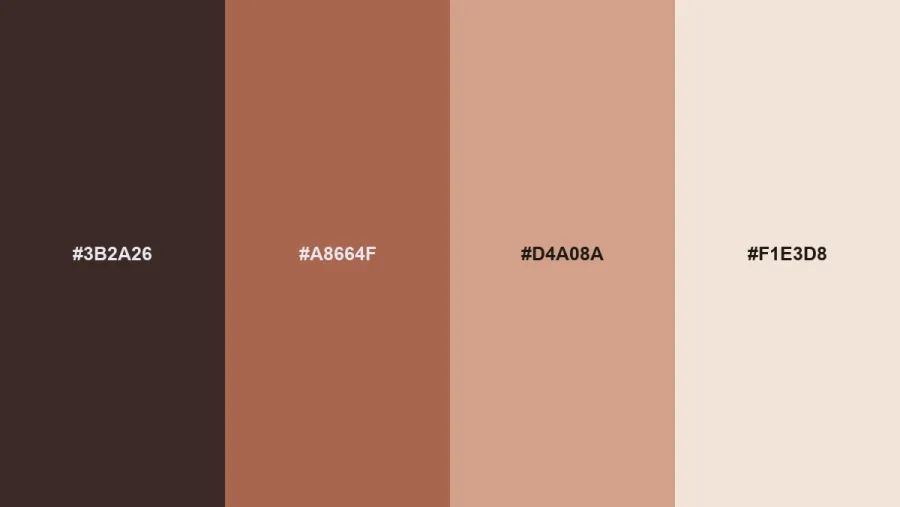
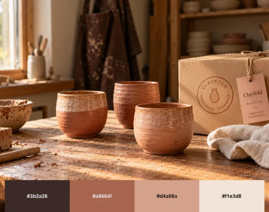
WGSN's Clay is a pink-toned, earthy neutral. It sits alongside Graham & Brown's Rose Earth, inspired by Italian clay pigments, and C2's Pueblo, an earthy rose-brown. Together they point to warm neutrals replacing cool gray.
Rose Clay feels handmade and human, which suits a design culture that is pushing back against polished, AI-smooth imagery. It's a natural fit for hospitality, homeware, ceramics, skincare and craft food brands, and it looks especially good on uncoated paper and kraft packaging.
6. Grounded Olive
Hex Codes: #3A382F | #615E50 | #E0DDBD | #F7F5EC
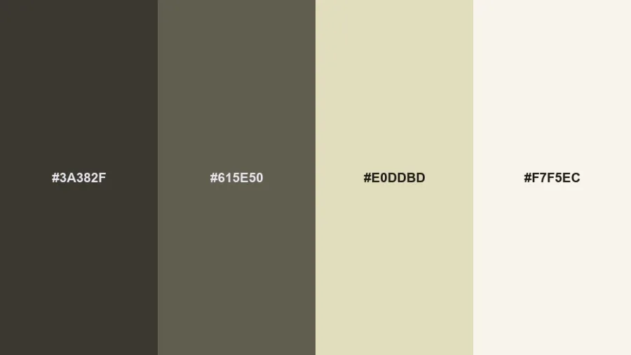
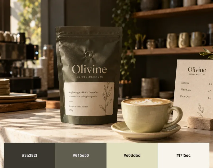
This palette is built on two official 2027 paint colors: Behr's Grounded (#615E50), a mossy olive with brown undertones, and Sherwin-Williams' Celery (#E0DDBD), which the brand describes as an airy, herbal green.
Olive and celery make a calm, adult combination that feels natural without looking rustic. It works for architecture practices, furniture, menswear, coffee and premium outdoor brands, and it gives packaging quiet confidence on the shelf.
7. Cloud Dancer, Reworked
Hex Codes: #1C1C1E | #FF5A1F | #D8D4CC | #F0EEE9
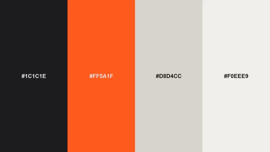
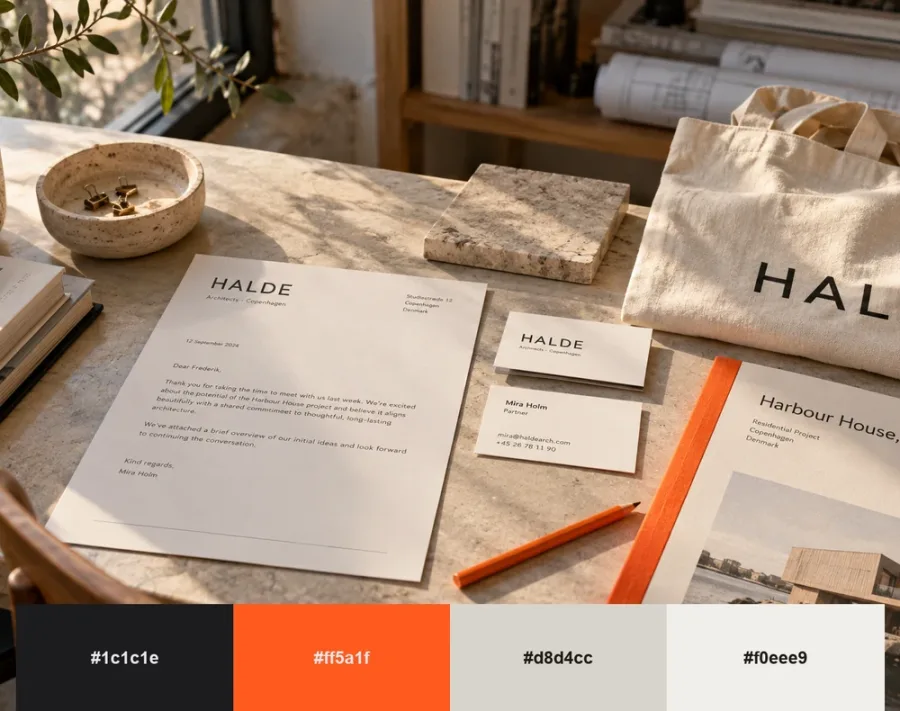
Pantone's Cloud Dancer divided the design world. We think white still works for brands when it has something to push against. This palette pairs a soft off-white close to Cloud Dancer with warm stone, near-black and one loud orange accent.
The white gives space and calm, and the accent stops the brand from disappearing. It's ideal for tech, architecture and editorial brands that love minimal design but refuse to blend in. Pantone doesn't publish an official hex value, so #F0EEE9 is our screen interpretation.
8. Heritage Red
Hex Codes: #1A1414 | #8E1B1F | #D7262E | #F6EBDD
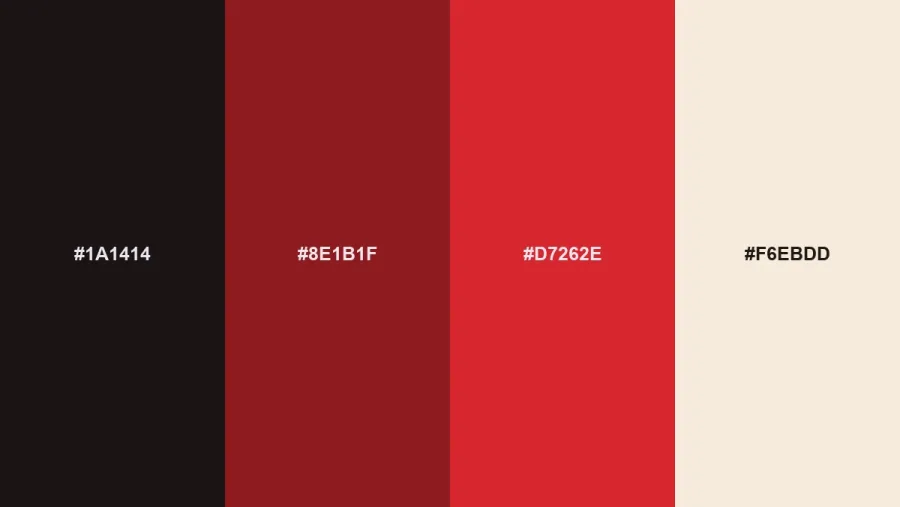
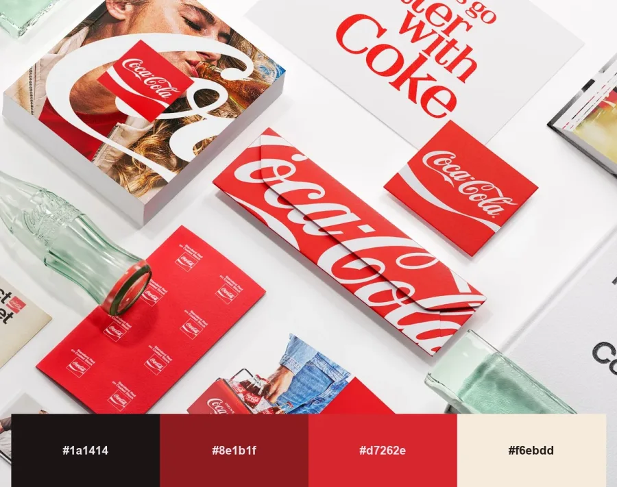
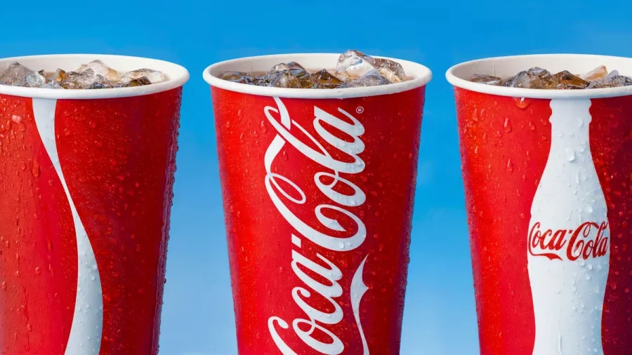
In July, Coca-Cola unveiled a global identity by JKR built on a simple brief: make Coca-Cola more Coca-Cola. Rather than replace its red, the brand strengthened it, along with the Spencerian script and Dynamic Ribbon.
Heritage Red takes the same lesson. A confident red with oxblood, warm cream and near-black reads as established and generous. It suits food and drink, retail, sport and any brand with history worth leaning on. These hex codes are our own take on the idea, not Coca-Cola's official red.
9. Hyper Chroma
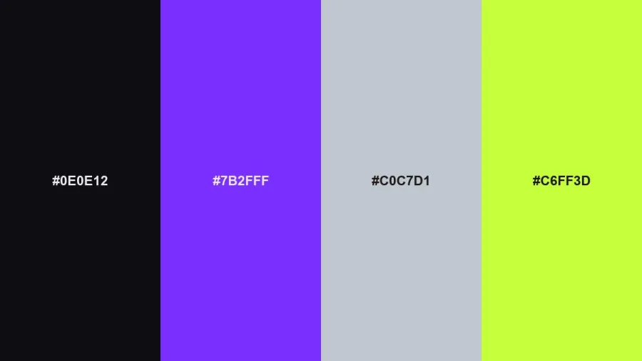
Hex Codes: #0E0E12 | #7B2FFF | #C0C7D1 | #C6FF3D
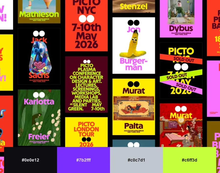
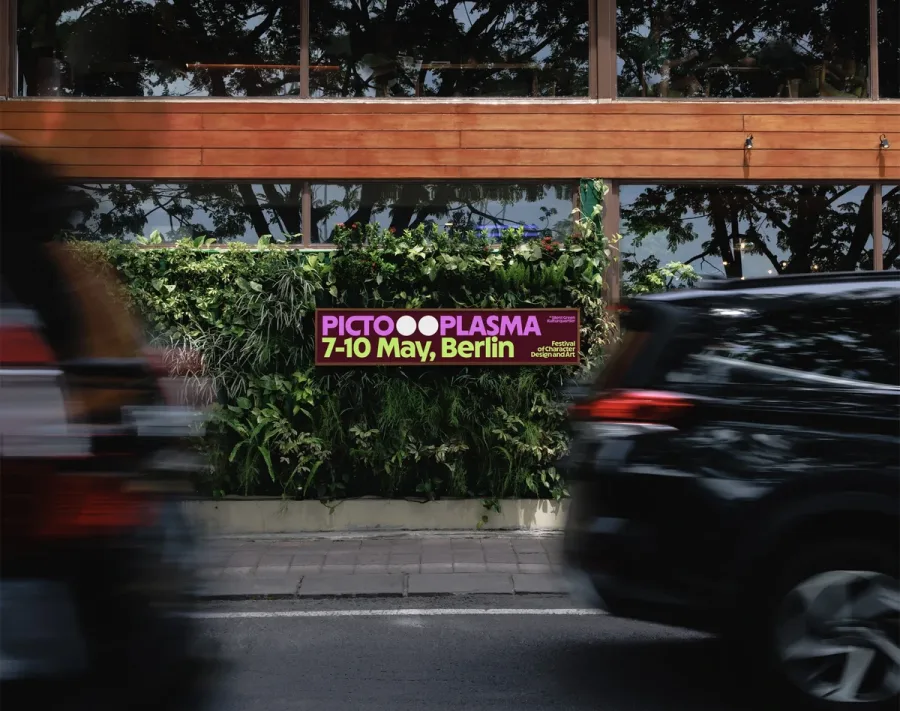
Not every brand is going quiet. Illustrators and stock libraries have been predicting saturated, almost neon color as the answer to beige, and the work is already here: andstudio's new identity for Berlin's Pictoplasma festival fills its posters with acid yellow, hot magenta and purple.
Hyper Chroma combines acid lime and electric violet with chrome gray on near-black. It's built for music, gaming, nightlife, streetwear and Gen Z brands. Use it boldly but sparingly, give the lime room to breathe, and always check contrast before setting text in it.
Quick Match: Which 2027 Palette Fits Your Industry?
If you're short on time, start here. These pairings are where we'd begin when choosing color palettes for branding in each sector.
- Fintech, SaaS and healthcare: Luminous Blue Hour or Cloud Dancer, Reworked.
- Food, drink and hospitality: Energy Orange, Heritage Red or Rose Clay.
- Beauty, fashion and events: Pop Pink or Rose Clay.
- Wellness, outdoor and sustainability: Meadowland or Grounded Olive.
- Architecture, interiors and furniture: Grounded Olive or Cloud Dancer, Reworked.
- Music, gaming and streetwear: Hyper Chroma.
Thinking about a bigger change than color? Our guide to the signals your business needs a rebrand is a good place to start.
How to Turn Color Palettes for Branding Into a System
A trend palette is a starting point. To turn one into a working brand system, we follow a few simple rules.
- Stick to three to five colors: One or two primaries, one or two supporting shades and a neutral are enough for most brands. More than that and consistency starts to slip.
- Use the 60-30-10 rule: Roughly 60% dominant or neutral color, 30% secondary and 10% accent keeps layouts balanced.
- Test contrast early: Body text should reach a 4.5:1 contrast ratio against its background under WCAG guidelines. Bright accents like Energy Orange and acid lime rarely pass as text on white.
- Define every format: Record HEX for screens, RGB, CMYK for print and a Pantone match for packaging in your brand guidelines.
- Borrow the mood, not the exact shade: Forecast colors are available to everyone. Shift the hue, value or pairing until the palette feels like yours.
- Pair color with type: A palette only comes alive next to the right typeface. Our list of typefaces designers are reaching for is a useful companion.
The Psychology Behind 2027's Colors
Good color palettes for branding work because people read color before they read words. Each palette family sends a different signal:
- Blue for trust with energy: Brighter blues keep the reliability of navy but add optimism and movement.
- Green and olive for balance: Natural greens suggest health, calm and responsibility without the clichés of eco branding.
- Clay and earth for warmth: Pink-toned neutrals feel human, tactile and approachable.
- Brights for optimism: Orange, pink and acid tones signal confidence and fun, and they are memorable at a glance.
The common thread is reassurance. After years of uncertainty, people respond to colors that feel either grounding or joyful.
Applying 2027 Palettes Across Your Brand
Once you've picked from these color palettes for branding, consistency matters more than the exact shade. Here's how to roll a palette out across every touchpoint:
- Branding & Identity: Choose one hero color that can own a logo, a favicon and a social avatar on its own, then let the rest of the palette support it.
- Packaging: Earthy palettes like Rose Clay and Grounded Olive suit uncoated stocks and natural textures, while brights need clean surfaces to stay vivid. See our packaging design thinking for more.
- Digital Design: Test every palette in light and dark mode. Saturated accents often need a slightly deeper value on screen.
- Motion & Social: Bright palettes such as Pop Pink and Hyper Chroma come alive in motion, and a consistent accent helps people recognize your posts before they read them.
Looking Ahead: Pantone 2027 and Beyond
Pantone usually announces its Color of the Year in early December, and the 2027 pick hasn't been revealed yet. Whatever Pantone picks, color palettes for branding in 2027 are already heading one way: confident blues, grounded greens and warm earth tones, with a strong current of joyful brights pushing back against beige. We'll update this guide when Pantone makes its announcement.
Our advice for 2027 is simple. Treat forecasts as a menu, not a rulebook. The strongest color palettes for branding next year will mix one current color with a foundation that will still feel right in five years.
Frequently Asked Questions
What is the color of the year for 2027?
WGSN and Coloro named Luminous Blue as their Color of the Year 2027. Paint brands have announced their own picks, including Behr's Grounded, Sherwin-Williams' Celery and Benjamin Moore's Webster Green. Pantone is expected to reveal its 2027 color in early December 2026.
What is Luminous Blue?
Luminous Blue (Coloro 125-28-38) is WGSN and Coloro's Color of the Year 2027. It's a bright, saturated blue that WGSN links to lapis lazuli and cobalt, and it was announced alongside four key colors: Energy Orange, Pop Pink, Meadowland Green and Clay.
What colors are trending for brands in 2027?
The biggest themes are bright, energetic blues, natural greens and olives, warm pink-toned neutrals, and a counter-trend of saturated brights such as orange, pink and acid lime.
How many colors should a brand color palette have?
Most brands work best with three to five colors: one or two primary colors, one or two secondary colors and at least one neutral for backgrounds and text.
Should my brand follow color trends?
Use trends for campaigns, seasonal packaging and refreshes, but build your core identity on strategy. A trend should support what your brand stands for, not replace it.
Can I use these color palettes for branding my business?
Yes. Every palette in this guide is free to use as a starting point. To make color palettes for branding truly distinctive, adjust the shades and test them across your real touchpoints.
Final Thoughts
The best color palettes for branding don't chase every forecast. They take what's useful from the moment and turn it into something customers recognize in a split second. 2027 gives brands plenty to work with, from Luminous Blue to grounded olive to unapologetic neon.
At Brandlic, we often find that color palettes for branding are where a brand's personality first becomes visible. If one of these palettes feels close to your brand, let's build it into a complete identity together.
Looking for expert support in branding, design, or packaging? Discover how Brandlic turns creative ideas into powerful brand experiences.
Explore our services →
Comments
Leave a reply
Your email address will not be published. Required fields are marked *