
When a brand starts to feel tired, the instinct is to tear everything up and start again. Most of the time, that's the wrong move. A brand refresh keeps everything customers already know and love, and fixes what's holding you back. A rebrand starts over.
2026 made the case better than any theory could. The year's best-received identity work, from KFC to Coca-Cola, kept the old assets and polished them. Some of the loudest backlash hit brands that threw away what people loved. Here's how to tell which one your business needs, with 12 real examples from the US, UK and Australia.
What Is a Brand Refresh?
A brand refresh updates how your brand looks and sounds without changing who you are. You keep your name, your core symbol and the things customers recognize. You change the details around them: the typeface, the color palette, the drawing of the logo, the photography style or the tone of voice.
Think of it as renovating a house you love rather than moving out. The address stays the same; the rooms get better.
A rebrand is the move. It can mean a new name, a new logo, a new strategy and often a new audience. It's bigger, slower, more expensive and much riskier, because you're asking customers to learn who you are all over again.

Brand Refresh vs Rebrand: The Key Differences
The simplest test is this: do customers still like what they see, even if it looks dated? If yes, you probably need a refresh. If your name, your offer or your reputation no longer fits, you may need a rebrand.
- What changes: a refresh changes the look; a rebrand can change everything, including the name.
- What stays: a refresh keeps your recognizable assets; a rebrand keeps very little.
- Time and cost: a refresh is usually faster and cheaper; a rebrand takes longer and costs more.
- Risk: a refresh is lower risk because people still recognize you; a rebrand risks losing the recognition you've built.
Signs You Need a Refresh, Not a Rebrand
These are the situations we hear about most often from growing businesses, and almost all of them can be solved without starting over:
- Your logo looks blurry or cramped on social media. It was designed for a shop sign or business card, not a profile picture.
- Every touchpoint looks slightly different. Your menu, website and packaging were made at different times by different people.
- Your brand looks older than your business feels. The product has moved on, but the visuals haven't.
- Competitors have caught up. Your look was distinctive five years ago; now everyone looks like that.
- You're adding new products or locations. The identity needs to stretch further than it was built to.
None of these mean customers dislike you. They mean your identity needs to work harder. That's exactly the job of a refresh.
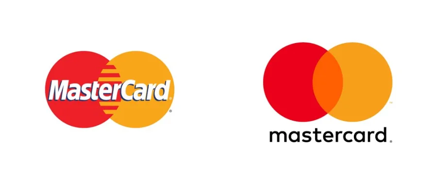
Mastercard is the classic example of the first sign. In 2016, Pentagram simplified its logo for screens while keeping the overlapping red and yellow circles people already knew. Three years later, the circles were familiar enough to appear without the name.
6 Brand Refresh Examples That Worked in 2026
1. KFC: bolder, not different
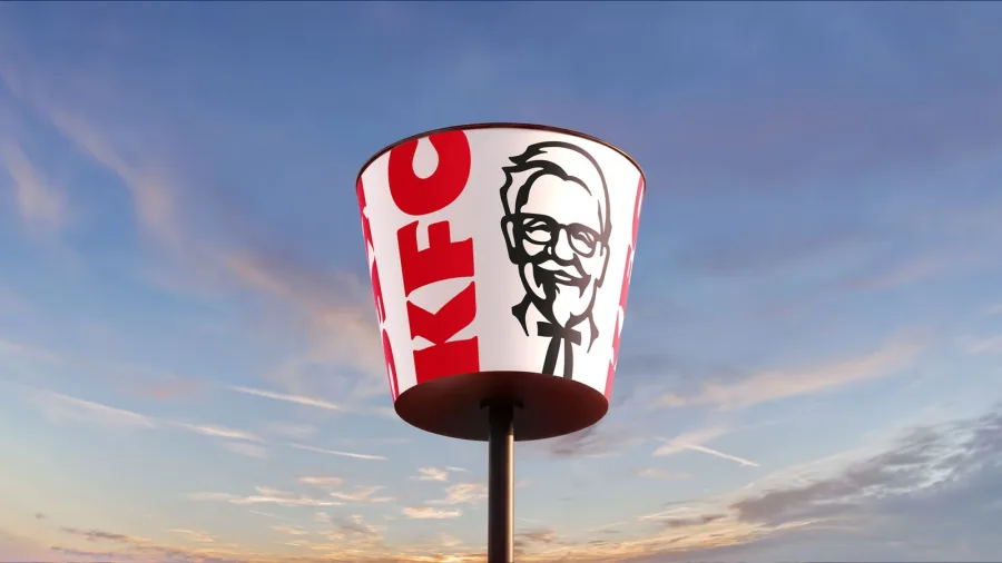
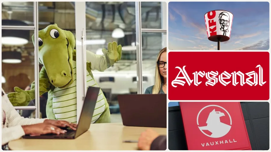
KFC's "Bucketverse" identity by JKR, launched in June 2026, kept the two things everyone knows: the bucket and Colonel Sanders. The bucket became the frame for everything, the Colonel got warmer, and a new Kentucky Fried Serif and Sans joined the system. Creative Review described it as less a radical reinvention than "a doubling down". It rolls out in the UK and Ireland first, then Australia and the US.
2. Coca-Cola: no new logo at all
Coca-Cola's global identity by JKR is a masterclass in restraint. There's no new logo. Instead, it strengthens what the brand already owns: the Spencerian script, the Dynamic Ribbon and that red, applied consistently across more than 200 markets. One headline summed up the brief: "make Coca-Cola more Coca-Cola". For a smaller business, the same idea applies: use what you already have more consistently before inventing anything new.

3. Norton Museum of Art: back to the archive
Koto's refresh for the Norton Museum in Florida revived a wordmark from the museum's own archive. The 40-degree angle of its "N" now drives the whole system, from posters to signage. The brand feels new, but it's built from something with real history.

4. Williams F1: restoring a classic
For 2026, Williams went back to the Williams F1 Team name and restored Frank Williams' original "Forward W", with a refreshed blue. Instead of inventing a new symbol, the team brought back one that fans already loved, just in time for its 50th year in Formula One.

5. Fulham FC: the crest stays put
Fulham's new identity by Music and F37 didn't touch the crest. Instead, it added a custom typeface drawn from the lettering at Craven Cottage, the club's stadium. Fans got something fresh without losing a thing they cared about.

6. Vauxhall: the 13th Griffin
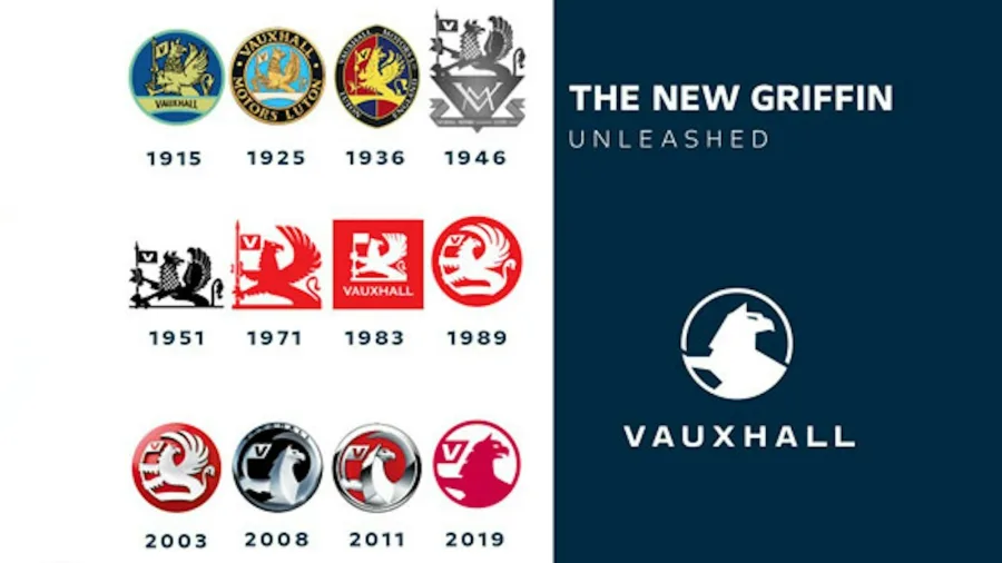
Vauxhall's new badge, revealed at the Paris Motor Show in October 2026, is the 13th version of its Griffin since 1915. It's simpler and sharper, drops the flag and the "V", and is designed to light up on the front of the car. Over a century, the symbol has changed many times, but it has never been replaced.
When a Brand Refresh Goes Wrong
A refresh is lower risk, not no risk. These three show where it can go off course.
7. Cracker Barrel: removing the one thing people loved
In August 2025, Cracker Barrel unveiled a text-only logo, dropping the "Old Timer" leaning on a barrel that had been part of its logo since 1977. Customers pushed back hard. About a week later, the company announced, "Our new logo is going away and our 'Old Timer' will remain."

Lesson: before you change anything, find out which asset customers are most attached to, and protect it.
8. Sam's Club: clean, but generic
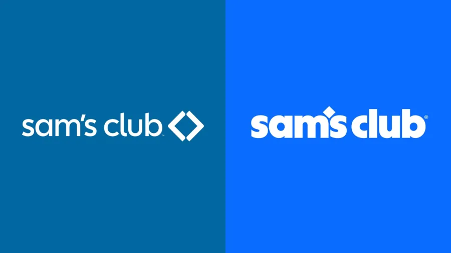
Sam's Club's 2026 refresh by Turner Duckworth introduced a lowercase wordmark with its diamond turned into an apostrophe, and swapped green for a bright blue. It's tidy and works well on screens, but many critics called it generic.
Lesson: simplifying is good; removing everything distinctive is not.
9. Bob's Red Mill: judge results, not first reactions
Bob's Red Mill's new packaging, also with Turner Duckworth, was criticized as more generic too. But the company says its focus groups found the design cut the time it took shoppers to find products on the shelf by nearly half.

Lesson: online reactions are loud and fast. Measure what matters to your business before deciding a refresh has failed.
When a Full Rebrand Is the Right Call
Sometimes a refresh simply can't solve the problem. Common triggers include a forced name change, a merger, a legal dispute over your name, or a business that has moved into a completely different market. In those cases, holding on to the old identity can confuse customers more than a clean break. These are the situations where starting over makes sense.
10. News24: when you have no choice
When Sky News Australia's licence to use the Sky name ended, it had to become something new. In July 2026 it relaunched as News24, with a new logo, motion package and studio created by Balboa. A forced name change is the clearest case for a rebrand: there's nothing to refresh.

11. Intuit: fixing the family
Intuit's 2026 identity brings TurboTax, QuickBooks, Credit Karma and Mailchimp together as "One Intuit". When the problem is a confusing family of brands, not an outdated look, you need to change the structure, which goes beyond a refresh.
12. Jaguar: the risk of starting from zero
In November 2024, Jaguar unveiled a radical new identity, including a mixed-case "JaGUar" wordmark and the line "Copy Nothing", as it prepared to become an electric-only brand. The launch ad showed no cars at all and was widely mocked online. Whatever the long-term result, it shows how much attention, and criticism, a full rebrand can attract.

Lesson: a rebrand needs a clear reason customers can understand. Without one, it looks like change for its own sake.
Logo Refresh: Small Changes, Big Difference
Many businesses don't need a full brand refresh at all, just a logo refresh. A good logo refresh usually involves:
- Simplifying details that disappear at small sizes.
- Redrawing the mark with cleaner lines and better balance.
- Updating the type so it feels current and reads well on screens.
- Creating responsive versions: a full logo, a compact version and a small icon.
- Tightening the color so it looks consistent in print and online.
KFC's Colonel and Intuit's wordmark show how much difference careful changes make. Both are instantly recognizable, but sharper and more confident.


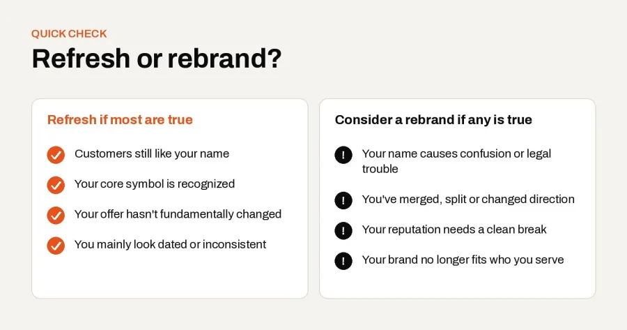
Refresh or Rebrand? A Quick Checklist
If most of the points on the left are true for your business, a brand refresh is likely the smarter move. If any of the points on the right are true, it's worth considering a rebrand. For a deeper look at the warning signs, read our guide to 10 clear signals your business needs a rebrand.
How to Plan a Brand Refresh in 6 Steps
- List what people recognize. Ask customers what they remember about your brand: a color, a symbol, a phrase. These are your most valuable assets.
- Decide what to keep, change and drop. Protect the recognizable assets, improve the weak ones, and remove what no longer earns its place.
- Keep the system small. A few strong parts used consistently beat a long list of rules.
- Test before you launch. Show the new look to real customers and check they still recognize you.
- Roll out in phases. Start with digital and high-visibility touchpoints, then update packaging and signage as stock runs out.
- Tell the story. Explain what changed and why. Customers accept change more easily when they understand it.
Step three is where we see the biggest difference. For GOTTO, a concept café identity we designed, the whole system has just three parts: a hand-drawn wordmark, a small "g." monogram and a little car inspired by a childhood toy made from two wooden blocks.

Those three parts work everywhere, from the storefront and takeaway cups to an enamel pin and an apron. That kind of lean, flexible system is exactly what a good brand refresh should leave you with. It also makes future updates easier: when there are only a few parts, refreshing them later is quick and affordable.

Frequently Asked Questions
What is a brand refresh?
A brand refresh is an update to your brand's look and feel, such as its typeface, colors, logo details and imagery, while keeping your name, core symbol and the things customers recognize.
What's the difference between a brand refresh and a rebrand?
A brand refresh improves your existing identity. A rebrand replaces it, often including the name, logo and strategy. A refresh is faster, cheaper and lower risk; a rebrand is for when your current brand no longer fits.
How much does a brand refresh cost?
It depends on the scope. Refreshing a logo and color palette costs much less than updating every touchpoint, from packaging to signage. The number of assets you need to update is the biggest factor.
How long does a brand refresh take?
A focused logo refresh can take a few weeks. A full brand refresh, including guidelines and rollout across packaging, signage and digital, takes longer, depending on how many touchpoints you have.
How often should you refresh your brand?
There's no fixed rule. Many brands make small updates every few years and larger refreshes when their identity starts to look dated or stops working on new platforms.
Will a brand refresh hurt my SEO?
A visual refresh on its own doesn't affect SEO. Changing your business name or website address can, so plan redirects carefully if a refresh grows into a rebrand.
Final Thoughts
The strongest identities of 2026 didn't start over. They found what customers already loved and made it work harder. Before you rebrand, ask whether a brand refresh could get you there with less risk, less cost and more of the recognition you've already earned. For more on where identity design is heading, see our guide to branding trends for 2027.
Wondering whether your brand needs a refresh or a rebrand? Talk to Brandlic and we'll help you decide.
Looking for expert support in branding, design, or packaging? Discover how Brandlic turns creative ideas into powerful brand experiences.
Explore our services →
Comments
Leave a reply
Your email address will not be published. Required fields are marked *