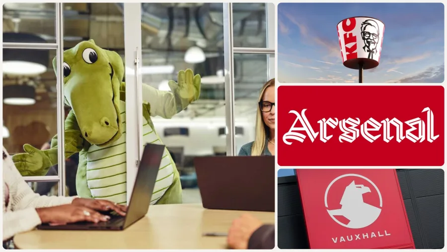
Every year, a few rebrands set the tone for everyone else. In 2026 it was a fast-food bucket, a football club's new typeface, a radio station's lips and a car badge built to glow. Look closely and the same ideas keep coming back. Those ideas are the branding trends 2027 will be built on.
We studied the biggest identity launches of the year across the US, UK and Australia, plus what design writers at Creative Review, It's Nice That, Brand New and Creative Boom made of them. Below are the seven shifts that matter, the real examples behind each one, and what they mean for a growing business.
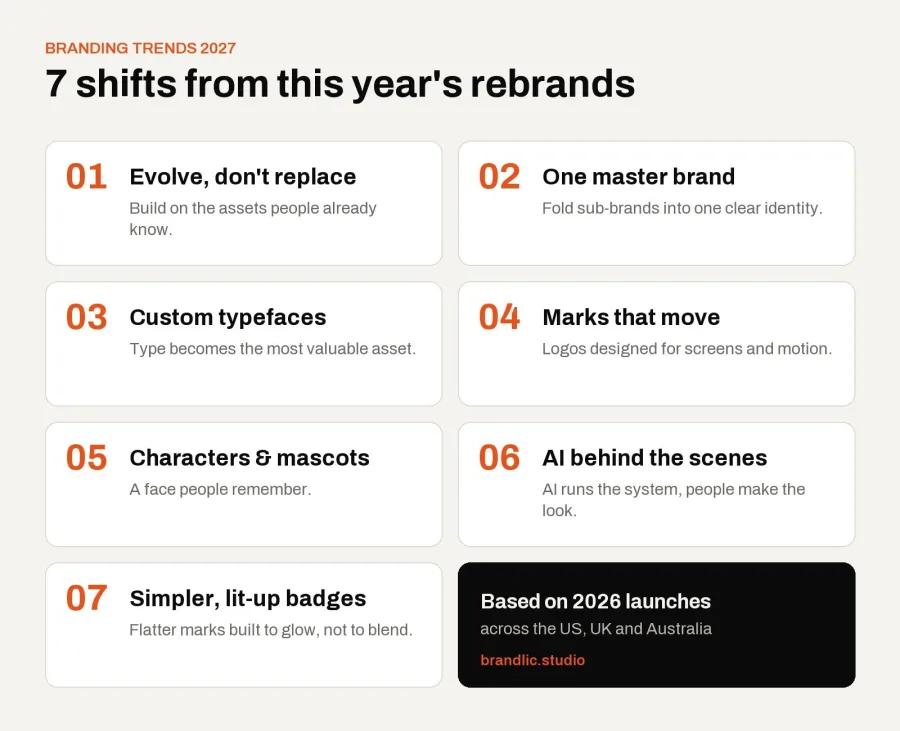
Why 2026's Rebrands Point to the Branding Trends of 2027
Trend lists often guess. We'd rather follow the work. Big companies plan identity changes years ahead, so what launched in 2026 shows where brands are heading next. If you're refreshing your brand this year or next, these are the branding trends worth knowing, and the ones worth ignoring.
To pick our seven branding trends 2027 will be shaped by, we only counted ideas that showed up in several major launches, from different agencies, in more than one country. A one-off stunt didn't make the list. We also looked at the reaction, because the rebrands people argued about tell you as much as the ones they loved. Where a brand's claims come from its own research, we say so.
1. Evolve, Don't Replace
The biggest brands of 2026 didn't throw anything away. They dug into what they already owned and made it stronger.
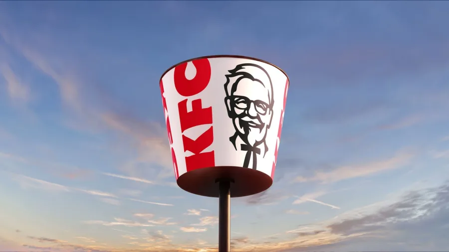
KFC's "Bucketverse" identity by JKR, launched in June, turns the famous bucket into a frame for everything else. The Colonel looks warmer, there's a new Kentucky Fried Serif and Sans, and the logo is no longer flat. Creative Review called it less a radical reinvention than "a doubling down". The rollout starts in the UK and Ireland, then Australia and the US.
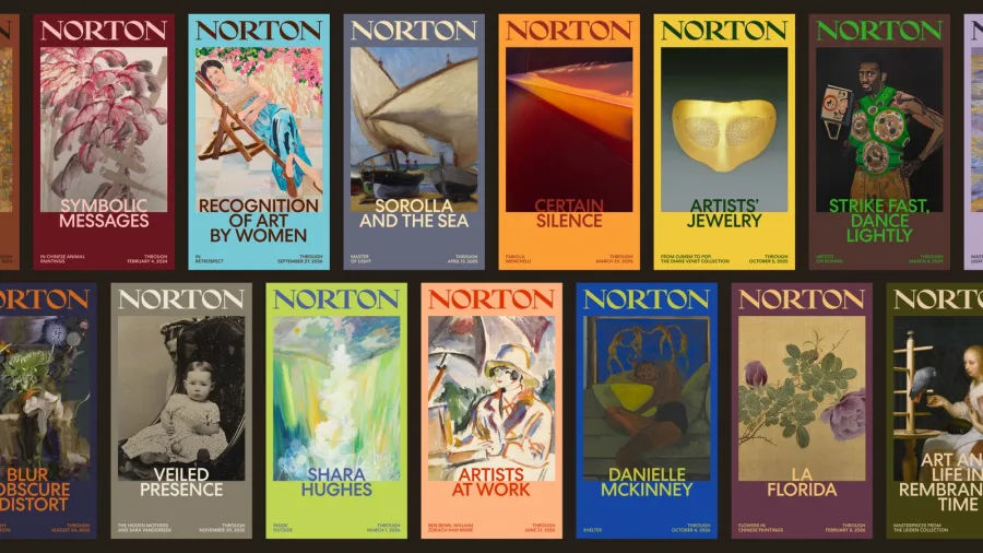
In Florida, Koto rebuilt the Norton Museum of Art's identity around a wordmark from the museum's own archive. The 40-degree angle of its "N" now shapes the whole system, from posters to signage, in a bright Florida palette.
Formula One did the same. For 2026, Williams went back to the Williams F1 Team name (with Atlassian as title partner), restored Frank Williams' original "Forward W" and refreshed its blue. With the team's 50th year in the sport coming up, heritage is the story.
The takeaway: before you replace anything, list what customers already recognize. A refresh that builds on that is cheaper, safer and usually more effective than starting from zero.
2. One Master Brand
Many companies spent 2026 cleaning up messy brand families. Instead of separate logos for every product, they're bringing everything under one parent identity.
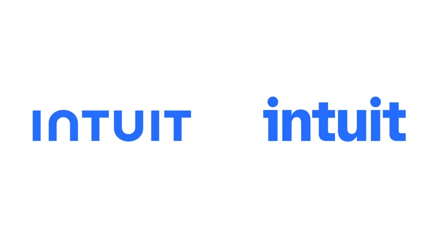
Intuit's new system, made by JKR with its in-house team, ties TurboTax, QuickBooks, Credit Karma and Mailchimp together as "One Intuit". The new lowercase wordmark also works as a symbol, so one mark can carry every product.
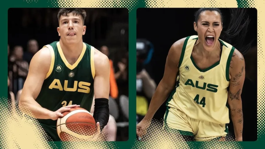
In Australia, Hulsbosch gave Basketball Australia one consumer brand across all its national teams. A bold "AUS" chest mark leads the system, with First Nations artwork by Danny O'Shane running through it.
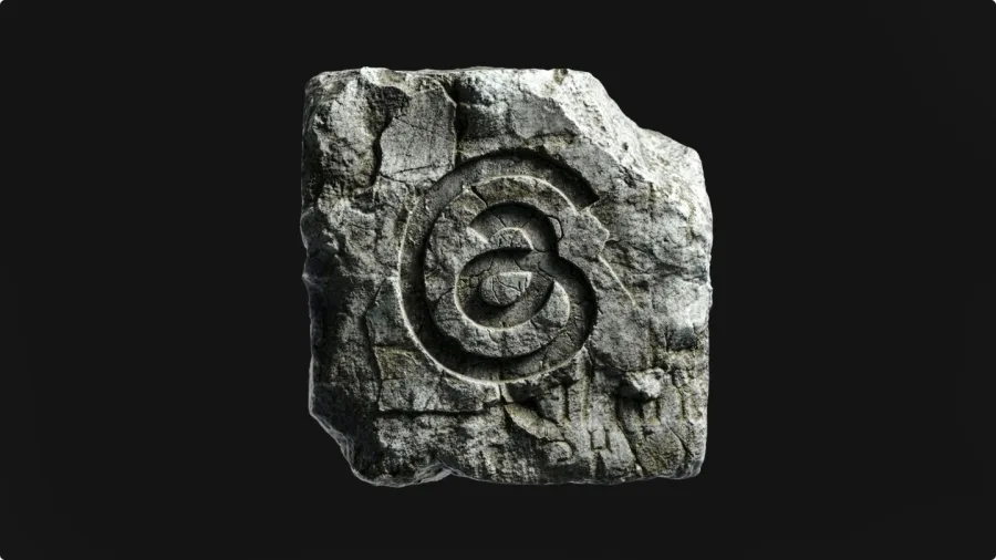
Threads went the other way: Studio NARI gave it a wordmark of its own, so it no longer sits in Instagram's shadow. Sky News Australia, renamed News24 in July, is another reminder that a new name only works when the whole system changes with it.
The takeaway: if your business has grown into several names, logos and color schemes, 2027 is a good time to simplify. One clear brand is easier to remember and cheaper to run.
3. Custom Typefaces Become the Hero Asset
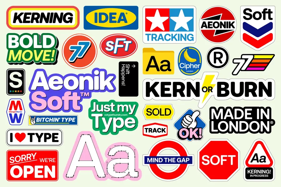
If one trend defined 2026, it was type. Brands are commissioning their own typefaces again, and treating them as their most valuable asset, sometimes more important than the logo itself.
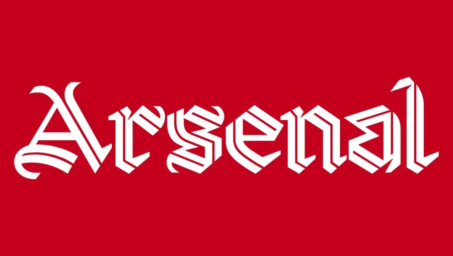
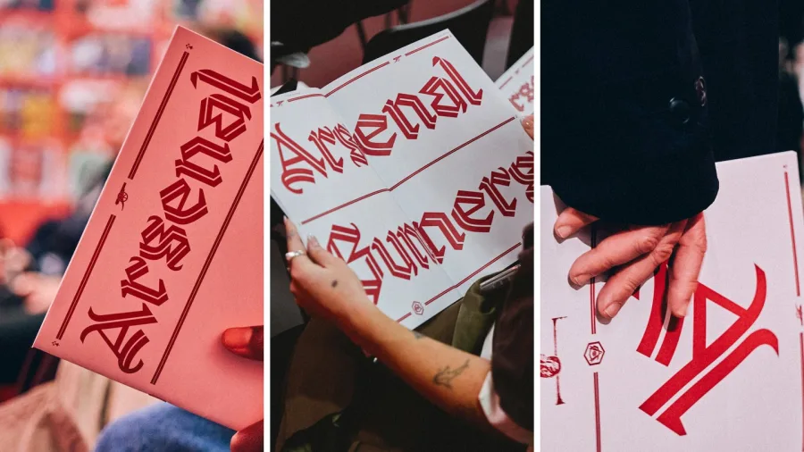
Arsenal unveiled "Rocastle", a three-weight blackletter by David Rudnick, named after club legend David Rocastle. It took four years to build from the club's archive and was launched at London's Design Museum. It's Nice That has the full story.
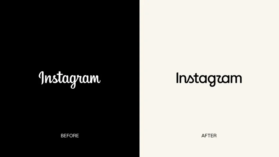
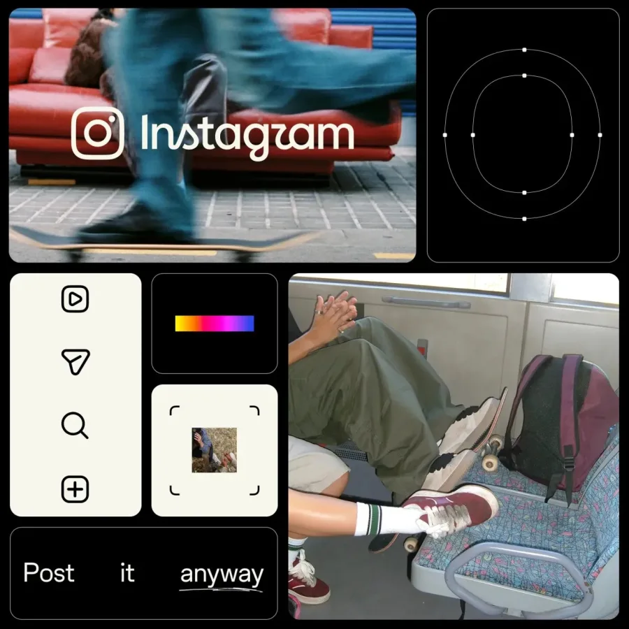
Instagram redrew its wordmark for the first time in a decade and launched three typefaces with it: an updated Instagram Sans, a handwriting face called Instagram Pen, and Instagram Mono. Not everyone loved it. Many people read the new "r" as a "z", and "Instagzam" trended for days.
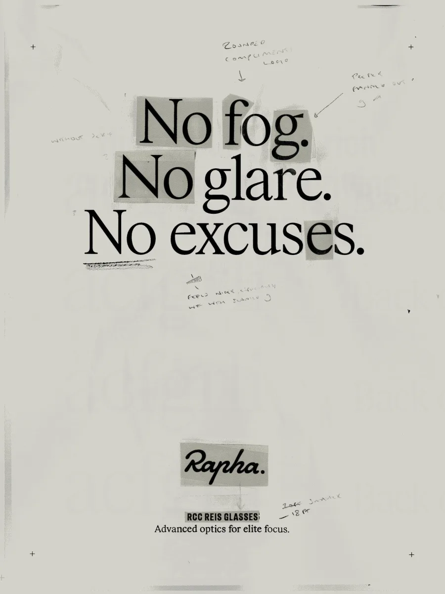
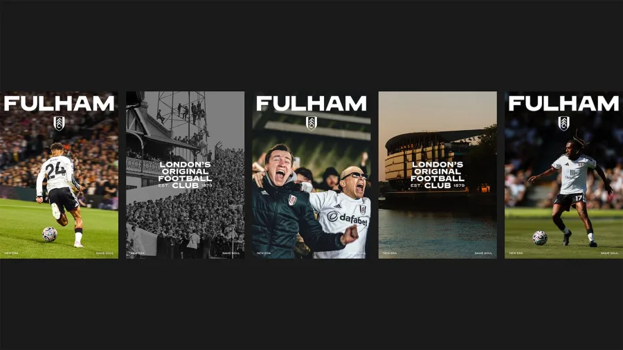
Elsewhere, Rapha relaunched with six bespoke typefaces by the agency Six and the foundry Frost, according to It's Nice That. In London, Fulham FC worked with Music and F37 on an identity "written into the Cottage", with a custom typeface drawn from the lettering at its Craven Cottage stadium. The crest didn't change at all.
This isn't only for global brands. For TRZ, we drew custom Arabic lettering instead of choosing a font, so the name itself became the identity.
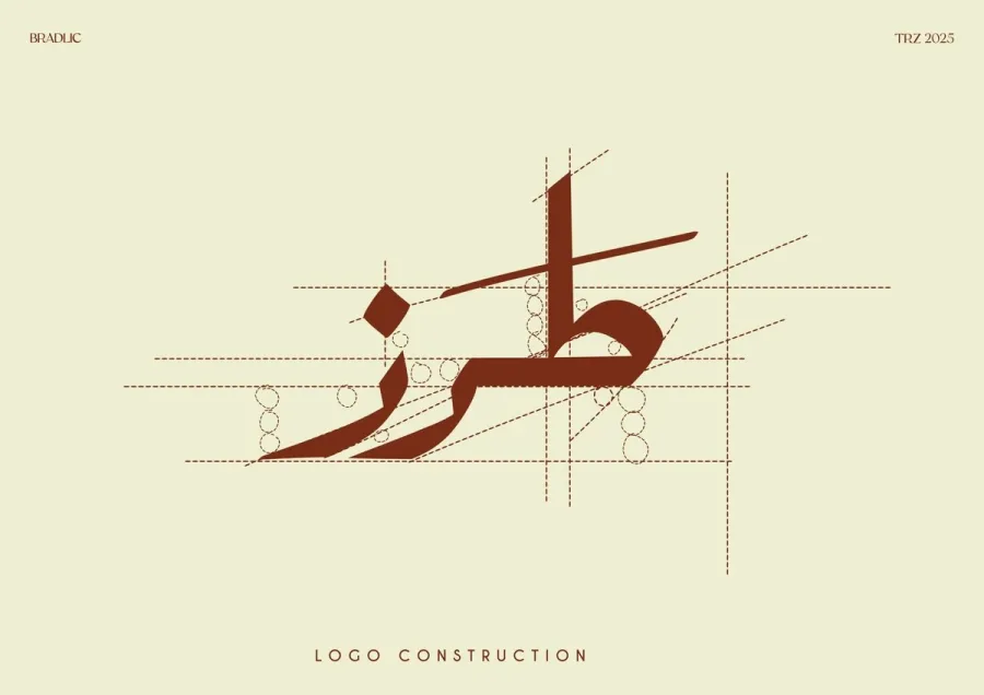
The takeaway: type is one of the logo trends for 2027 to take seriously. A custom typeface or custom lettering makes every menu, post and sign look like you, even without a logo on it. For more ideas, see the typefaces designers are reaching for in 2026.
4. Marks That Move
More logos are now designed for screens first. They're built to animate, react and change, not just sit still in a corner.
Bauer's KISS radio, rebranded by NOT Wieden+Kennedy, wraps its name in a big "x", the kiss you add at the end of a text. The logo animates like lips. As the agency's Adam Hunt put it, "It doesn't just look like a kiss, but behaves like one too."
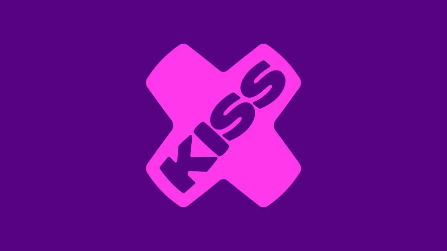
Intuit's "i" works as a separate glyph and is reportedly animated for its AI product, Intuit Intelligence. Threads' leaders describe the brand as "fast and always in motion".

Small brands can do this too. Our Meowlette wordmark was built to switch between colorways and animate across social posts and signage.
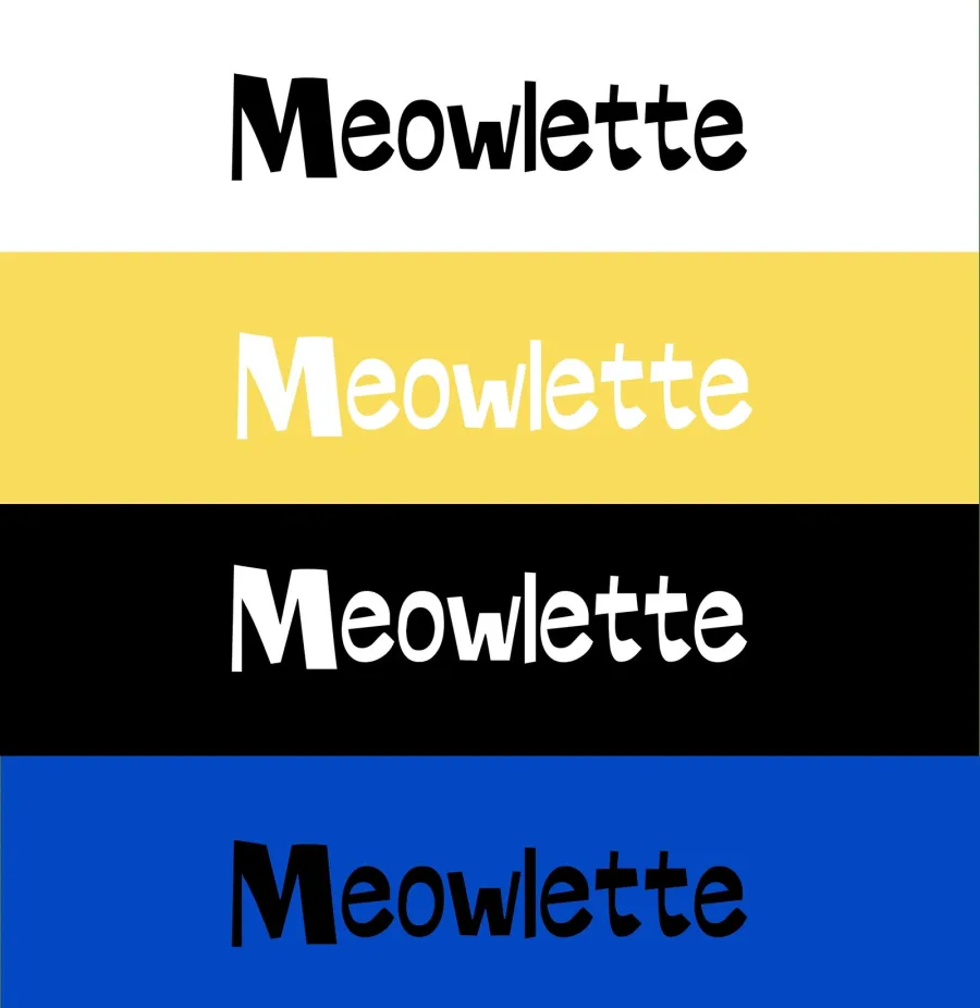
The takeaway: ask how your logo behaves on a phone screen, in a story or as a loading icon. A mark that moves well gets noticed in places a still logo doesn't.
5. Characters and Mascots Come Back
Characters are back, and they're getting real jobs. When so much content looks the same, a character gives a brand a face people remember.
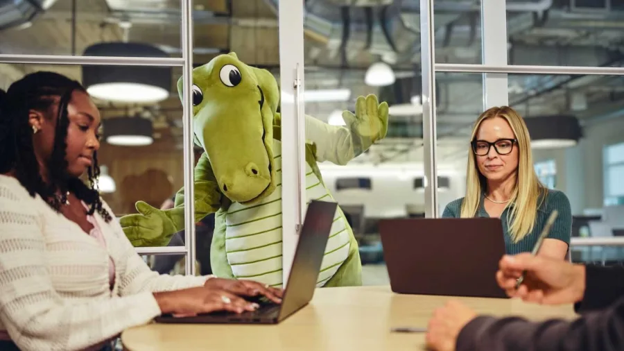
In August, Crocs launched Niles, its first official mascot: a six-foot crocodile taken from the rivet logo on its shoes. He stars in social-first episodes, and Crocs' marketing chief called him a "long-term investment in scalable intellectual property" ahead of the brand's 25th anniversary in 2027.
KFC's warmer Colonel is a character comeback too. Tinder's rebrand by Porto Rocha took a different route: a fictional columnist called "T" now sets the brand's tone of voice, with a sharper flame and the new line "happily TBD".
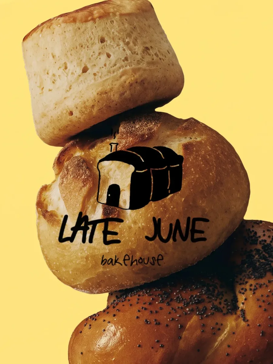
For Late June Bakehouse, we drew a little house character instead of the usual loaf or wheat stalk. It appears on bread bands, bags and signage, and it's the first thing customers remember.
The takeaway: a character doesn't have to be a giant foam costume. A small drawn figure, an icon with personality or a strong brand voice can do the same job.
6. AI Behind the Scenes, Craft on Show
AI is changing how brands run their identities, but not how they want to look. Most big brands now use AI to manage and roll out their systems, then make sure the work people see feels human.
Coca-Cola's global refresh by JKR is a good example. It doesn't introduce a new logo. It strengthens the Spencerian script, the Dynamic Ribbon and the red across more than 200 markets, and adds AI-powered tools to help teams apply the system consistently. North America gets it in 2027.
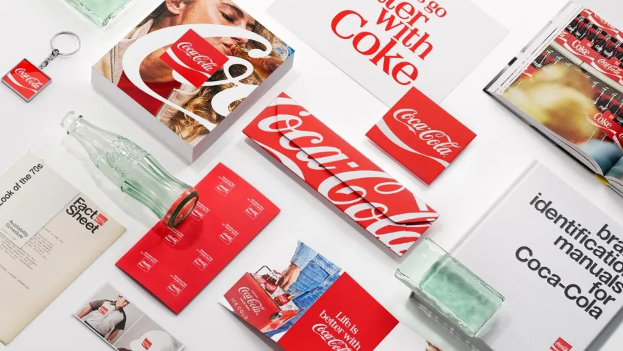
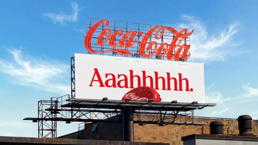
Now look at what got the most praise this year: Arsenal's four-year hand-drawn typeface and Instagram's handwriting font. Both are about the human hand. We see the same pattern in our own work, and we explain why in our guide to signs your business needs a rebrand.
The takeaway: use AI for speed, admin and consistency. Keep the parts customers actually see, your logo, type and imagery, made by people.
7. Simpler Badges That Light Up
Car badges, app icons and shop signs are getting flatter and simpler, because they now need to work on screens, in tiny sizes and, more and more, when lit up.
Vauxhall revealed the 13th version of its Griffin at the Paris Motor Show in October. The flag and the "V" are gone for the first time, and the sharper badge is designed to glow on the front of its cars. The first production car to wear it arrives in 2027.
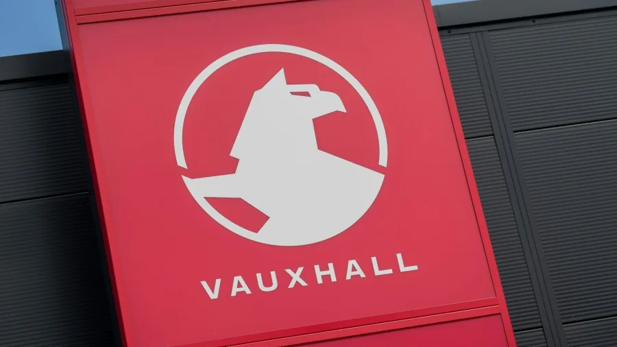
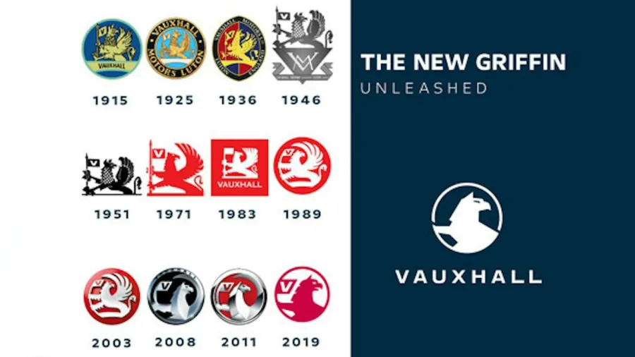
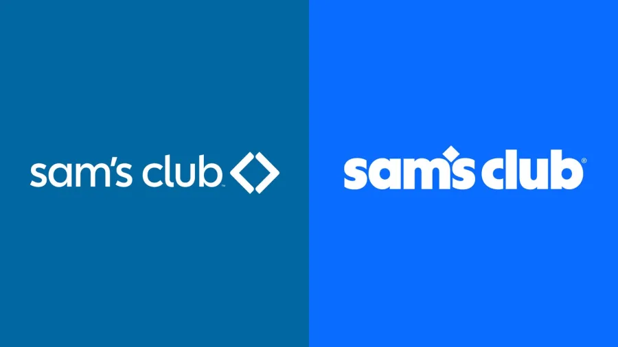
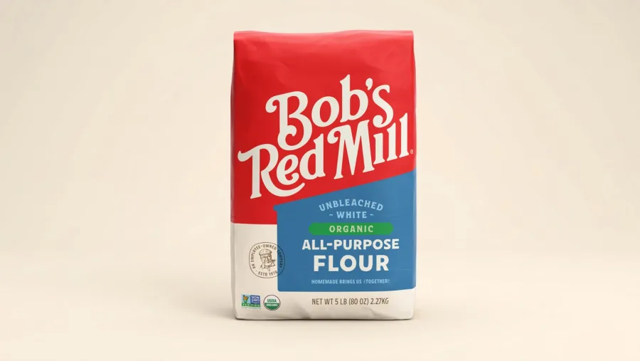
Simple can backfire, though. Sam's Club's new lowercase wordmark by Turner Duckworth, with its diamond turned into an apostrophe and green dropped for blue, was widely called "generic". Bob's Red Mill, also with Turner Duckworth, got similar criticism, but says its new packs cut shelf search time by nearly half in its own focus groups.
Our identity for Motiv follows the same rule: one simple mark that works as an app icon, a favicon and a sign, without losing its character.
The takeaway: simplify for clarity, not for fashion. If your new logo could belong to anyone, you've gone too far.
Color Note: Blue and Earthy Greens
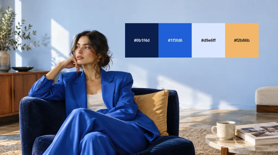
Across 2026's rebrands, blue kept showing up: Intuit, Sam's Club, a refreshed Williams blue and Tinder's new blues and greens. Forecasters agree. WGSN and Coloro named Luminous Blue their color of the year for 2027, while paint brands went green and earthy, with Behr's Grounded, Dulux's Soulful Sage and Sherwin-Williams' Celery. Pantone's 2027 pick is expected in early December.
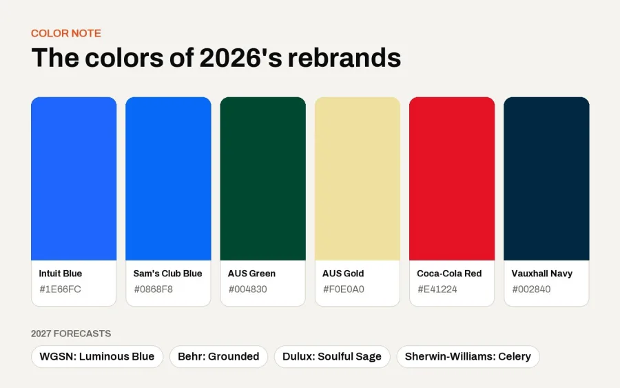
For full palettes with hex codes, read our guide to color palettes for branding in 2027.
Branding Trends 2027: What They Mean for Your Business
You don't need a global budget to use these ideas. The branding trends 2027 will reward are mostly about focus, not spend. A local bakery, a fitness studio or a tech startup can apply every one of them. Here's how:
- Start with what you own: list the colors, shapes and words customers already link to you before changing anything.
- Simplify your brand family: if you run several names or logos, ask whether one strong brand would work harder.
- Invest in type: custom lettering or a carefully chosen typeface often does more than a new logo.
- Design for motion and screens: test your mark at 32 pixels, in a story and as an animated sticker.
- Give your brand a face or a voice: a character, an illustration style or a clear tone sets you apart.
- Keep it human: use AI where it saves time, not where customers will feel it.
Frequently Asked Questions
What are the biggest branding trends for 2027?
Based on 2026's major rebrands, the biggest branding trends 2027 will bring are evolving heritage assets, master-brand simplification, custom typefaces, logos designed for motion, characters and mascots, AI used behind the scenes, and simpler badges built for screens and lighting.
What are the logo trends for 2027?
Expect simpler, flatter marks that work at small sizes and when lit up, logos designed to animate, and more custom lettering in place of off-the-shelf fonts. Heritage details from a brand's own archive are also coming back.
Should my business rebrand in 2027?
Only if there's a real reason, such as a new direction, a confusing brand family or an identity that no longer fits. Most businesses benefit more from a careful refresh than a full rebrand.
Is AI changing brand design?
Yes, mainly behind the scenes. Big brands use AI tools to manage and apply their identities, while the logos, type and imagery customers see are still made by designers.
What colors will be popular in branding in 2027?
Blues and earthy greens. WGSN named Luminous Blue its 2027 color of the year, and several paint brands chose sage and olive greens.
Final Thoughts
The best rebrands of 2026 weren't about chasing what's new. They were about making a brand more itself: stronger type, clearer systems, a bit of character and a lot of craft. That's the thinking behind the branding trends 2027 will reward, whatever the size of your business.
Thinking about refreshing your own brand? Talk to Brandlic about building an identity that's ready for 2027.
Looking for expert support in branding, design, or packaging? Discover how Brandlic turns creative ideas into powerful brand experiences.
Explore our services →
Comments
Leave a reply
Your email address will not be published. Required fields are marked *