Branding
Spark Beauty
Overview
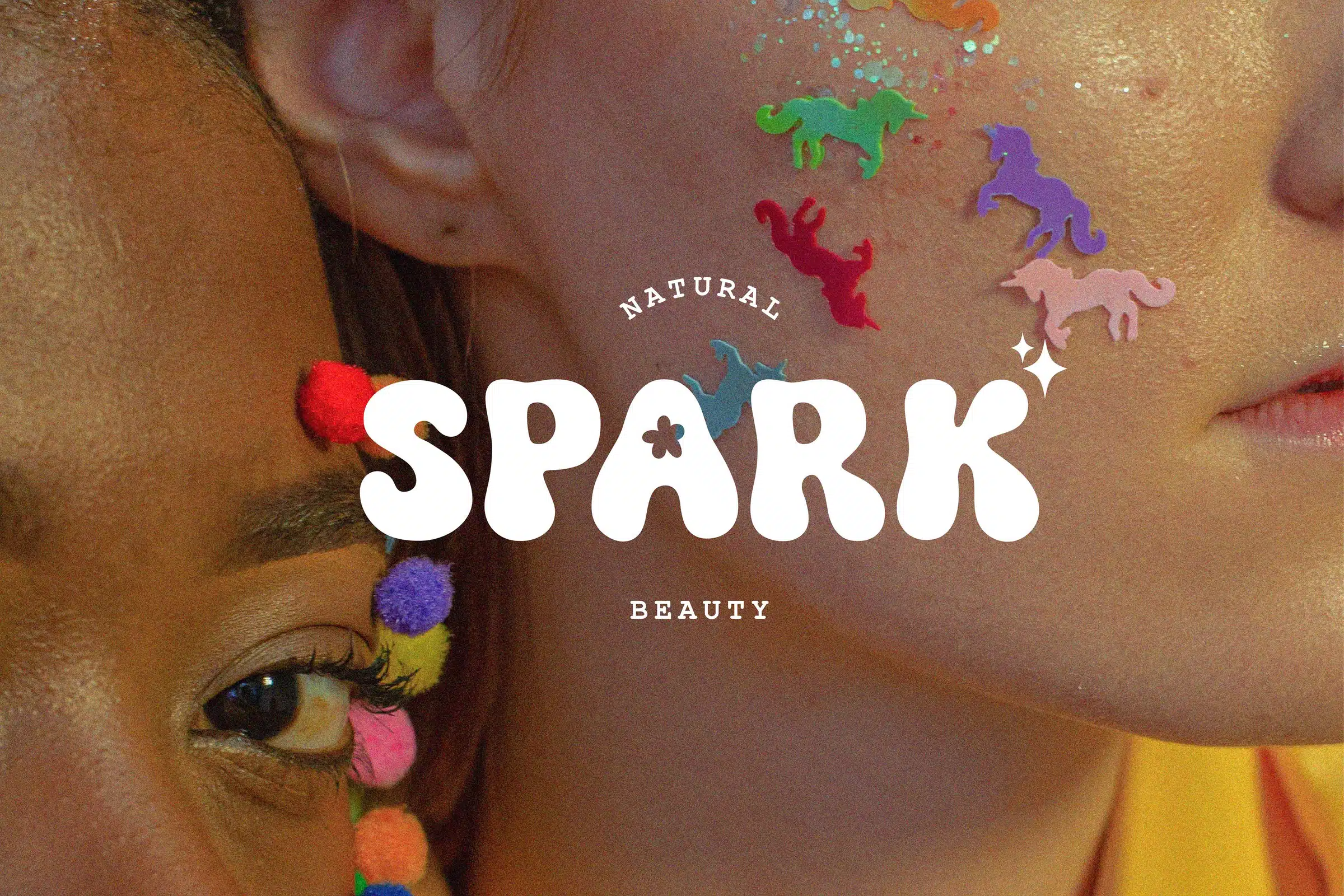
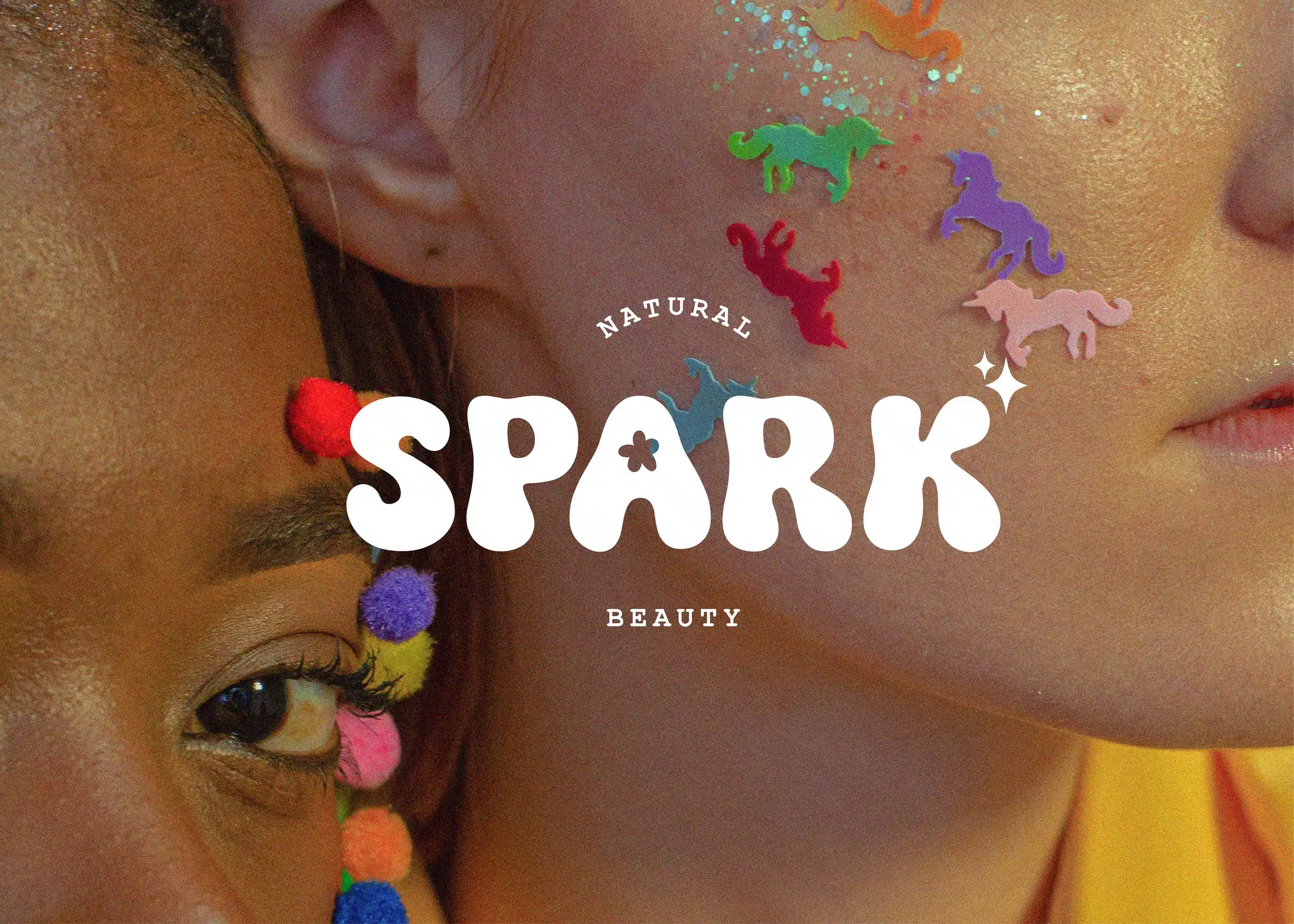
Spark Beauty is a natural beauty range made for people who are not precious about it. The brand had to be as unserious as the product is honest.
Everything grows from one idea: make it look like it was fun to make.
Natural beauty is a category of restraint: cream cartons, thin sans serifs and a list of ingredients doing the persuading. It signals honesty, but it also signals the same thing every competitor is signalling.
Spark needed the opposite energy without reading as a children's brand, and the range is wide, so a system that only worked on one carton size would have collapsed on the shelf.
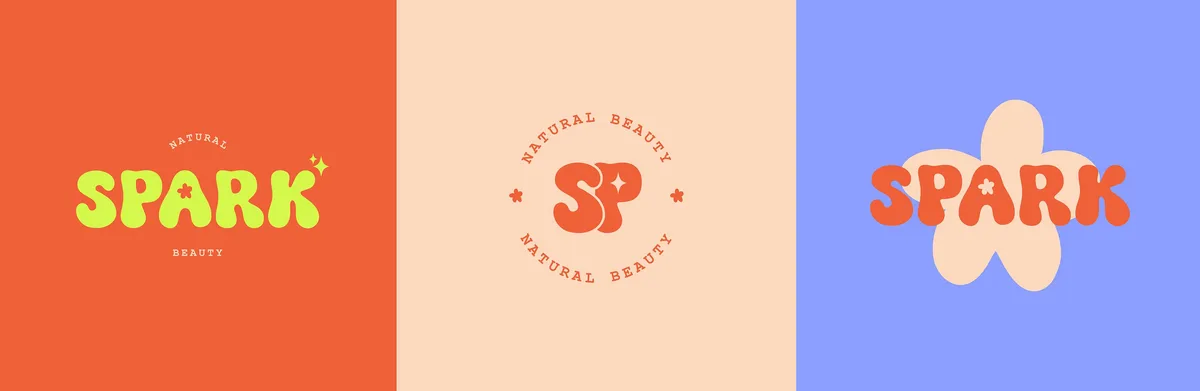
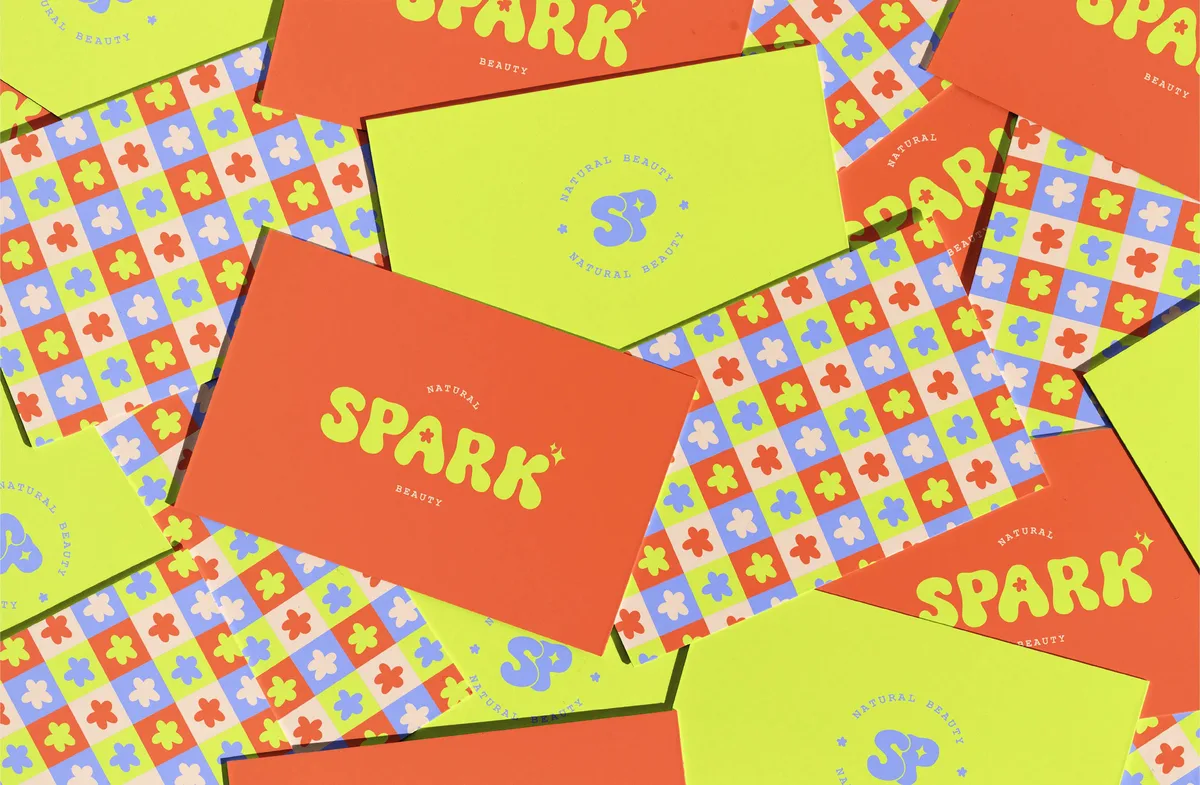
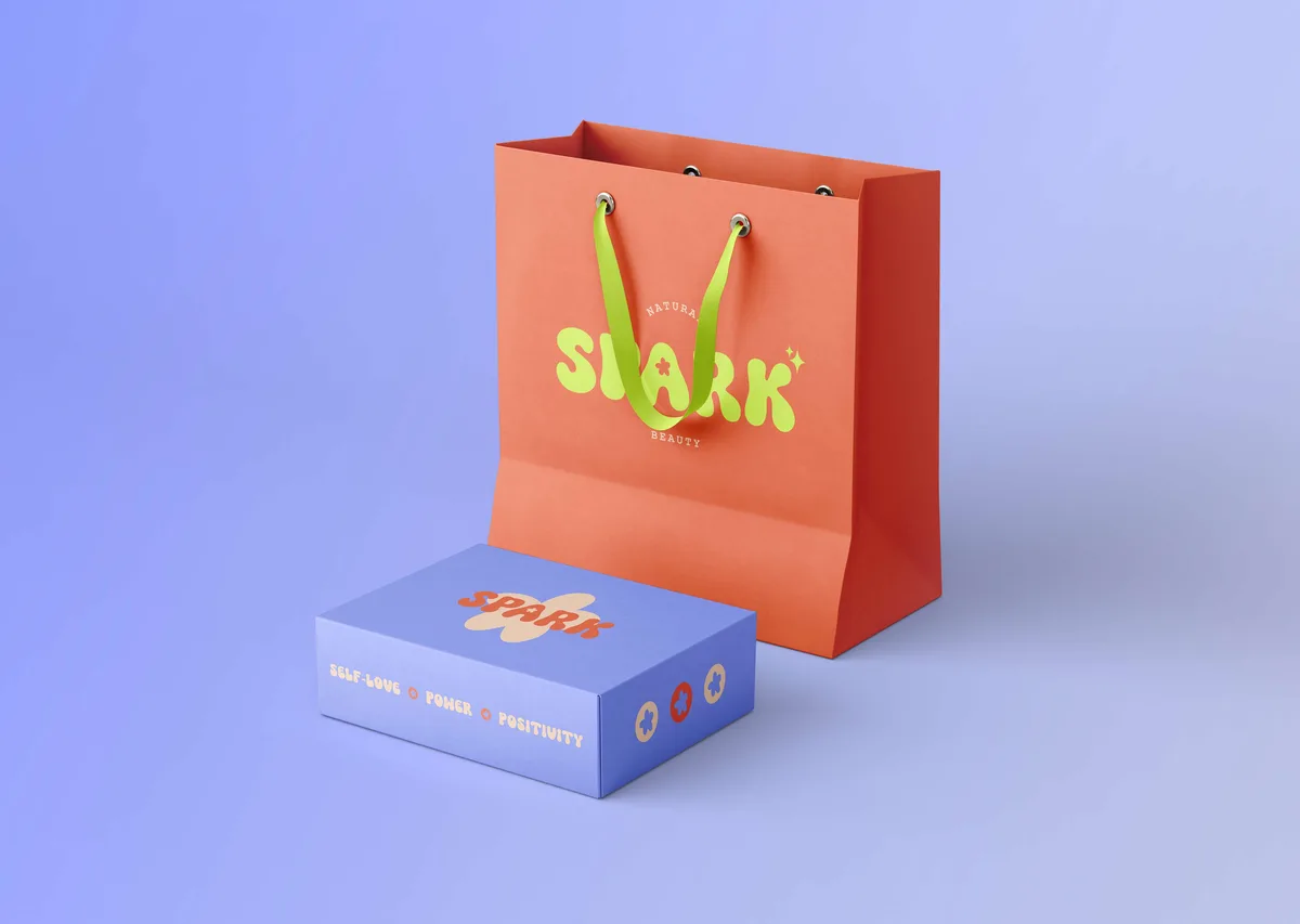
The wordmark is drawn with soft swollen terminals and a slight upward drift, so it feels handmade rather than set. It comes with two companions: an SP monogram for seals and caps, and a flower lockup for the moments that need more warmth.
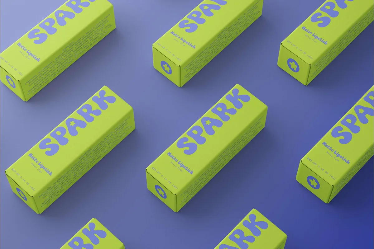
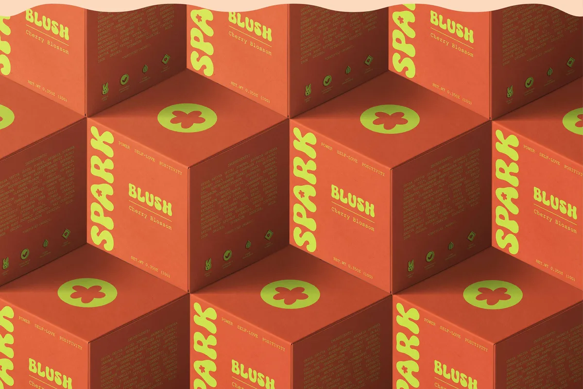
Four colours carry the range, orange, lime, periwinkle and peach, used at full strength and rotated per product so each line is instantly separable on shelf without leaving the family.
A repeating flower pattern ties the smaller pieces together, so a business card and a carton read as the same brand even when they share no colour.
Conclusion
Spark now reads as one brand across four colours and a dozen cartons, loud on the shelf and still legible at the size of a cap.
Brandlic's Contribution
- Brand Strategy
- Visual Identity & Logo
- Monogram & Pattern System
- Typography & Colour System
- Packaging & Retail Collateral
- Art Direction