Packaging
Edge of Ember
Overview
Edge of Ember is a jewellery brand, and jewellery arrives in a box long before anyone wears it. That box is the first thing you touch.
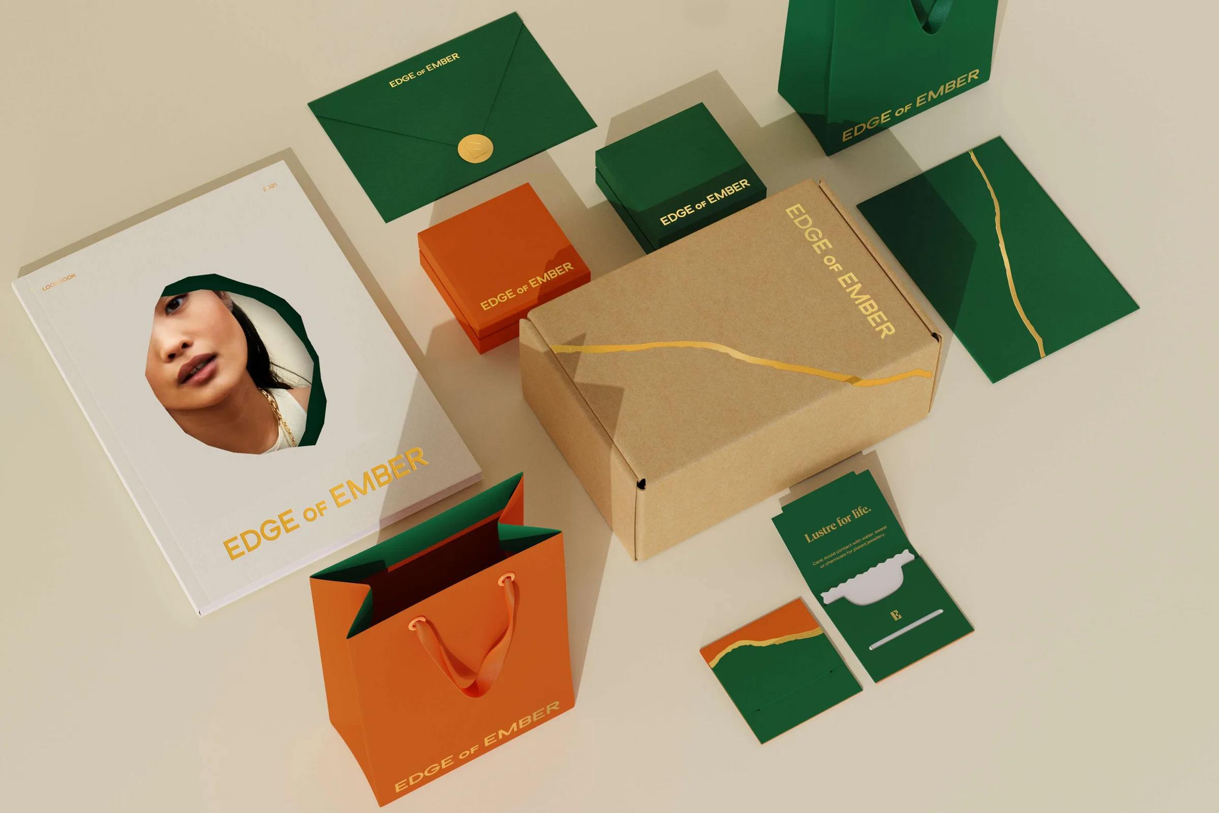
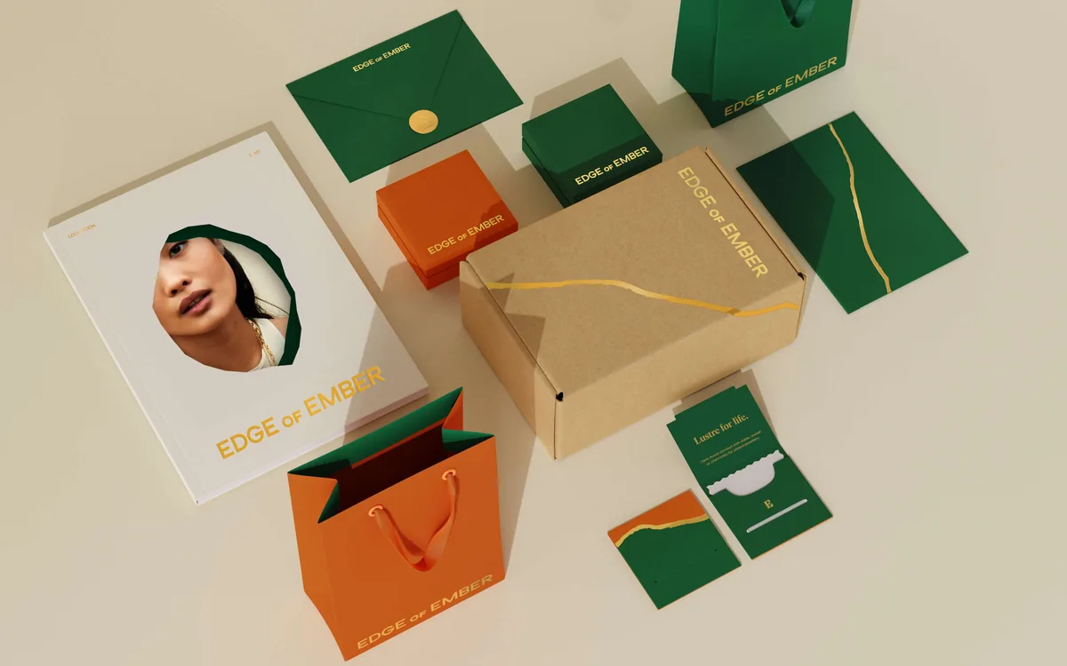
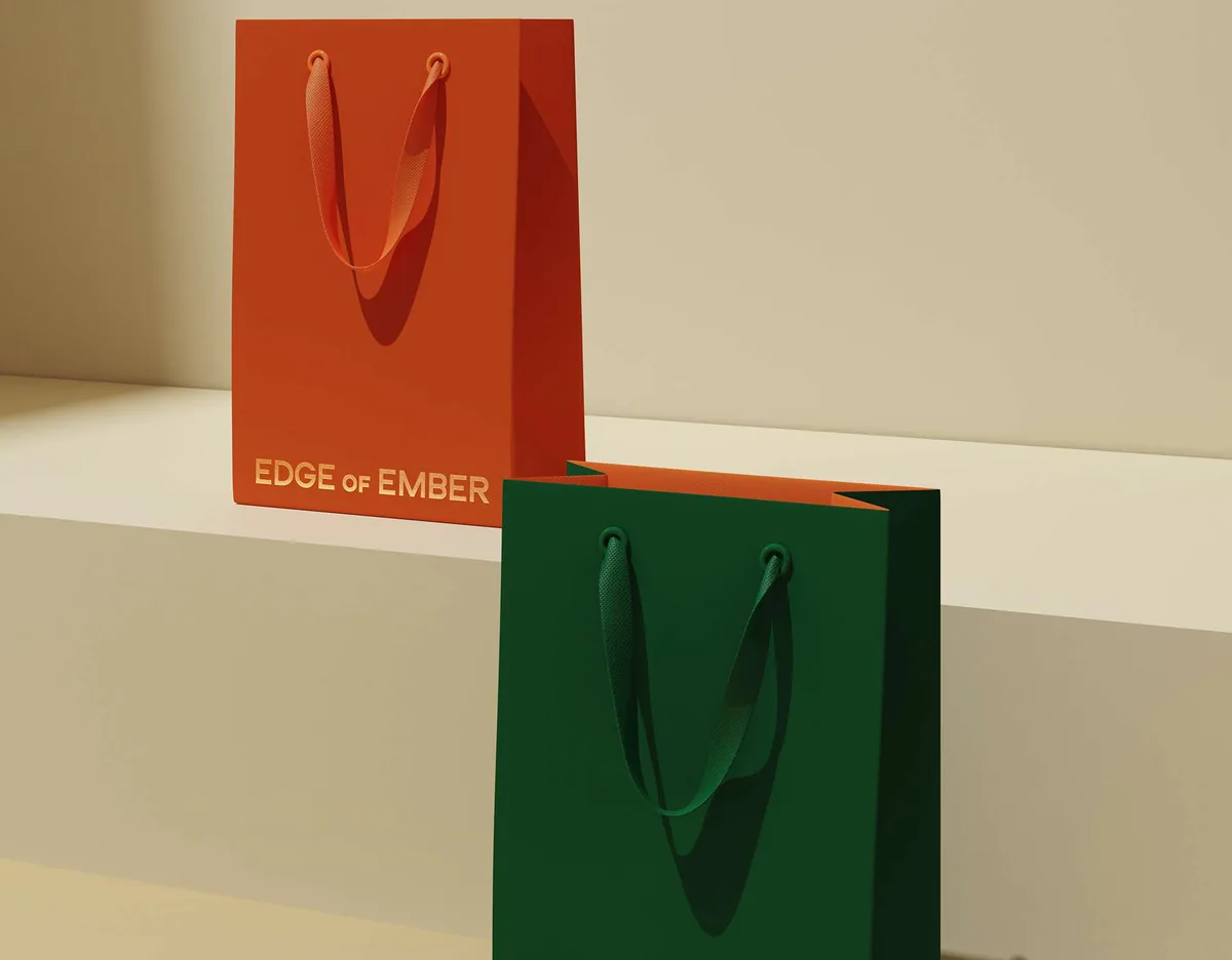
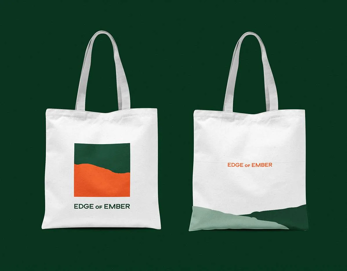
So the whole range was drawn as one set: a jewellery box, a shipper, the printed pieces inside and the bags you carry it out in.
Jewellery packaging usually reaches for gloss and black. This range had to feel special while staying honest about what it is made of, because the materials are recycled board and the brand says so on the box.
Two colours do the work: a deep forest green and a warm ember orange, with gold foil kept for the name and a single drawn line.
Uncoated board carries all of it, so the range still looks considered while the texture stays plainly what it is.
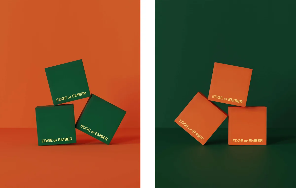
The two colours swap places rather than sitting in a fixed hierarchy. Green boxes on orange, orange boxes on green, so the range reads as one family however it is stacked.
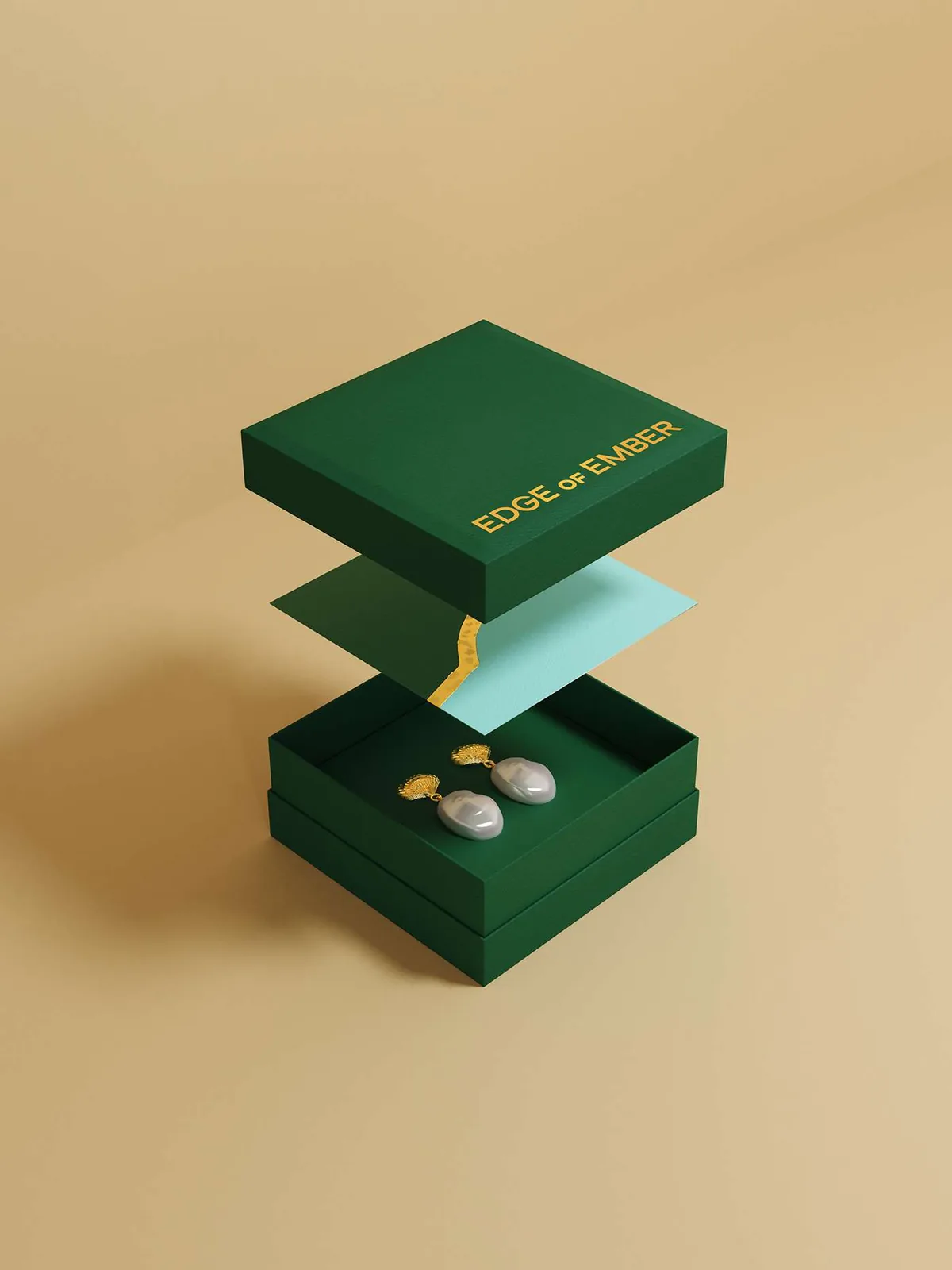
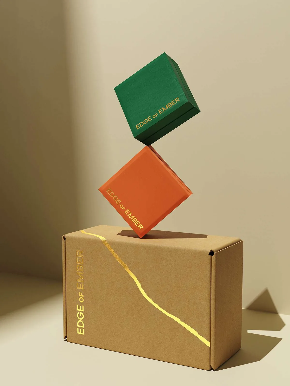
The jewellery box is the piece that gets kept, so it opens properly: a lift-off lid, a tissue leaf and the gold line running across the seam.
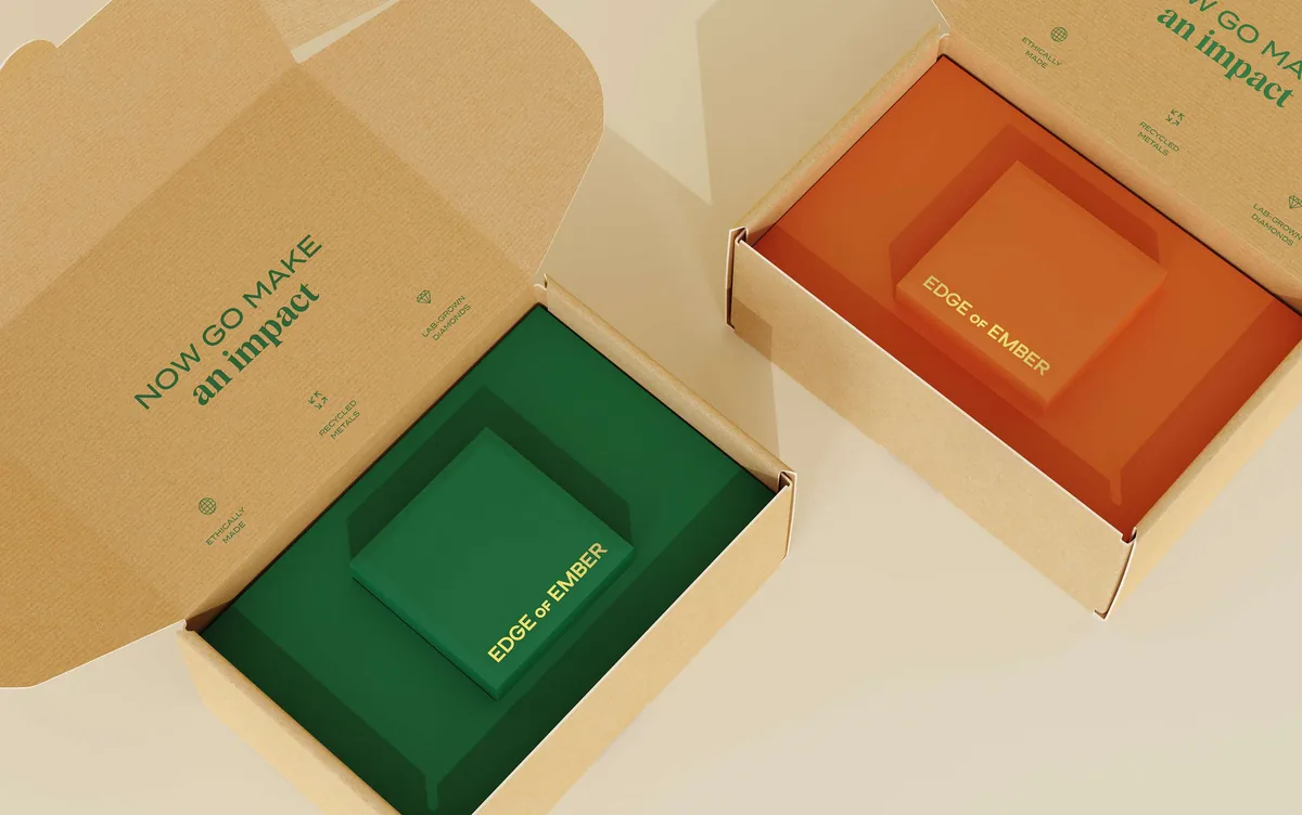
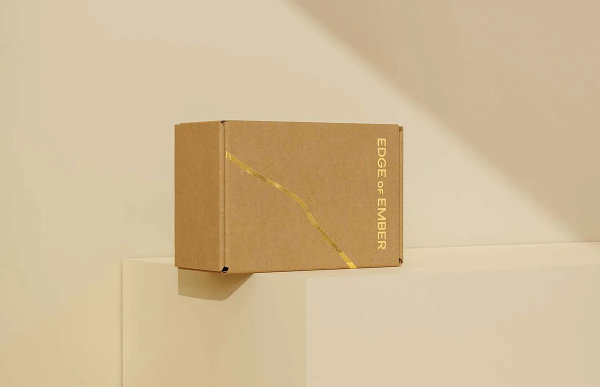
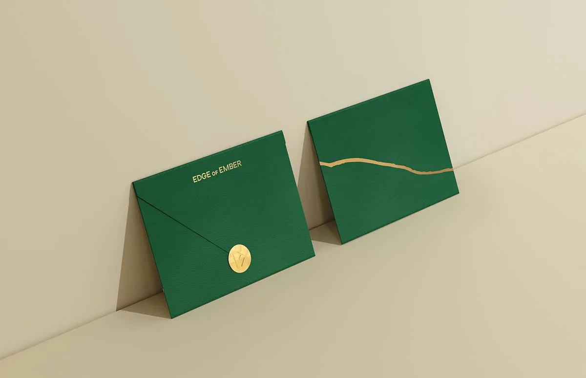
Outside, the shipper is plain recycled board with one gold line. Inside, it is printed. Opening it is where the brand actually speaks, which is the only moment it needs to.
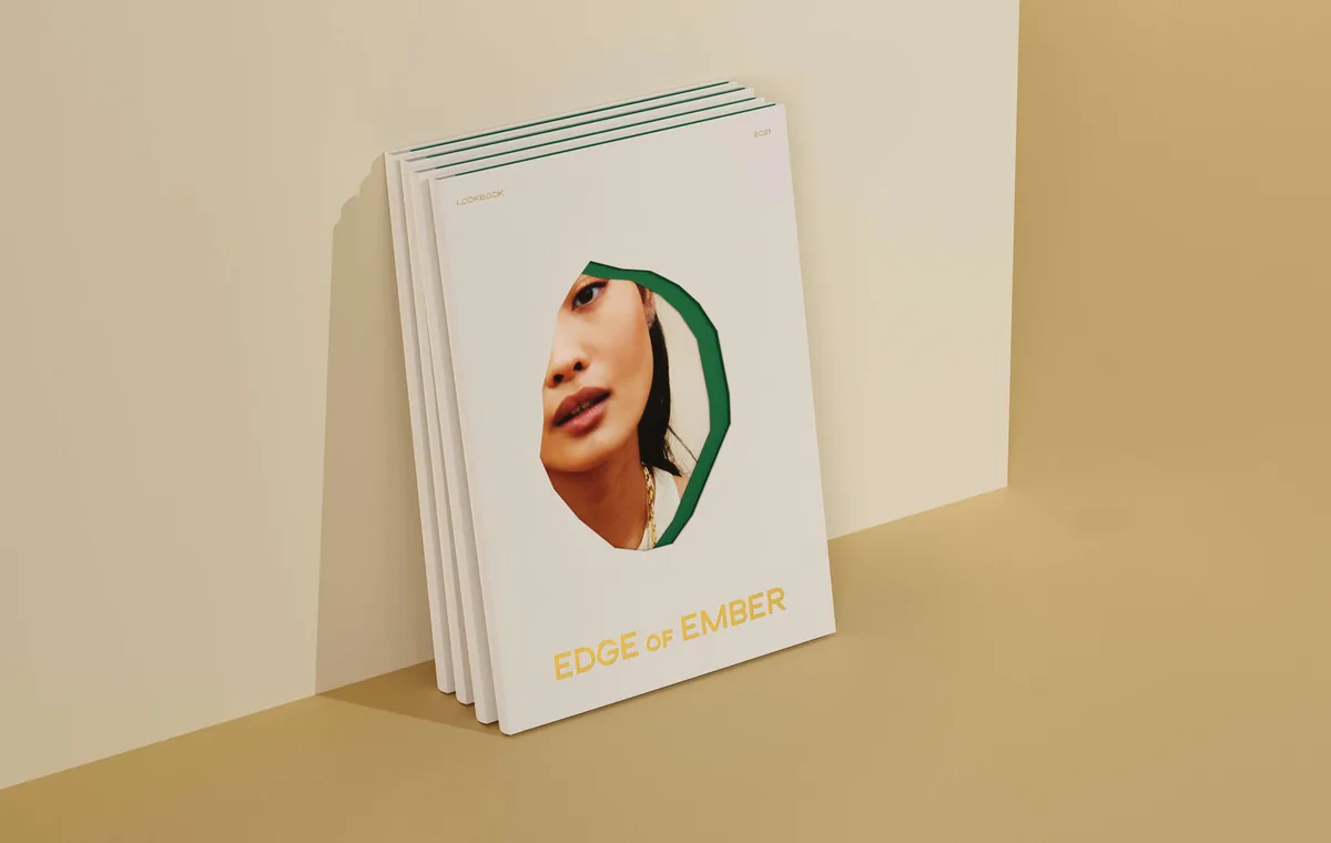
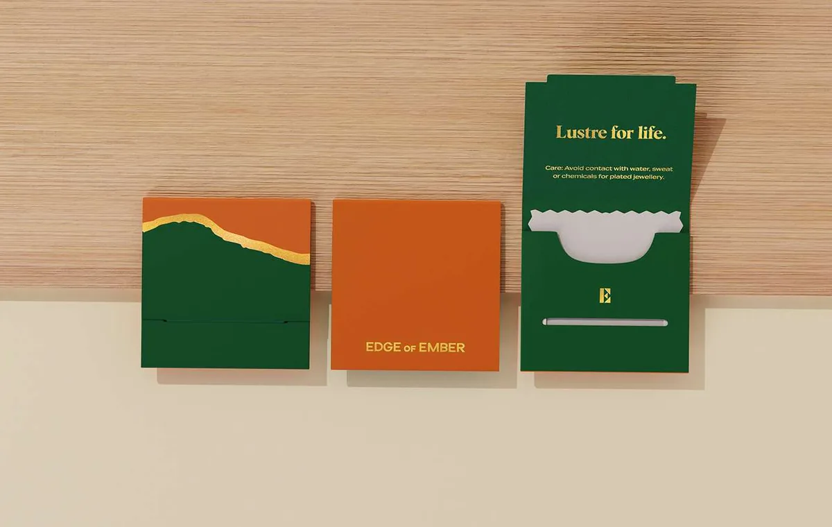
The printed pieces carry the writing: a care card, a note about the materials and a line to send you off. Small things, but they are what turns a delivery into something worth opening slowly.
Conclusion
The result is a set that holds together from the shipper on the doorstep to the box on a shelf, using two colours, one foil and board that never pretends to be anything else.
Brandlic's Contribution
- Packaging Strategy
- Structural & Surface Design
- Colour & Foil System
- Print Collateral
- Art Direction