Branding
peep

Overview
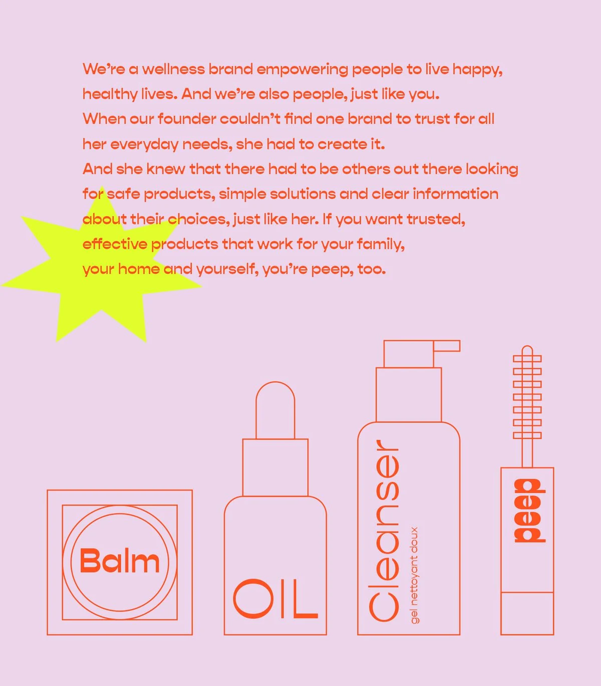
peep is a wellness and beauty range built on plain speaking. Its own line is that it exists because the founder could not find one she trusted, and the identity had to sound exactly that direct.
Everything grows from one idea: say what is in it, then get out of the way.
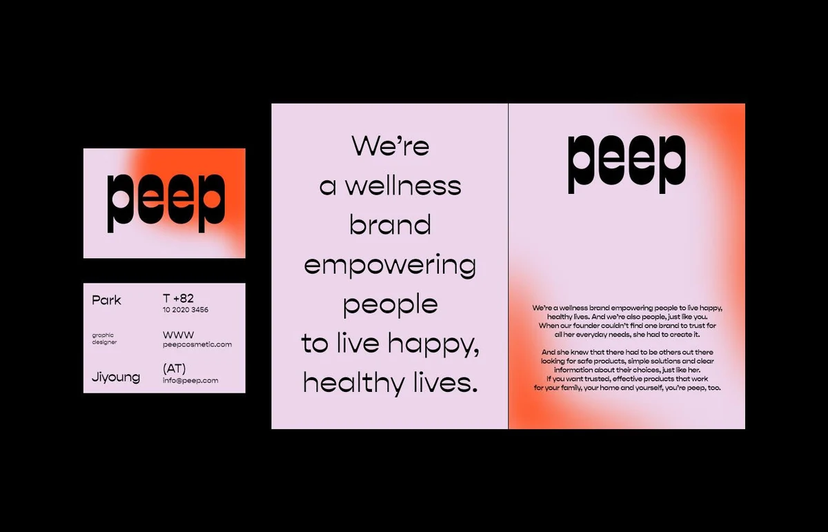
Beauty packaging tends to whisper in beige. peep wanted the opposite, but a loud cosmetics brand is one bad decision from looking like a toy, and this range has to sit in a bathroom for months without wearing out its welcome.
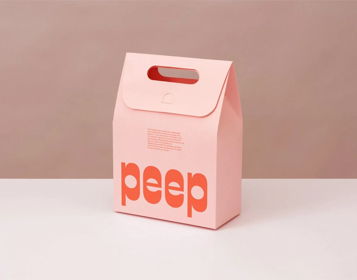
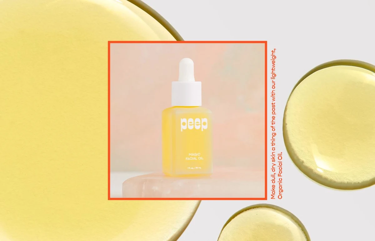
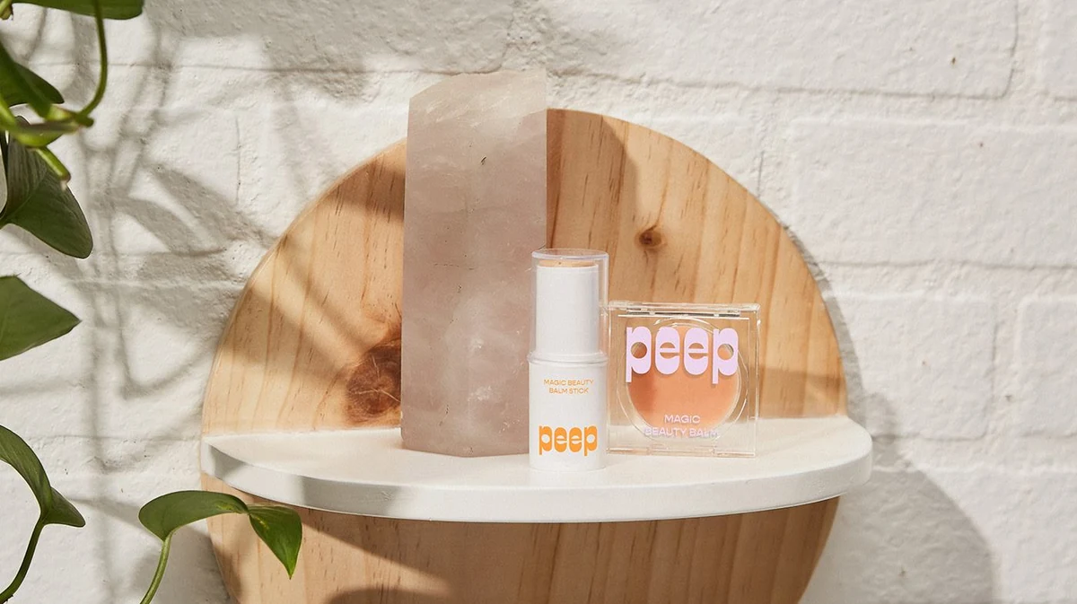
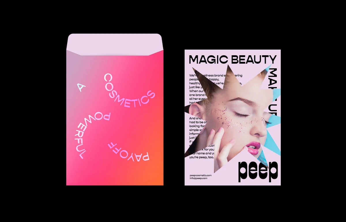
The line also spans very different objects: a compact, a dropper, a pump bottle, a folding carton and a mailer. A system that only worked on one of them would not have been finished.
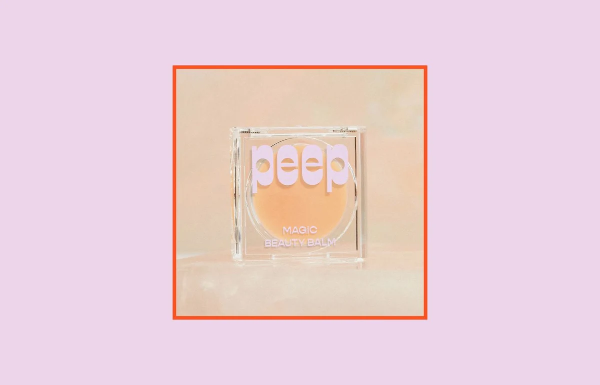
The wordmark is set in a soft geometric sans with fully rounded terminals, so the two e's read as open eyes. It sets tight enough to work as a block on a carton face and loose enough to sit over photography.
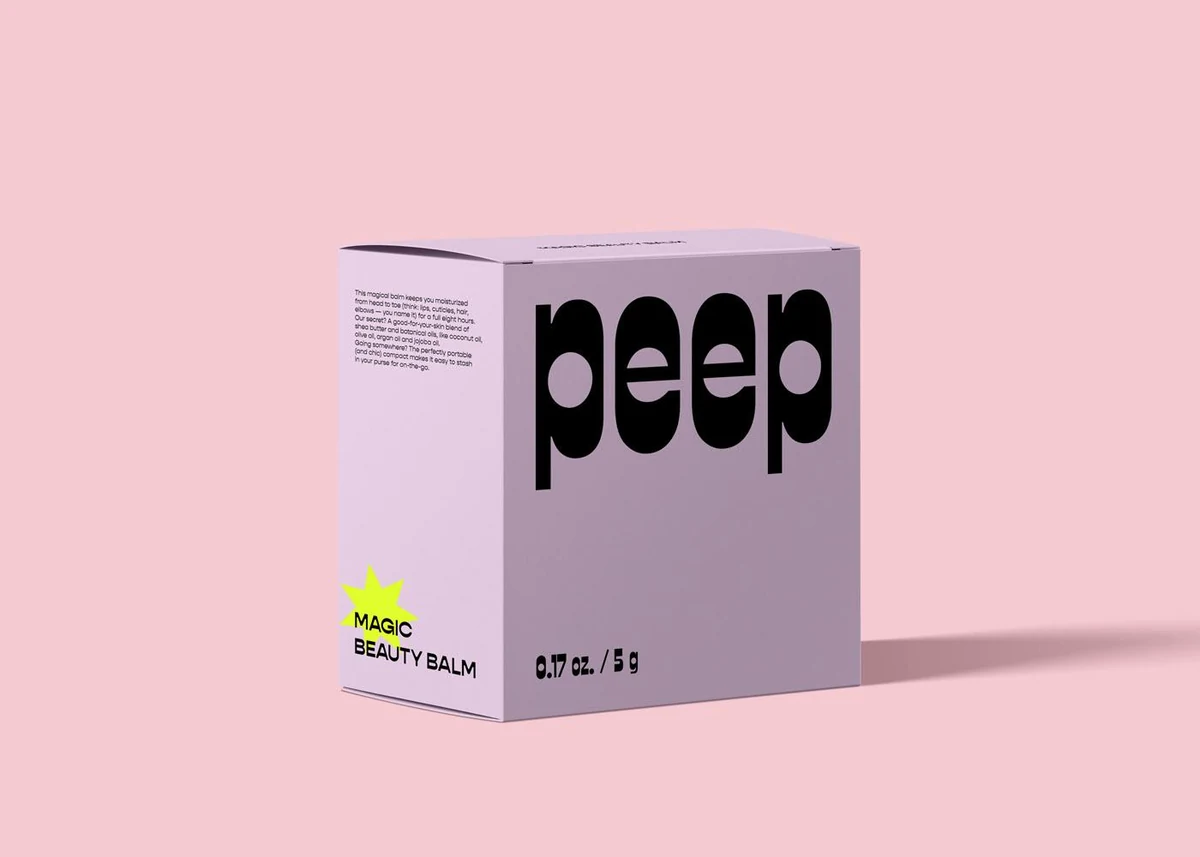
Lilac is the constant. Acid yellow, hot pink and orange rotate as accents so each product reads as its own thing without leaving the family, and black holds the type wherever the colour gets too bright.
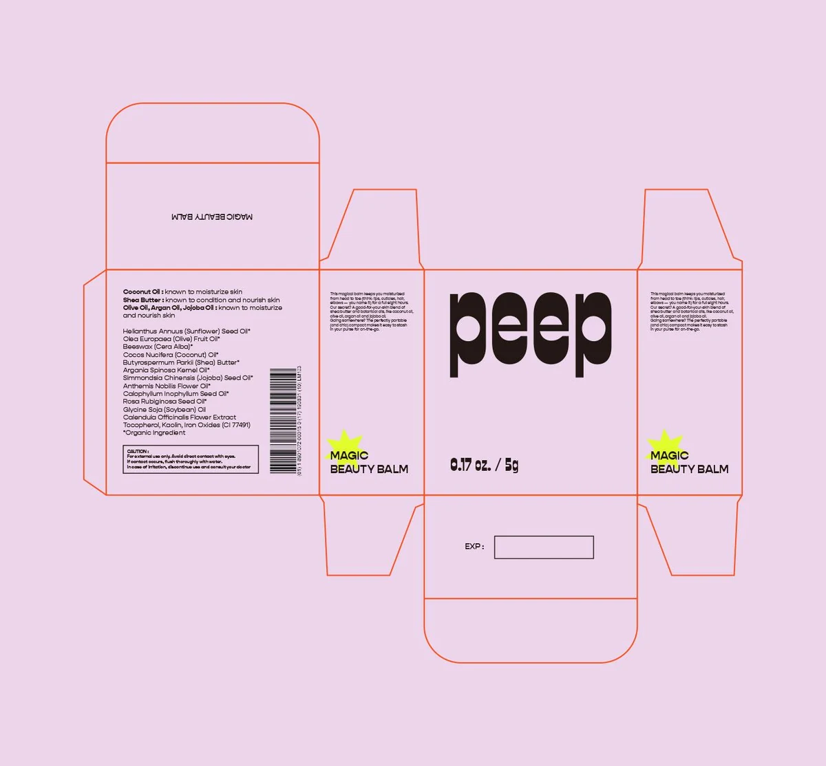
The structural work came first: one dieline family across the range, with each product carried by colour and a single line of type rather than by a different box.
Conclusion
peep now reads as one brand across a compact, a bottle and a mailer. Loud on the shop shelf, calm on the shelf at home.
Brandlic's Contribution
- Brand Strategy
- Visual Identity & Logo
- Typography & Colour System
- Packaging & Structural Design
- Print & Editorial
- Art Direction