Branding
Motiv
Overview
Motiv is a business management system built for photographers. Every client, shoot, file and invoice lives in one place, and the tasks hanging off them are run from there too.
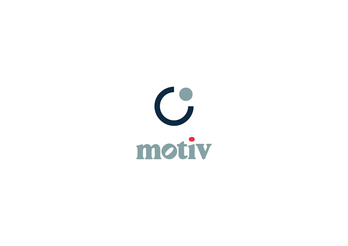
So the brand had to feel like a working instrument rather than a studio. The mark is an aperture drawn as one open curve with a single dot beside it: a camera, without ever drawing a camera.
Software for photographers tends to reach for the same shorthand: a shutter, a lens, a viewfinder. Motiv runs a whole business, not just a camera roll, so the mark had to name who it is for without shrinking the job it does. It also had to survive as a small app icon.
The mark is one curve left deliberately open, with a dot sitting in the gap. Read one way it is an aperture, read another it is a task still waiting to be closed.
It holds its shape at any size, which is what a system someone opens twenty times a day actually needs.
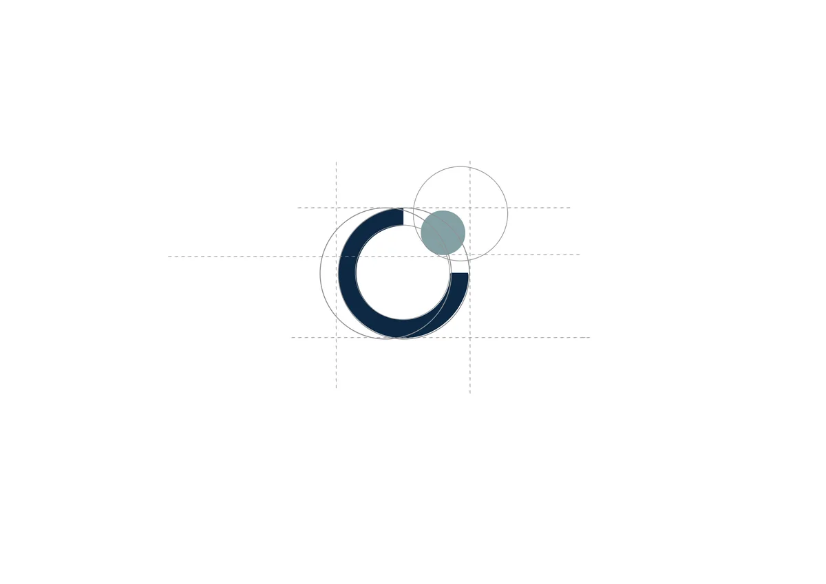
The curve is built on a simple grid so the gap, the stroke and the dot stay in proportion however far the mark is scaled down.
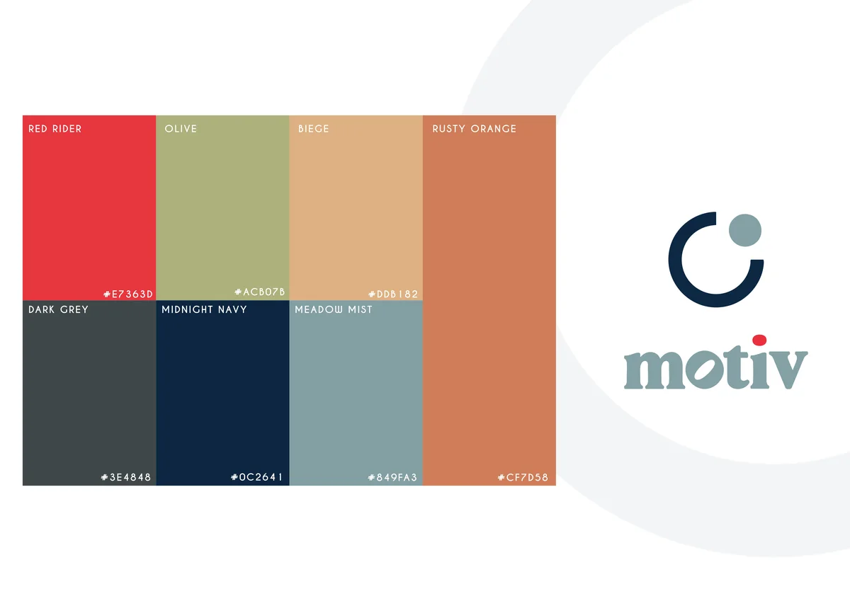
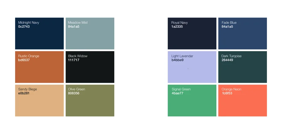
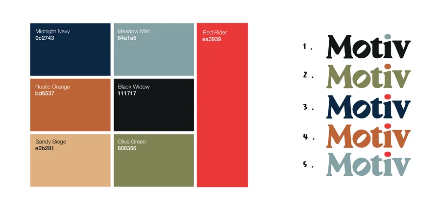
The palette runs warm through the middle and anchors on a deep navy, so the interface can stay calm while the brand still has colour to work with.

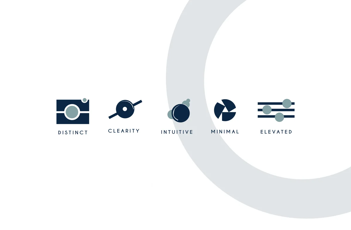
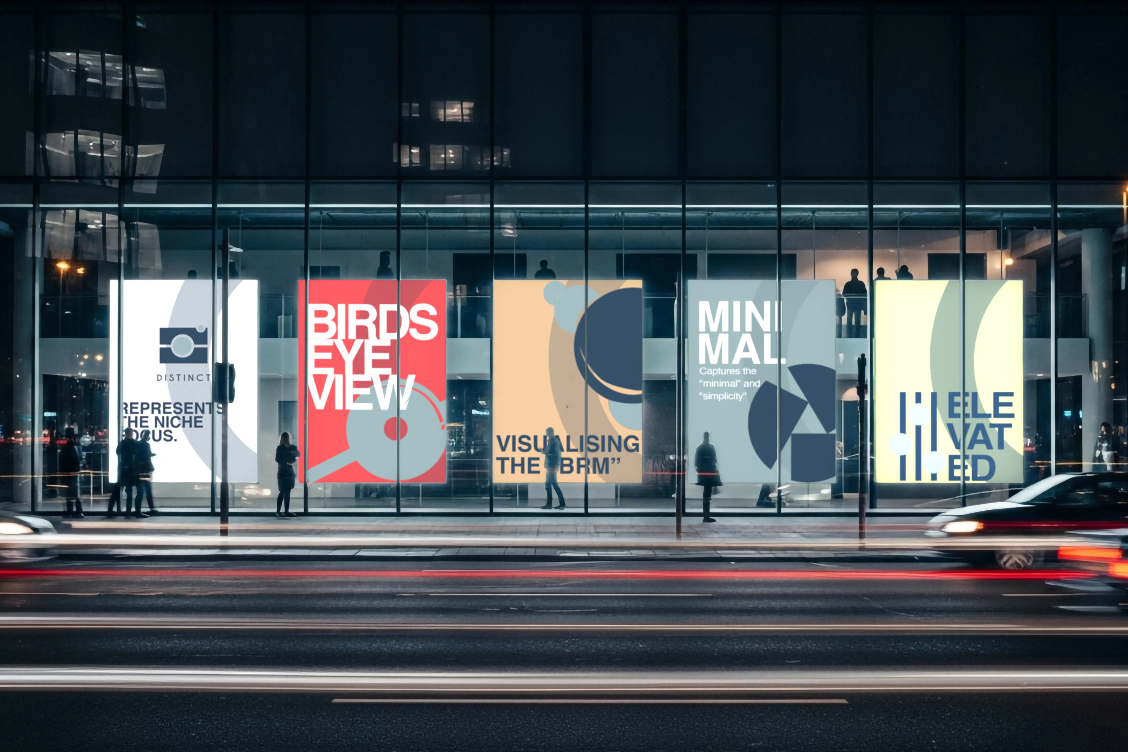
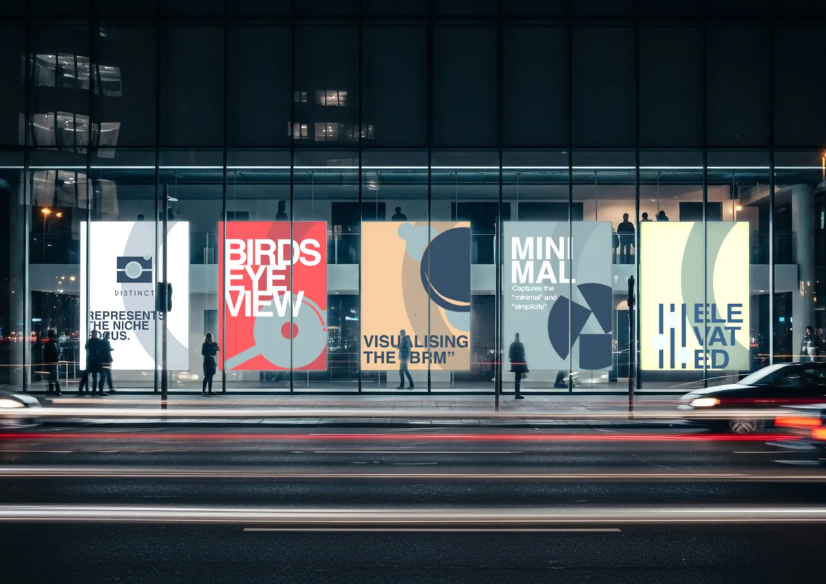
Five small marks extend the system beyond the logo. Each one takes a single idea from the way photographers actually work and draws it in the same language as the aperture: the niche, the clear view, the schedule, the pared back frame, the sense of being on top of the job.

On screen the mark does the least work it can. It sits in the corner and stays there, while the jobs, the dates and the files take the space. That is the right order for something a studio runs its whole week on.
How the mark was found
The aperture at the top of this page took a while to arrive. Before it did, the name was drawn several ways and the brand was taken in two complete directions.
Everything below is that search, in the order it happened.
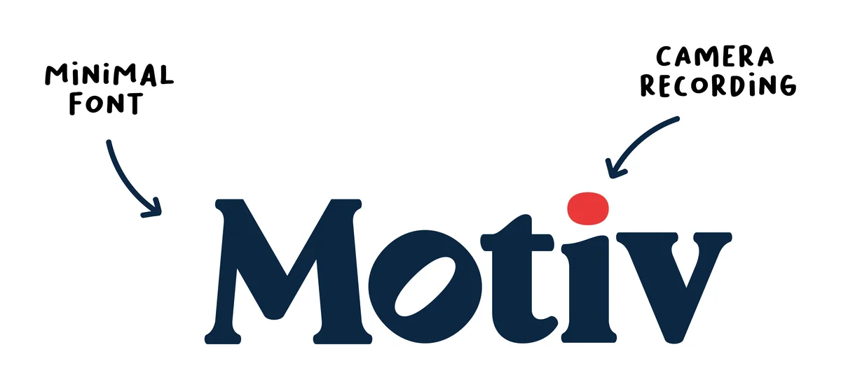

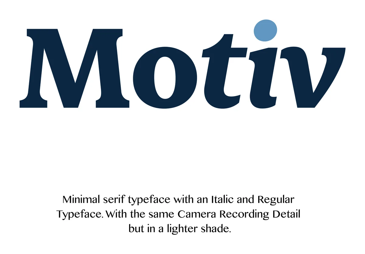
The first drawings went straight at the subject. A recording dot on the letter i, a lens built into a counter, an italic cut to give the name some movement. The dot is the one detail that survived all the way to the final mark.

Alongside the name, a set of icons mapped the job itself: the camera, the raw images, the edit, the finished pictures. Drawing the workflow first is what later turned into the five brand elements.
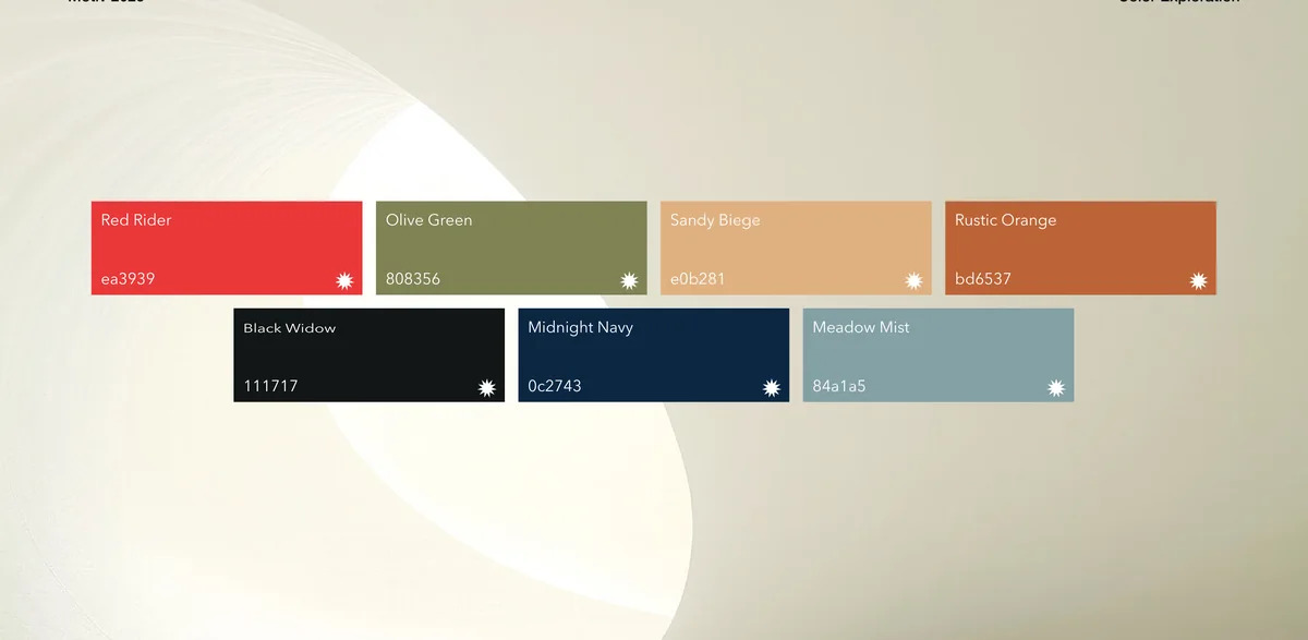
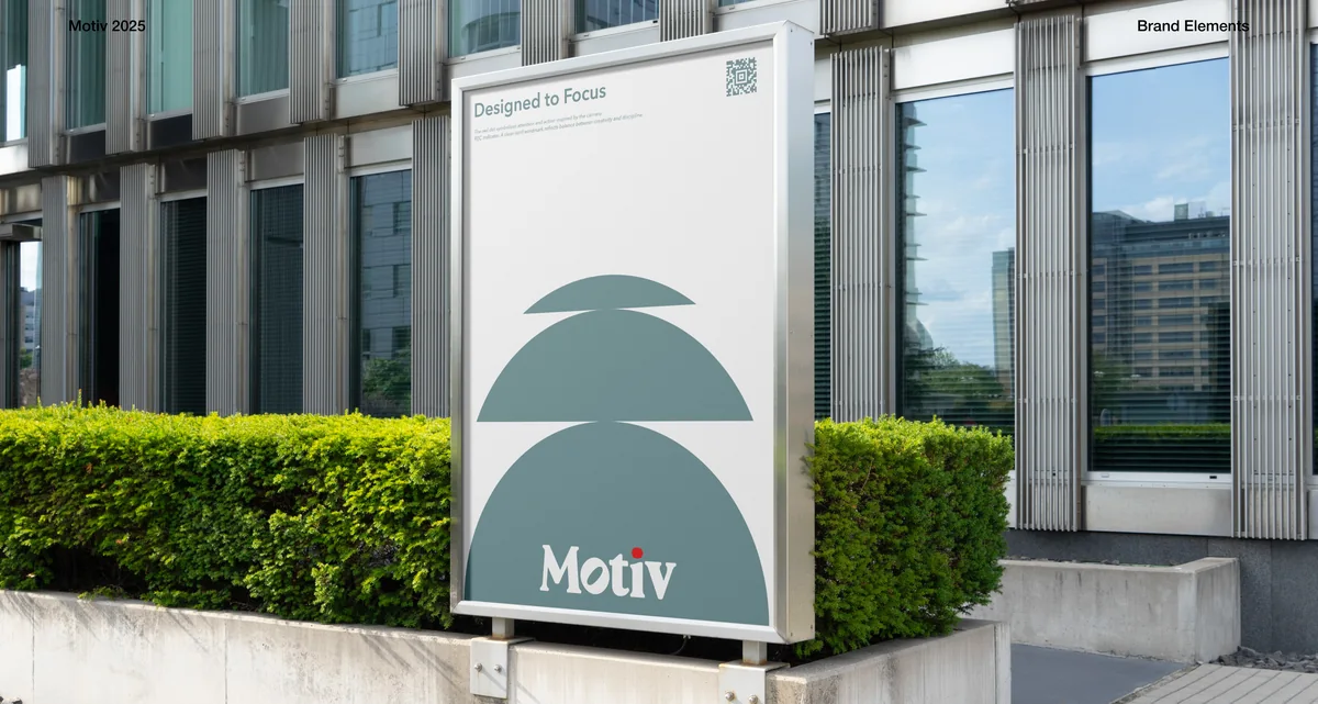
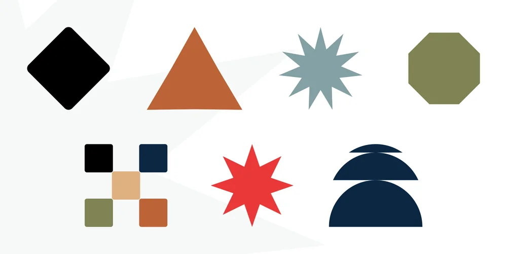
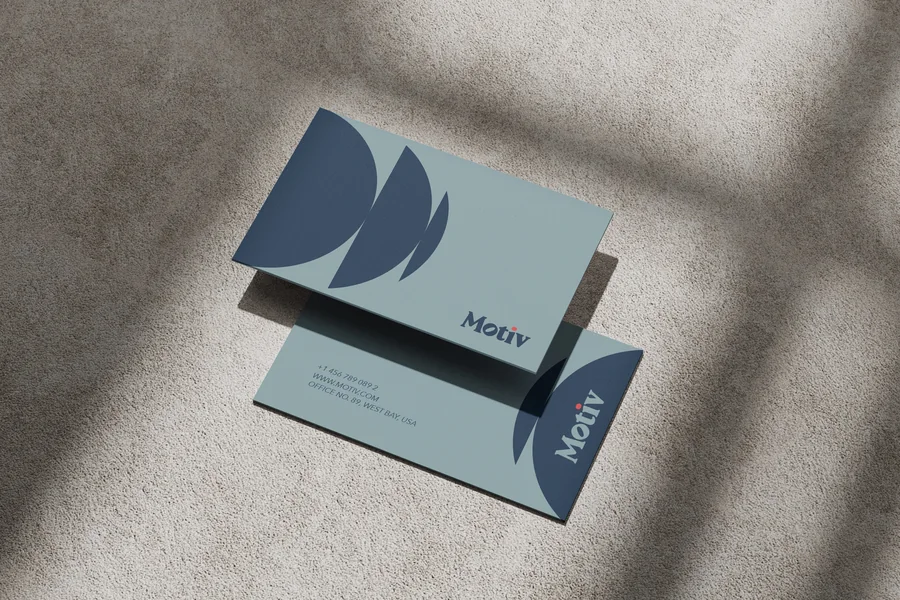

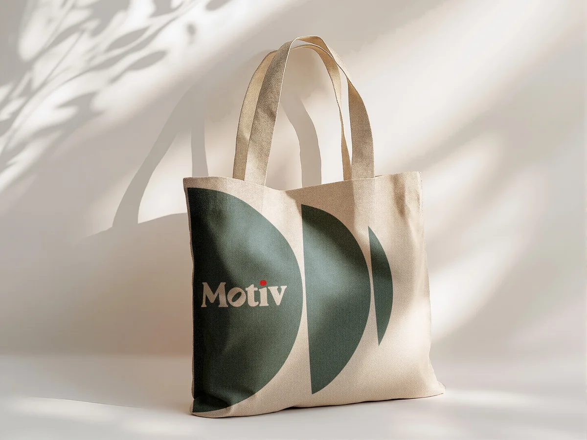
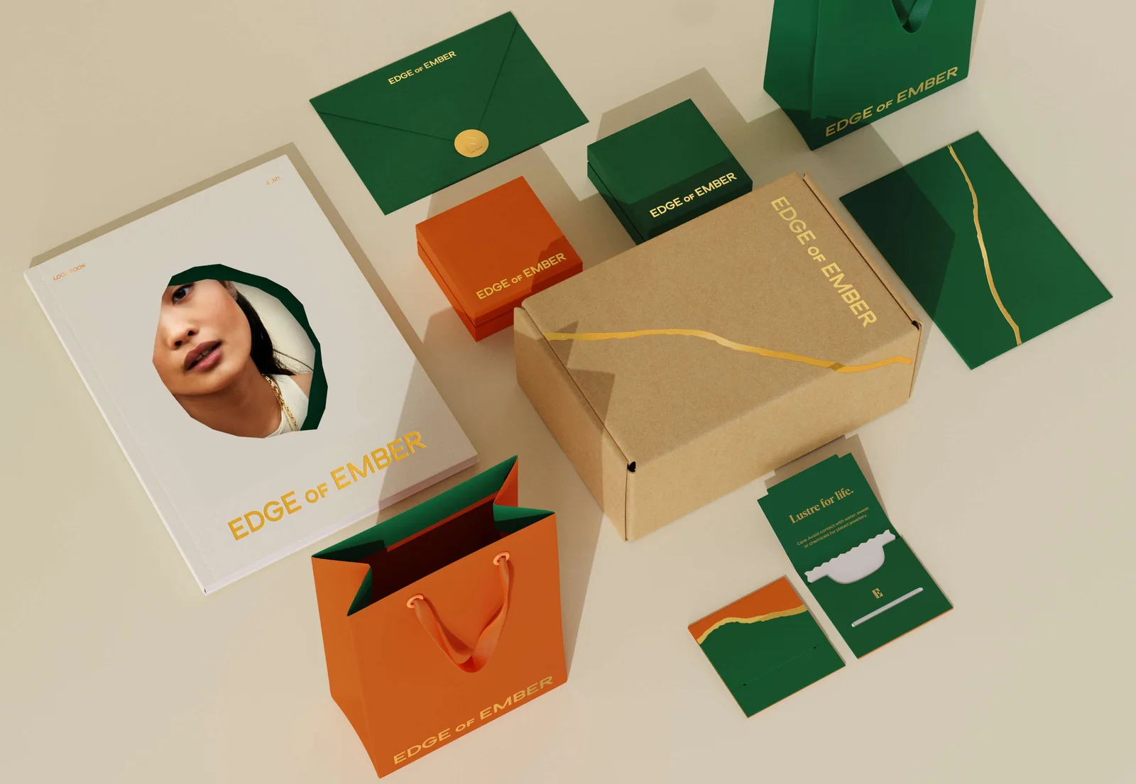
The first direction went warm and soft: a rounded serif, arcs and cut circles as elements, and a muted sage running through everything. It was built out to billboards, cards and merchandise so it could be judged as a finished brand rather than a sketch.
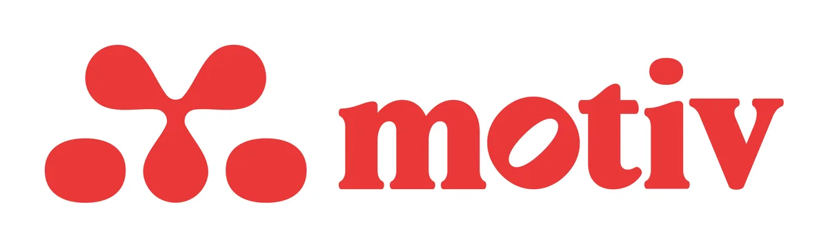
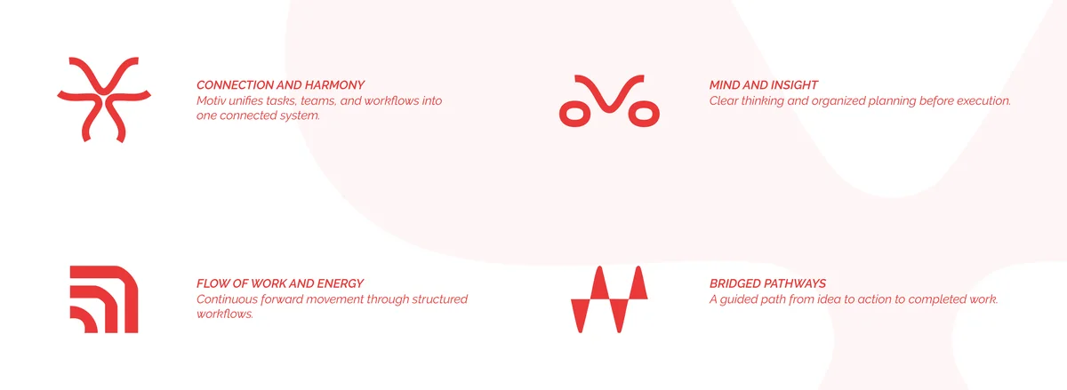
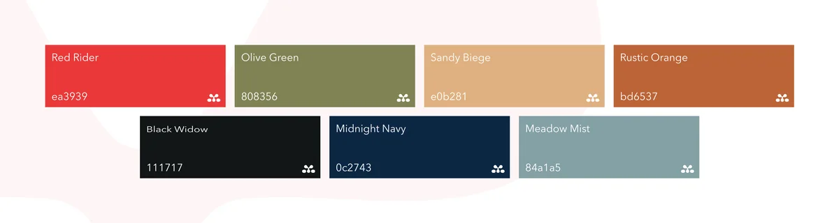
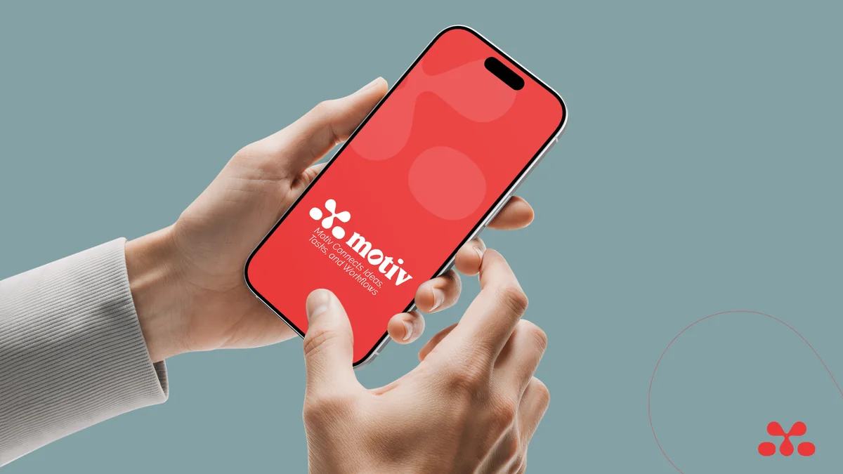
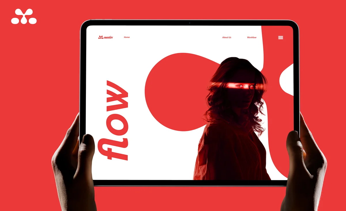
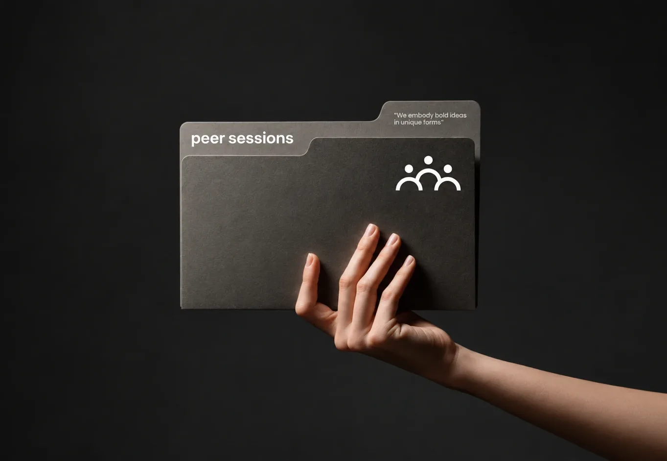
The second went the other way entirely: a single loud red, a mark made of three dots reading as people rather than lenses, and elements drawn as gestures. It pushed the brand towards teams and momentum instead of the camera.
Conclusion
Each direction was taken far enough to be judged on its own terms, which is the only way a choice like this can be made honestly.
The aperture is where it landed: the one mark that still said camera at app-icon size, and the one that got out of the way once the work filled the screen.
Brandlic's Contribution
- Brand Strategy
- Logo Exploration & Design
- Colour & Type System
- Brand Elements & Iconography
- Product & Environmental Application