Branding
RO&RE
Overview
RO&RE is a luxury clothing house in Riyadh, founded by the designers Rofida and Remas. The name is simply the two of them.
They make dresses, suits, trousers, skirts and bags, so the brand had to sit on a label, a box and a shopfront and feel like one thing.
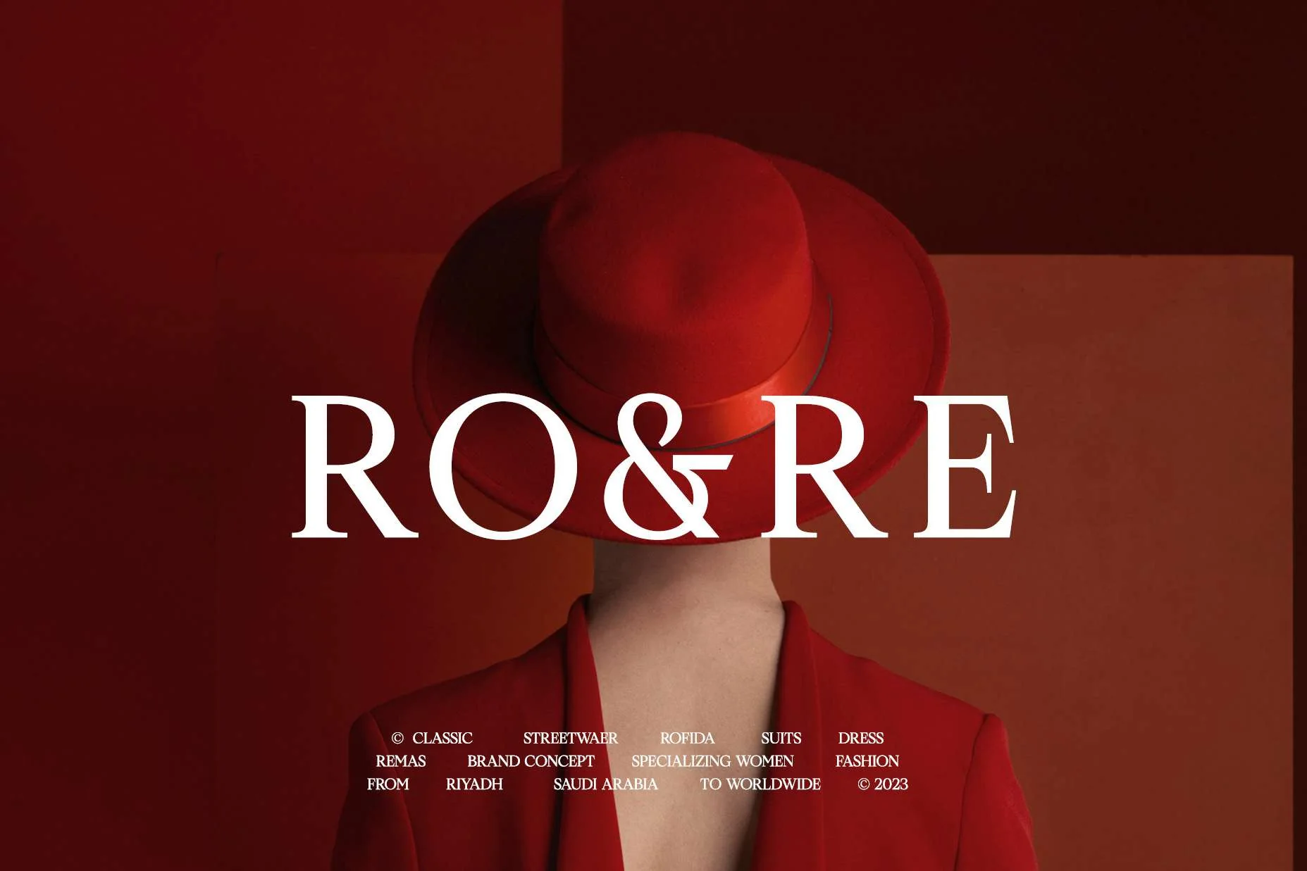
Luxury fashion branding tends to go quiet: black, white and a thin logo. RO&RE wanted to be warm and confident instead, and it had to hold up on a woven label a few centimetres wide as well as on a shop sign.
One deep red carries everything, paired with a serif wordmark that has the two names sitting either side of the ampersand.
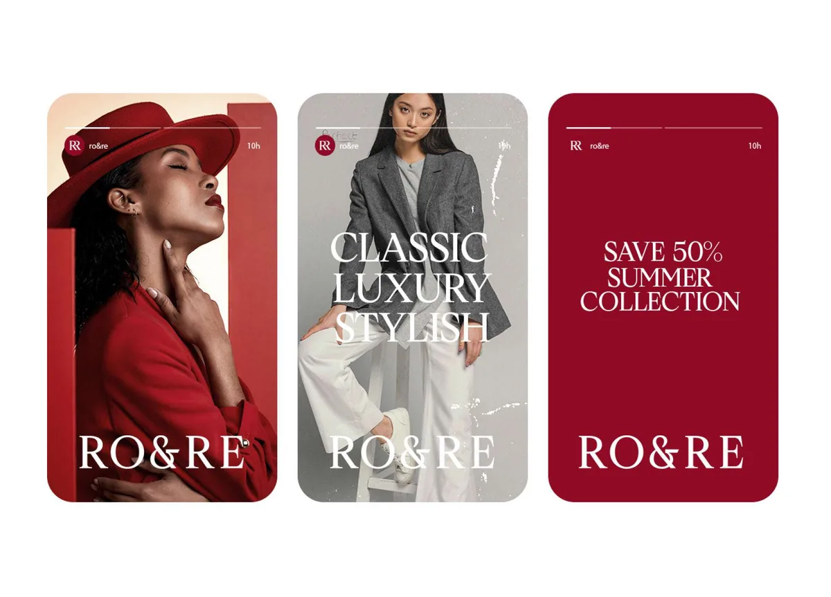
An RR monogram does the work where the full name will not fit, so the smallest label and the largest sign still read as the same brand.
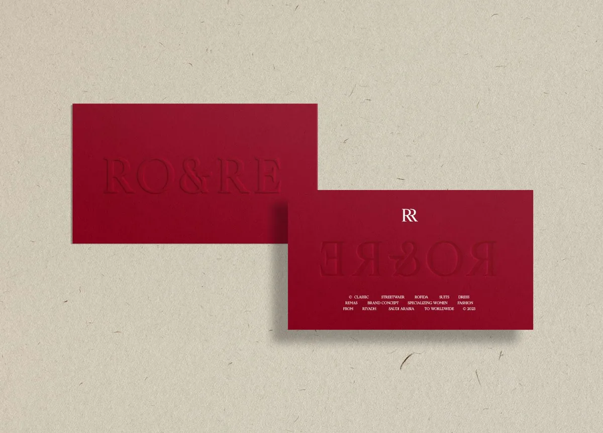
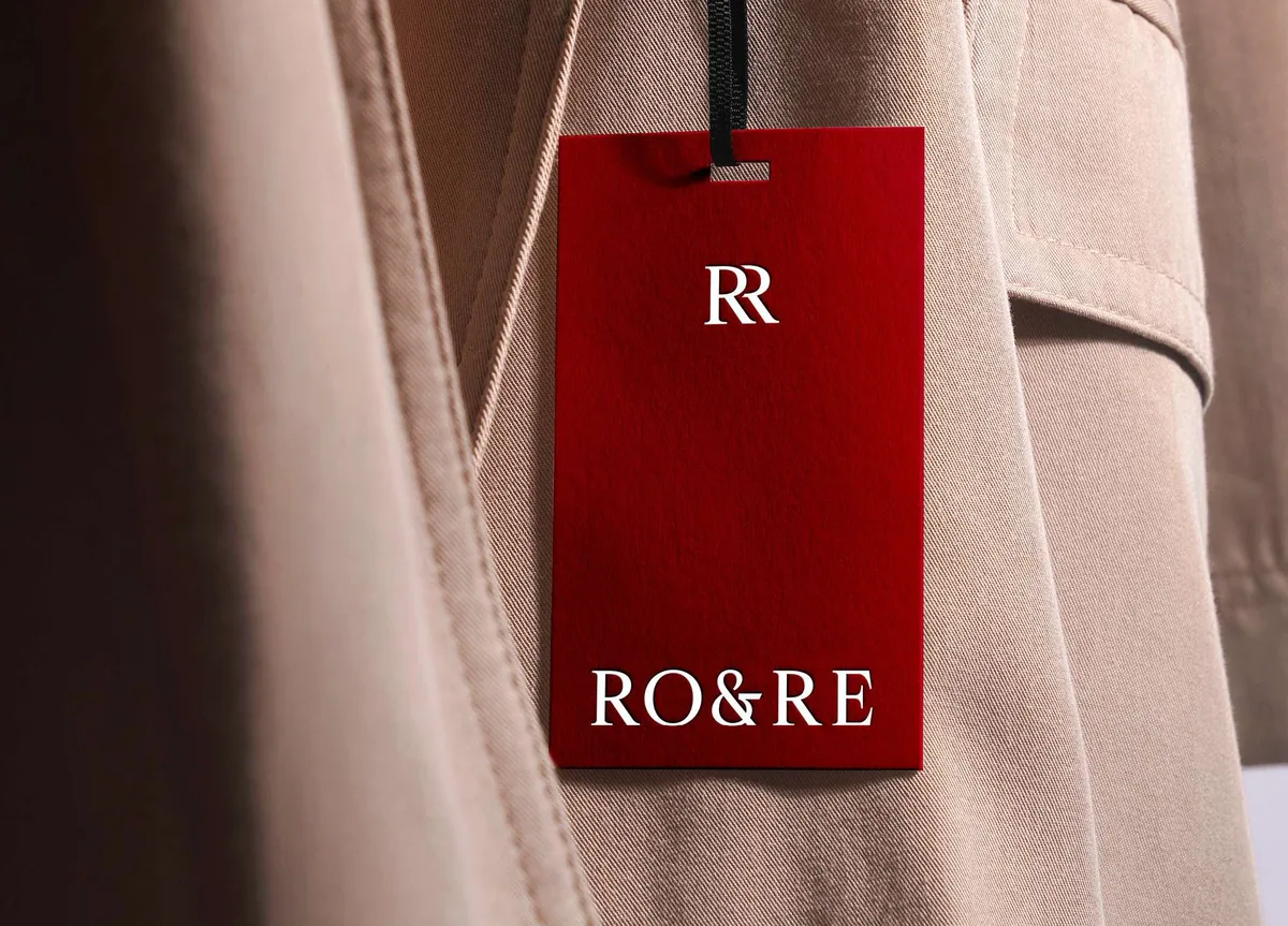
The monogram was drawn for the small end first. On a card or a swing tag it has room to breathe, and it keeps the same weight as the full wordmark next to it.
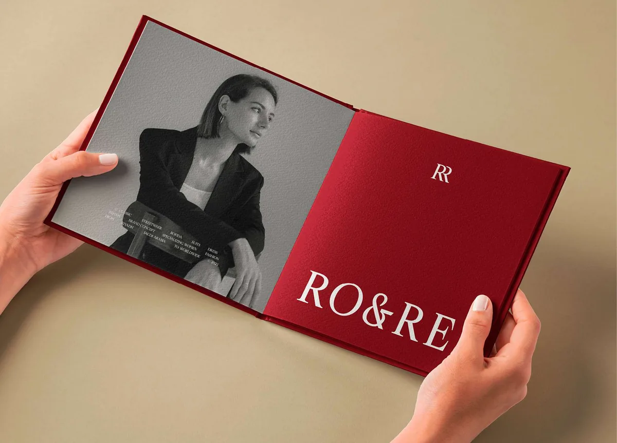
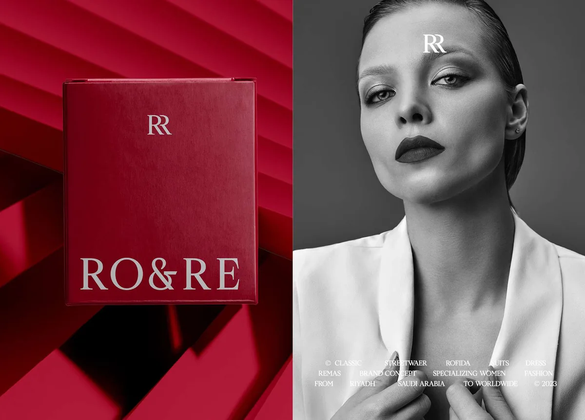
Print is where the brand gets to slow down. The lookbook runs black and white photography against a solid red page, so the clothes lead and the brand frames them.
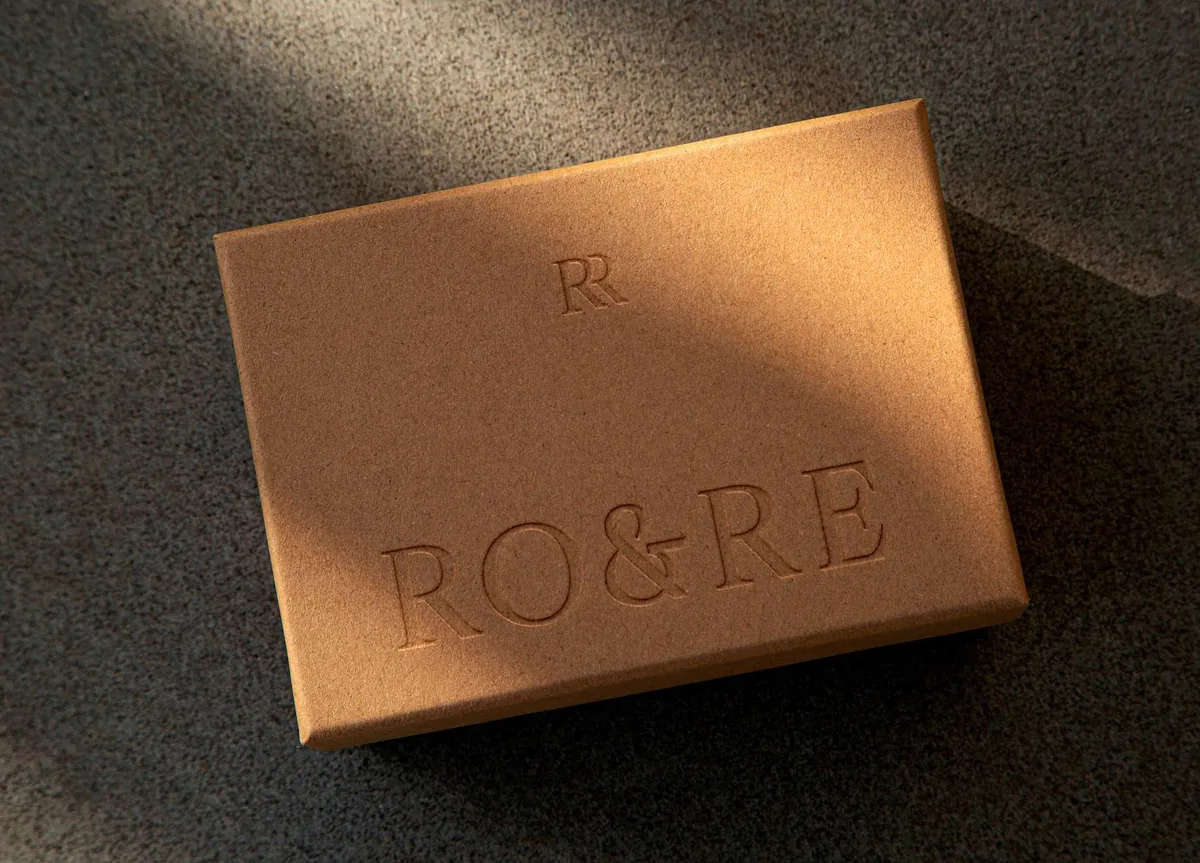
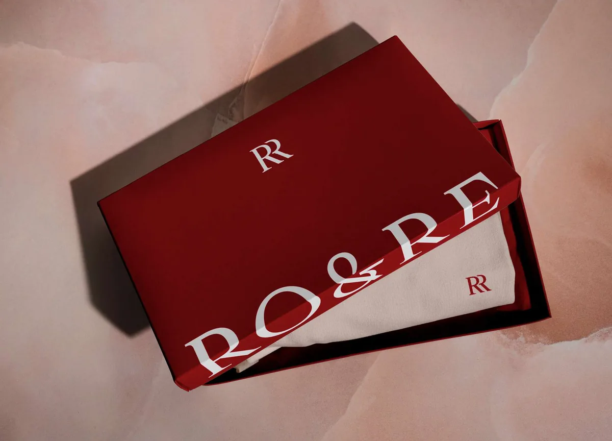
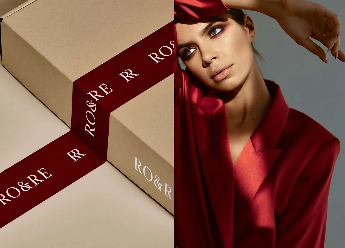
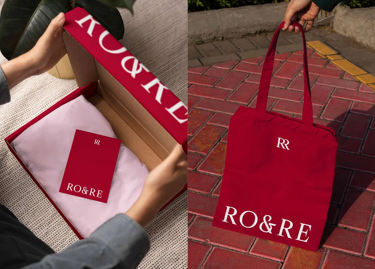
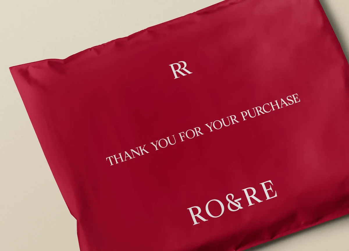
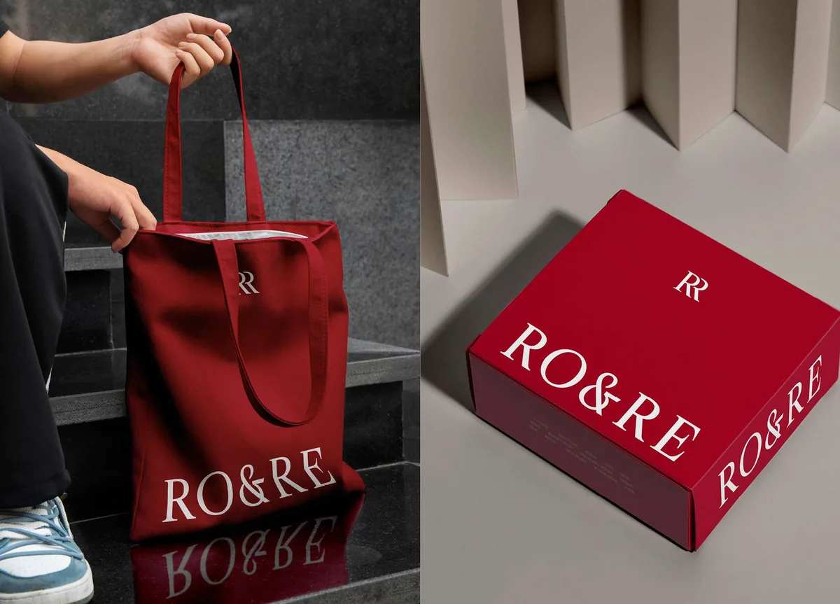
Packaging is treated as part of the purchase, not a wrapper for it. A printed ribbon, an embossed lid and a lined box mean the order still feels considered by the time it is opened at home.
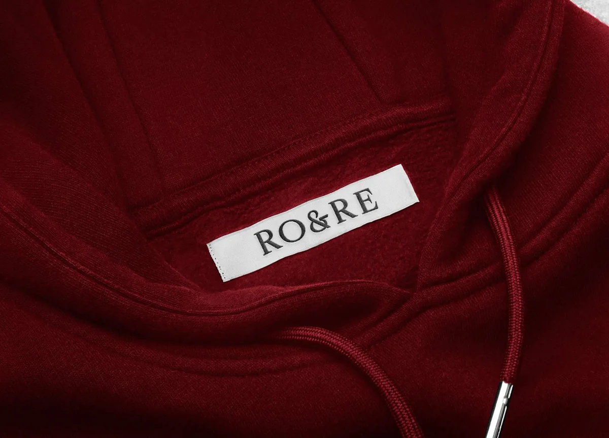
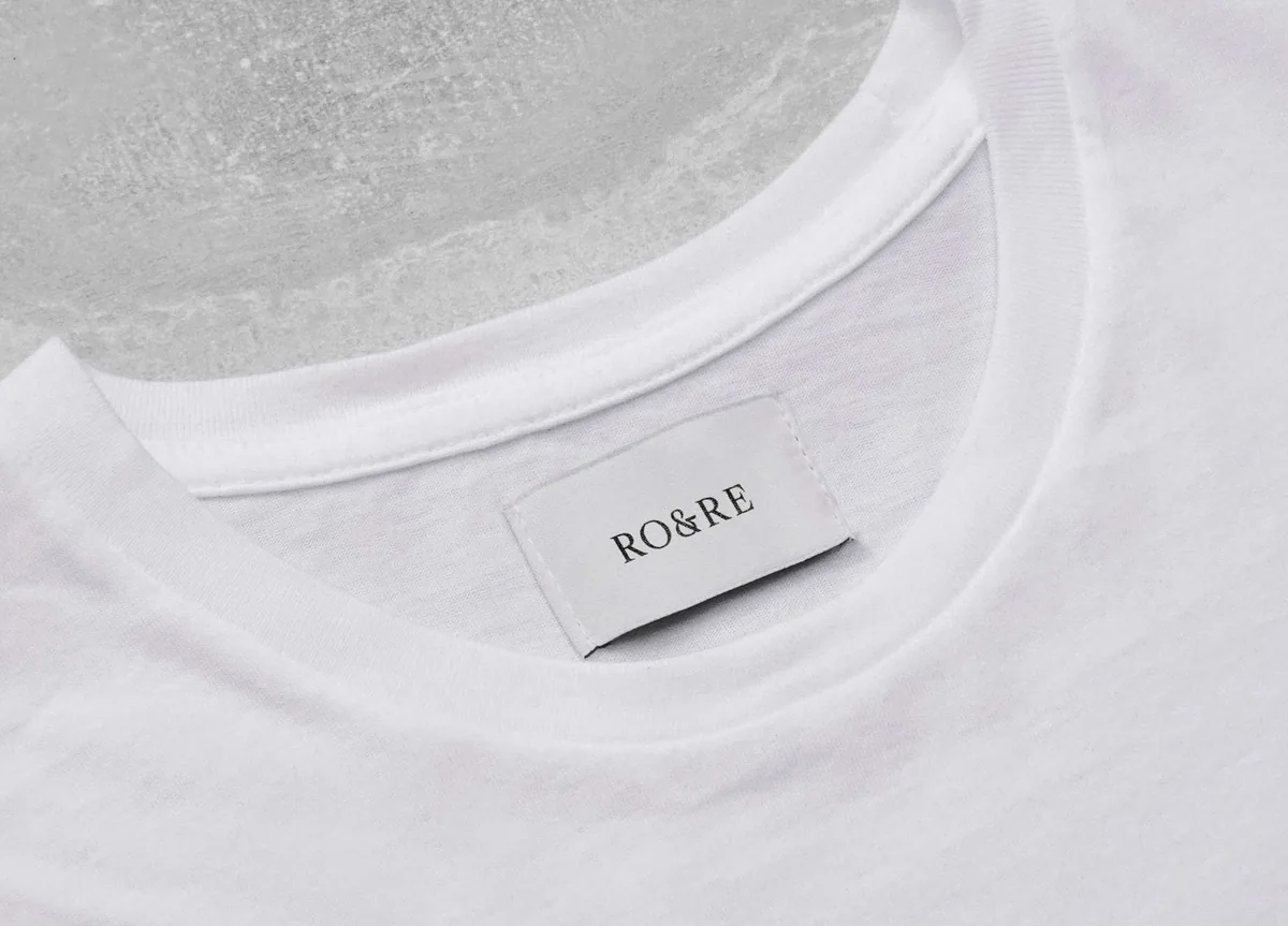
On the garments the brand goes quiet on purpose. A woven label and a small neck tag are all it needs, because by then the clothes are doing the talking.
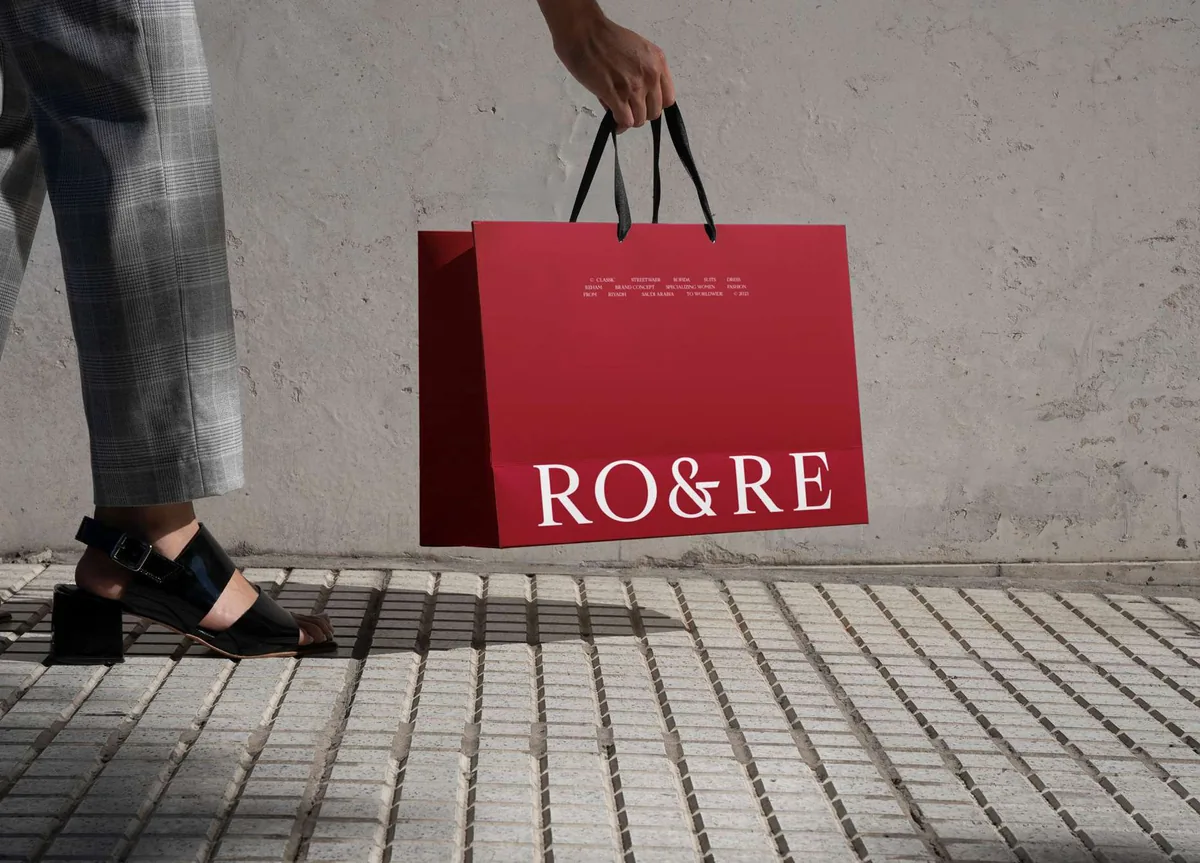
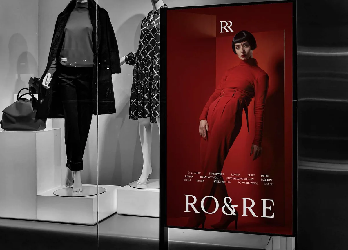
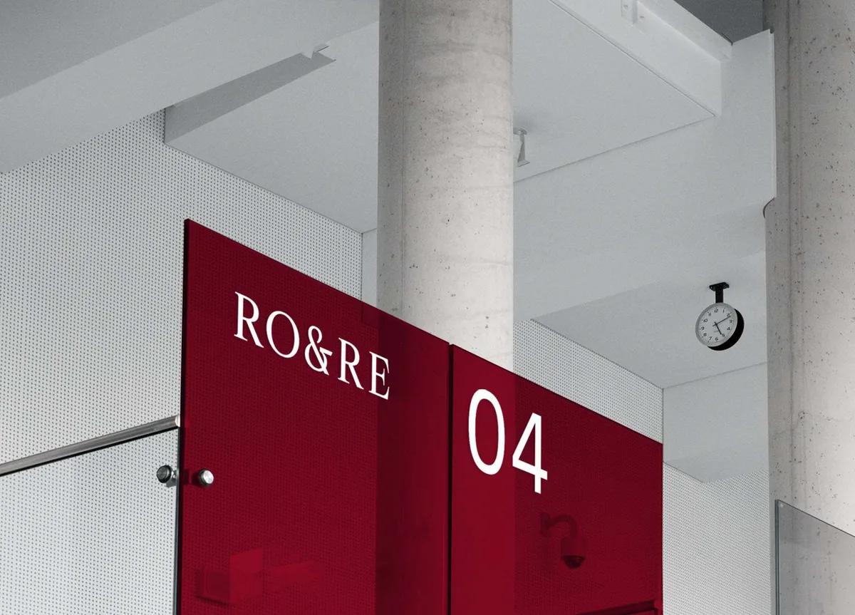
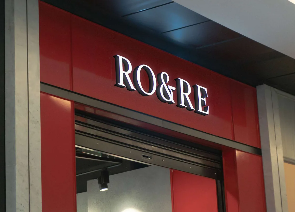
In store the red does the navigating. It marks the entrance, the fitting rooms and the window, so you can find your way around without reading a single sign.
Conclusion
RO&RE ended up with one colour and one mark that work at every size, from a label stitched inside a collar to a lit sign above a shopfront in Riyadh.
Brandlic's Contribution
- Brand Strategy
- Wordmark & Monogram
- Packaging Design
- Garment Labelling
- Retail & Signage