Branding
TRZ
Overview
TRZ is a speciality coffee roastery and bakery, and the name is the whole brief. Tiraz means style, or form, or the way a thing is made. So the work was never going to be only a logo. It had to be a language the place could be built in.
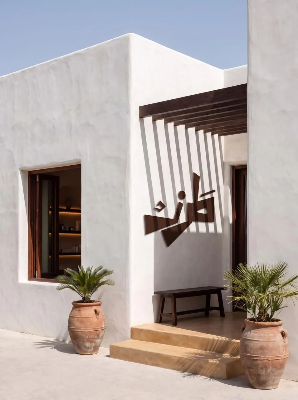
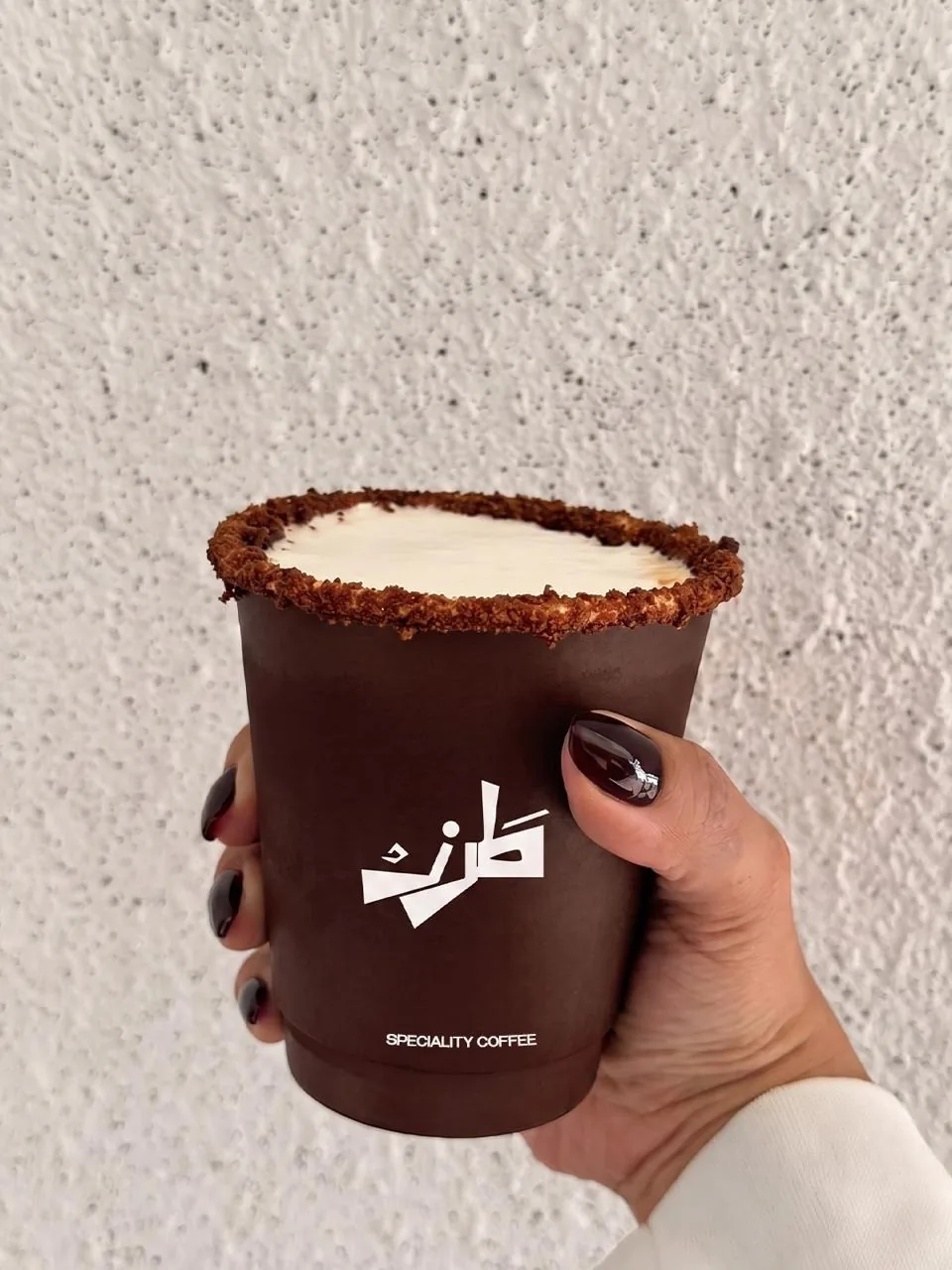
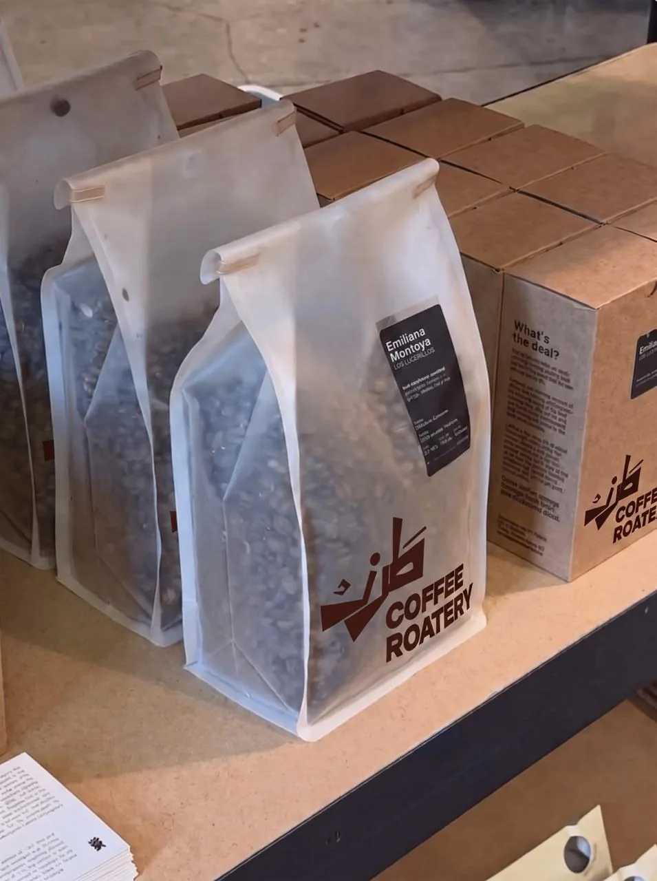
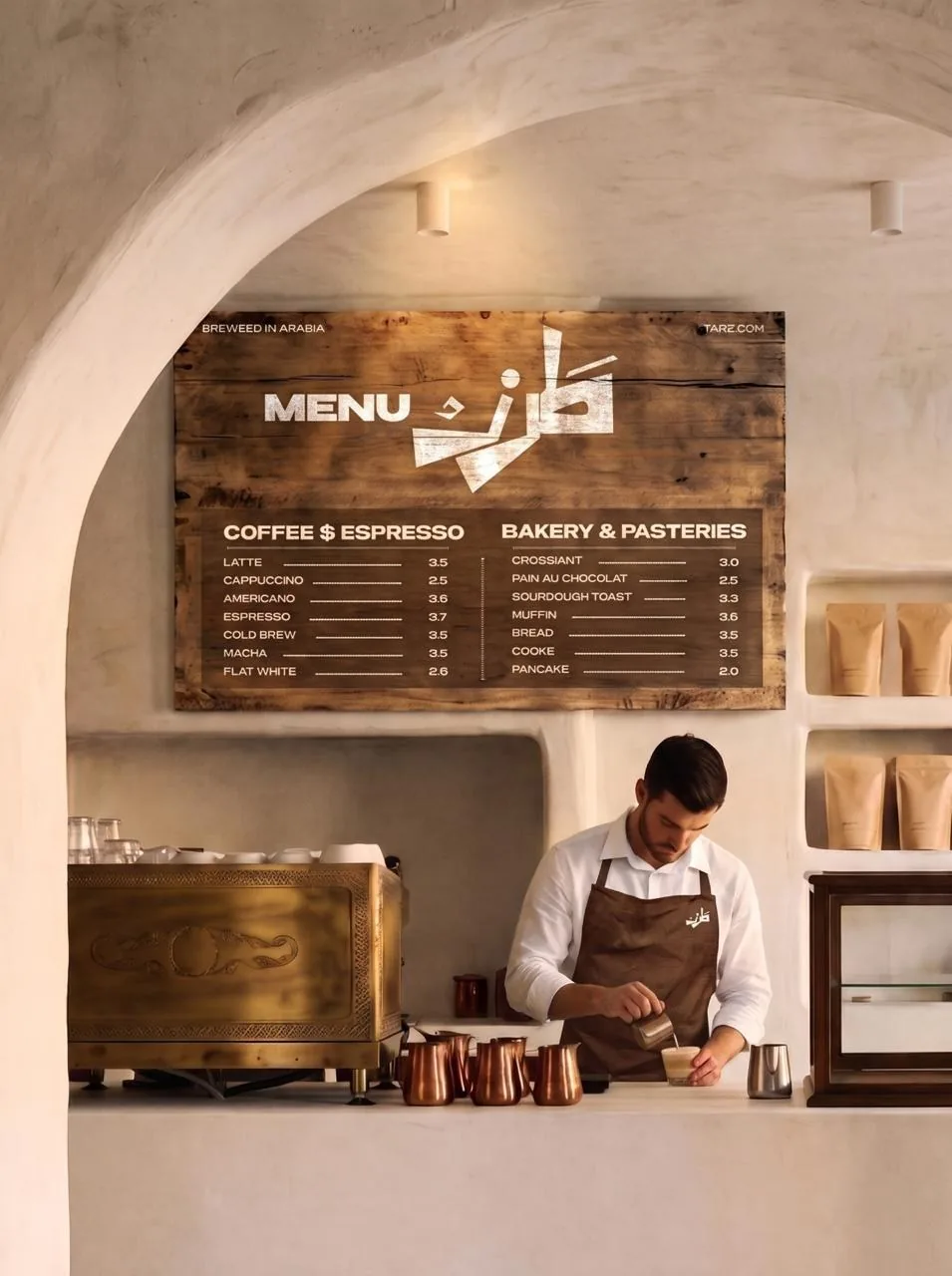
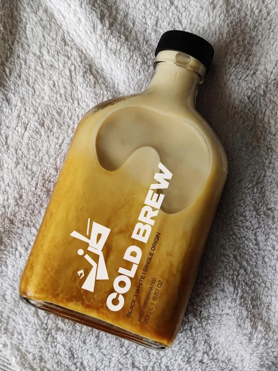
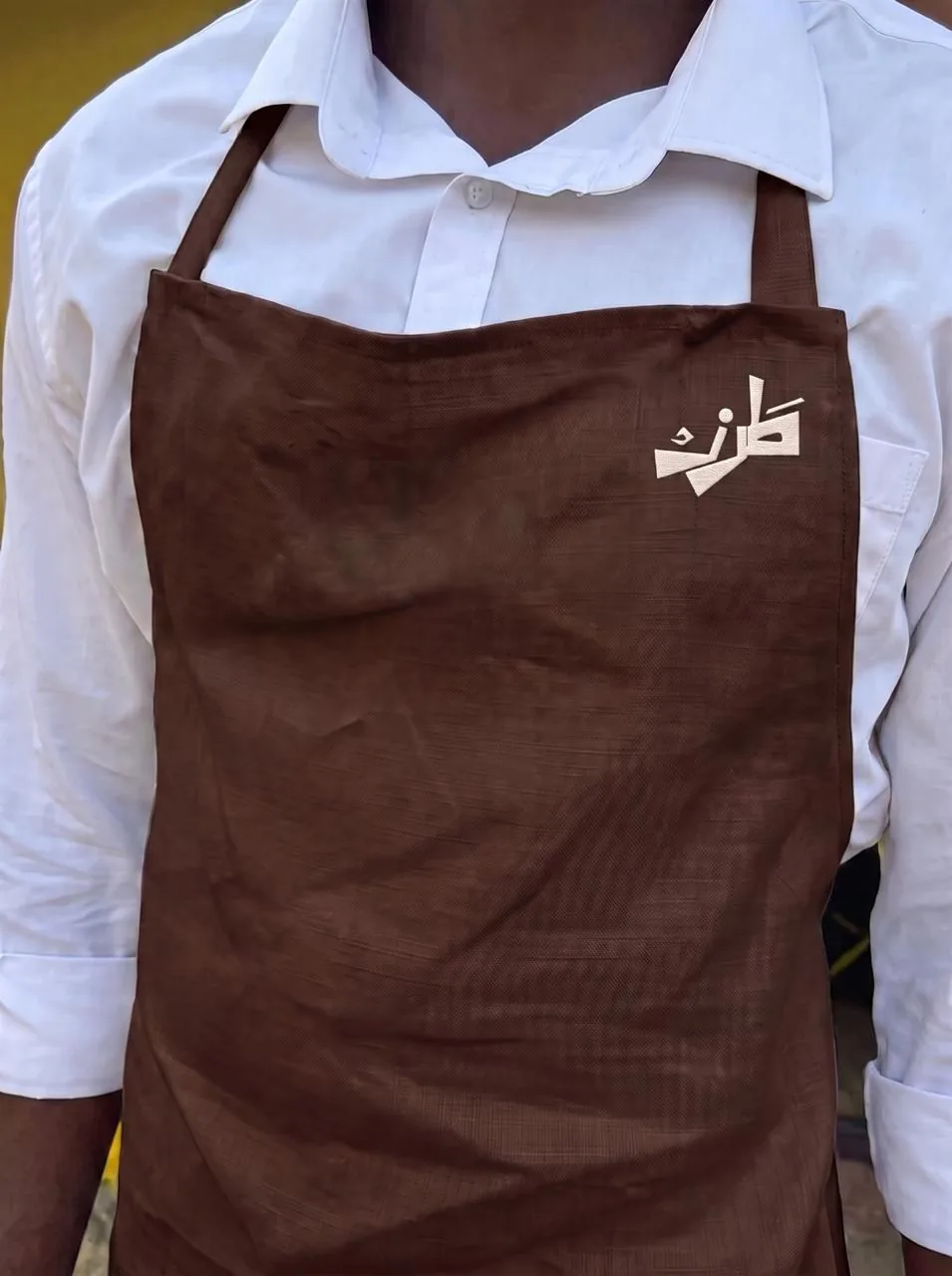
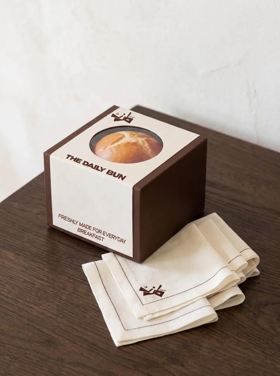
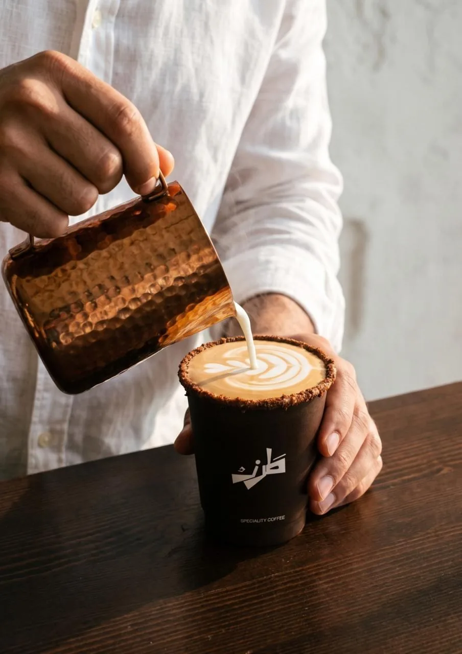
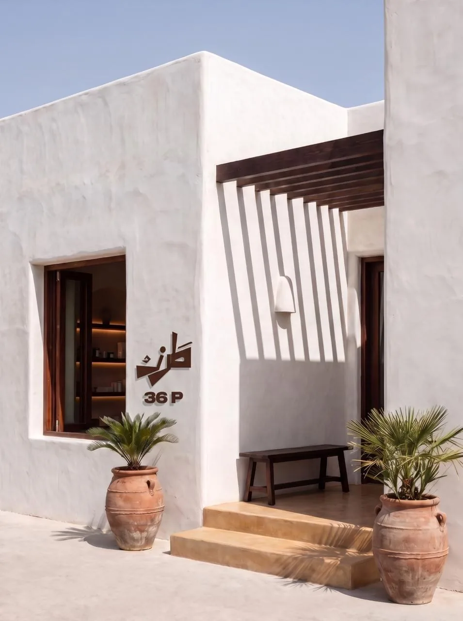
One mark carries it, drawn so the Arabic and the Latin share a single shape instead of sitting side by side. It goes on the wall, the apron, the cup and the bag without being redrawn, and the room was made to match: arches plastered by hand, counters shaped rather than built, dark wood left unfinished so it ages with the space.
A name that lives in two scripts often ends up as two separate logos sitting side by side. TRZ wanted a single mark that reads naturally to both audiences, and that still works at the size of a shop awning.
We drew the Arabic form first and let its long horizontal stroke become the spine of the whole mark. The Latin letters then sit under that stroke, so the two scripts share one shape instead of competing.
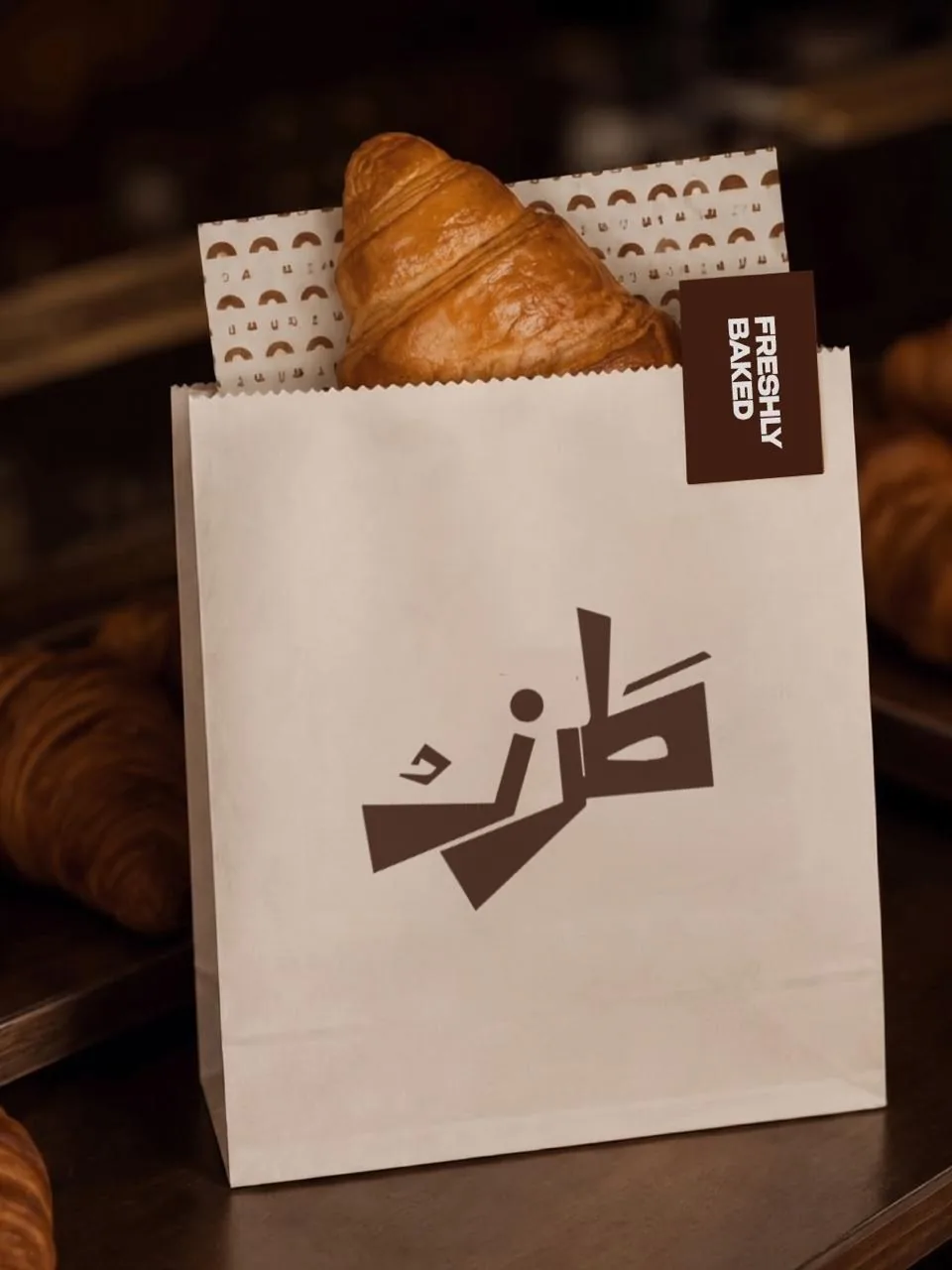
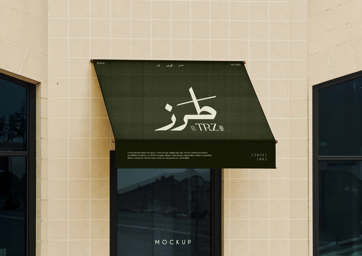
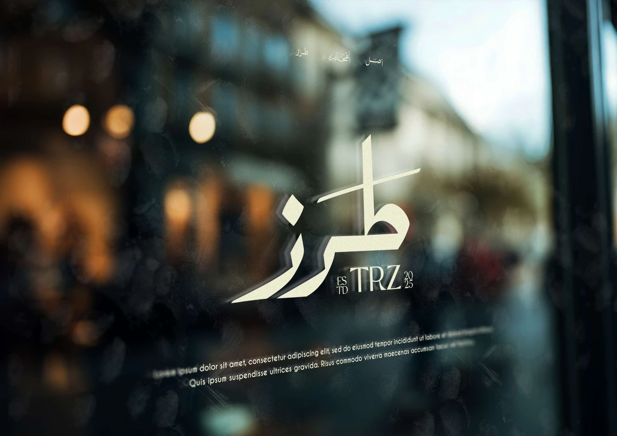
The result stays clear whether it is stitched into fabric, printed small, or painted across a shopfront.
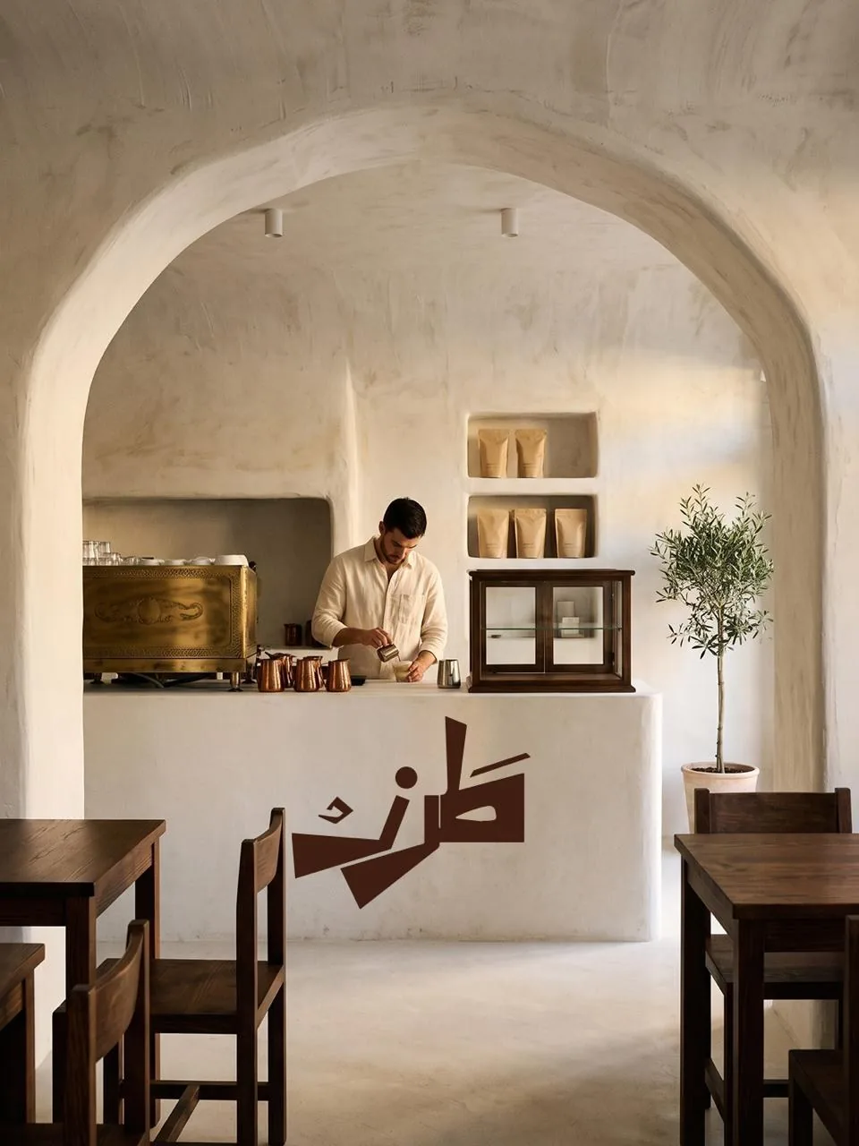
How the mark was drawn
The shopfront above carries a mark that took a while to settle. Below is the drawing behind it: the Arabic form, the grid it was built on, the palette, and the first mockups made before any of it was plastered or poured.
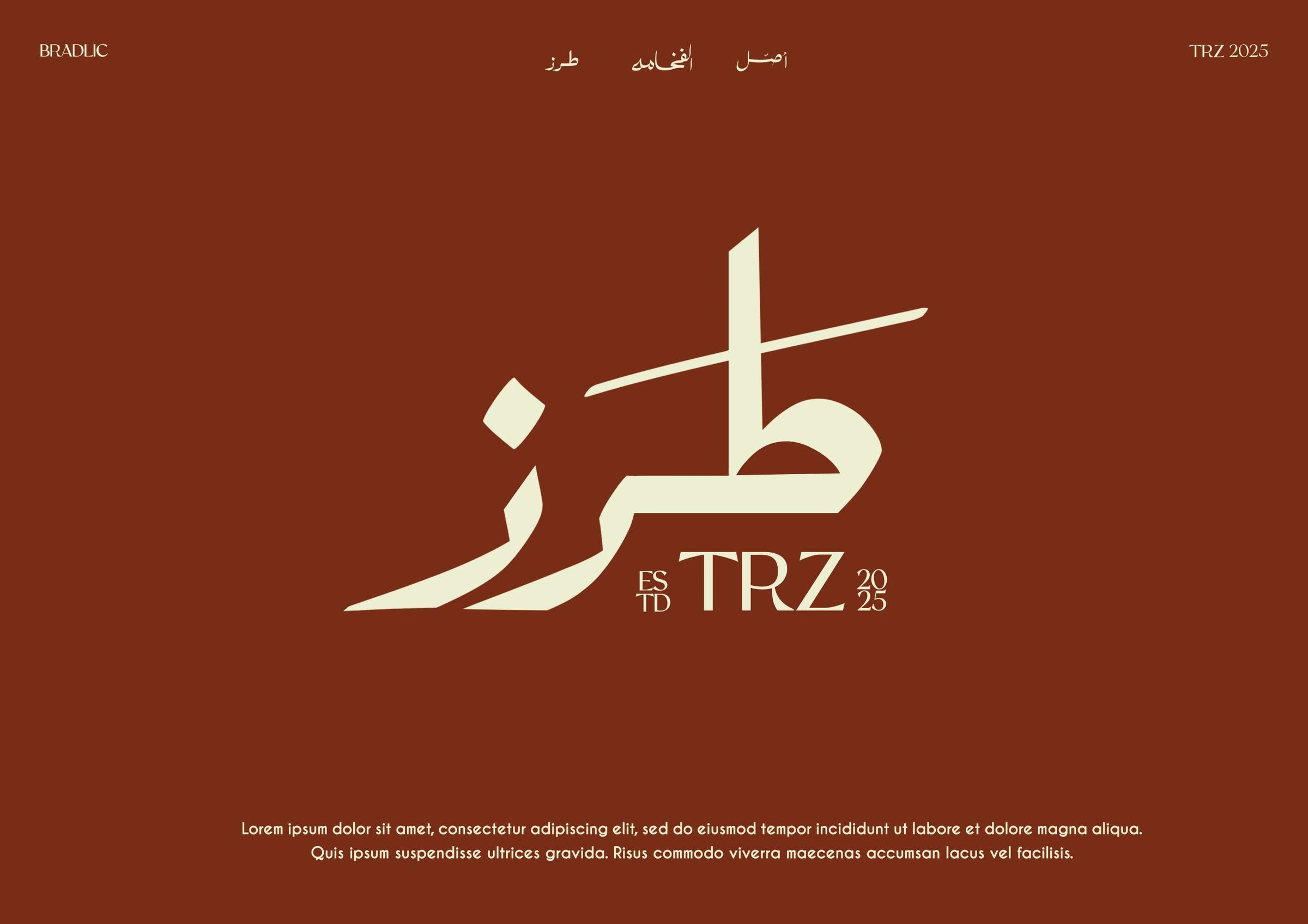
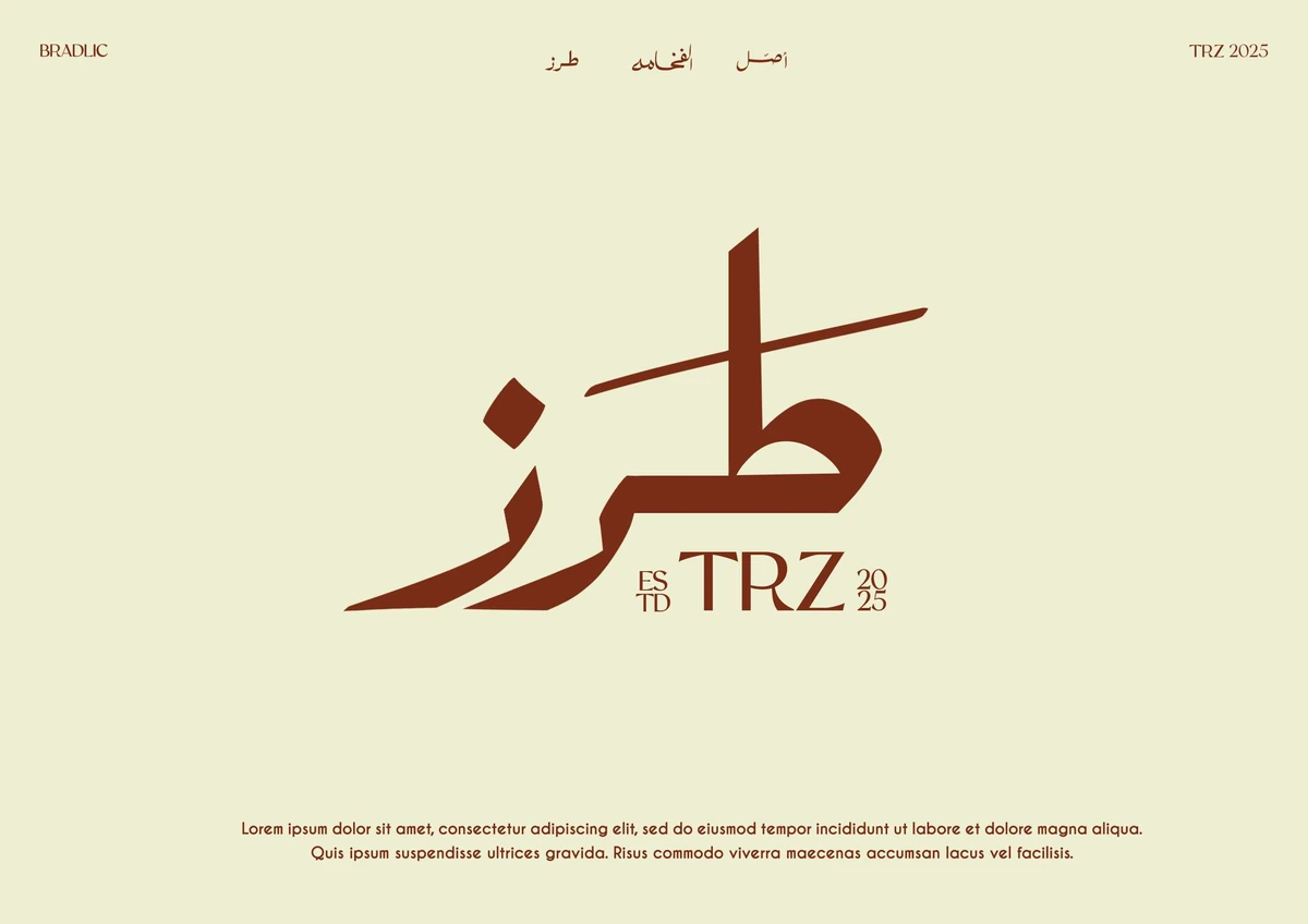
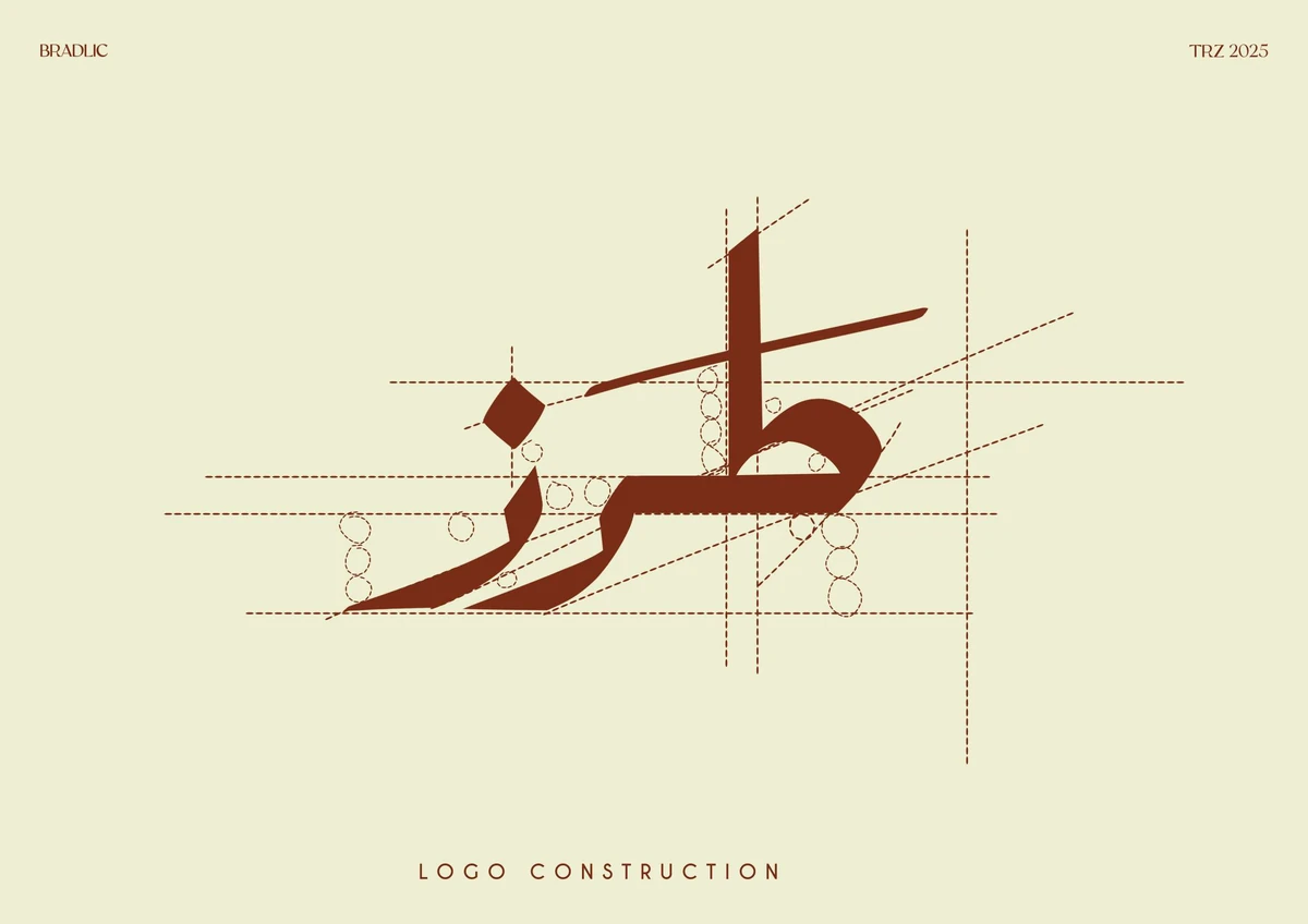
The mark is built on a simple grid, so every curve has a reason behind it and the shape can be redrawn at any size while keeping its balance.
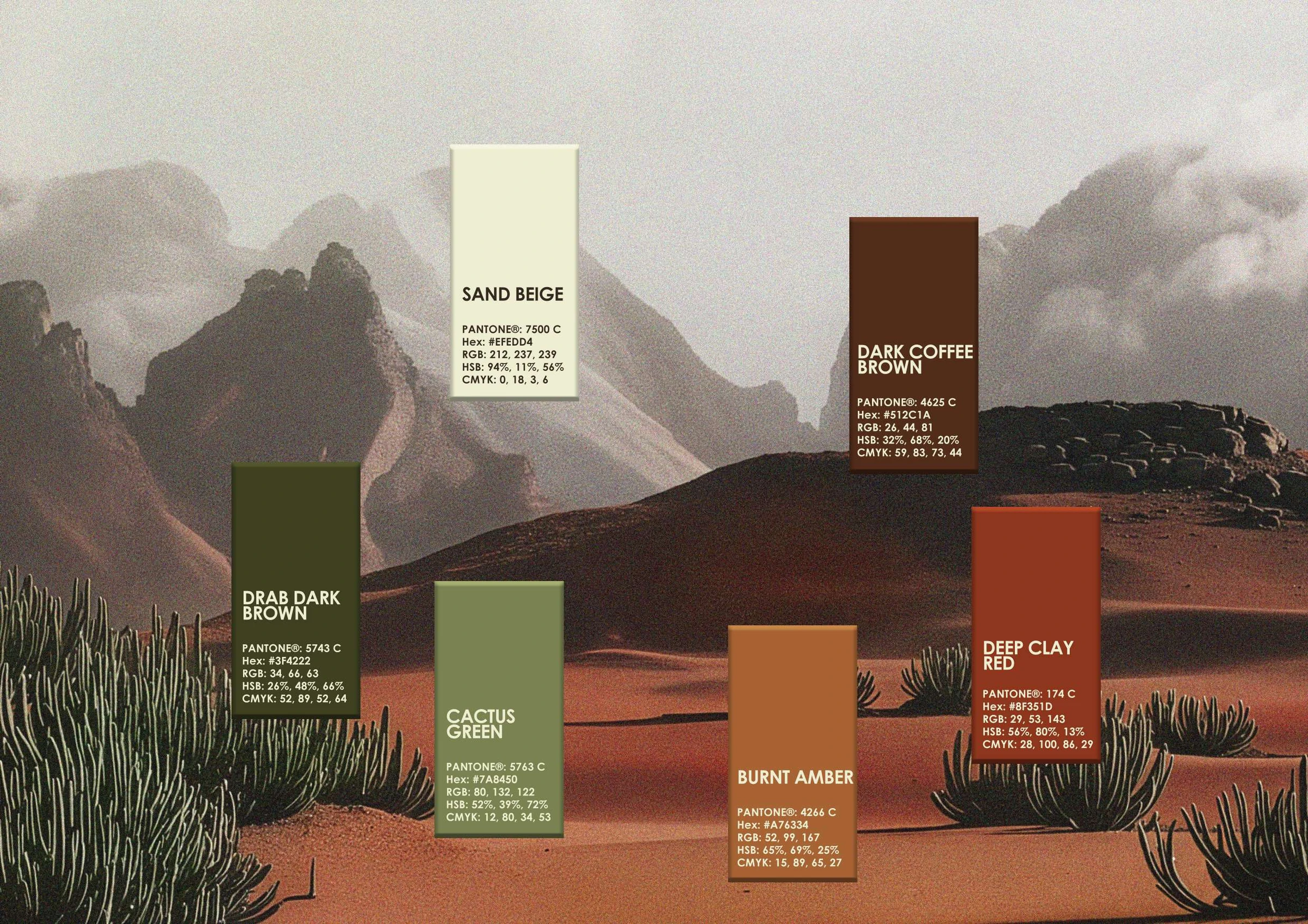
The colours come from the landscape the brand belongs to. Deep clay red leads, with sand beige, burnt amber, cactus green and dark coffee brown behind it. Warm, grounded, and easy to live with across print, fabric and paint.
Conclusion
TRZ now has one mark that speaks both languages at once. It reads from across the street on an awning, and holds together just as well on a label.
Brandlic's Contribution
- Brand Strategy
- Arabic & Latin Logotype
- Colour System
- Signage & Environmental
- Art Direction