Branding
Peer Sessions
Overview
Peer Sessions gathers the people who are building businesses. The point was never the platform, it is the room: founders and leaders sitting together and trading what they have learned.
So the identity had to hold three things at once, connection, collaboration and growth, and still look composed enough to belong in a business setting.
Business networks reach for the same devices: handshakes, interlocking rings, an abstract swoosh. They say partnership without ever showing a person. Peer Sessions had to feel like people in a room, stay clean enough for an entrepreneurial audience, and still hold together at the size of a stamp.
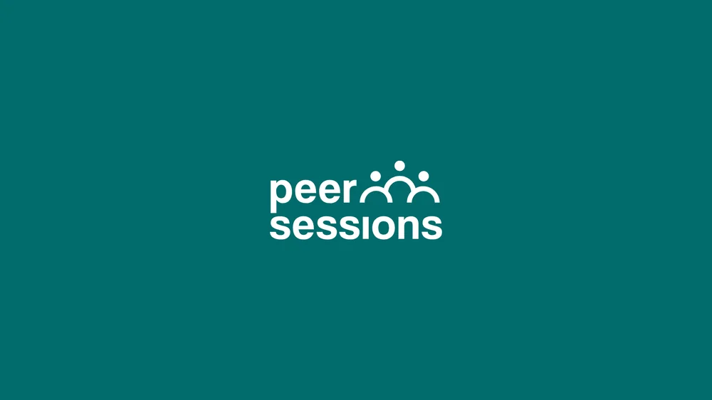
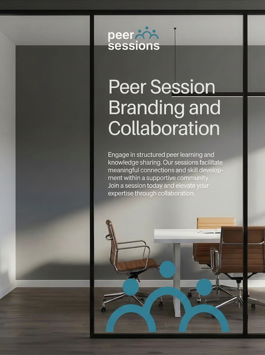
The mark is three figures under one arc, drawn from a single repeated shape: a dot and an arch, set three times at different heights. Read fast it is a group. Read slowly it is a conversation with someone at the centre of it.
Colour carries the feeling. A steady teal for trust, a warm clay so it never turns cold, and a bright yellow held back for the moments that have to reach across a station platform.

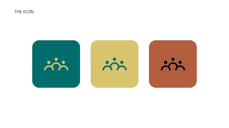
The three figures are the same two shapes repeated, which is what keeps the mark steady at small sizes. Set on the grid, the gaps stay even however far it is scaled down.
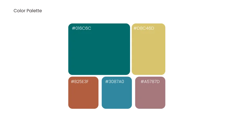
The palette was picked for what each colour does rather than how it looks in a row. Teal steadies everything and clay warms it, so the mark can swap between them without changing what it means.
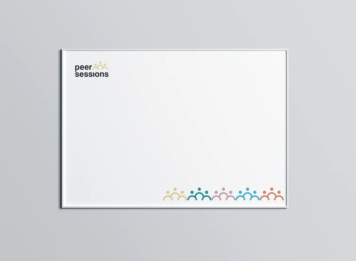
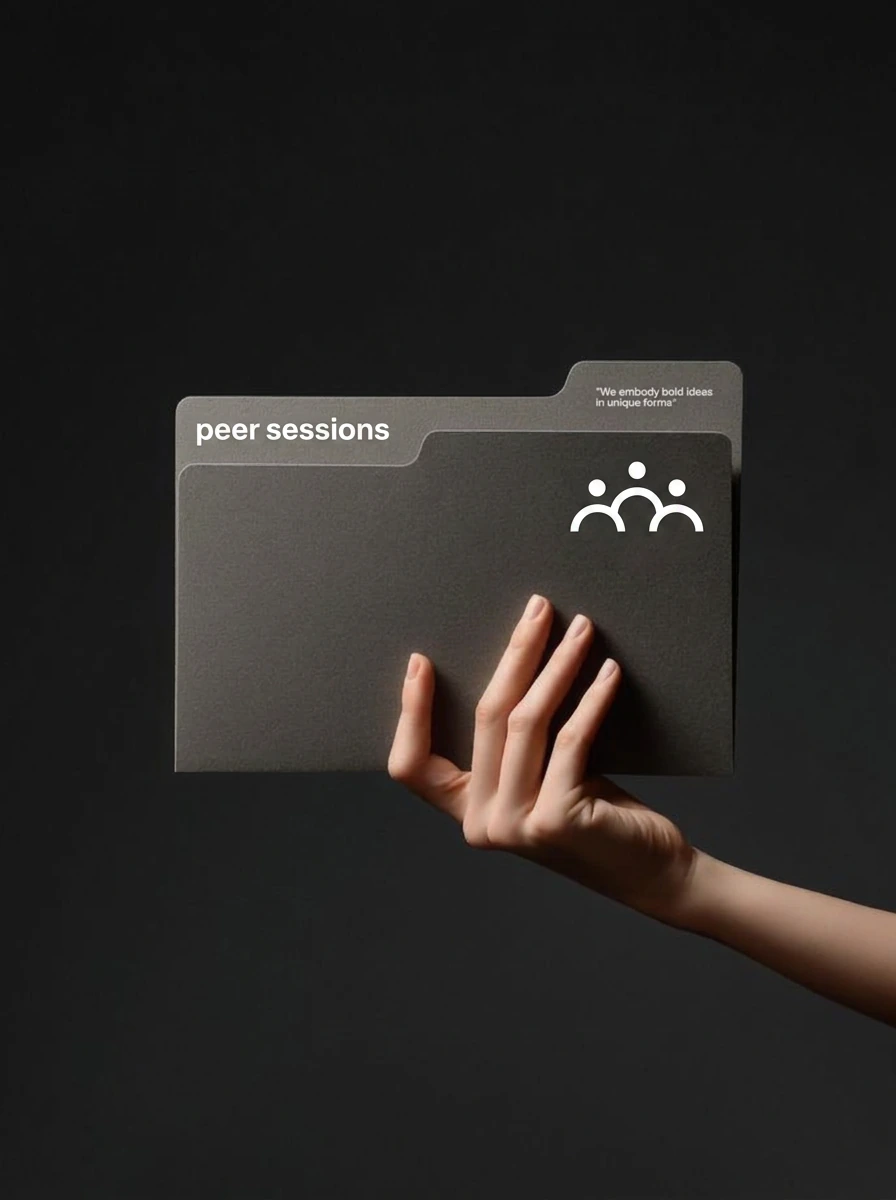
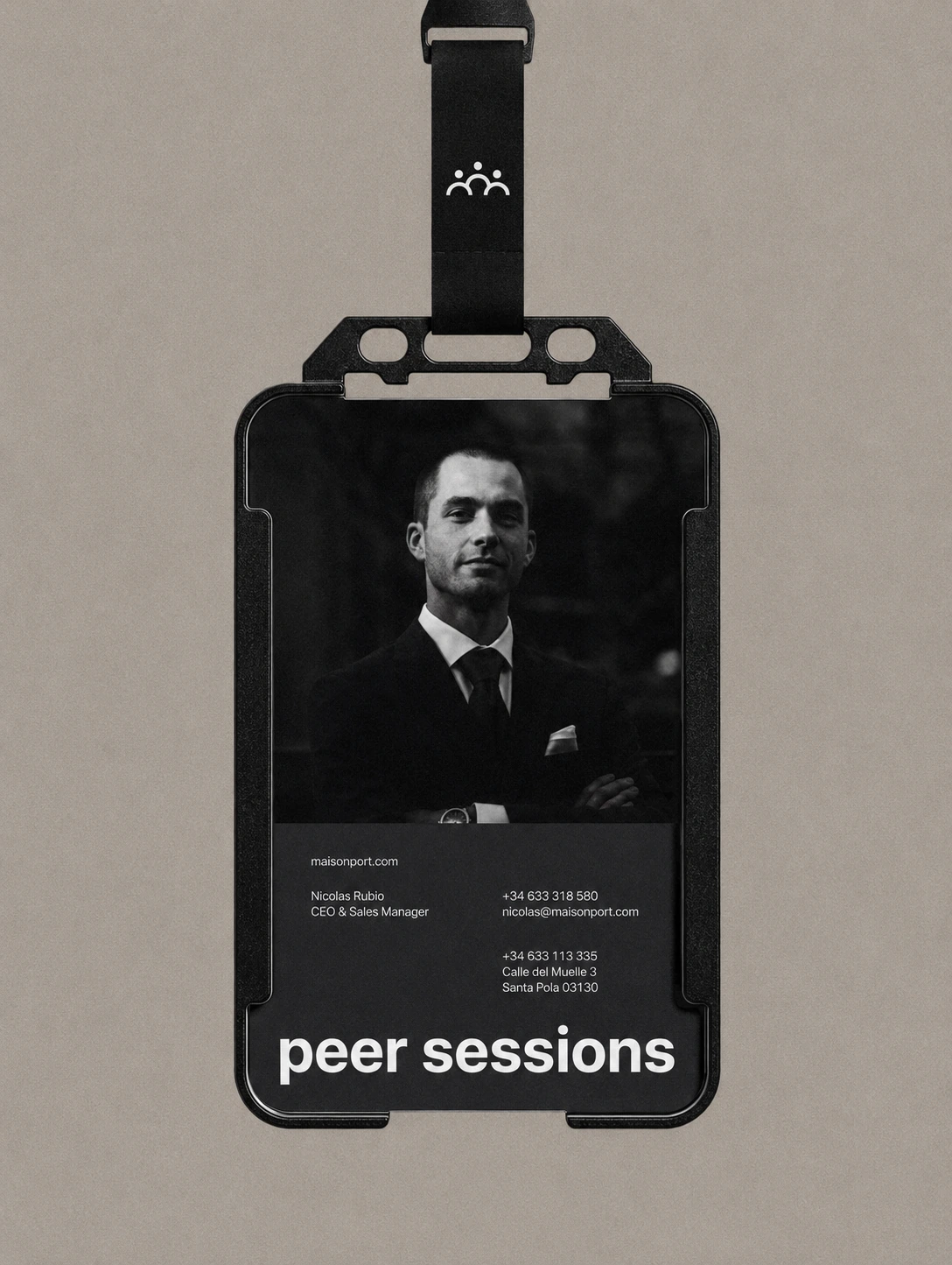
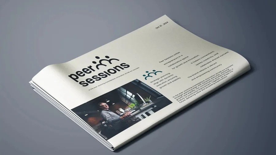
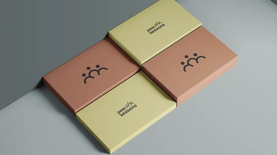
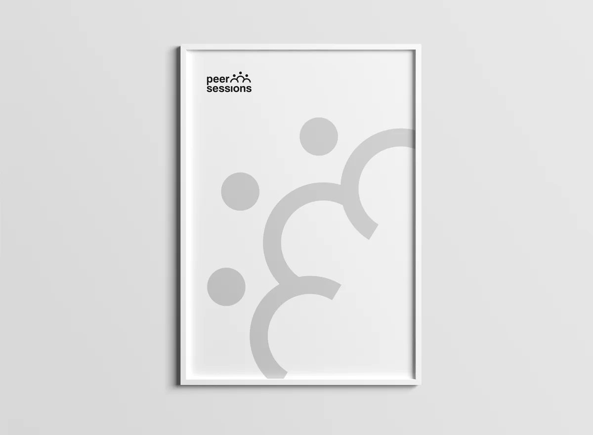
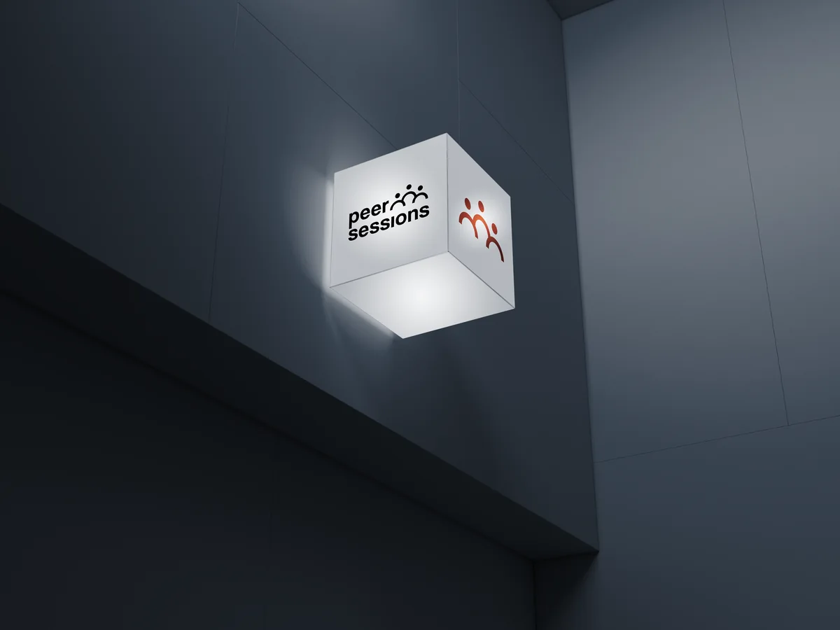
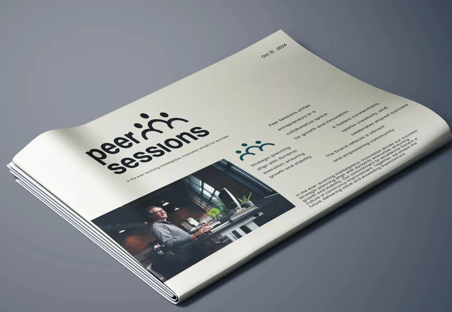
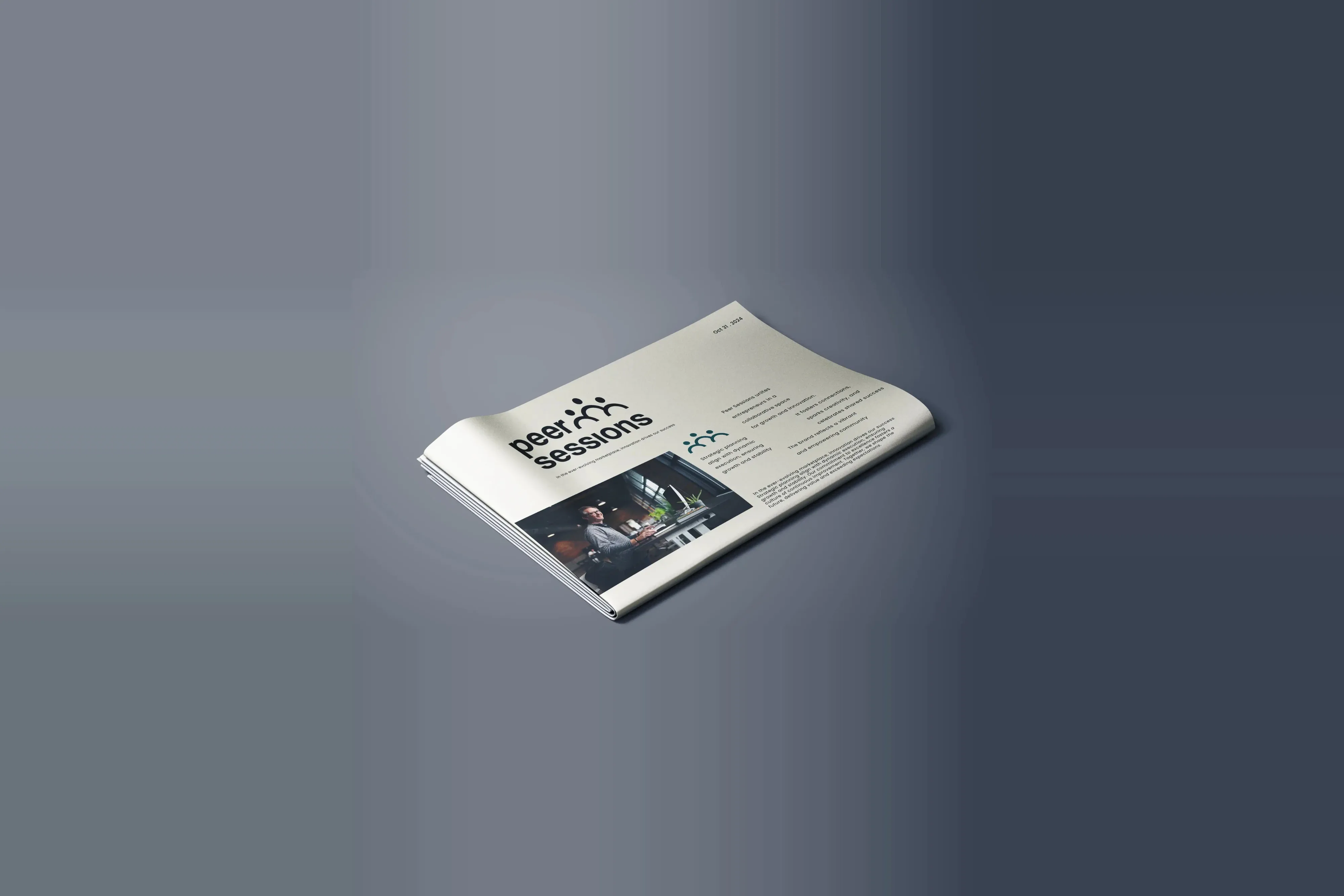
Print does the heavy lifting. A newspaper for the long read, stationery for the everyday, and boxes that carry the palette without needing the logo to shout.
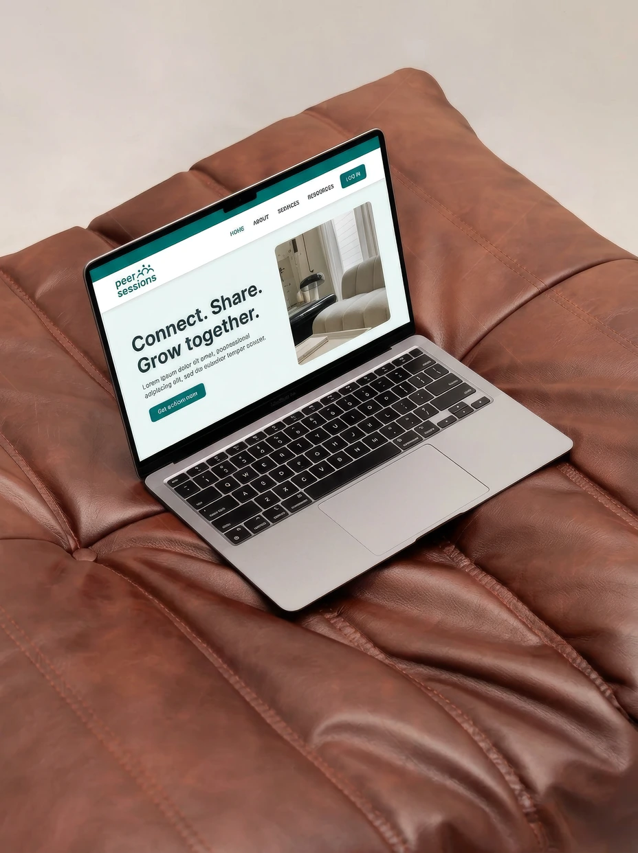
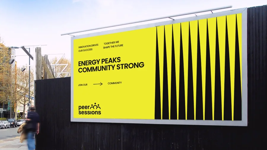
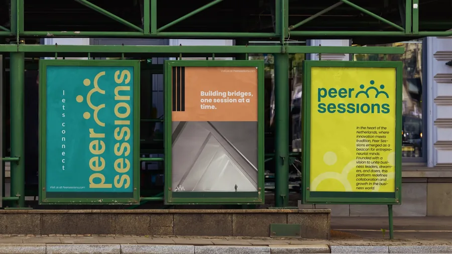
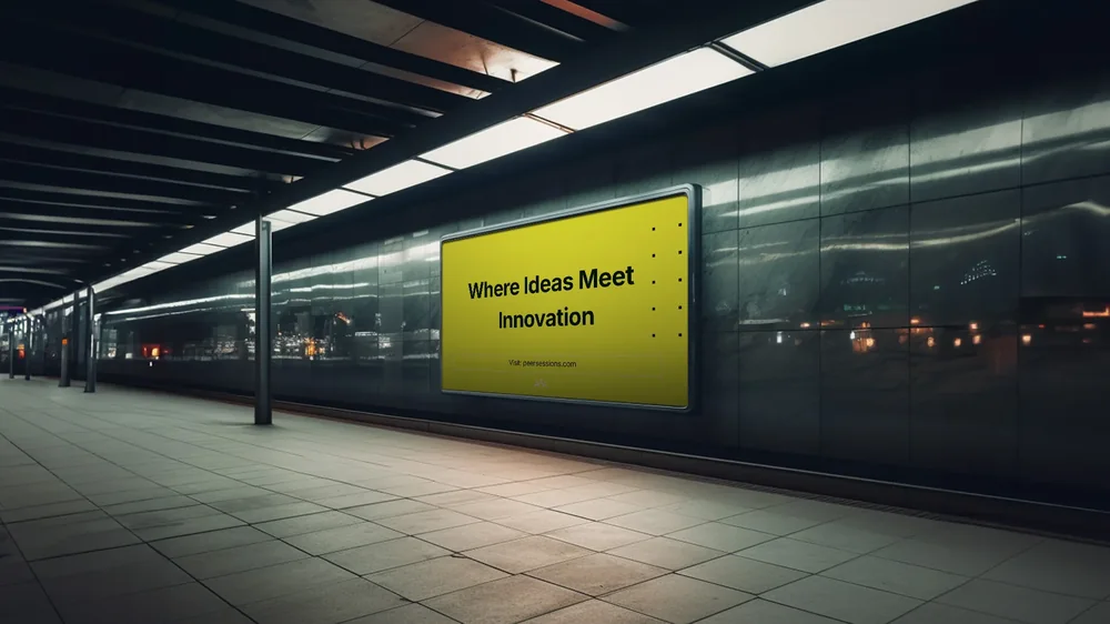
Out of home the brand goes loud. Big yellow, one line of copy, and the three figures small in the corner, because by then everyone already knows the shape.
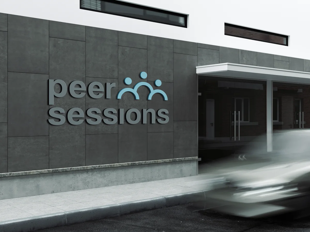
On the building the mark is cut rather than printed, so it reads by its shadow in daylight and by its own light after dark.
Conclusion
Peer Sessions ended up with an identity that works at both ends: quiet enough to sit on a letterhead in a business setting, clear enough to hold a billboard from across a platform.
Brandlic's Contribution
- Branding & Identity Design
- Logo & Wordmark
- Typography
- Colour System
- Visual Storytelling
- Print, Signage & Out of Home