Branding
Chamo
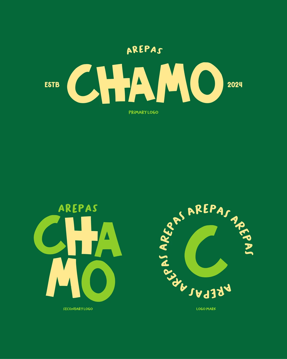
Overview
Chamo is an arepas kitchen. The food is warm, quick and made to share, so the brand needed to feel just as friendly the moment you see it.
Everything grows from one character: a round, wide-eyed face that turns up on every bag, box and sign.
Fast food branding often shouts. Chamo wanted to feel welcoming instead, and it had to work across a lot of surfaces at once: bags, boxes, aprons, receipts, a shopfront and a billboard.
We built the brand around a simple character with two big eyes. It is easy to draw, easy to recognise, and it still reads at a glance from across the street.
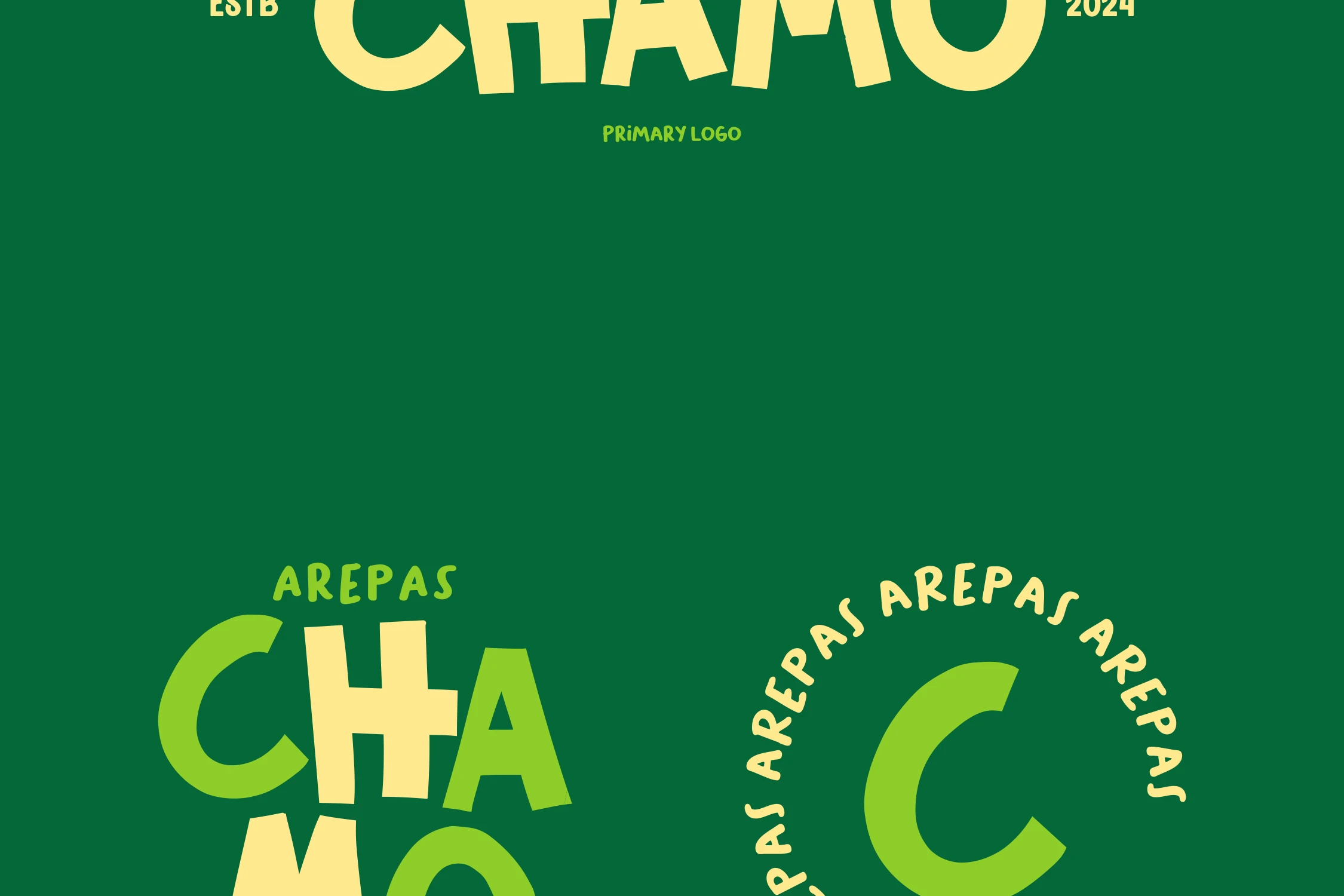
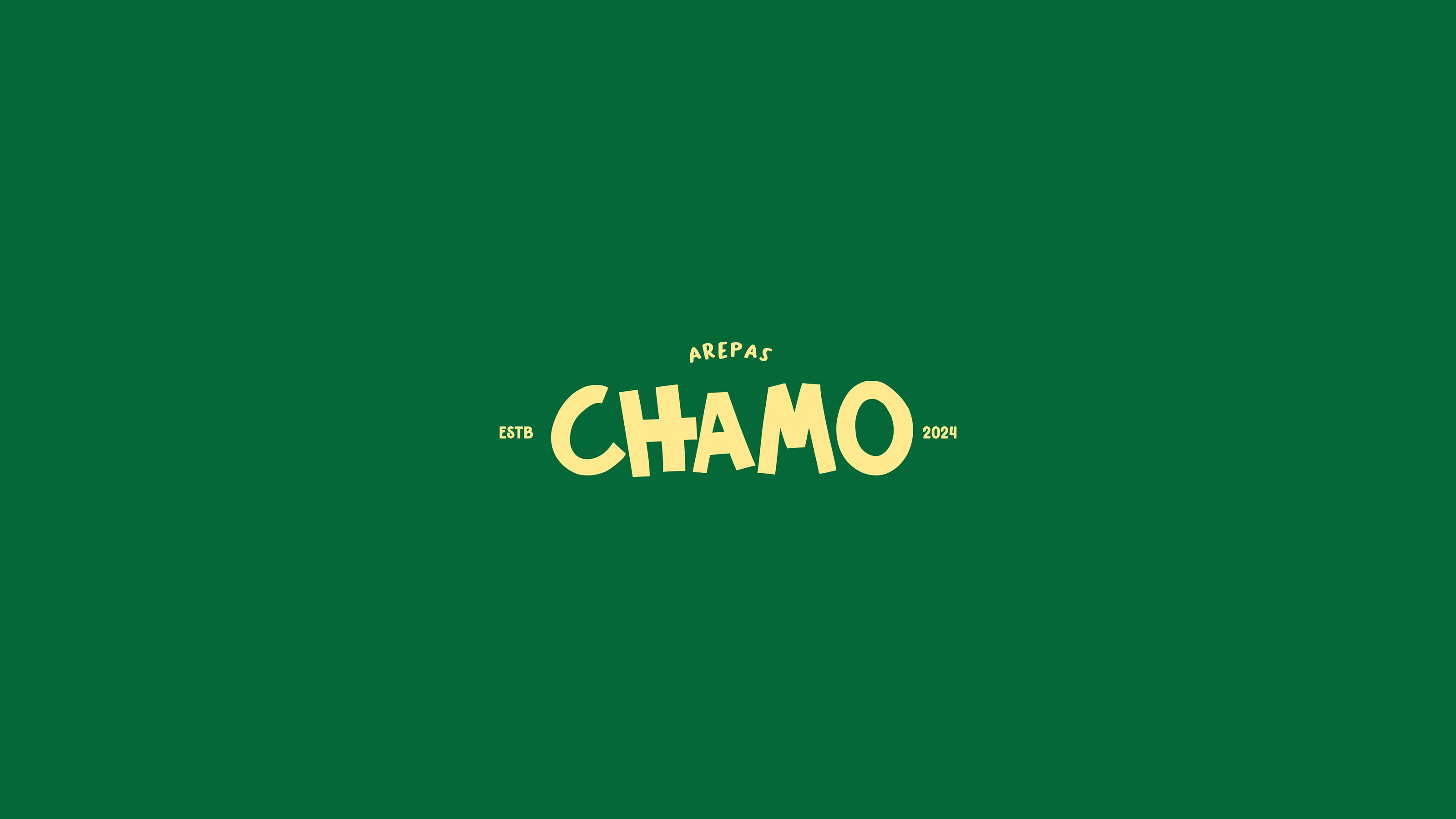
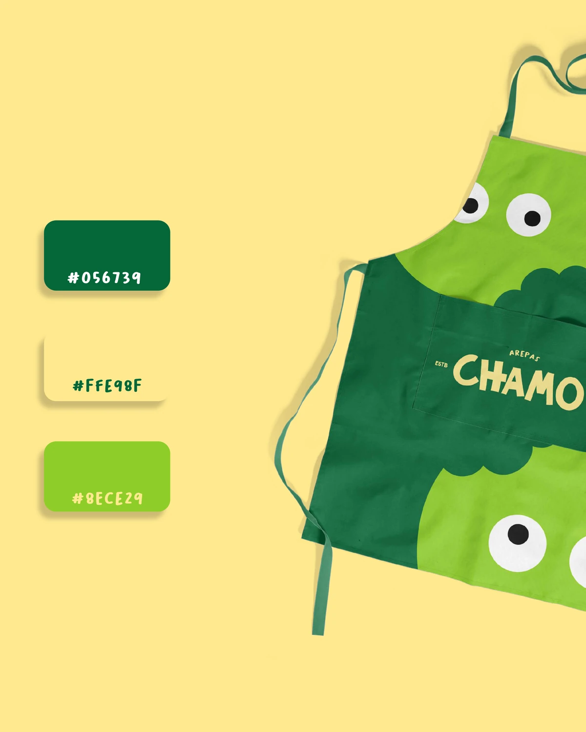
A deep green and a bright yellow carry everything, so even a plain paper bag looks like Chamo from a distance.
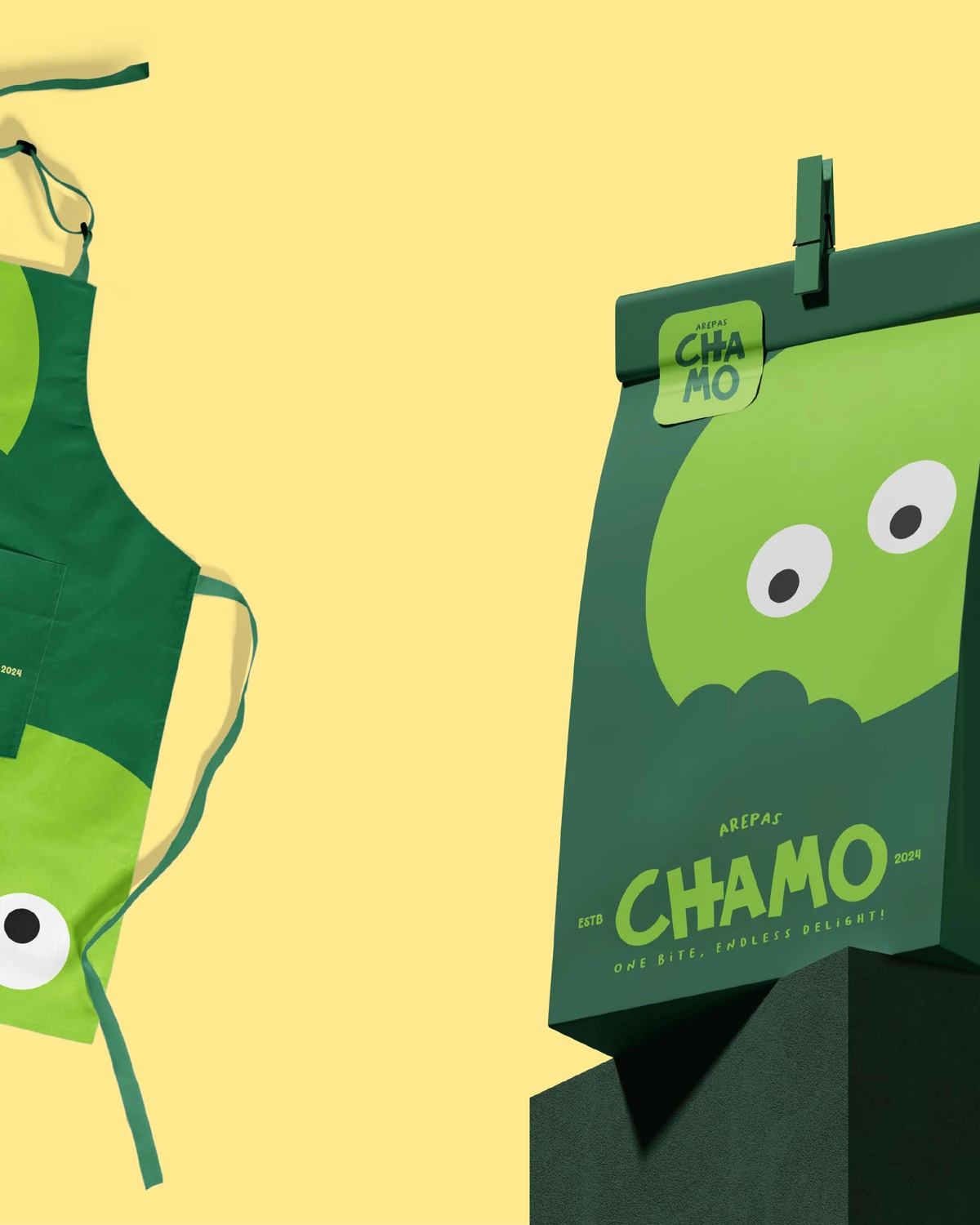
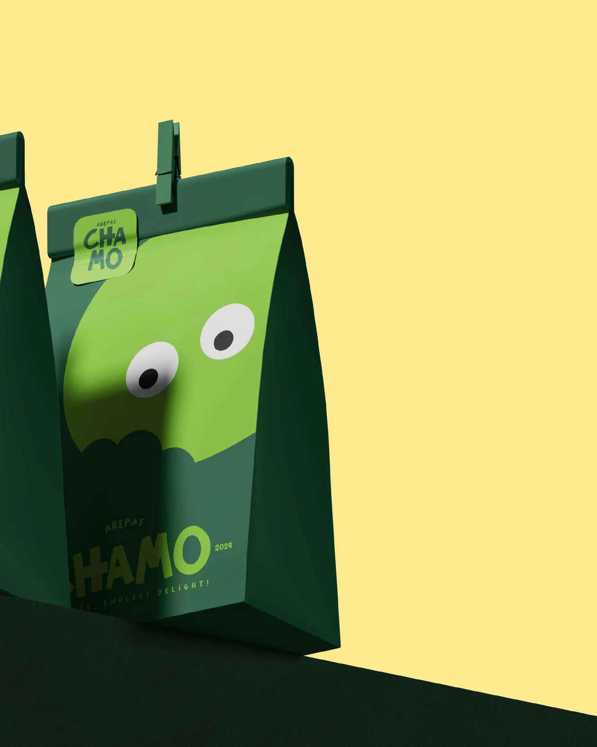
The character does most of the work. It sits large on the aprons the team wears and on the takeaway bags, so Chamo is the first thing you notice at the counter.
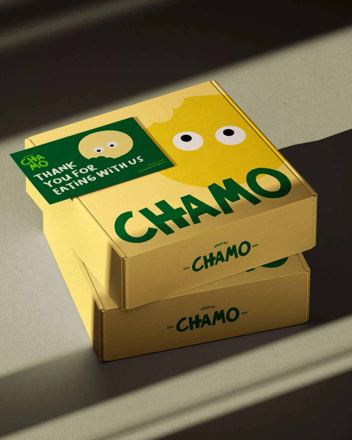
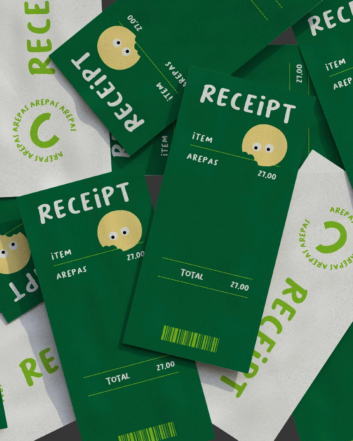
It carries through to the boxes and even the receipts, so every small thing that goes in the bag feels part of the same family.
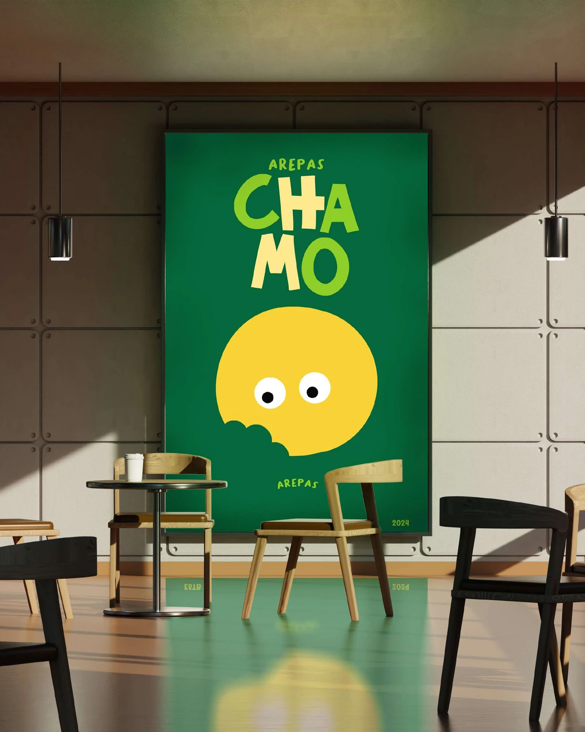
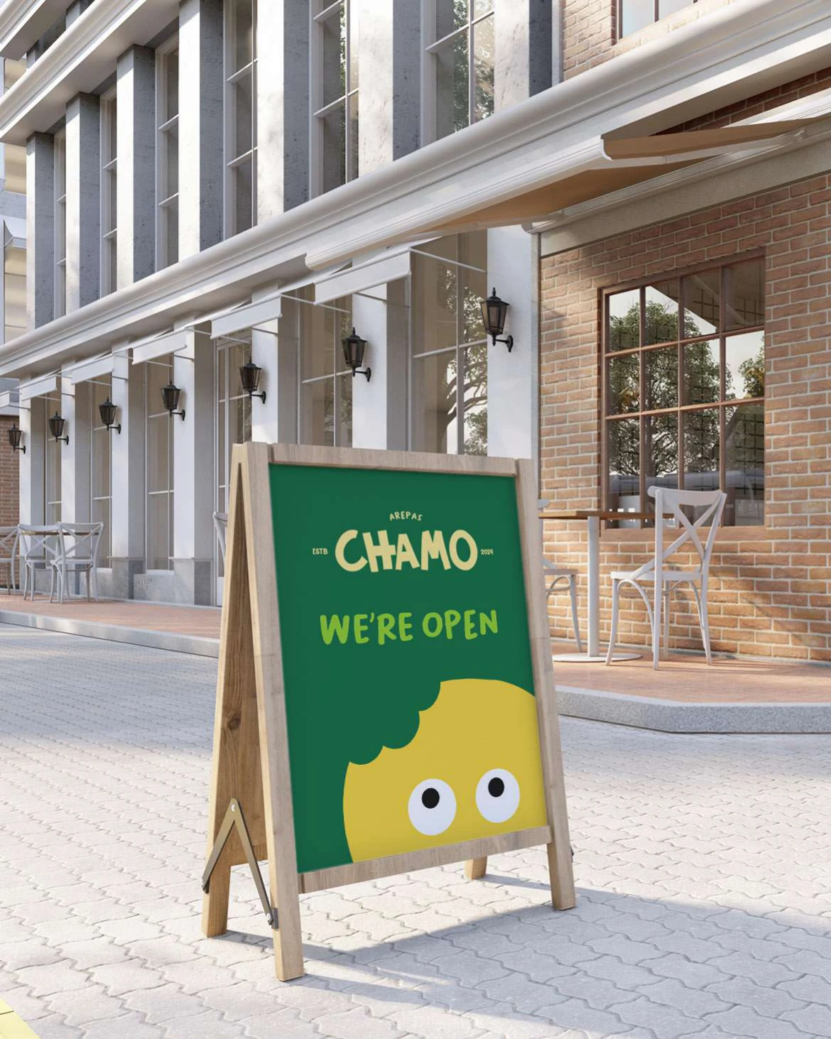
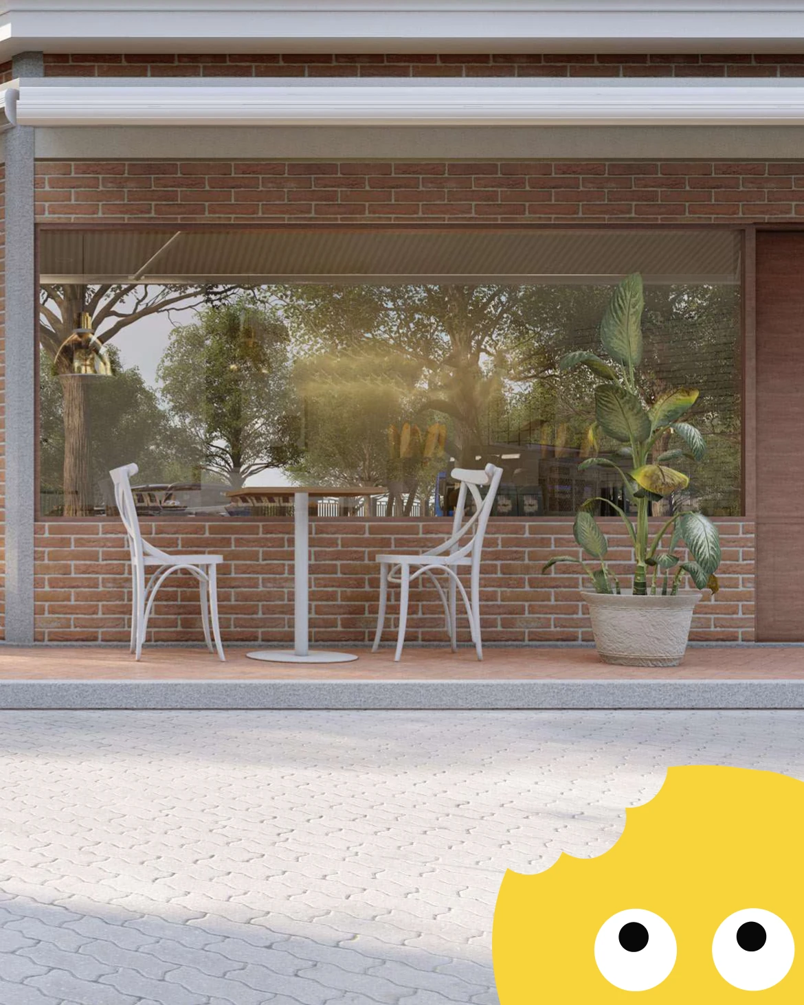
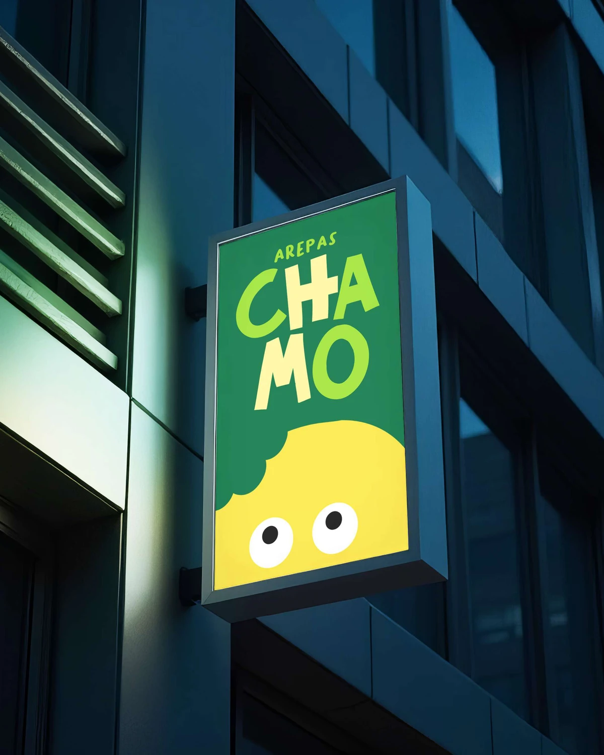
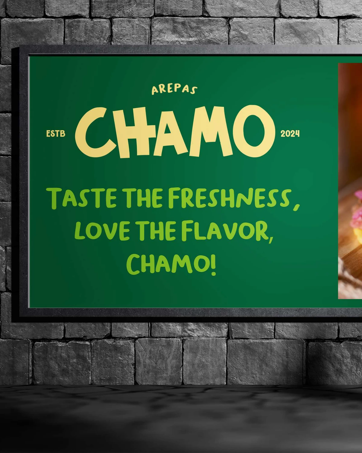
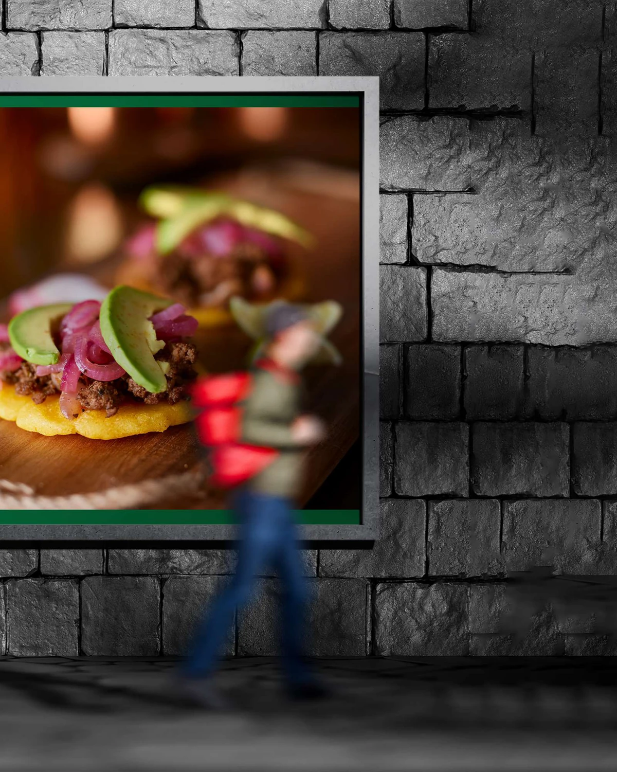
Out on the street the brand keeps the same warmth. Big type, bright colour and the character doing the work, whether it is a billboard, a pavement sign or the window itself.
Conclusion
Chamo ended up with a brand people recognise before they read the name. One friendly face, two strong colours, and a system that works on a paper bag and a billboard alike.
Brandlic's Contribution
- Brand Strategy
- Visual Identity & Character
- Colour System
- Packaging Design
- Signage & Environmental