Branding
MELTD
Overview
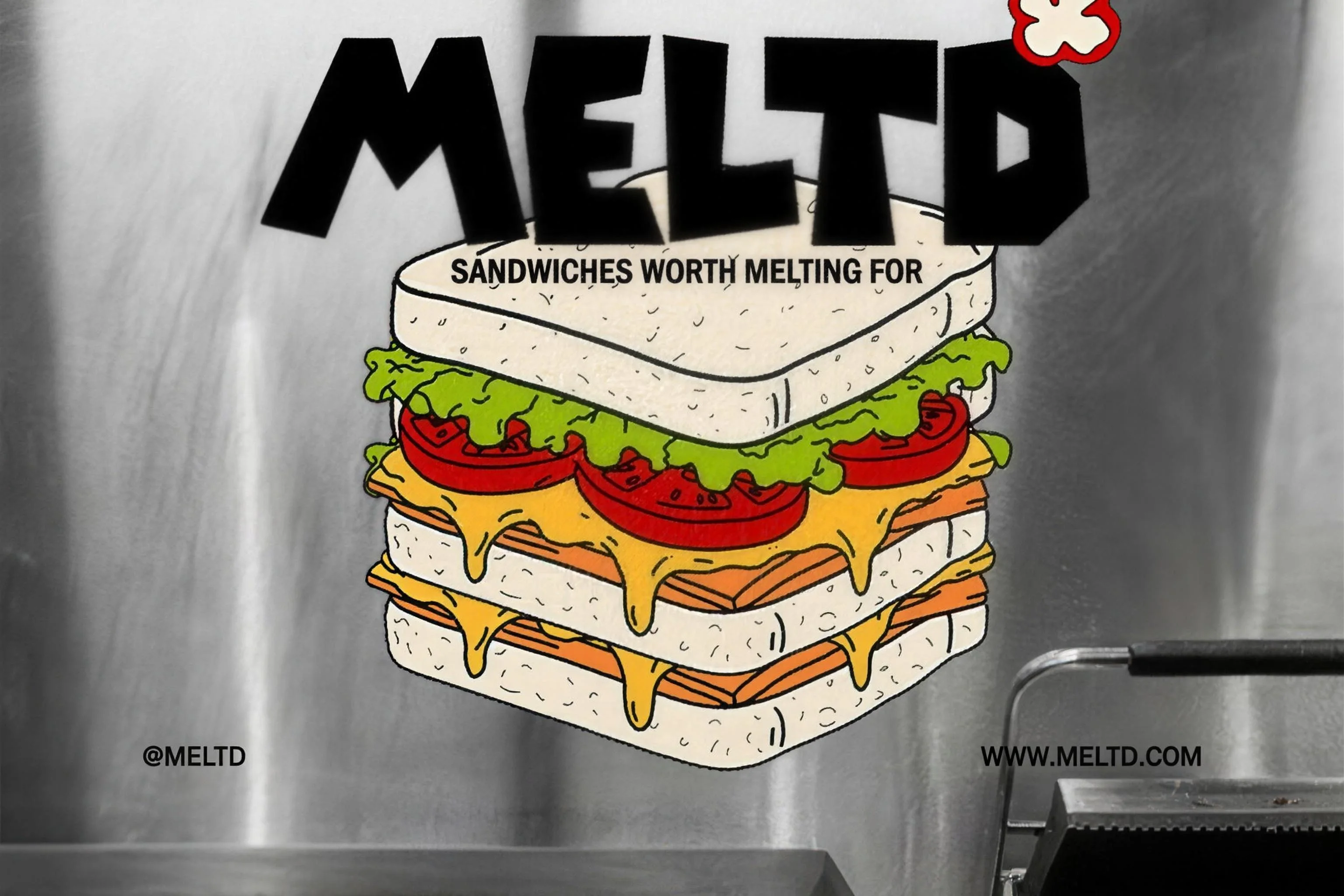
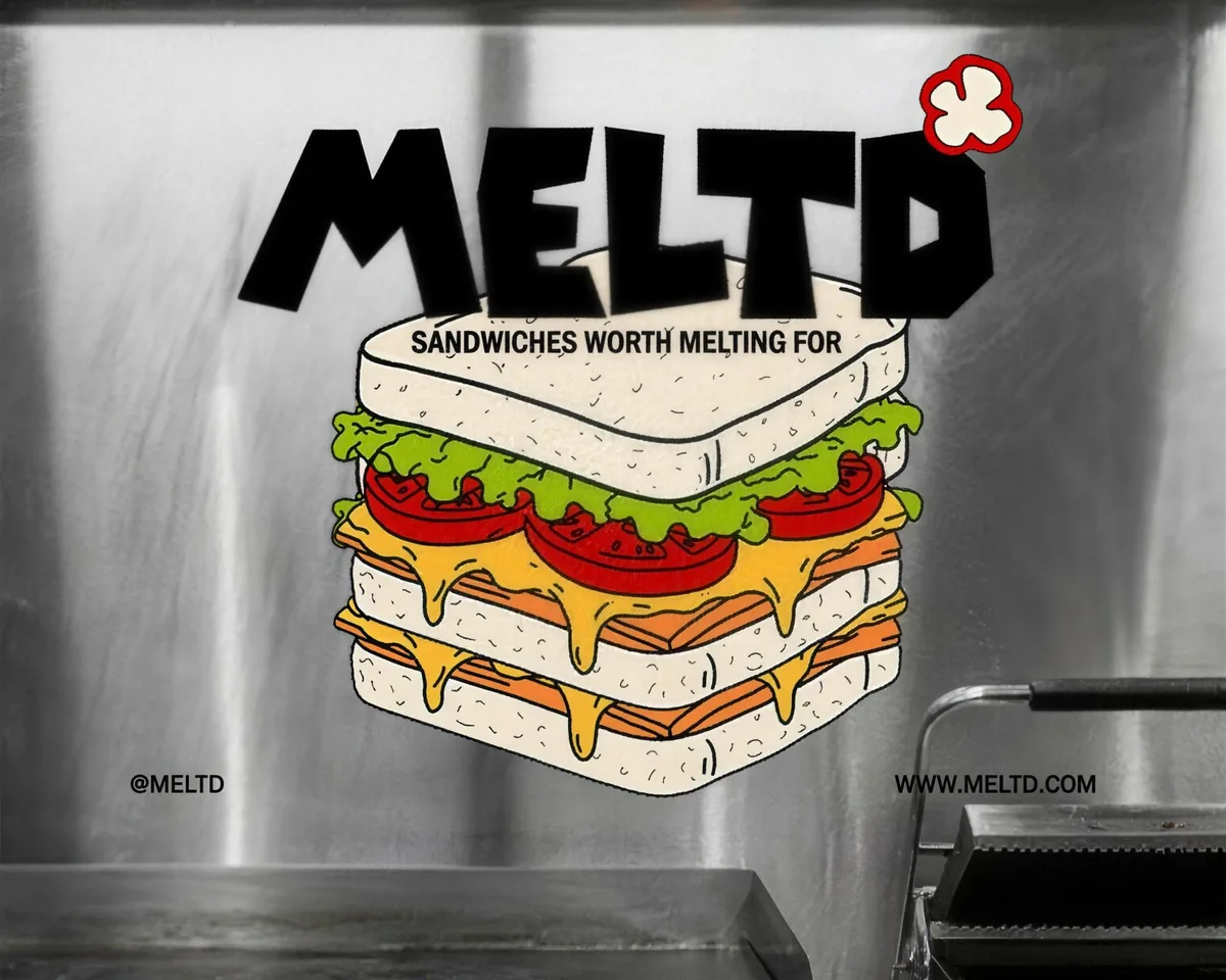
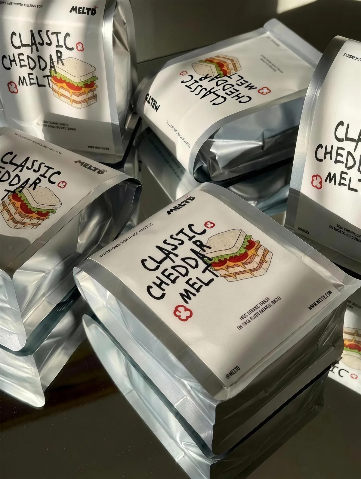
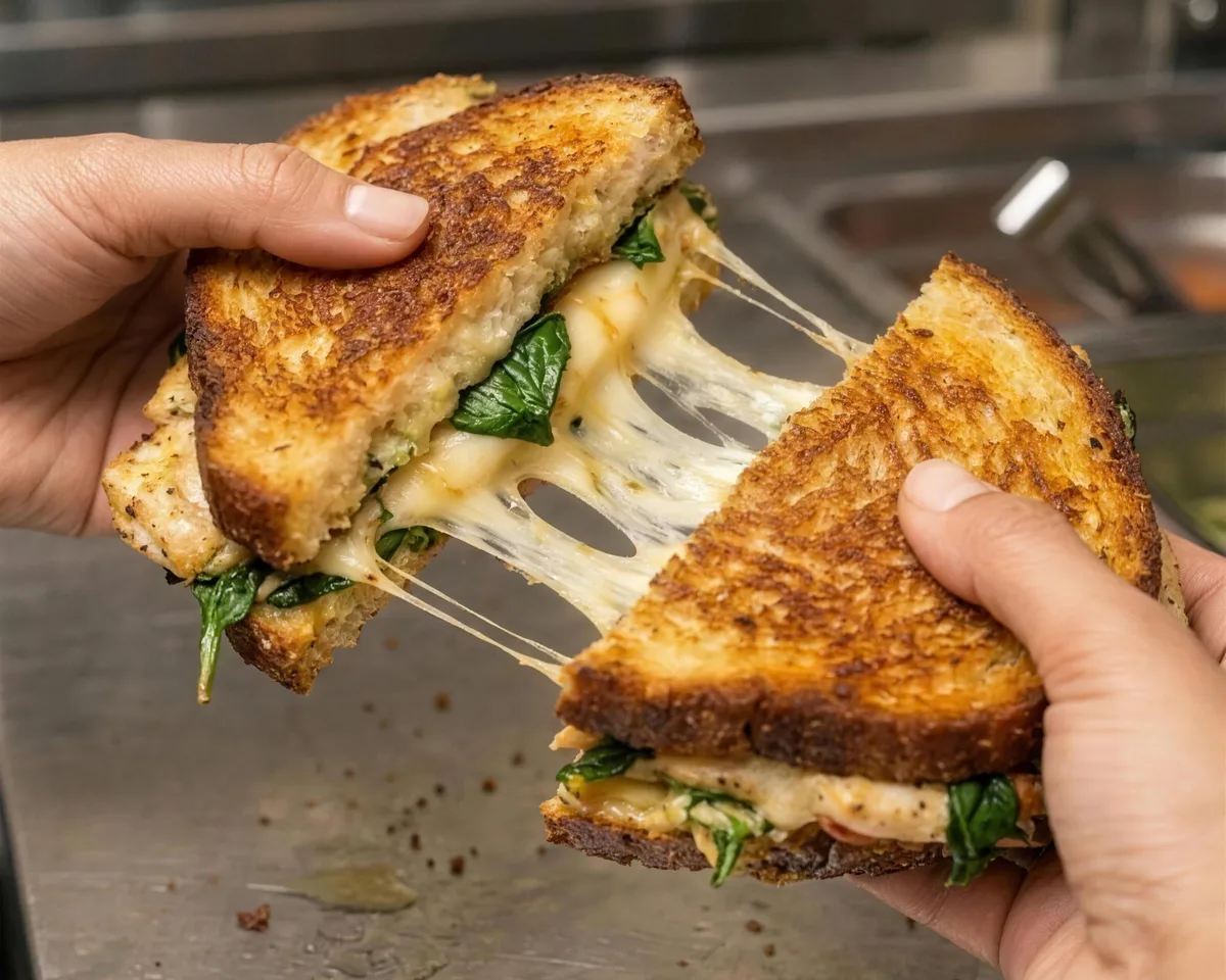
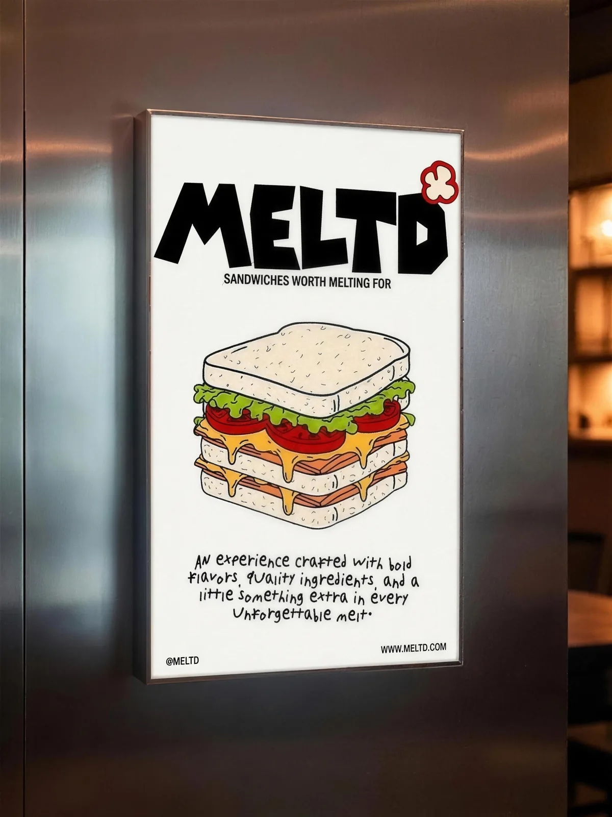
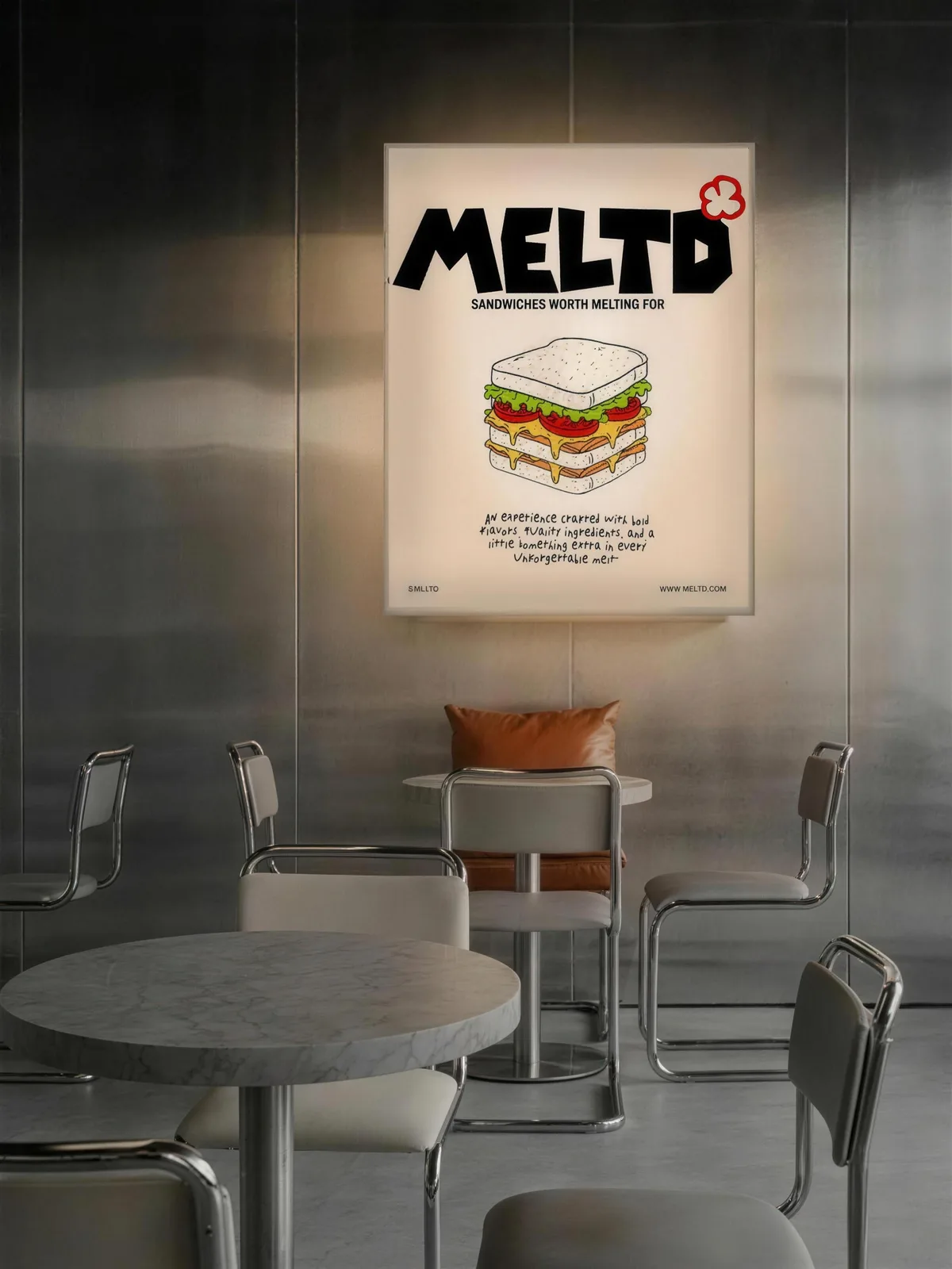
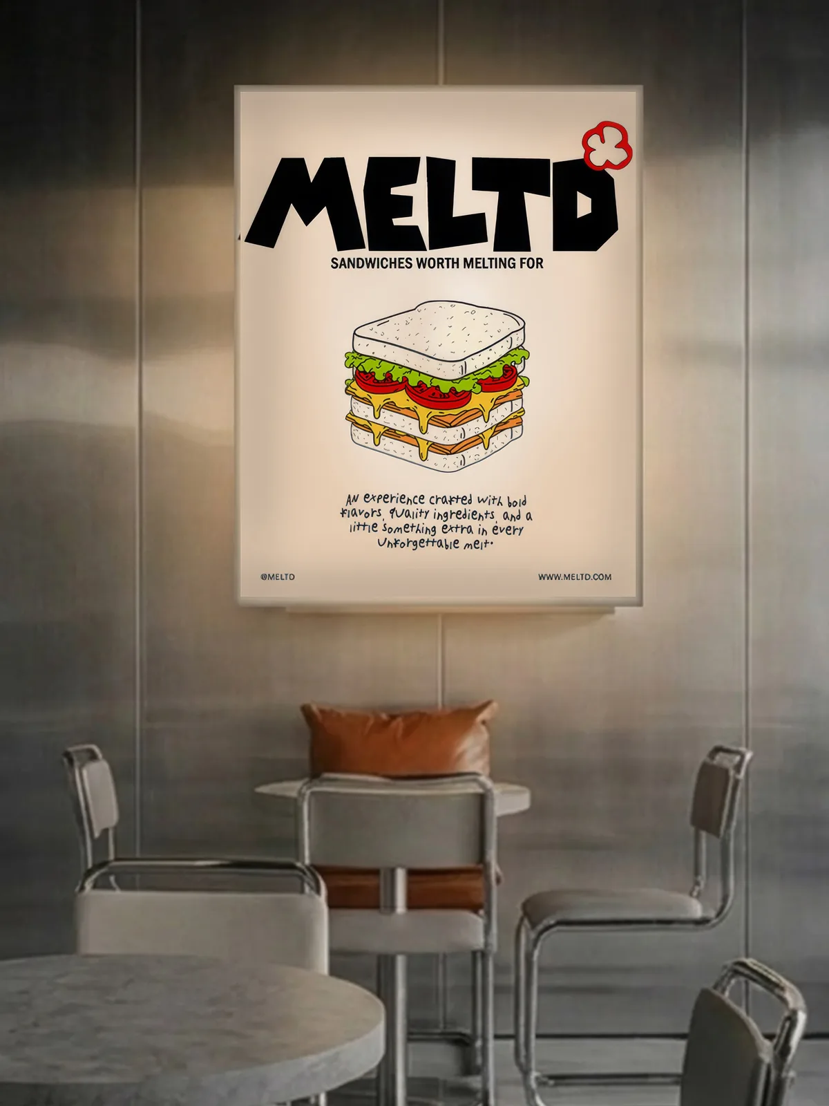
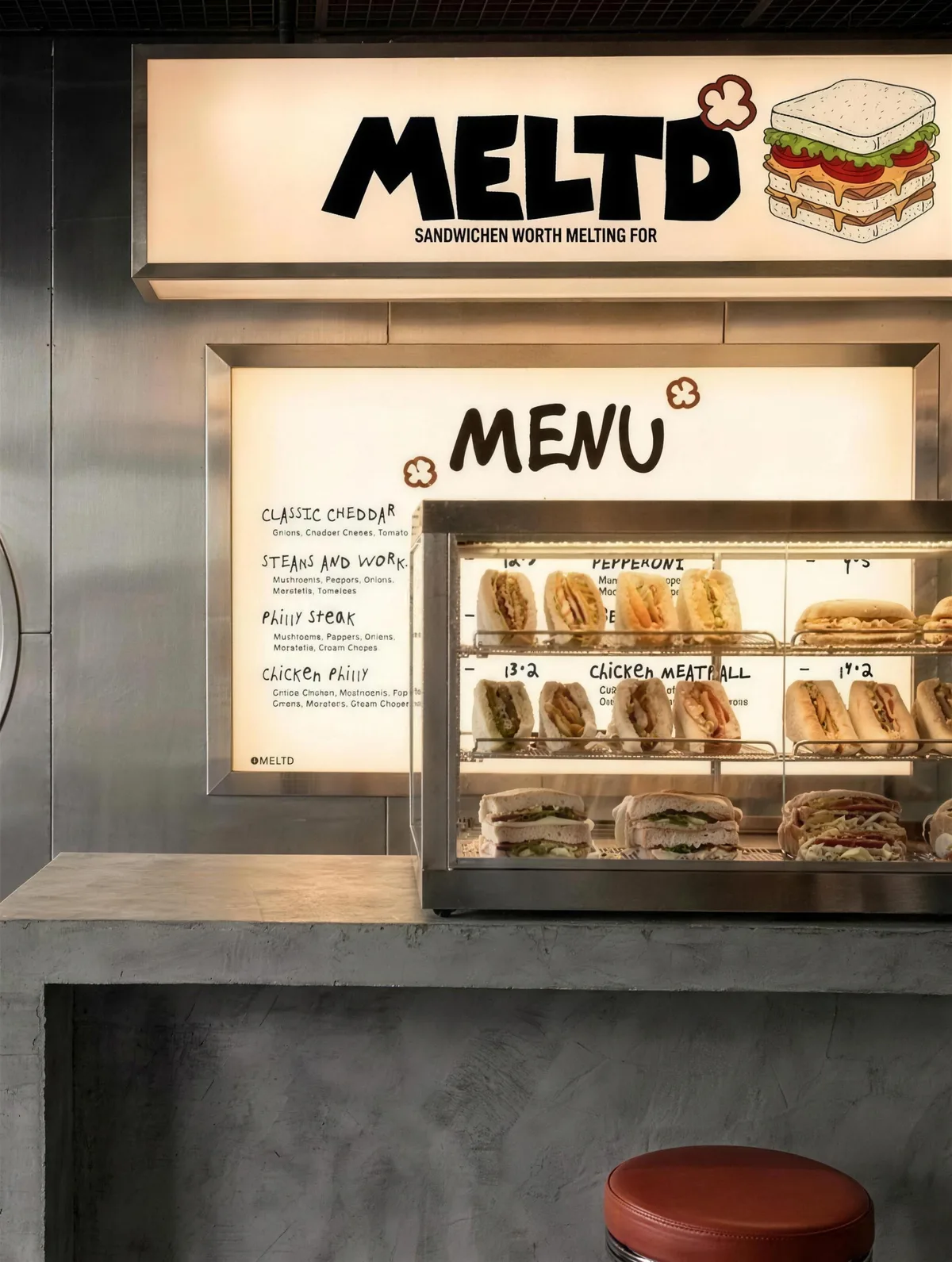
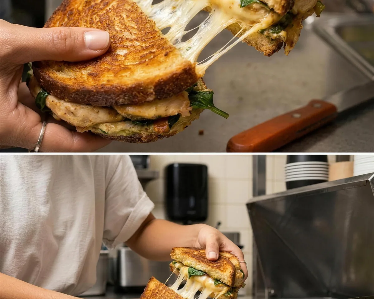
Meet MELTD, where every bite melts into experience. The identity is built around a hand-drawn sandwich, kept deliberately raw and expressive.
Everything grows from one idea: draw it by hand and let the personality show.
Sandwich shops usually pick one of two costumes: the deli, all script and checkerboard, or the clean fast-casual system with a rounded sans and a flat icon. Both are legible and neither is memorable.
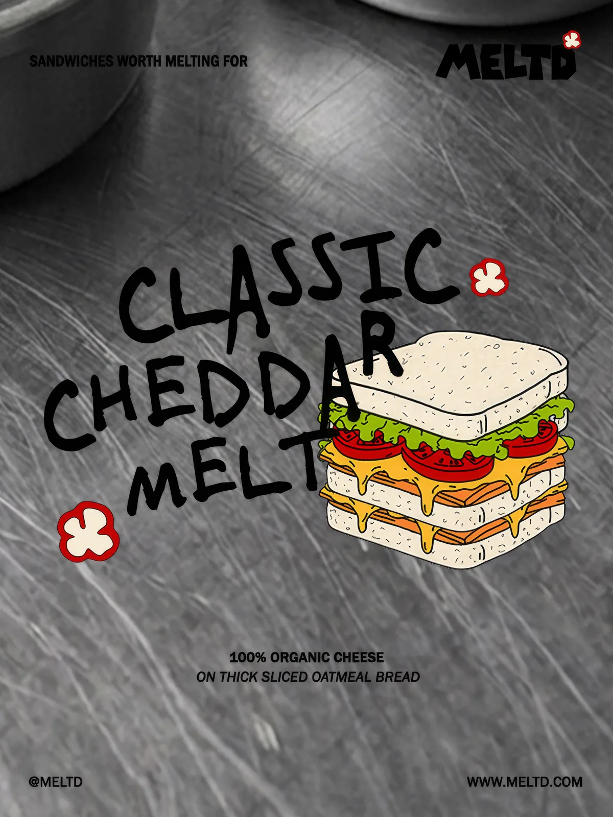
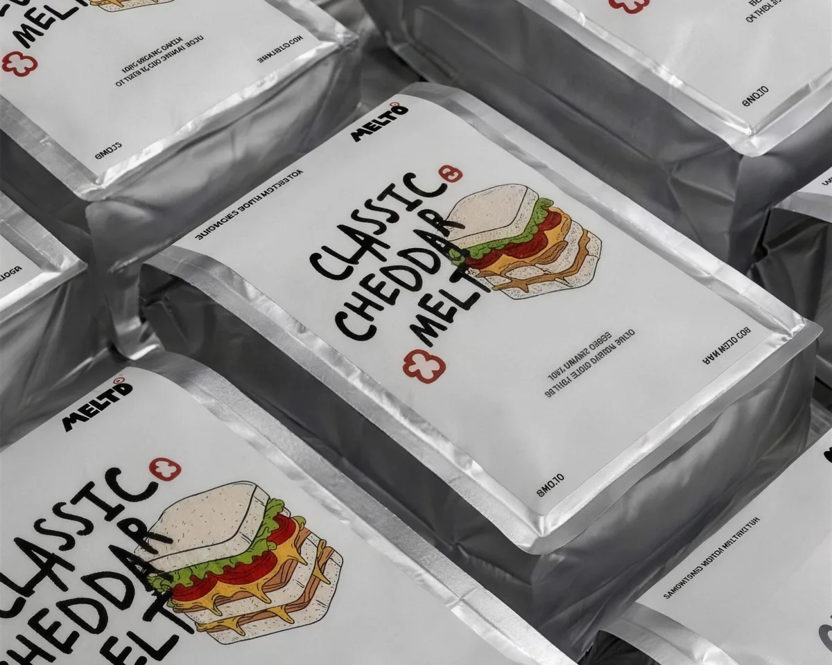
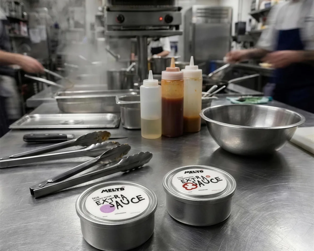
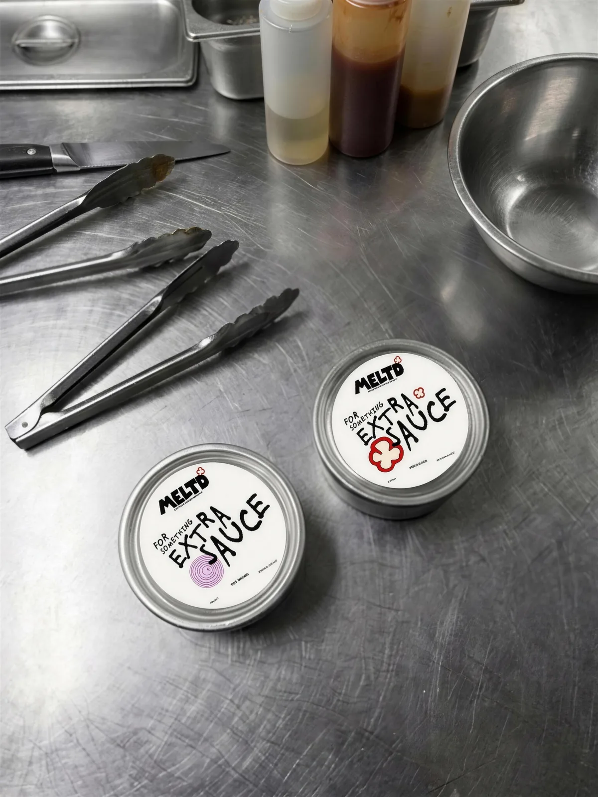
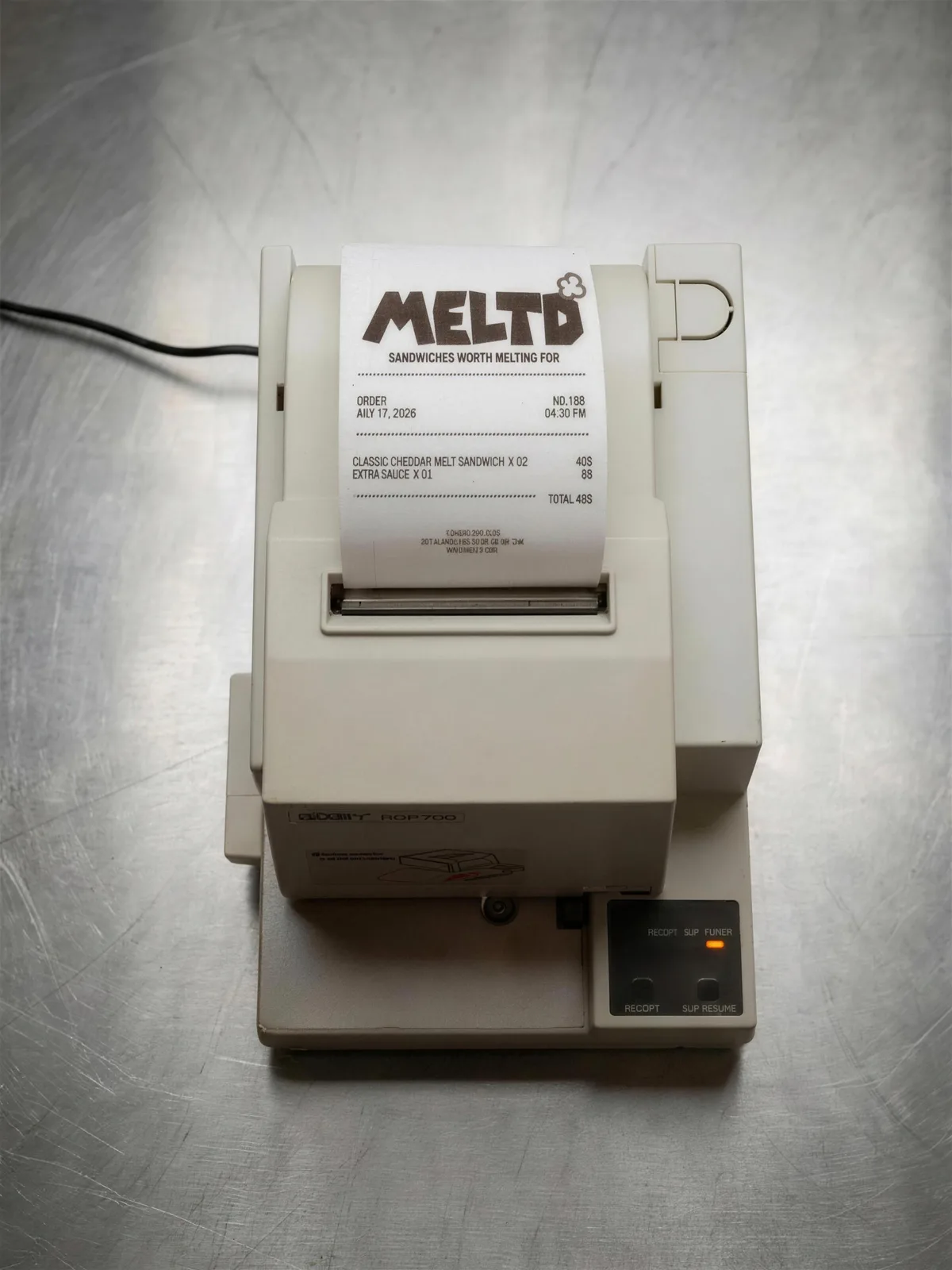
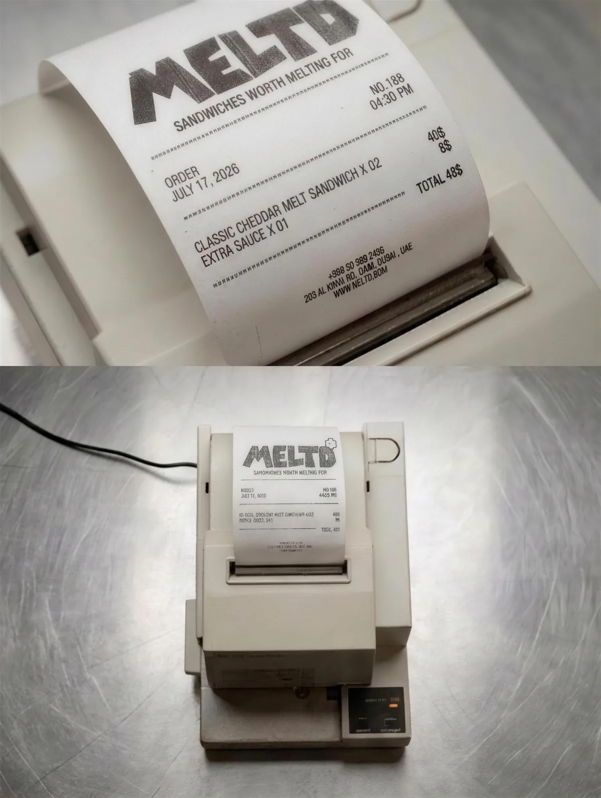
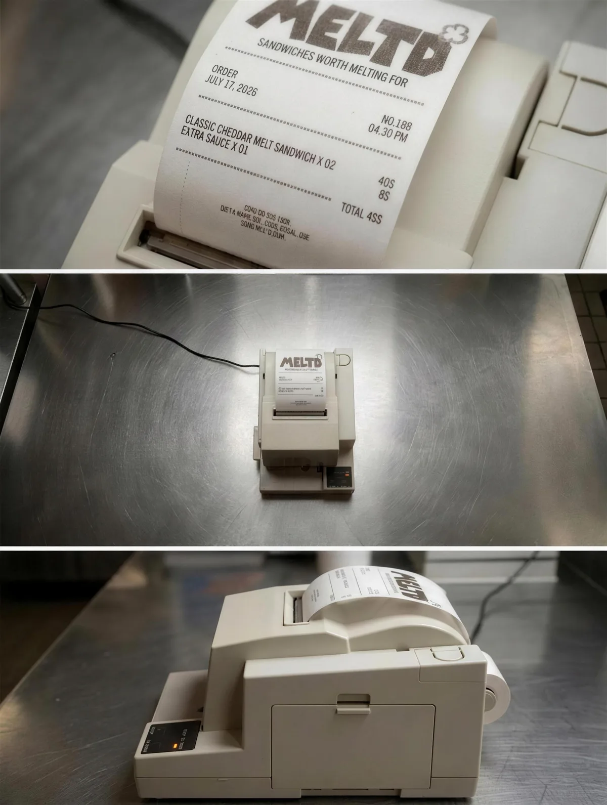
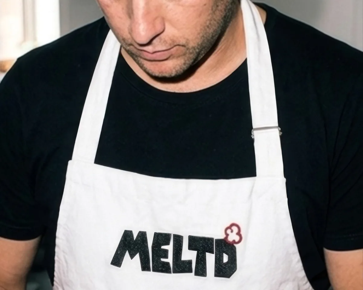
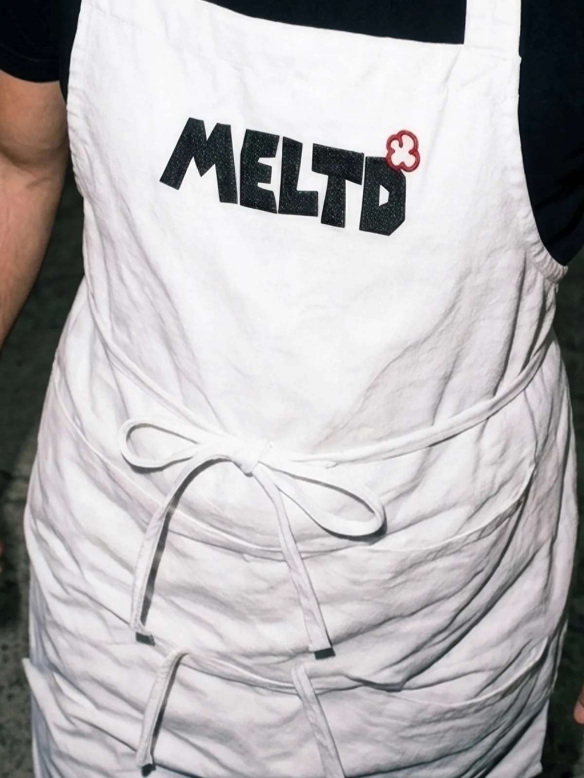
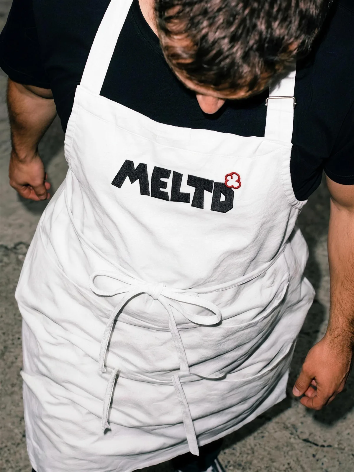
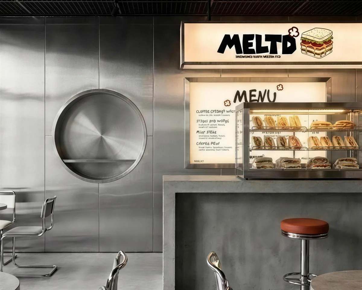
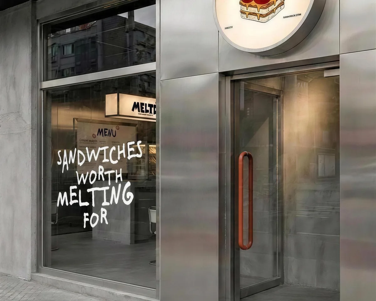
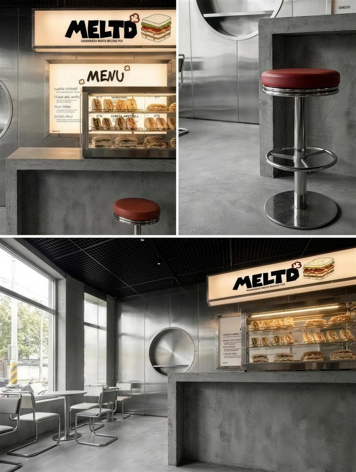
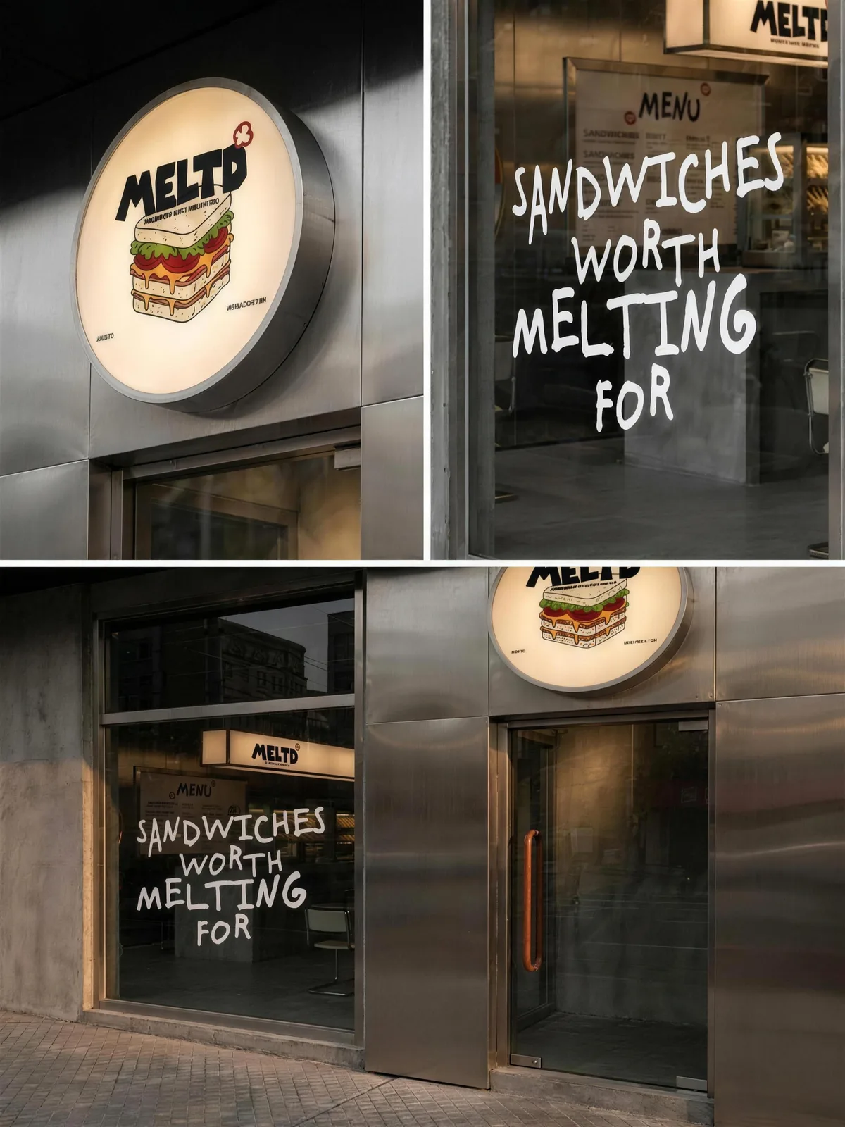
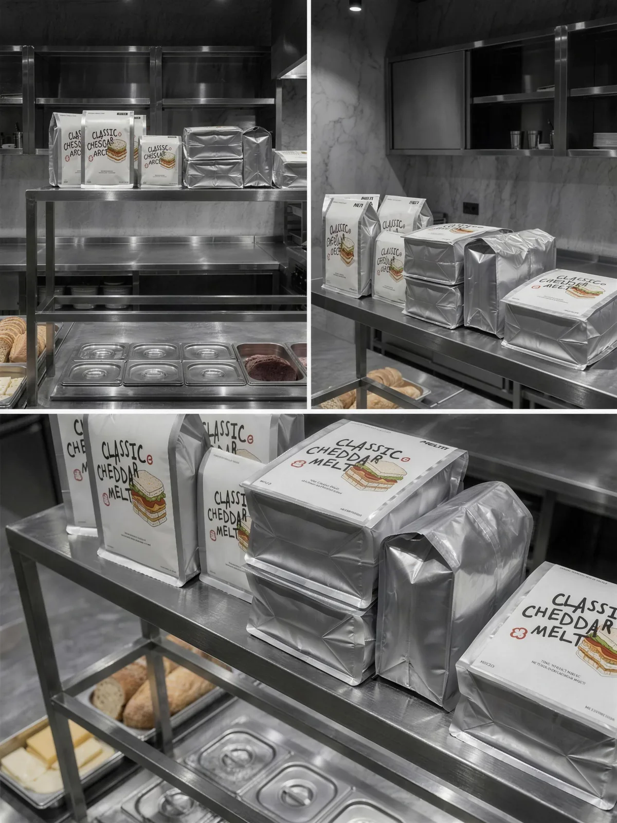
MELTD needed to be unmistakable at a glance, but it also had to sit on stainless steel all day, print on a foil wrapper, screen onto an apron and come out of a receipt printer without losing its character.
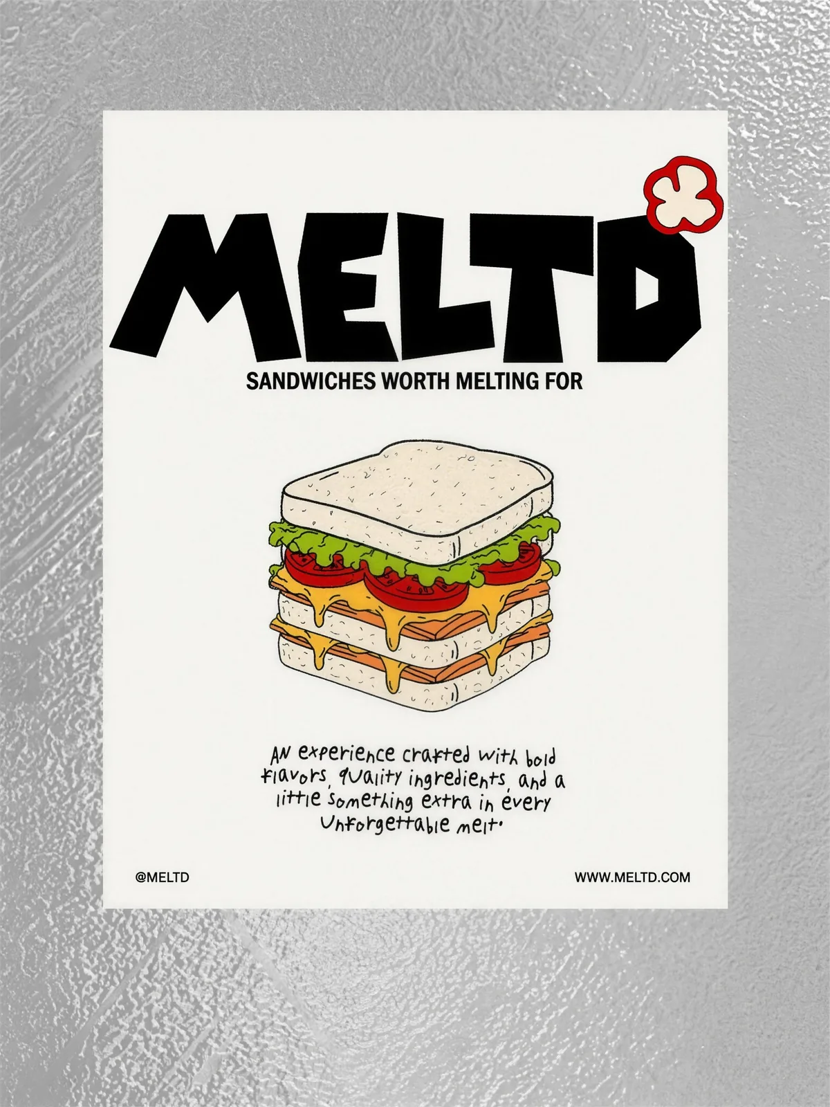
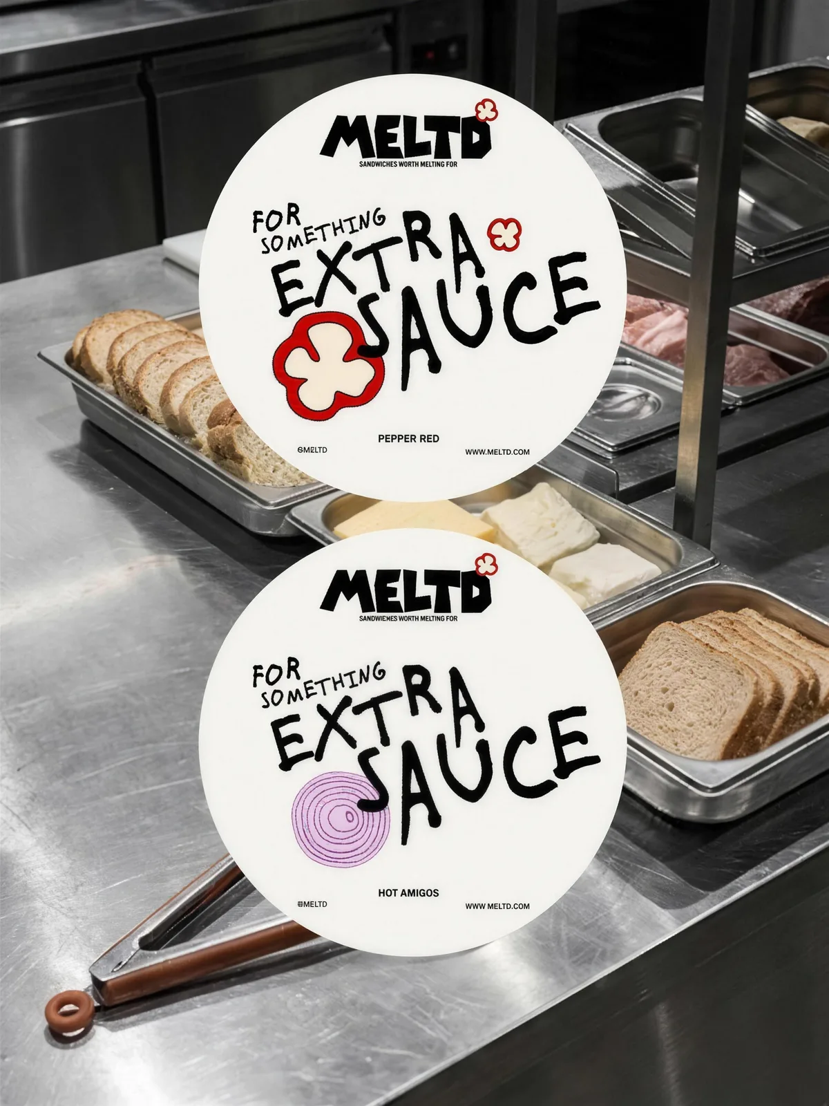
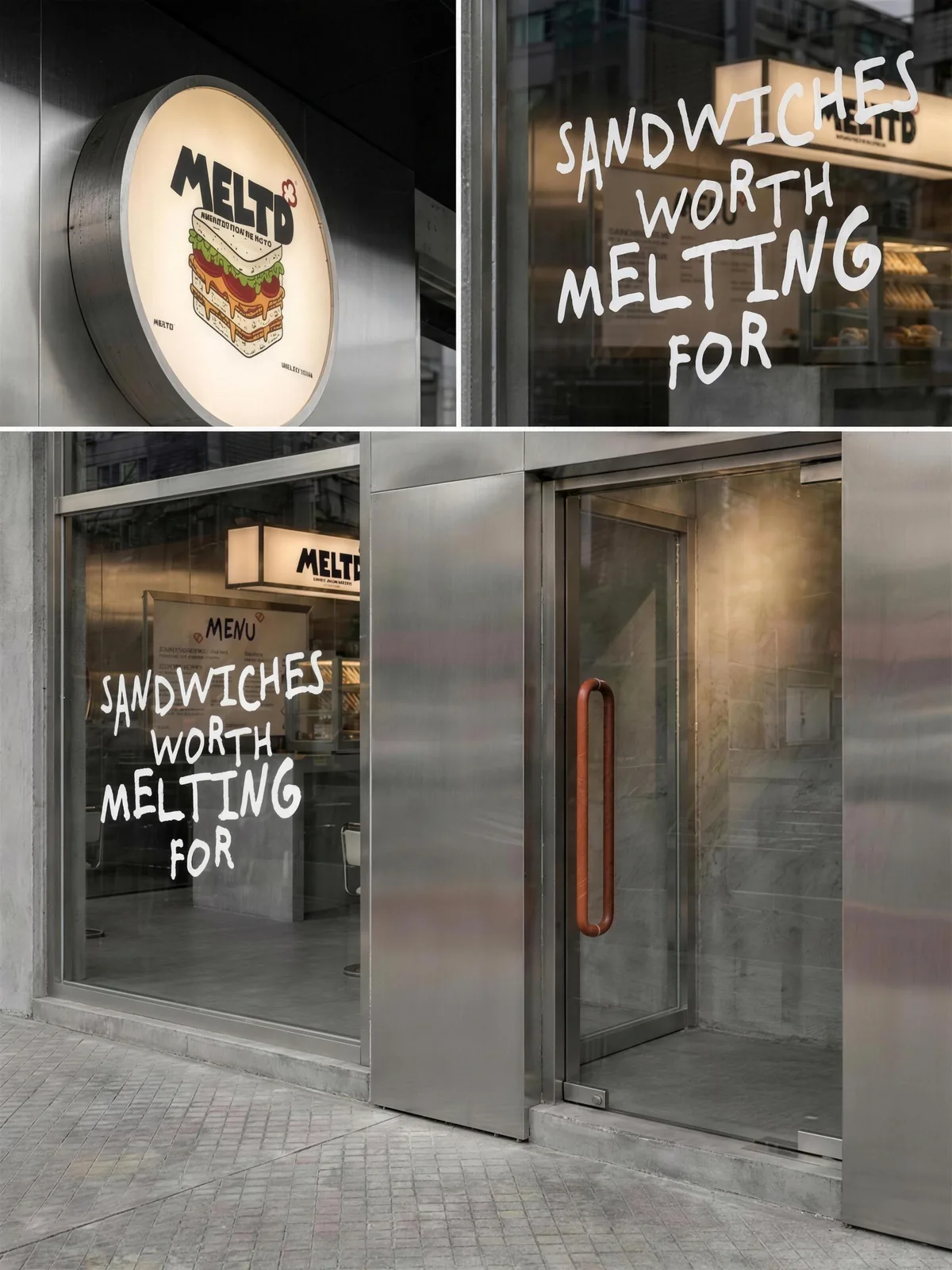
The wordmark is a heavy condensed display letter with the D cut through, so the name reads as one solid block. A small red flower sits at the shoulder as a mark that can stand alone on a sauce lid or a cup seal.
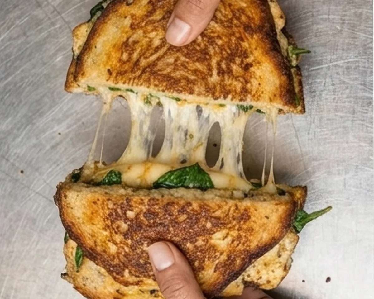
The sandwich is drawn by hand and never redrawn to be neat. Its wobbling outline and uneven fill are the point: it is the one thing in the system that no competitor can copy without it looking borrowed.
Everything else gets out of the way. Black type, white stock, one red accent, and the kitchen's own stainless steel doing the work a second colour usually would.
Conclusion
MELTD now reads as one hand across a poster, a wrapper, an apron and a receipt. Bold, distinctive, and unmistakably itself.
Brandlic's Contribution
- Brand Strategy
- Visual Identity & Logo
- Illustration System
- Packaging & Print
- Signage & Uniform
- Art Direction