Branding
Jona Coffee
Overview
Jona Coffee is a neighbourhood cafe. The identity is built around slow mornings, warm pastries and the comfort of a place you already know.
Everything grows from one idea: draw it by hand, so it feels made rather than specified.
Cafe branding tends to arrive fully grown up: a tight monogram, a serif, a lot of white space and a promise about the roast. It photographs well and says very little about what the room actually feels like.
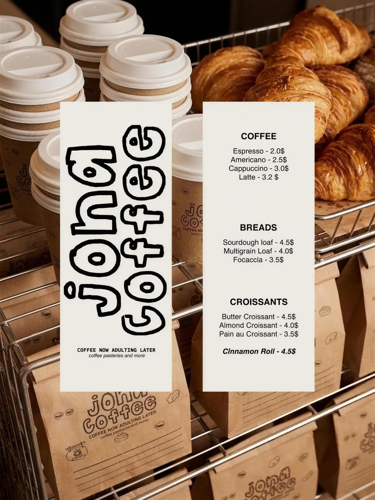
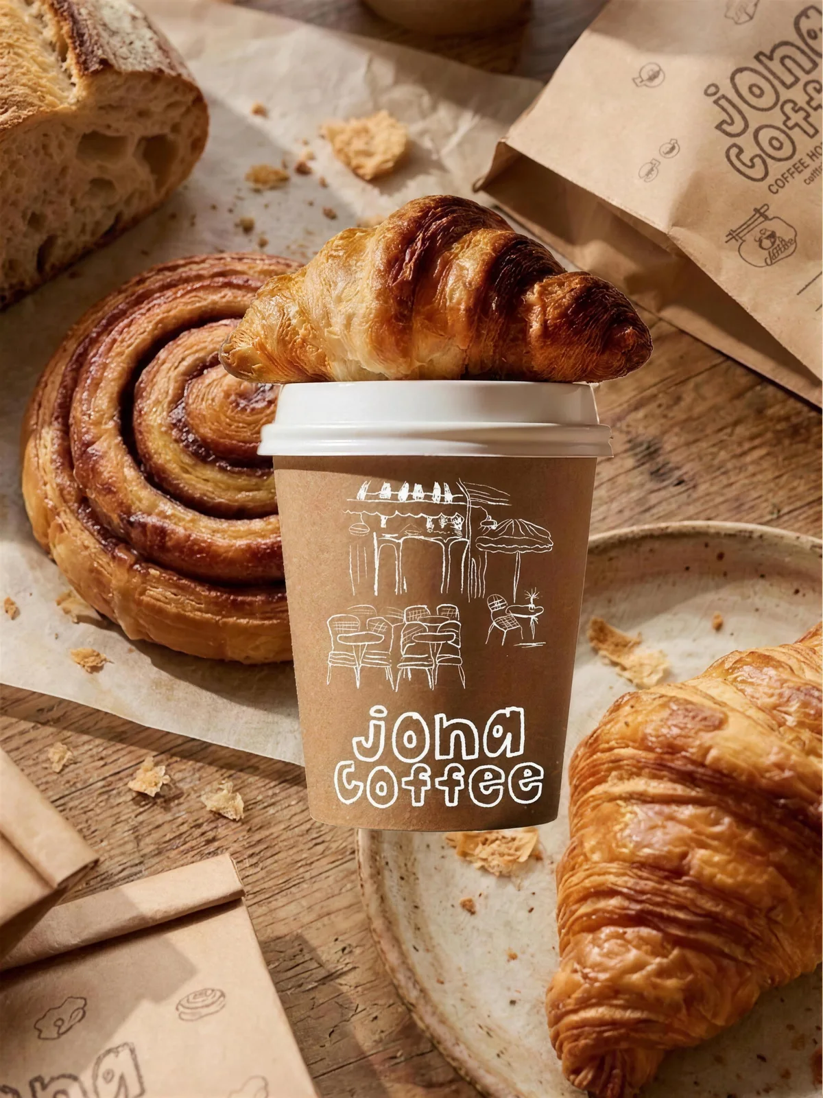
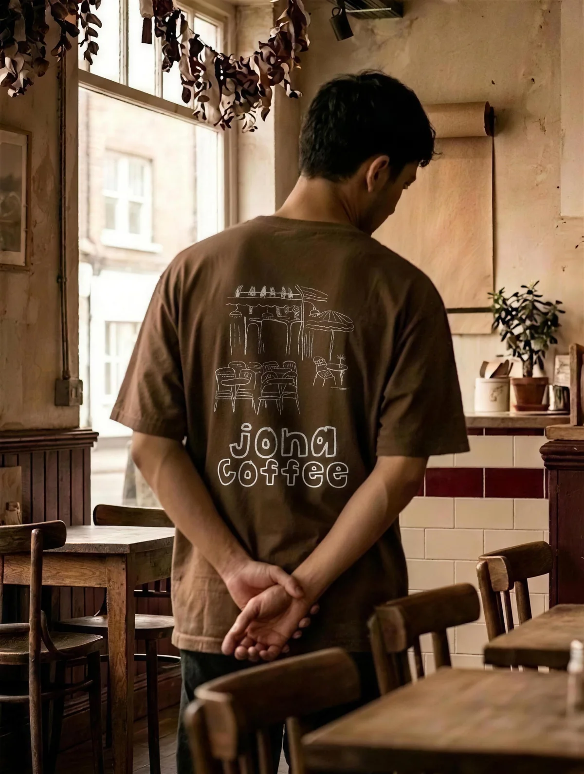
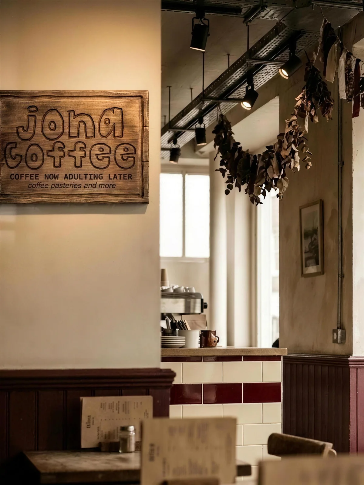
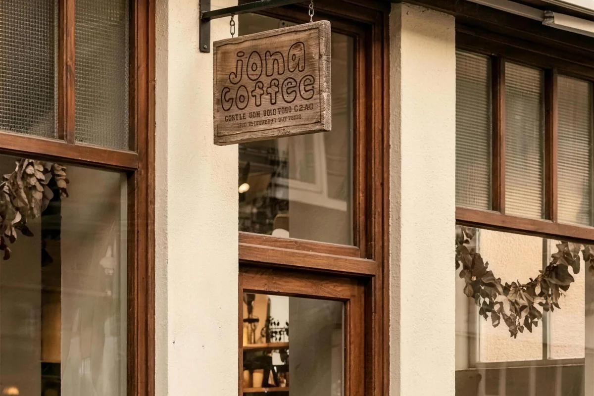
Jona needed the opposite, warmth and character without tipping into novelty, and it had to survive being printed on kraft board, screened onto a tee, routed into a hanging sign and set on a price list.
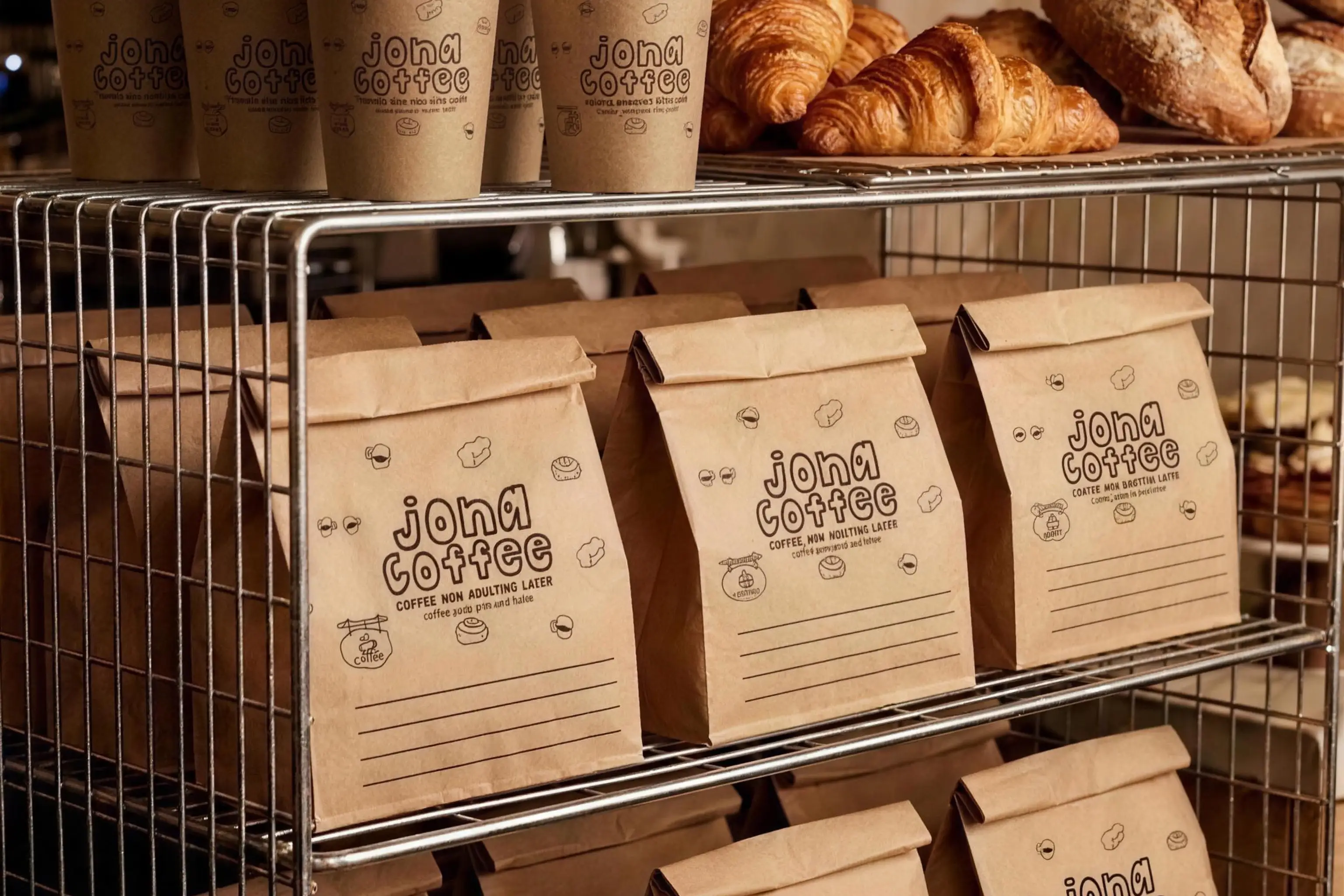
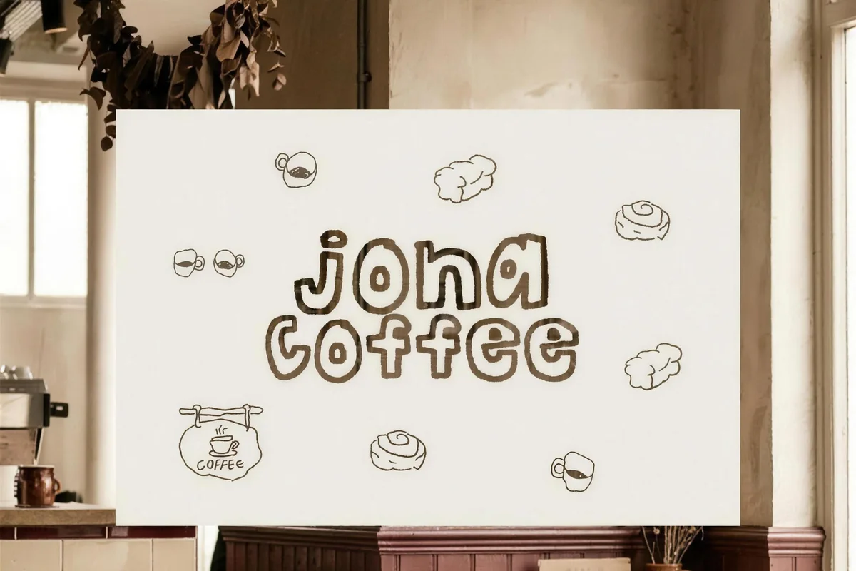
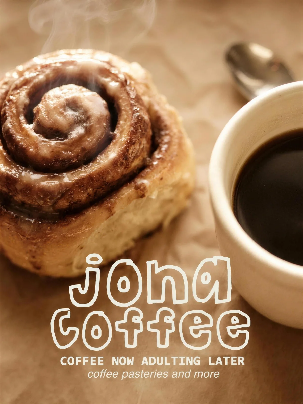
The wordmark is drawn by hand in a soft rounded display letter, with the counters left slightly uneven so it never reads as a typeface someone chose. It sets on two lines and holds together at the size of a cup seal.
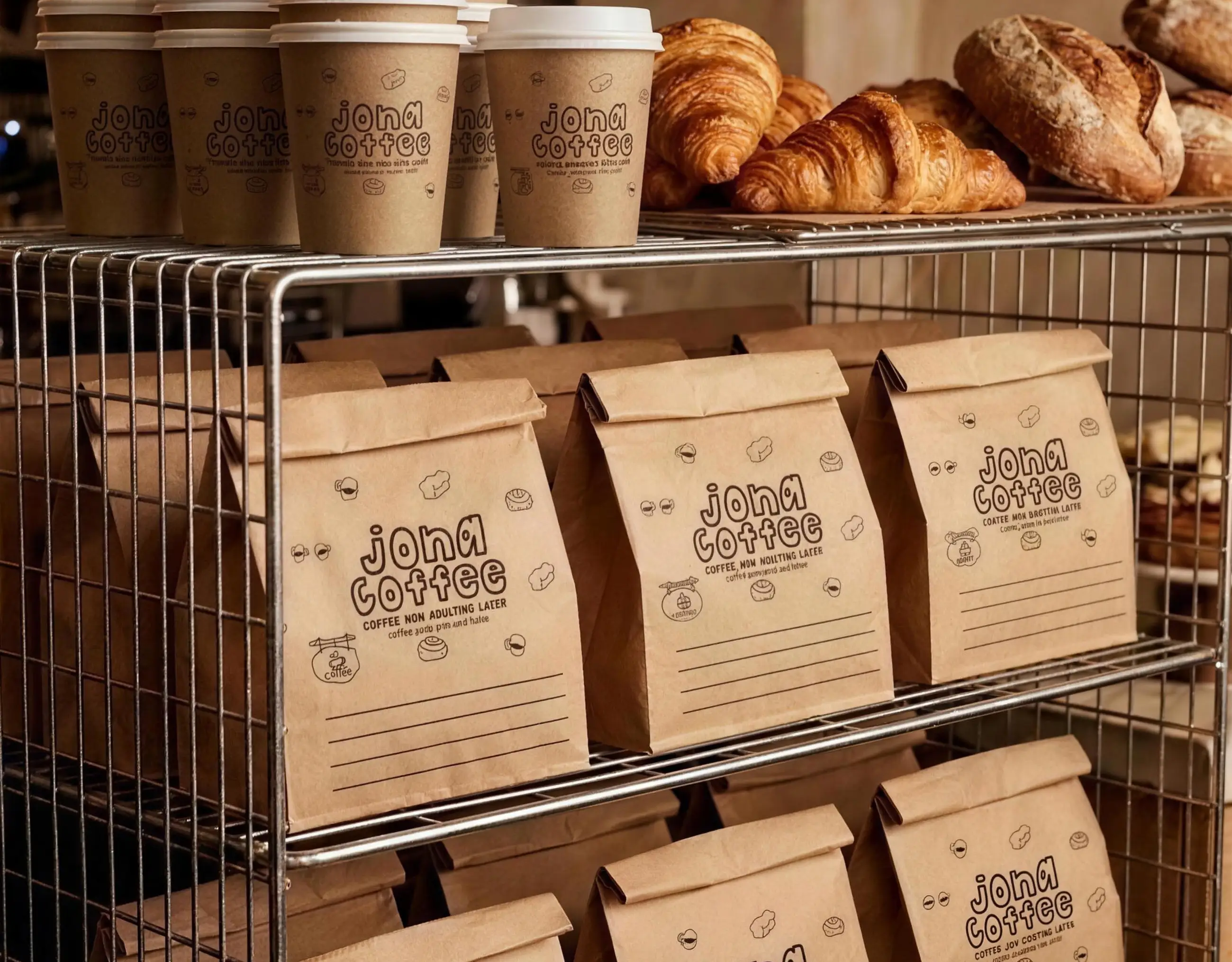
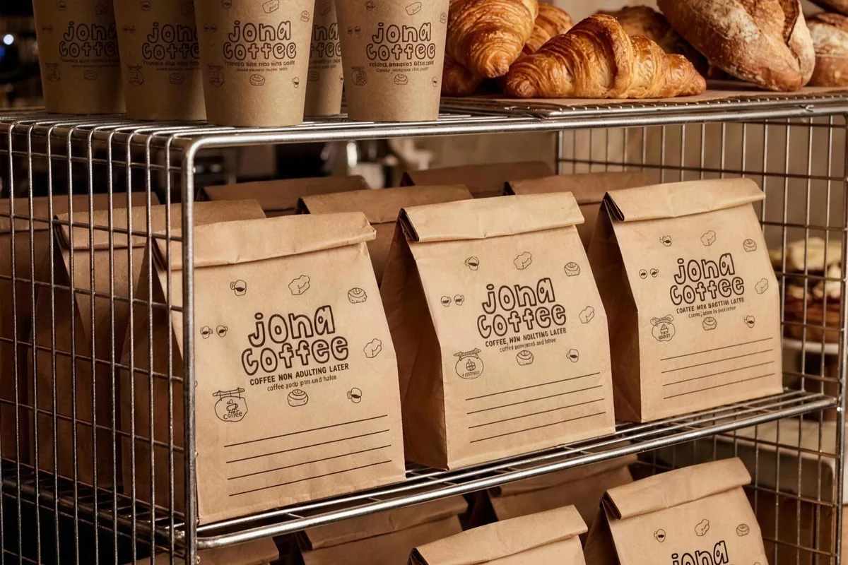
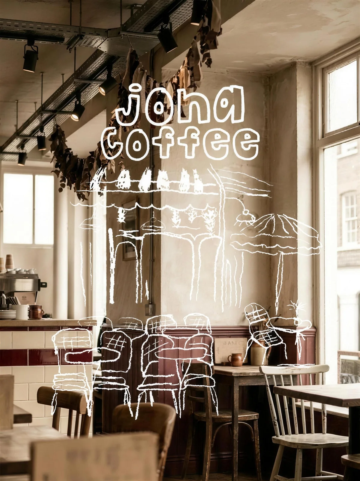
Around it sits a family of single-line illustrations, cups, chairs, pastries and awnings, drawn in the same weight as the wordmark so any of them can stand in for the brand when the name is already on the piece.
Warm browns and kraft carry it. Nothing is coated, nothing is bright, and the texture of the board is left doing the work that a second colour usually would.
Conclusion
Jona now reads as one hand across a bag, a cup, a sign and a shirt. The drawings change with the season; the hand behind them does not.
Brandlic's Contribution
- Brand Strategy
- Visual Identity & Logo
- Illustration System
- Packaging & Menu Design
- Signage & Merchandise
- Art Direction