Branding
Gypsy
Overview
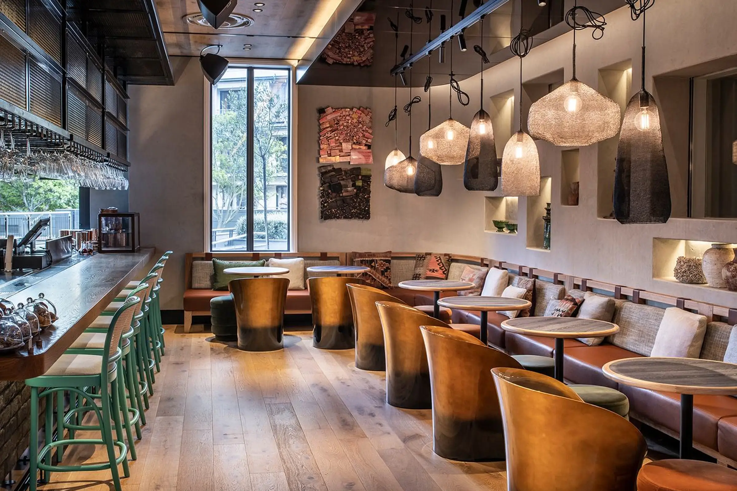
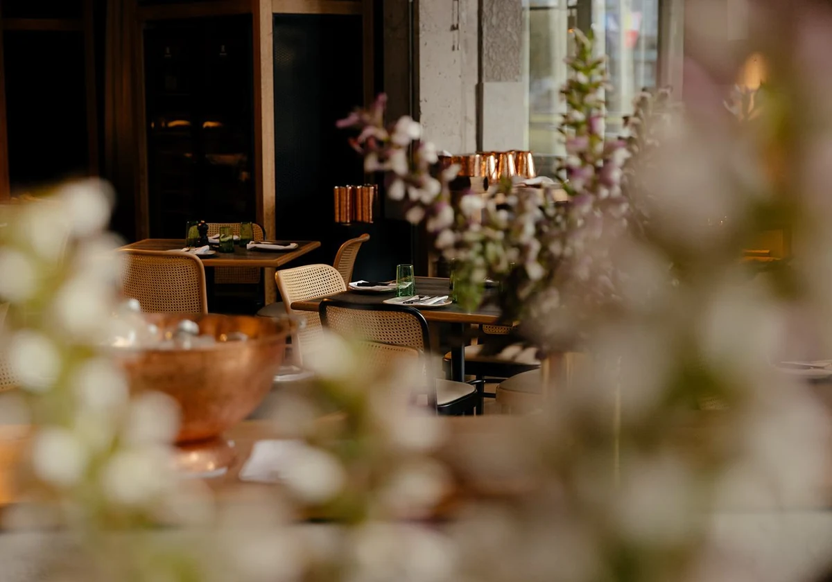
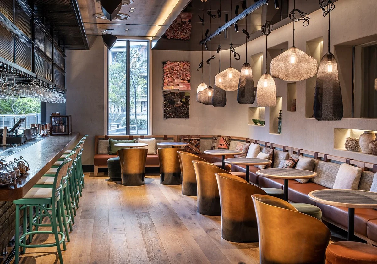
Gypsy is a restaurant. The brand had to feel like the room it belongs to, warm, unhurried and a little handmade, rather than like a logo applied to a restaurant.
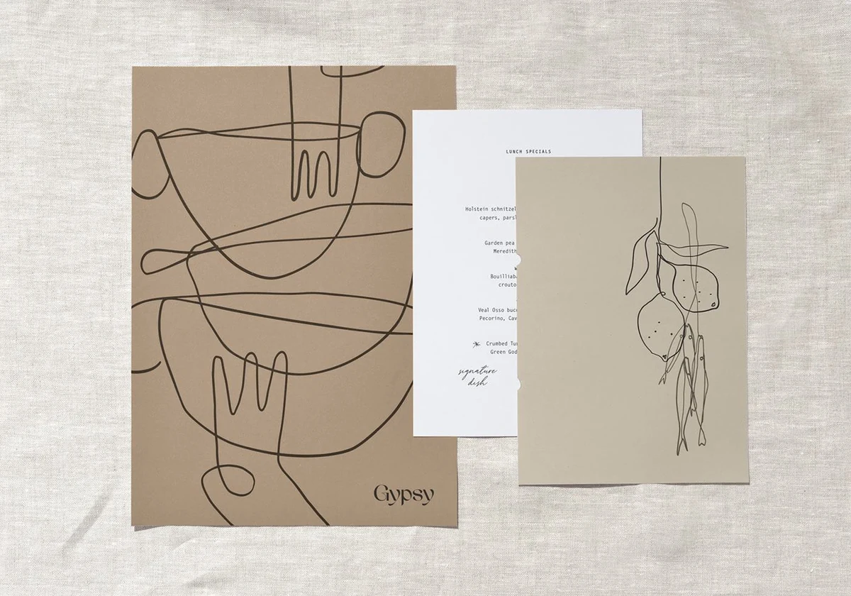
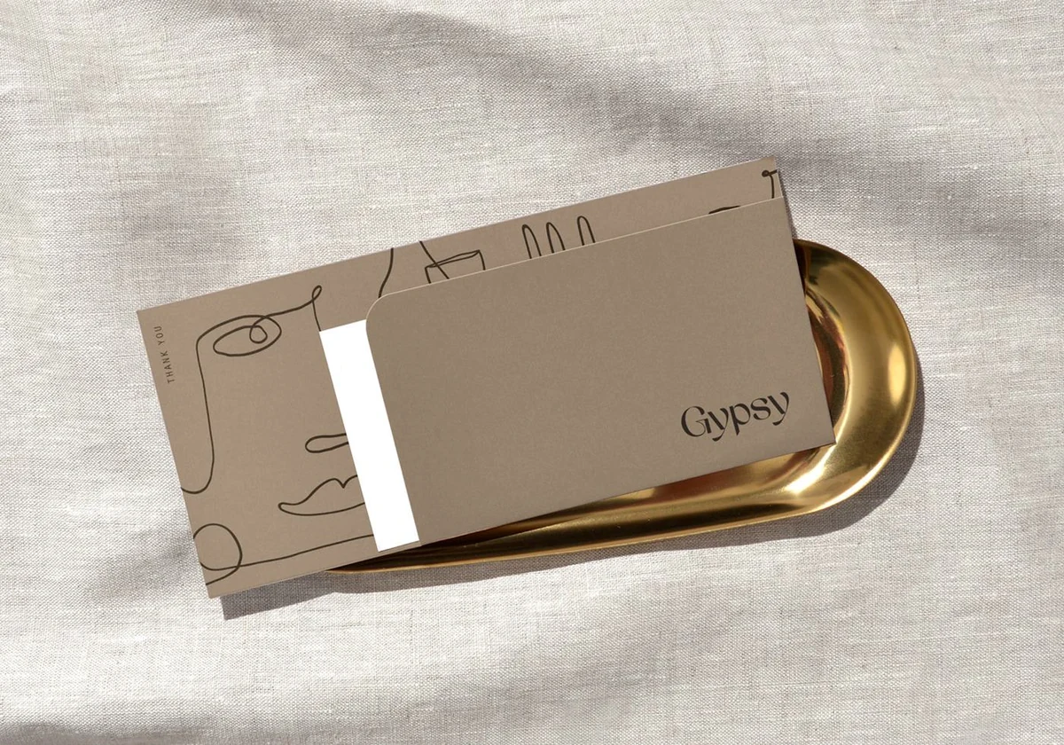
Everything grows from one idea: draw it the way a cook would sketch it, in one line, without lifting the pen.
Restaurant identity usually arrives as a logo and then stops. A typeface on a sign, the same typeface on a menu, and nothing that survives contact with a table.
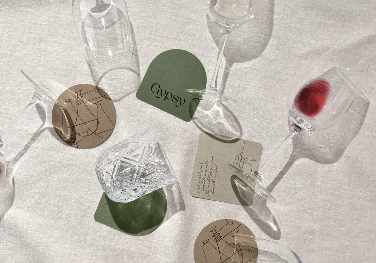
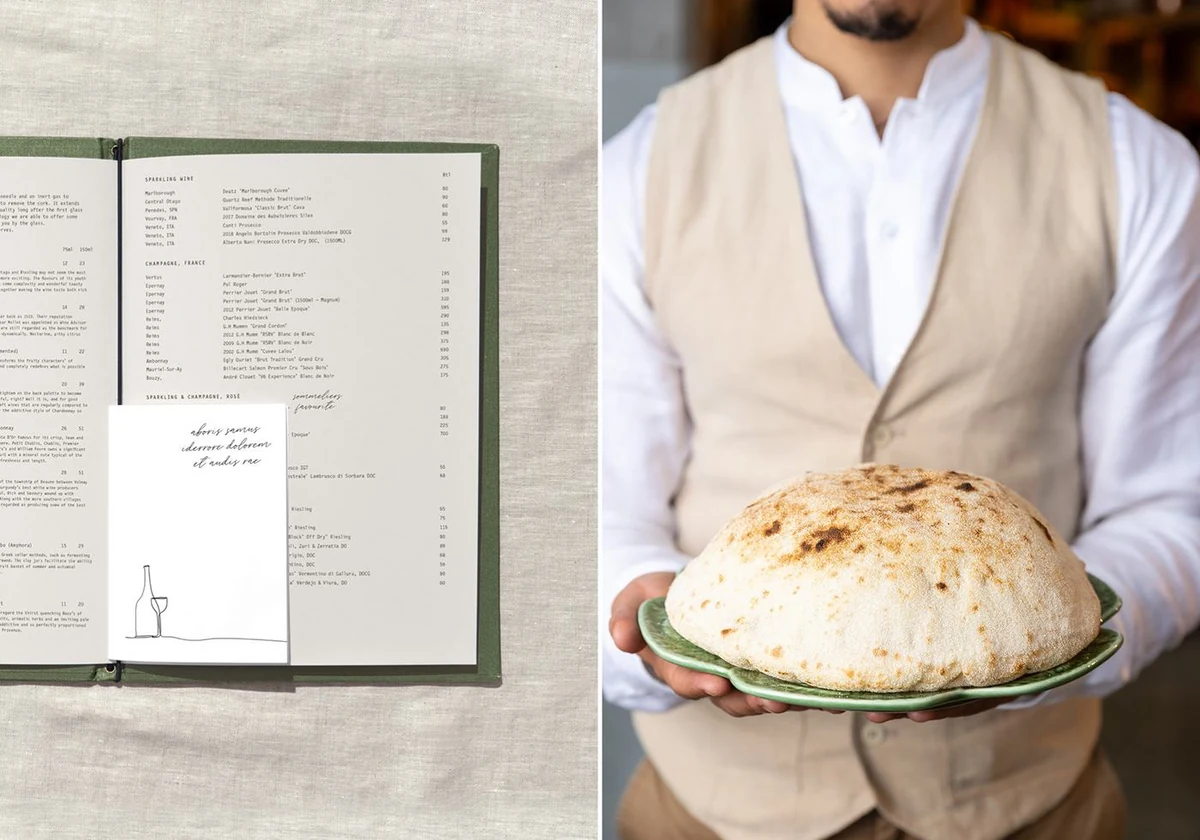
Gypsy needed a system that could keep going: a coaster, a napkin band, a menu that changes weekly, a takeaway sleeve. Each one is a different shape and a different print process, so a mark that only worked in one place was no use.
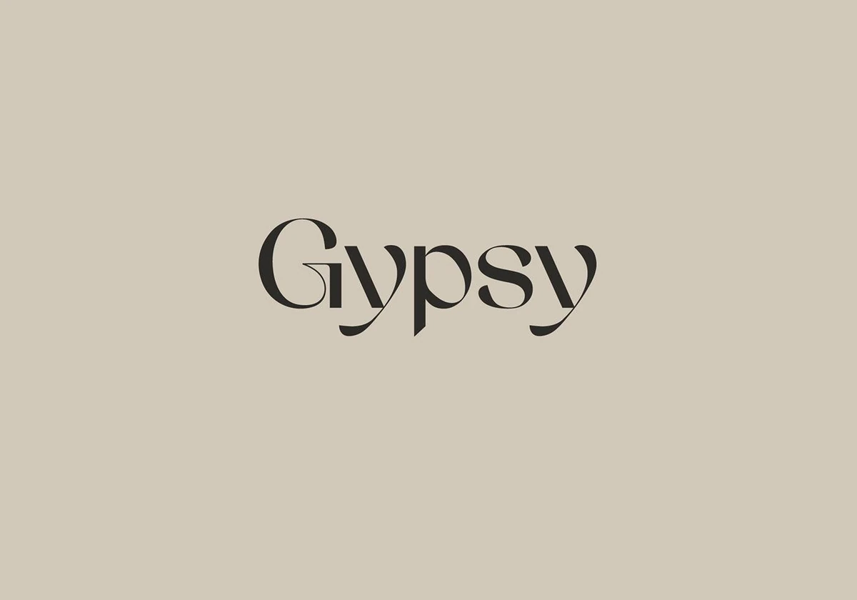
The wordmark is a high-contrast serif with a drawn ligature joining the G and the y, so the name reads as one continuous stroke rather than five letters. That single unbroken line is the idea the rest of the system is built on.
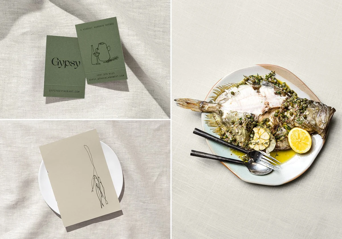
From it comes a family of one-line drawings, glassware, produce and hands, that can be redrawn as often as the menu changes without needing new artwork approved each time.
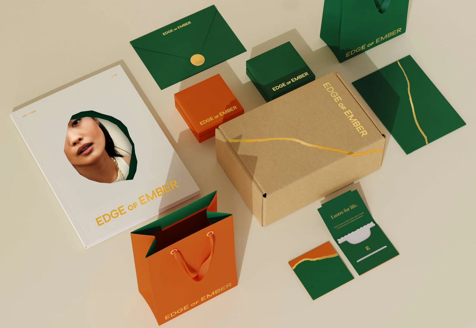
Taupe carries the brand, olive marks the moments that matter, and cream keeps the printed pieces quiet. Gold appears once, on the tray, and nowhere else.
Conclusion
Gypsy now reads the same on a coaster as it does across the room. The drawings change with the menu; the hand behind them does not.
Brandlic's Contribution
- Brand Strategy
- Visual Identity & Logo
- Illustration System
- Typography & Colour System
- Menu & Print Collateral
- Art Direction