Branding
Haya
Overview
Haya is a coffee brand. The work had to carry the weight of a specialty roaster without the workshop clutter the category usually reaches for.
Everything grows from one idea: let the colour do the talking and keep the type quiet.
Specialty coffee has a house style: kraft board, a stamp, a lot of hand-drawn detail, and a promise about origin. It reads as craft, but every brand doing it reads the same.
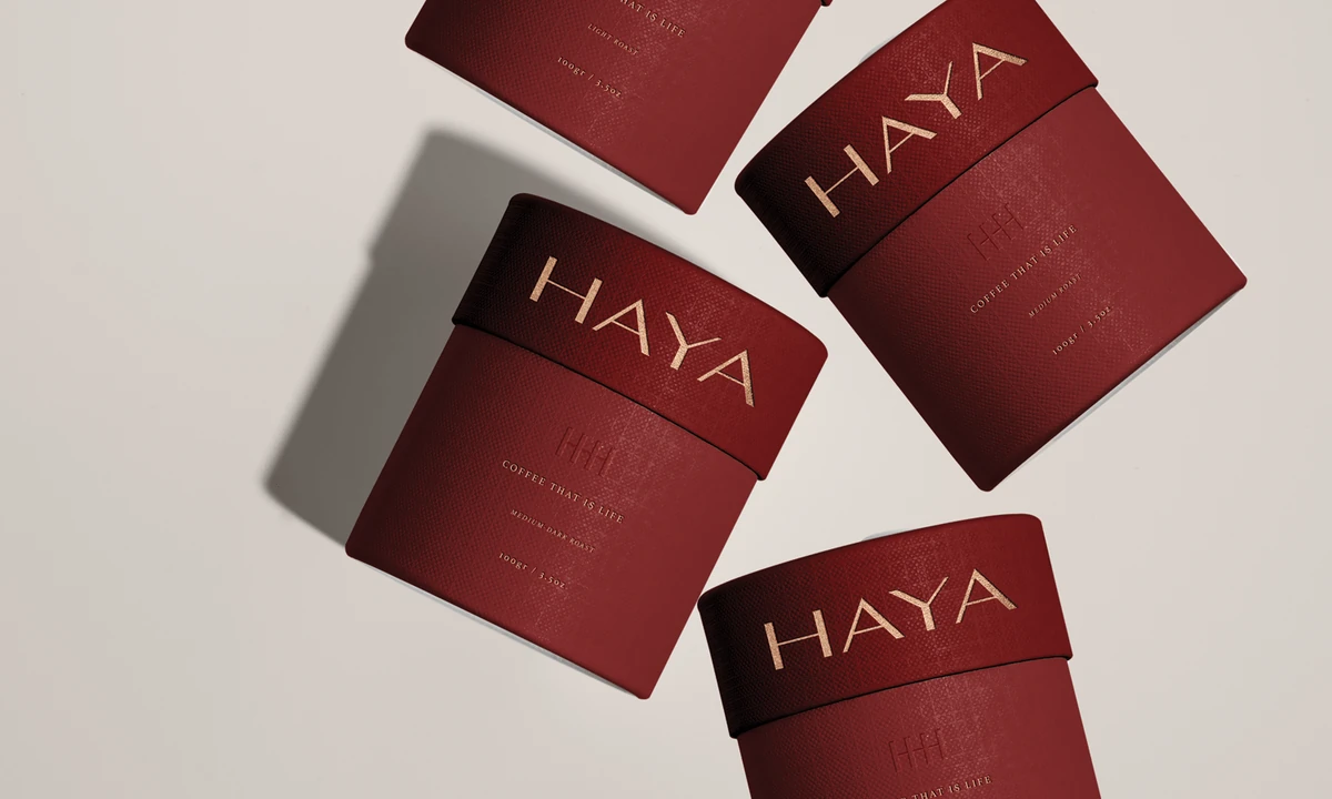
Haya needed to sit somewhere else entirely, closer to a fragrance counter than a roastery, while still surviving the places coffee packaging actually lives: a hot cup, a cold cup, a foil-lined bag and a shelf edge.
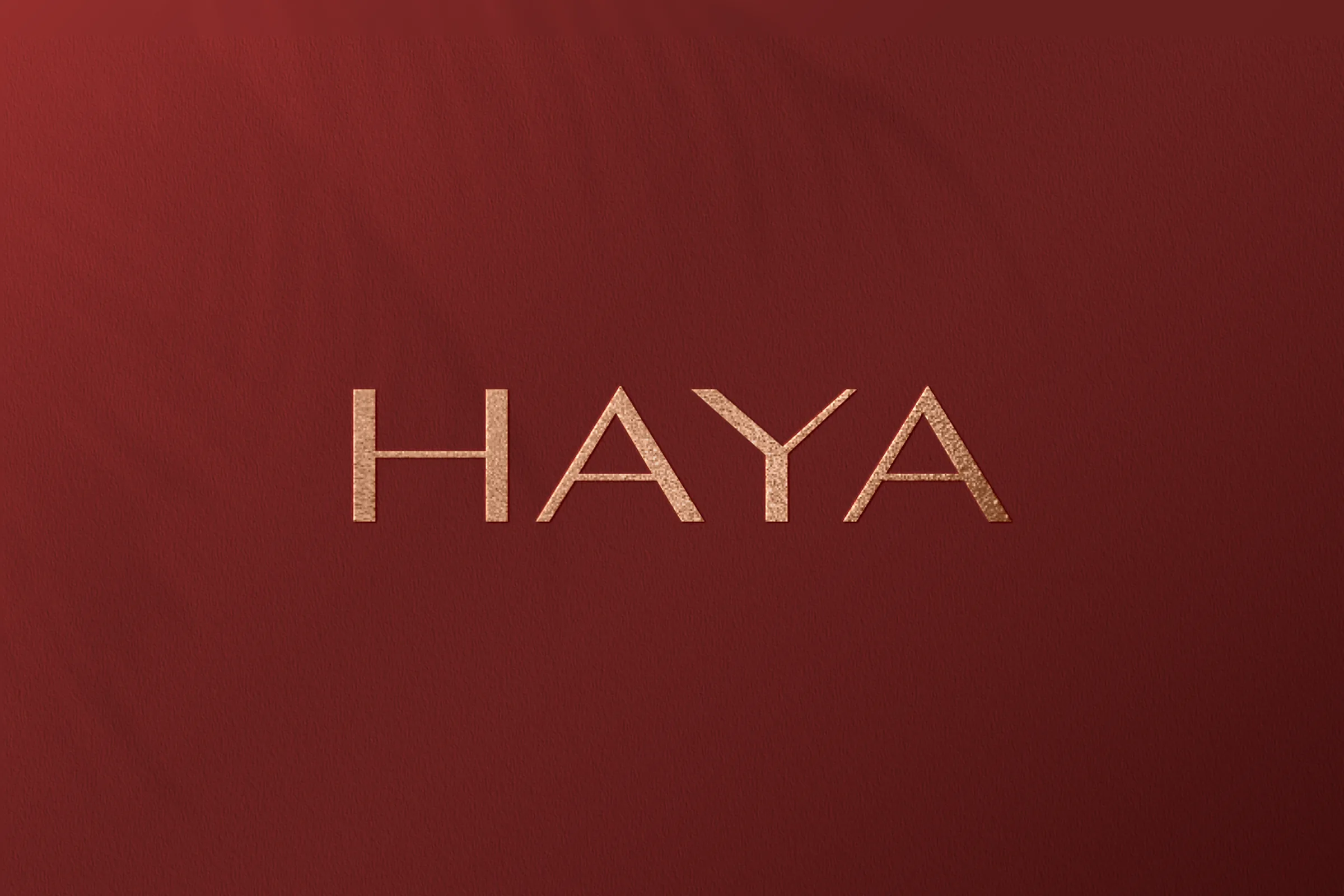
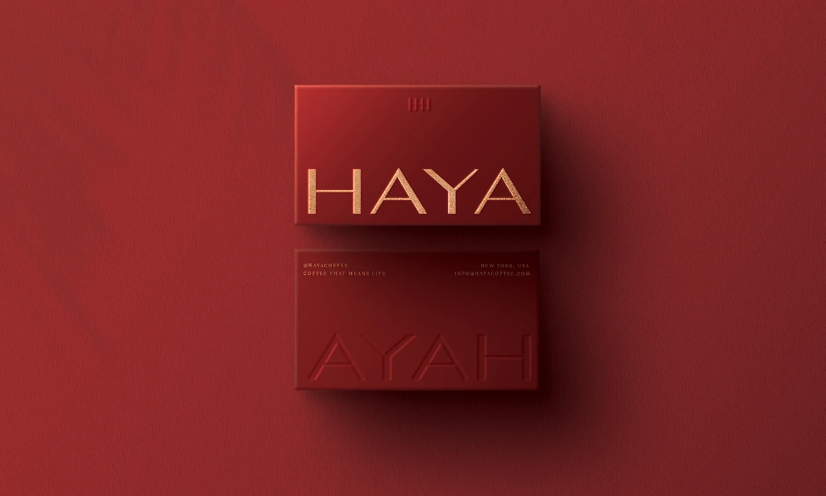
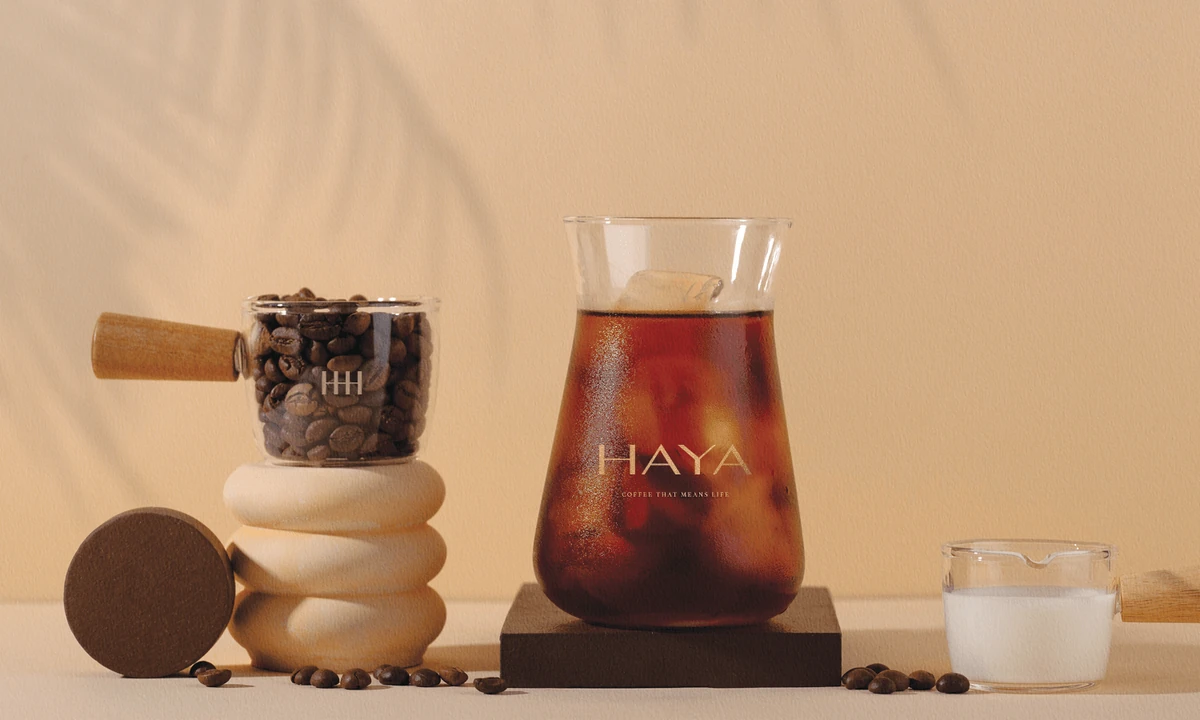
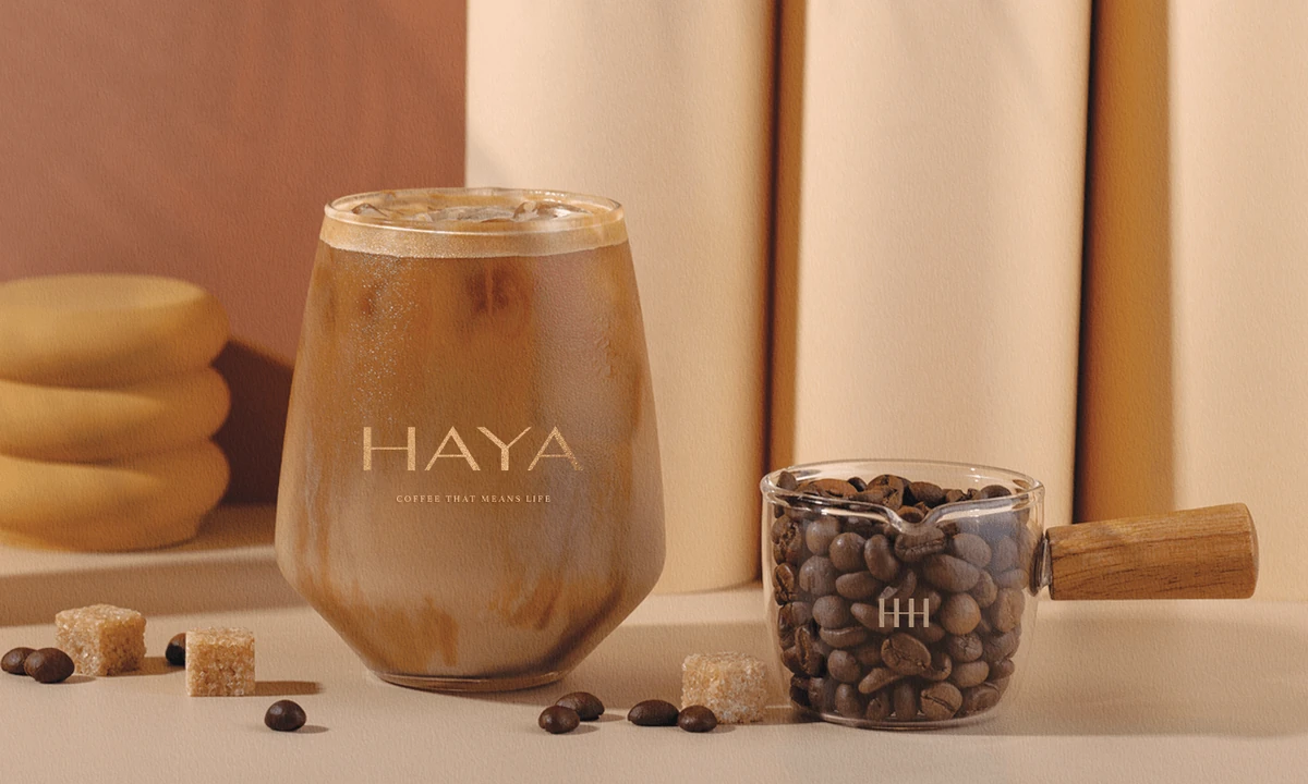
The wordmark is a light serif set on wide tracking, so the name reads as five separate letters rather than a single block. At that weight it can be foiled small and still hold, which is what the cups and the boxes both needed.
Deep oxblood carries the brand and warm gold marks it. There is no third colour and no secondary mark; the restraint is the idea.
Tone does the rest. Everything printed sits in one family of warm neutrals, so a cup, a box and a bag photograph as one set without needing a pattern to tie them together.
Conclusion
Haya now looks like something you would keep on the counter rather than in the cupboard. One colour, one mark, and nothing else asking for attention.
Brandlic's Contribution
- Brand Strategy
- Visual Identity & Logo
- Typography & Colour System
- Packaging & Cup Range
- Art Direction