Branding
Concept Store
Overview
Concept Store sells clothing for people who dress to be seen. The brand had to feel as certain as the person wearing it, so nothing about it is quiet.
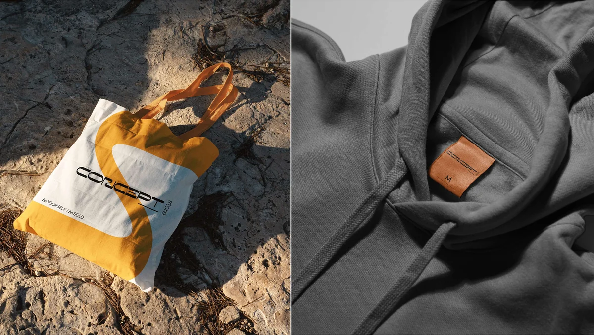
The whole system grows from one line: be yourself, be bold.

Fashion retail is full of brands that whisper. Thin type, soft colour, a lot of empty space. Concept Store needed the opposite. But loud is easy to get wrong, and it turns cheap quickly.
The identity also had to survive the sizes retail actually uses. A hang tag, a shipping label, the side of a paper bag and a phone screen are not the same problem, and a mark that only works large is not finished.
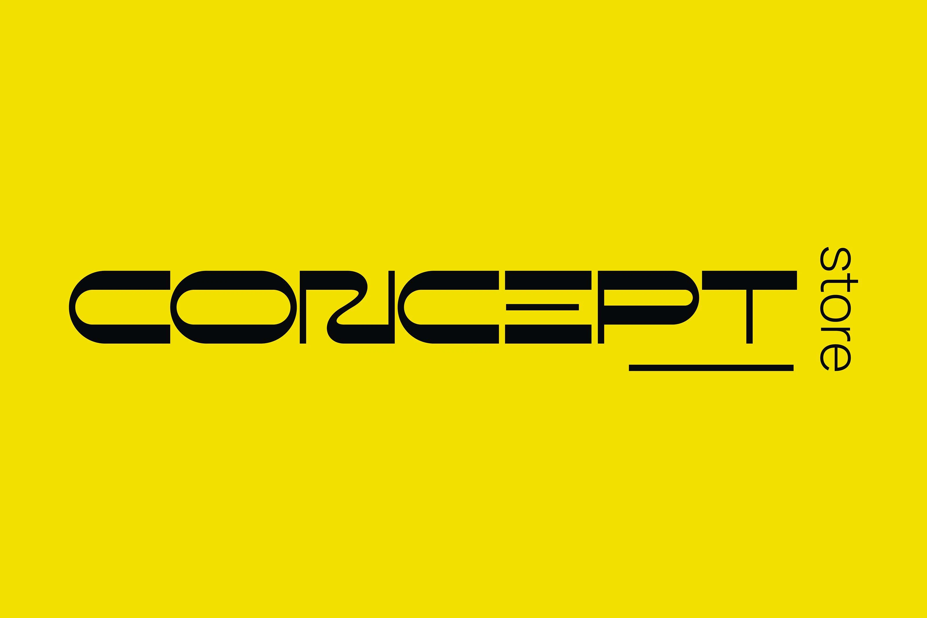
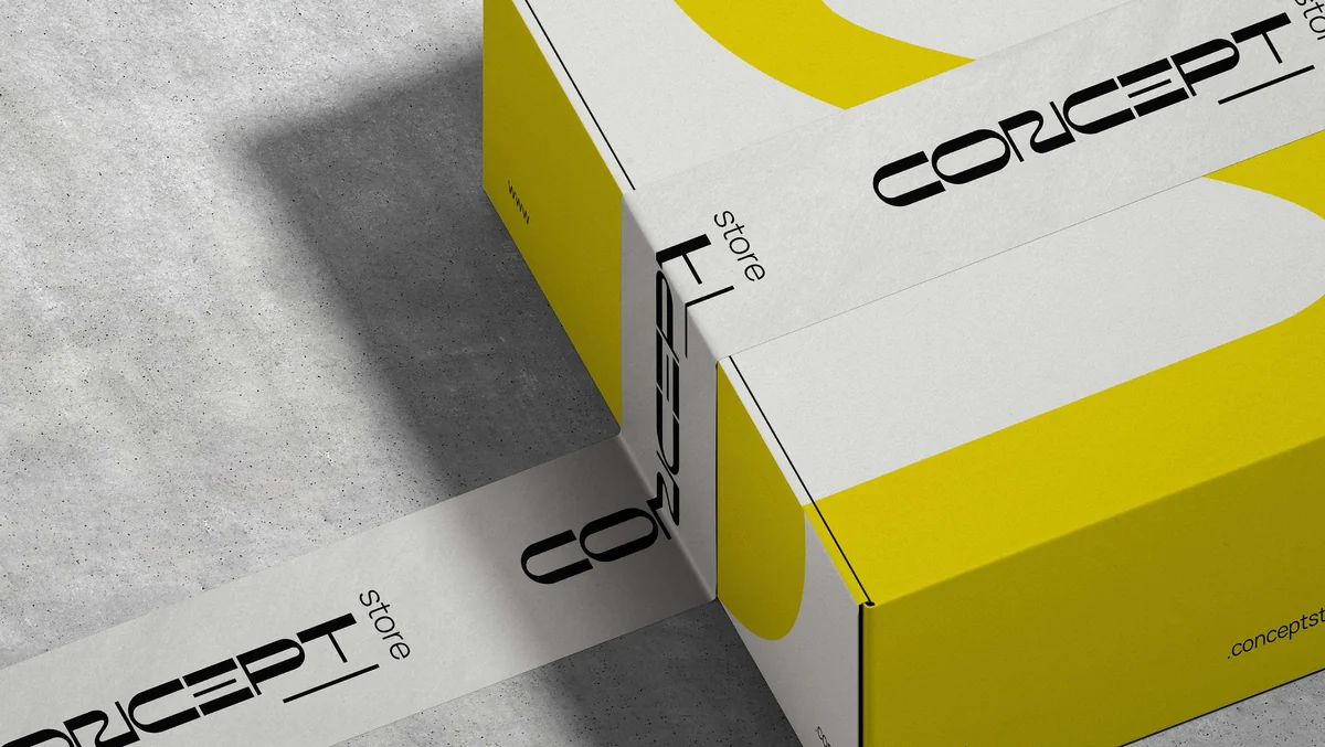
The wordmark is drawn as one long stroke and then cut. Counters open, joins break, and the seven letters read as a single wide bar instead of seven separate shapes. Setting "store" on its side locks the pair together, so the lockup cannot be assembled carelessly.
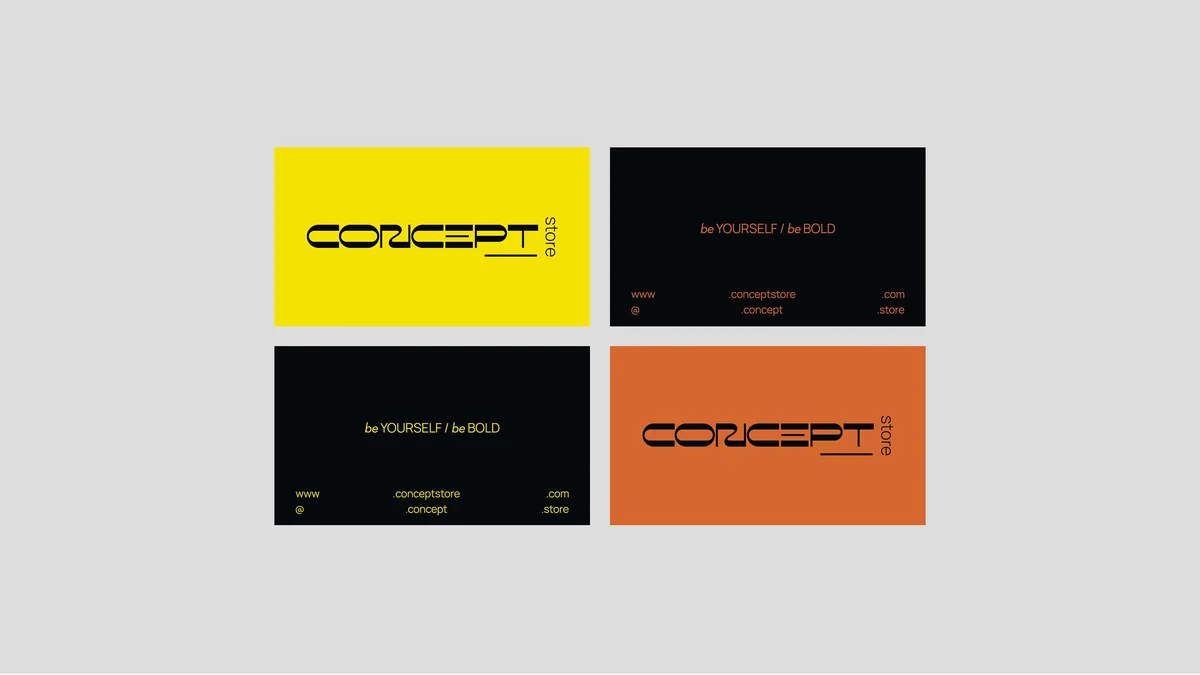
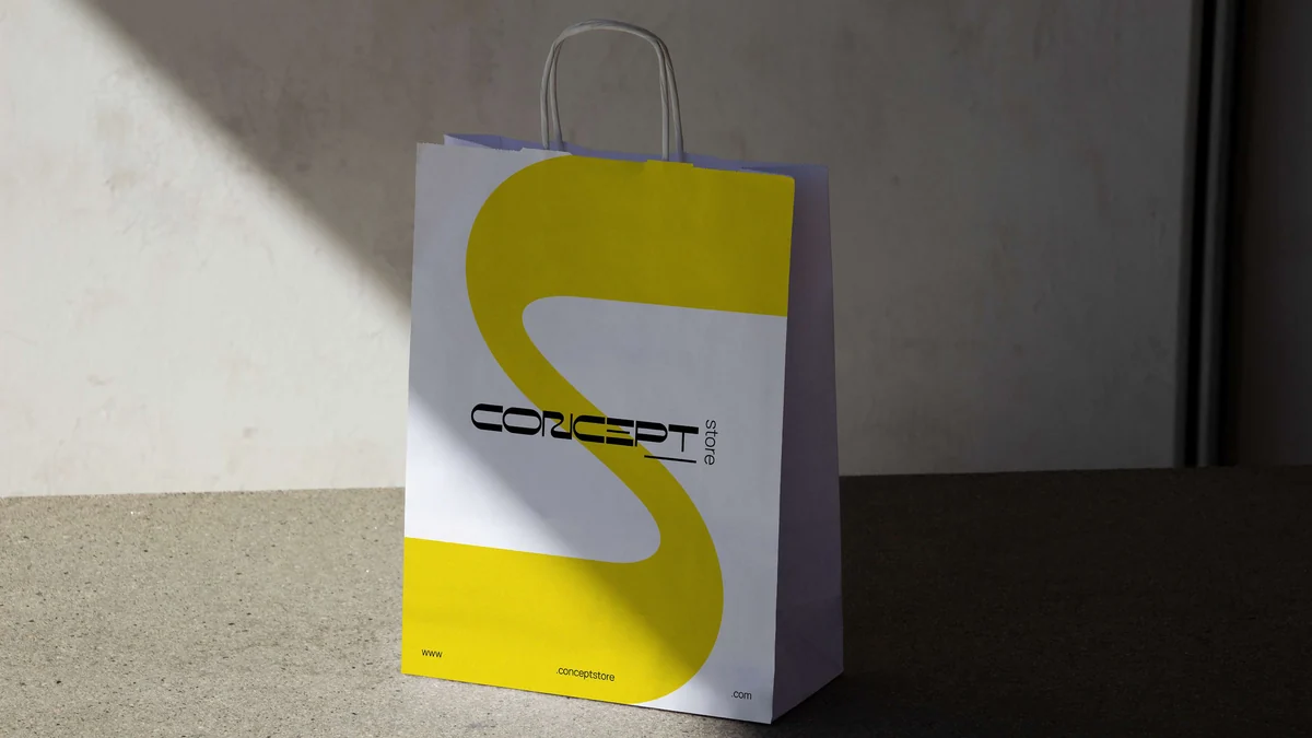
Signal yellow leads, black carries the type, and a burnt orange sits underneath for the places where yellow would be too much. Off-white keeps the printed pieces from feeling airless.
Because the full name needs width, the system also runs on a single oversized crop of the mark. That is what carries the bag, where the whole wordmark would have to shrink to nothing.

Conclusion
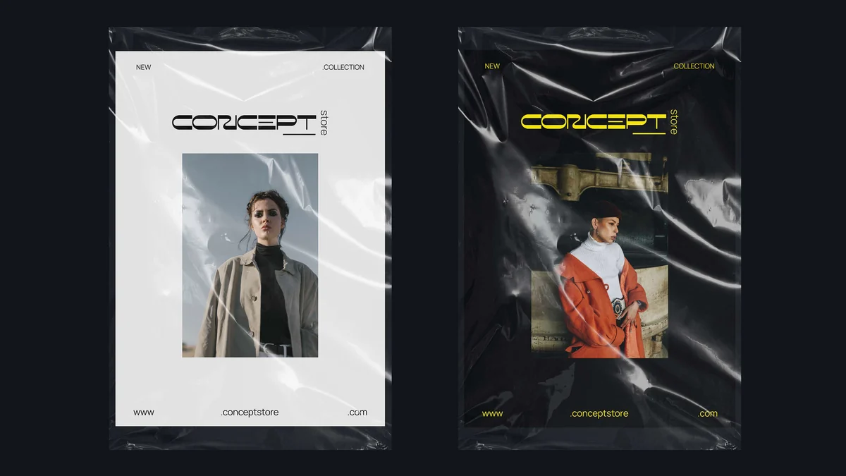
Concept Store now behaves the same way on a paper bag in daylight as it does on a dark product page at night. It is loud on purpose, and built tightly enough to stay that way.
Brandlic's Contribution
- Brand Strategy
- Visual Identity & Logo
- Typography & Colour System
- Packaging & Retail Collateral
- Art Direction
- Campaign & Digital Direction