Branding
Late June Bakehouse

Overview
Late June Bakehouse is a neighbourhood bakery for specialty bread and everything baked. The bakery branding had to feel as warm and unhurried as the name.
Everything grows from one idea: draw the bakery as a loaf, and the loaf as a home.


Bakery branding has a familiar uniform: a wheat sheaf, a rolling pin, a script that tries to look handmade and a palette of browns. It says bread, but it says the same bread as every other shop on the street.
Late June needed a bakery logo design people would remember after one visit, and it had to hold its character on paper bags, pastry boxes, a lit sign, an awning and a baker's shirt.
We drew the bakery itself. The mark is a loaf turned into a small house, with a slice for the front wall, an arched door and a chimney letting off steam. It says bakery before a single word is read.
It is drawn in one line weight and one colour, so it prints as cleanly on a paper bag as it lights up on a sign above the door.


The name is lettered by hand in the same marker line as the house, with the letters left slightly uneven so it never reads as a typeface someone picked. A small lowercase bakehouse sits underneath, like a note left on the counter.


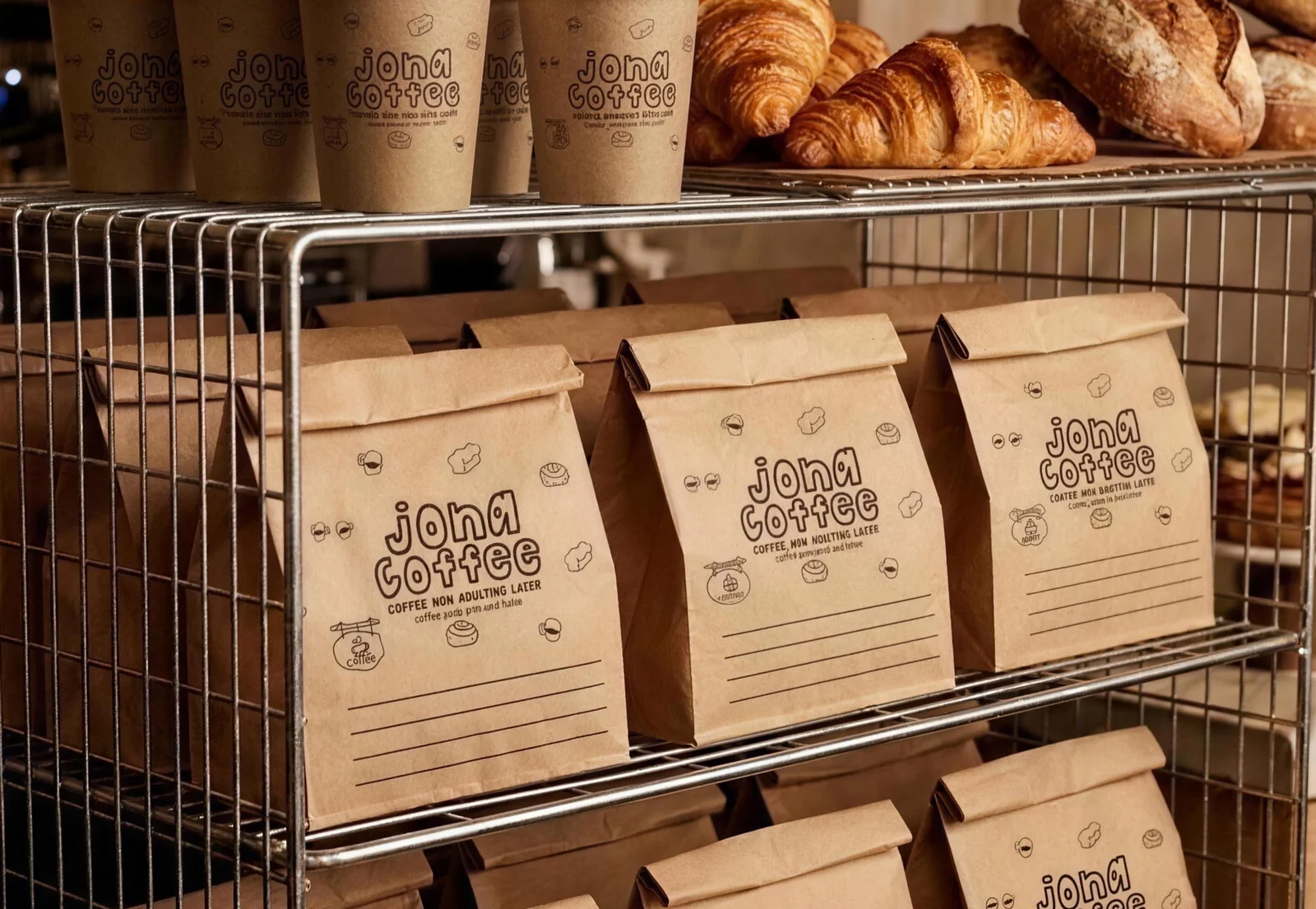
For the smaller pieces there is a second mark: a single flower in a milk bottle beside LJ bakehouse. It signs the bread bags, the cups and the baguette sleeves, where the full house would be too much.


Butter yellow and black carry the whole brand, with nothing in between. The paper bags carry a line written for the bakery, baked like a slow late June evening, and the baguette sleeves repeat the name until it becomes a pattern.


Conclusion
Late June now has a mark people can draw from memory: a loaf with a door in it. It sits as comfortably on a lit sign above the street as it does on a paper bag going home warm.
Brandlic's Contribution
- Visual Identity & Logo
- Illustration & Hand Lettering
- Secondary Mark
- Packaging Design
- Signage & Shopfront
- Uniforms & Merchandise