Branding
Calista
Overview
Calista delivers flowers. The brand had to feel like the gift rather than the courier, so every piece was designed to be handed over, not just shipped.
The whole system grows from one idea: the arrangement should not be the first beautiful thing you see.
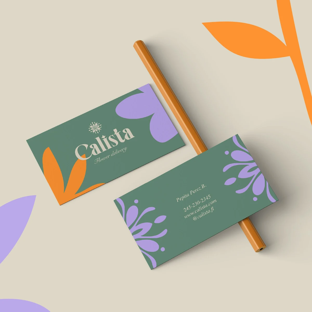
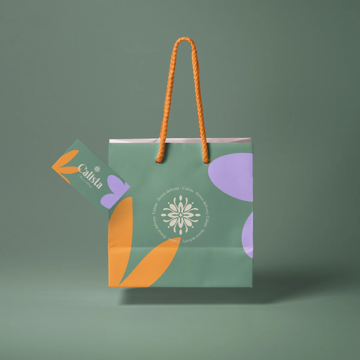
Flower delivery is a category of sameness. Script logotypes, soft pinks, a photograph of a bouquet and very little else. Calista needed to look composed rather than pretty.
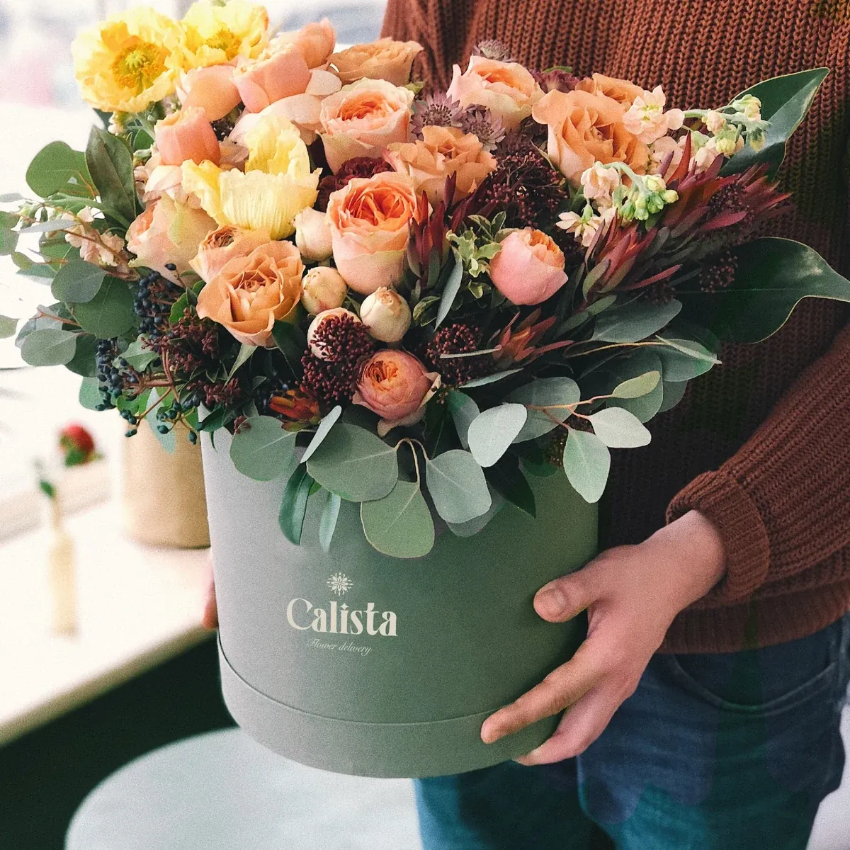
It also had to hold up in the place these brands usually give up, the box that actually arrives, and work at two extremes: a hatbox lid read from a metre away and a card read at arm's length.
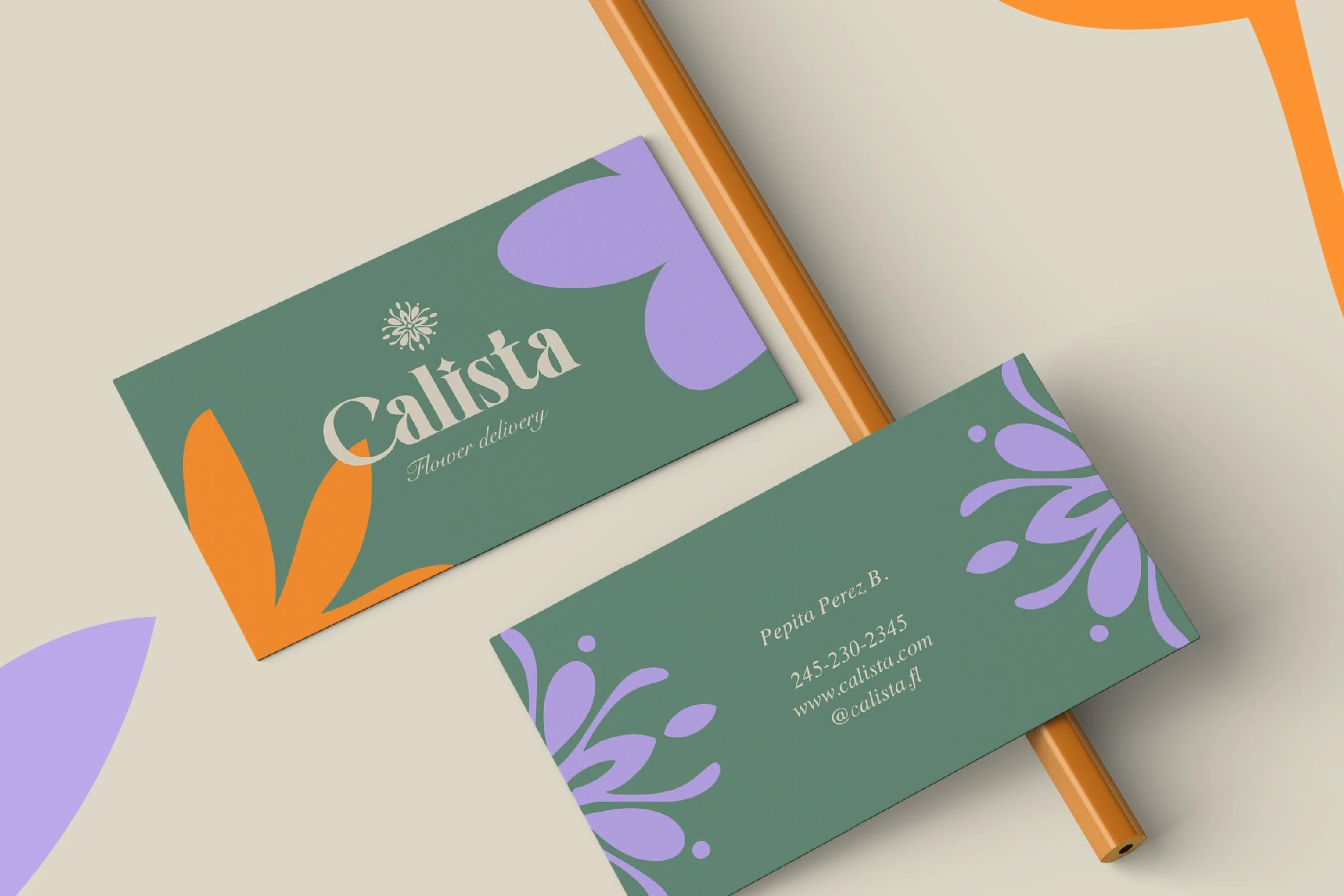
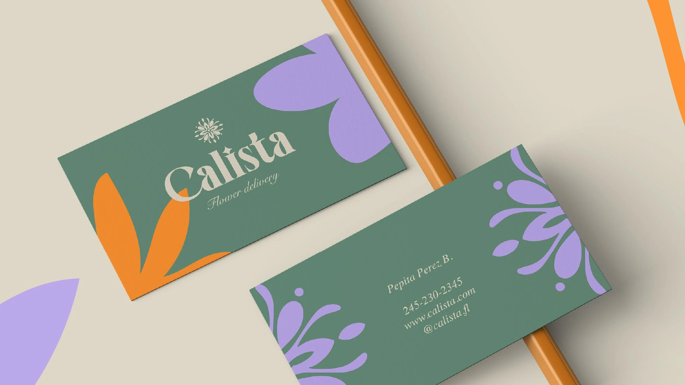
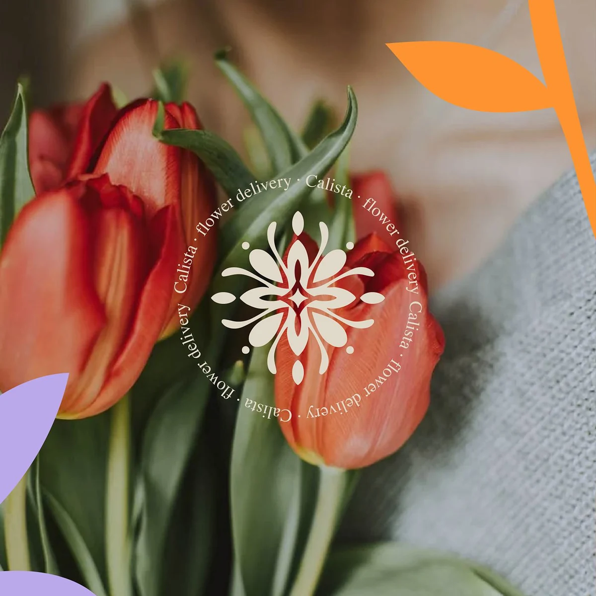
The wordmark is a high-contrast serif with a single swash on the C, drawn so the thin strokes stay open at small sizes. Above it sits an eight-point rosette that reads as both a flower and a compass, which gives the brand a mark it can use without the name.
Deep sage green carries the identity, with burnt orange and lilac cut into loose petal shapes that scale and rotate to fill any surface. Cream keeps the type legible on all of them.
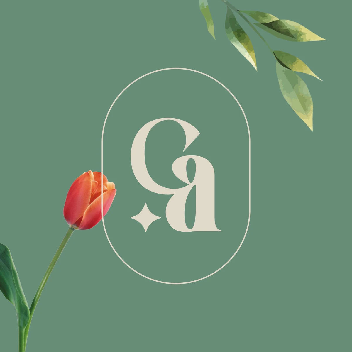
The monogram, C and A locked into an oval, does the work where the full name will not fit: the seal on a bag, the badge on a ribbon.
Conclusion
Calista now arrives looking deliberate. The box, the bag and the card read as one brand, and the flowers are the second beautiful thing you see.
Brandlic's Contribution
- Brand Strategy
- Visual Identity & Logo
- Monogram & Rosette Mark
- Typography & Colour System
- Packaging & Print
- Art Direction