Branding
Bait Al Zaitoon
Overview
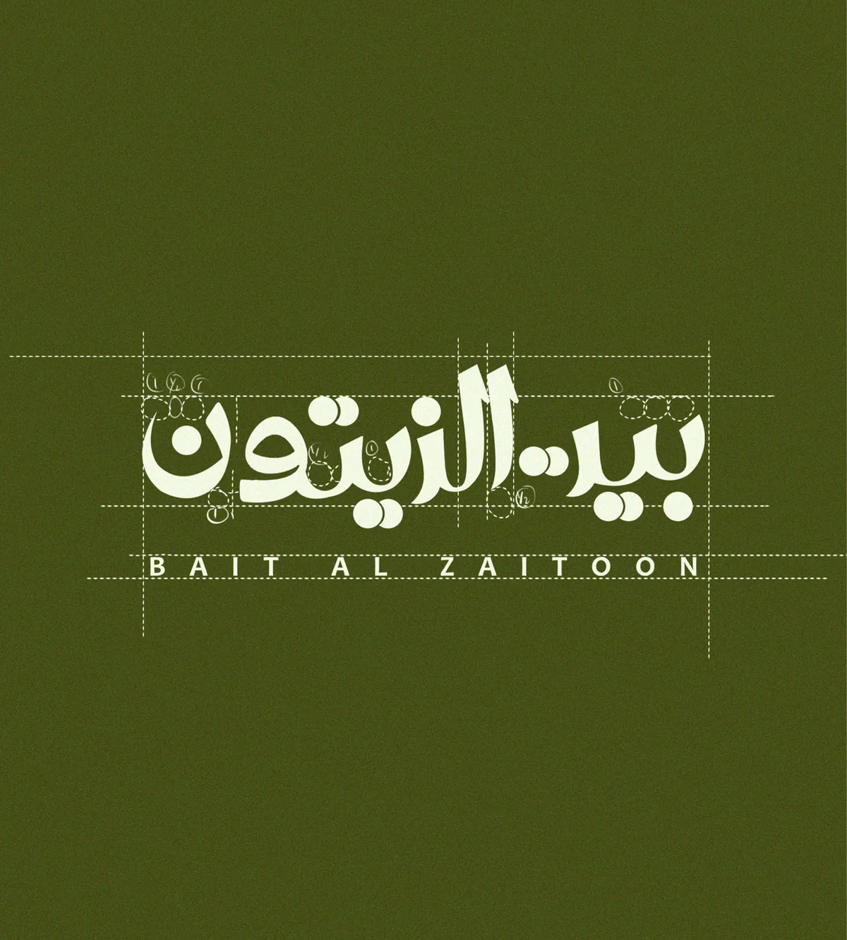
Bait Al Zaitoon means the house of olives. It is a Saudi olive oil brand, and the name is written in flowing Arabic script.
The whole identity is built to feel like the grove it comes from: warm, generous and made by hand.
Olive oil packaging often looks the same: a green bottle, a gold label, a picture of a branch. Bait Al Zaitoon wanted something that felt clearly Saudi and genuinely its own, and it had to read in Arabic and English side by side.
The Arabic name is drawn as one flowing line, with the English set quietly beneath it so both read as a single mark rather than two competing logos.
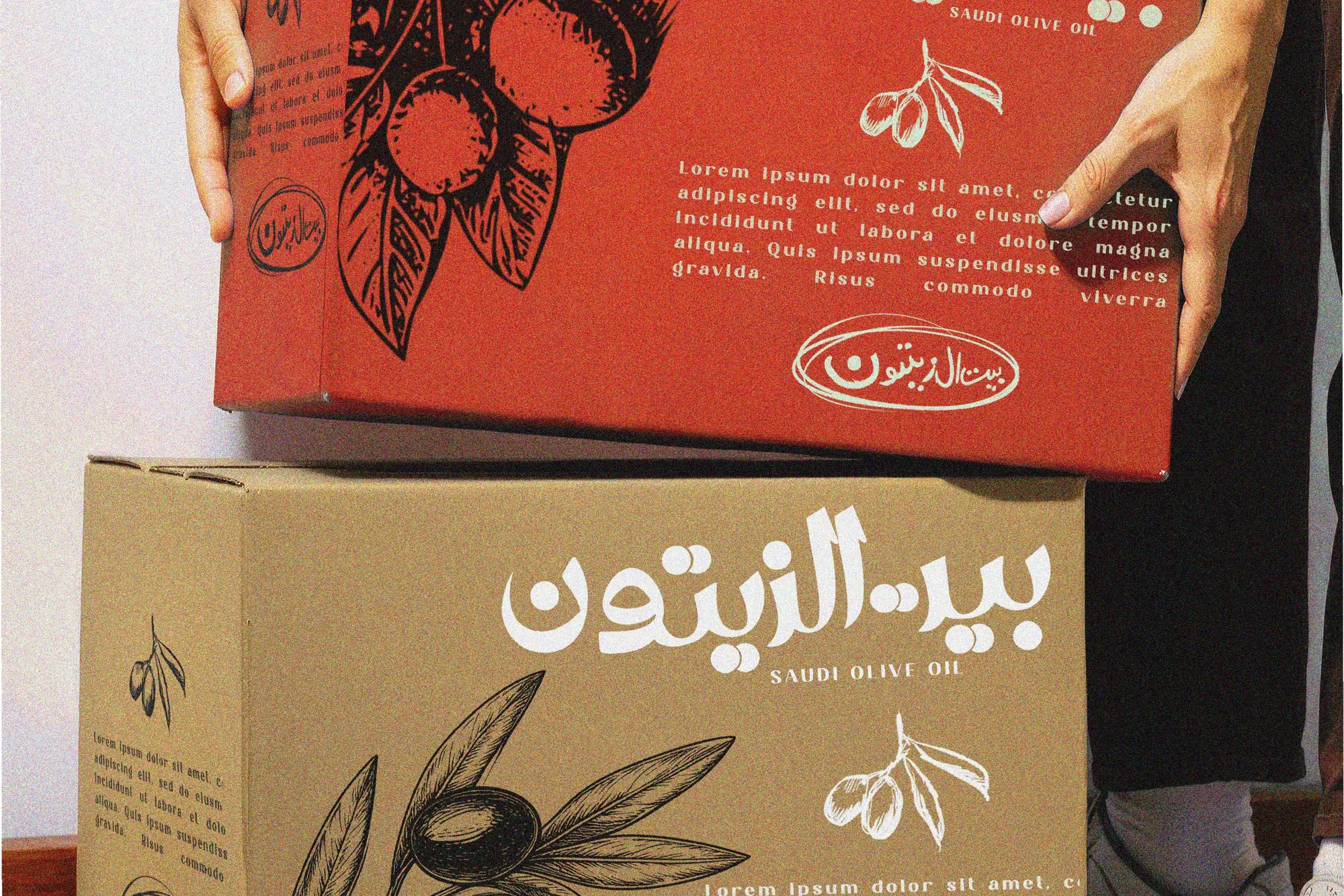
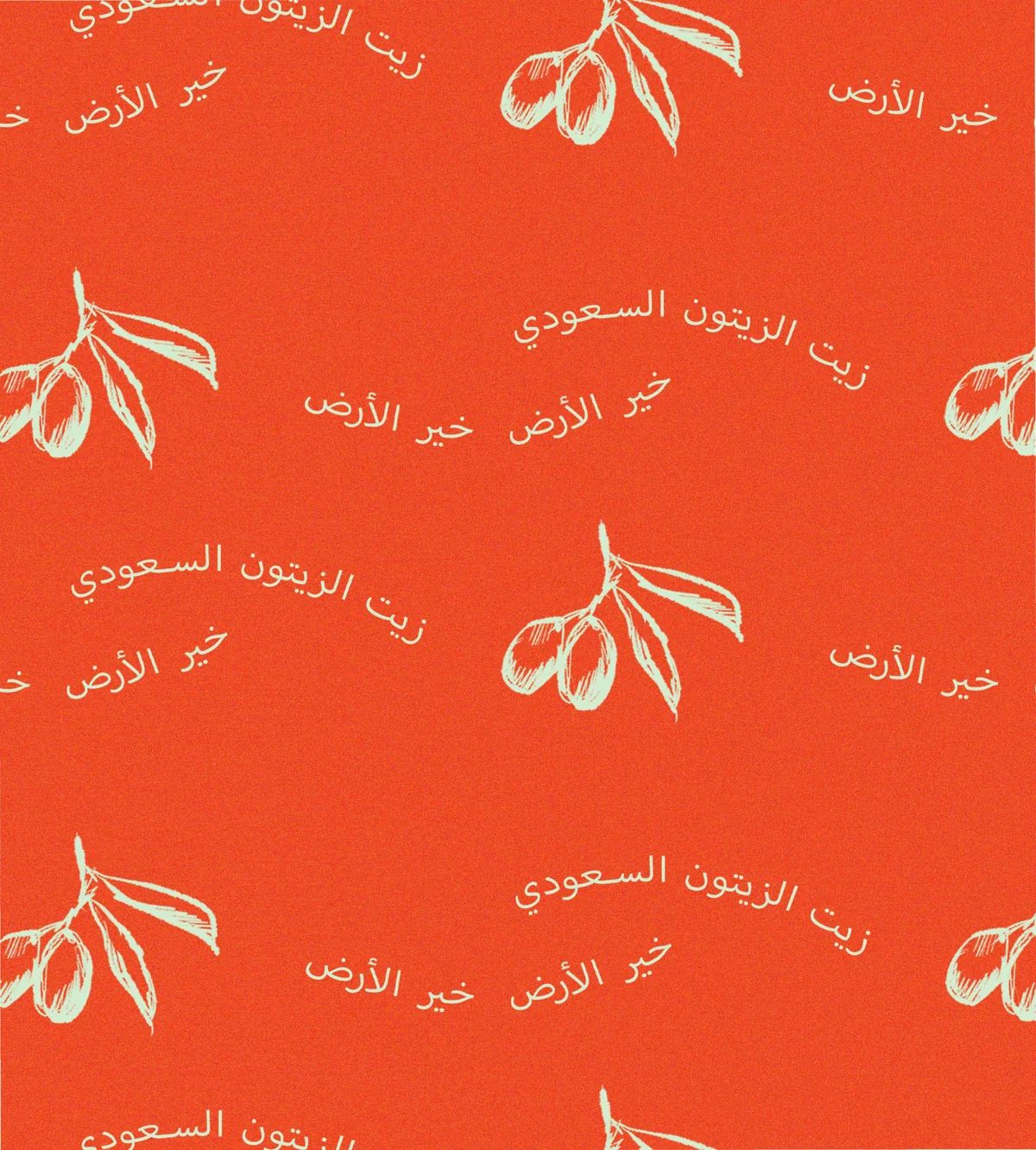
Olive green and a warm red carry the brand, with hand-drawn olive branches used as a pattern across packaging and print.
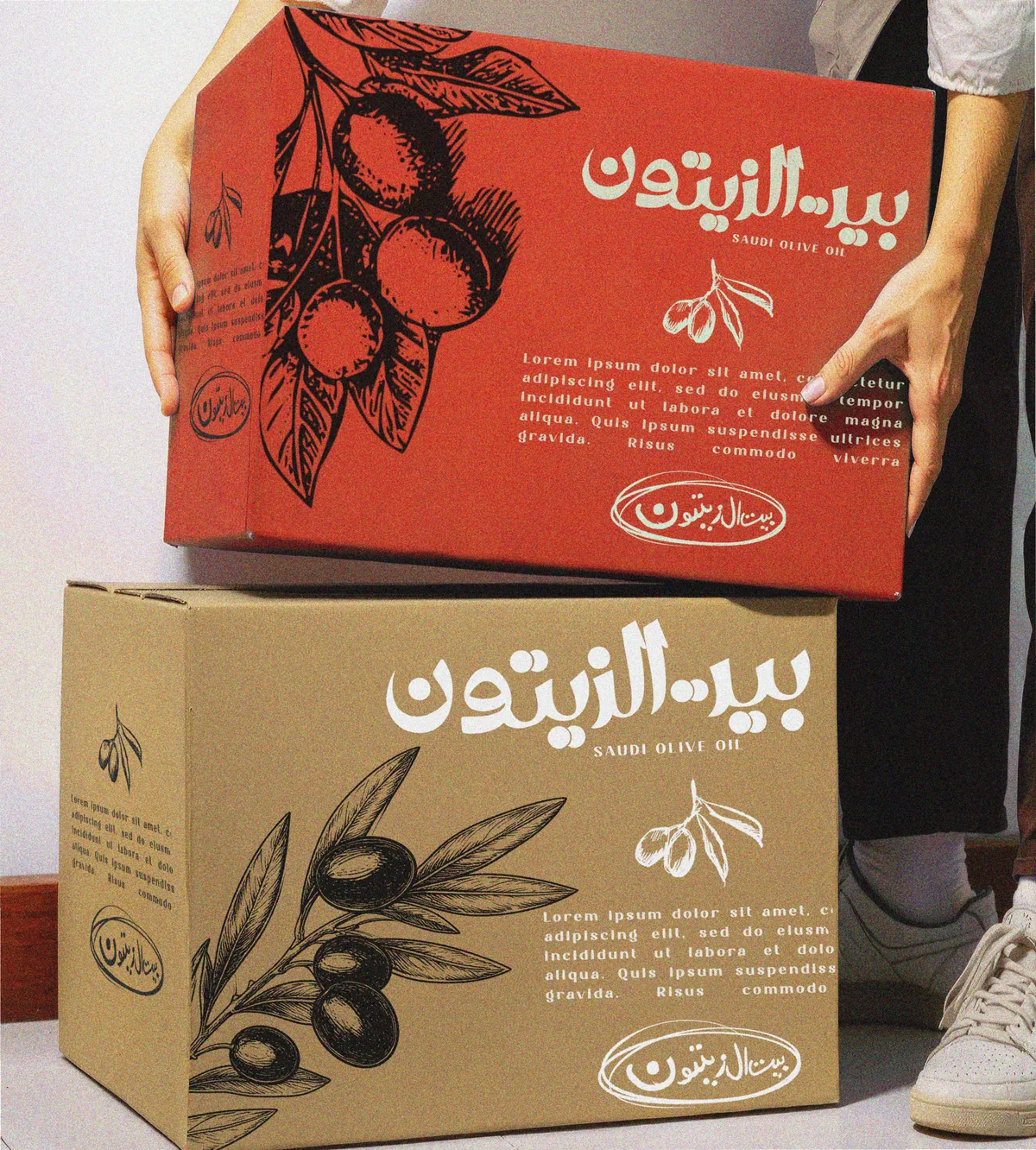
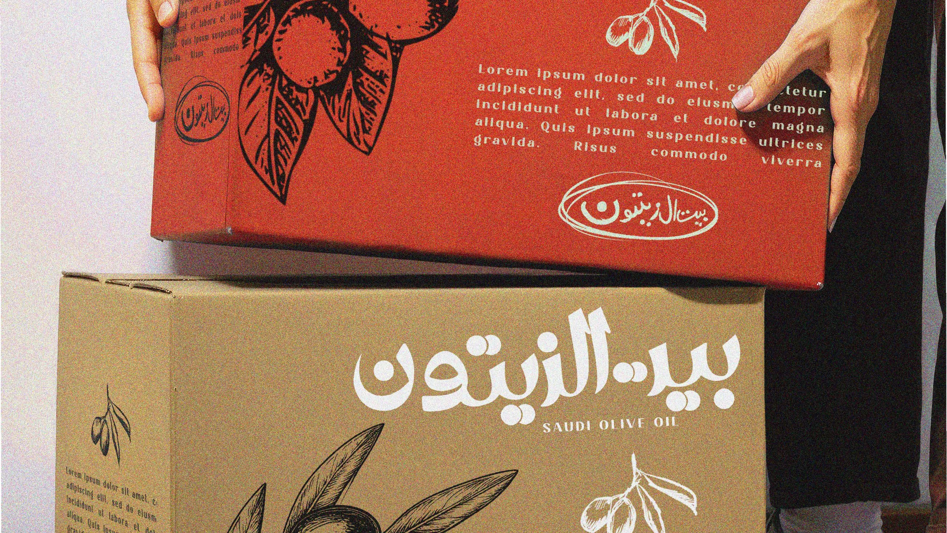
Packaging does the talking. The olive branch drawing wraps the boxes, and the name sits large enough to read across a room, so a delivery arriving at a door still looks like a gift.
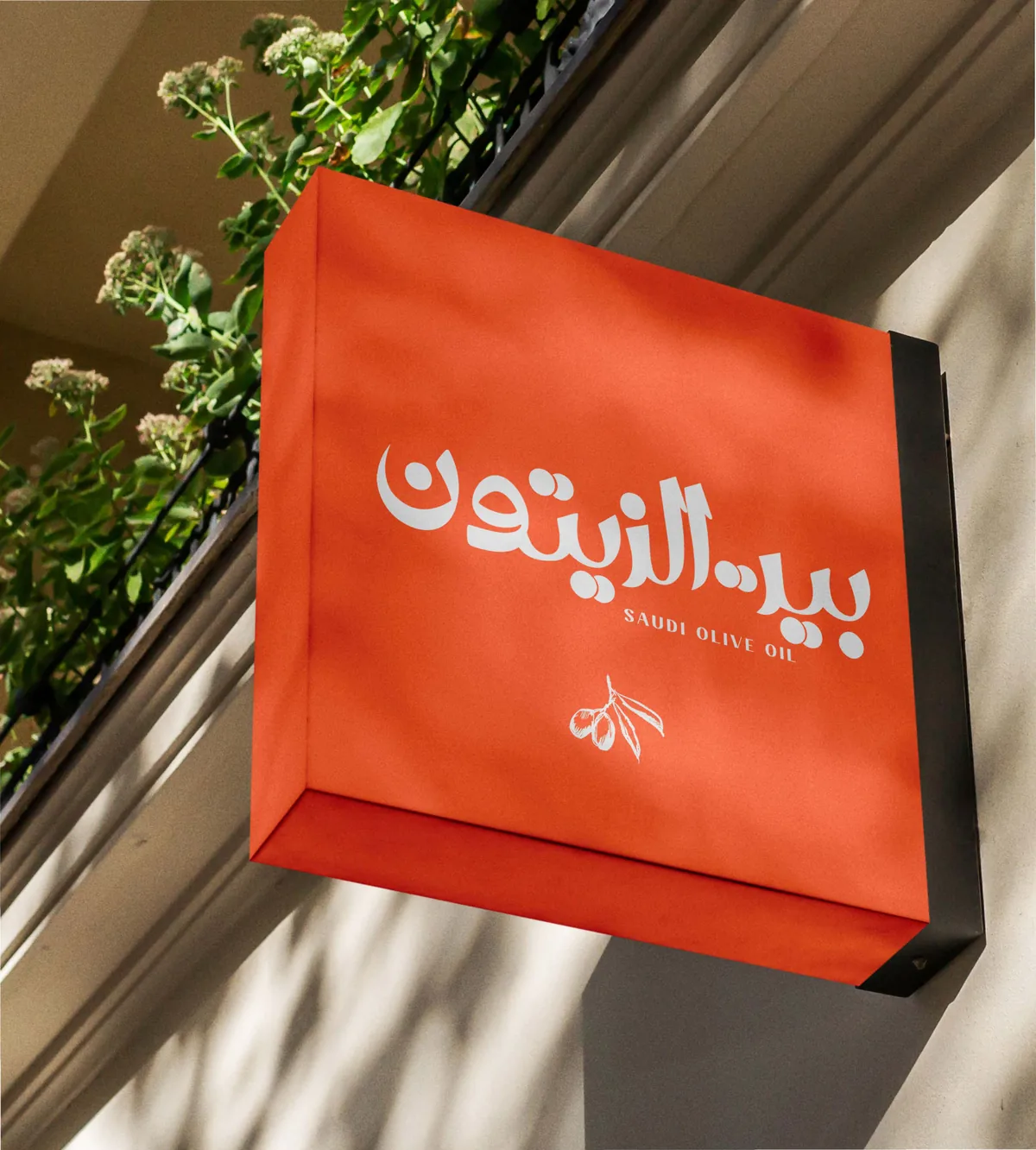
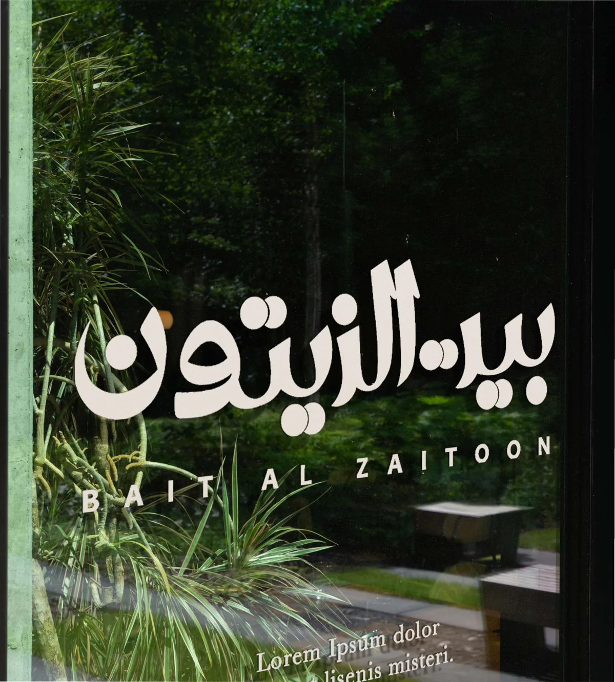
On the street the mark carries the whole brand on its own. It is set large and clear on the hanging sign and across the window, so the shop reads from a distance without needing anything else.
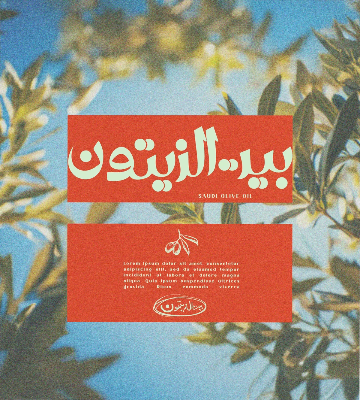
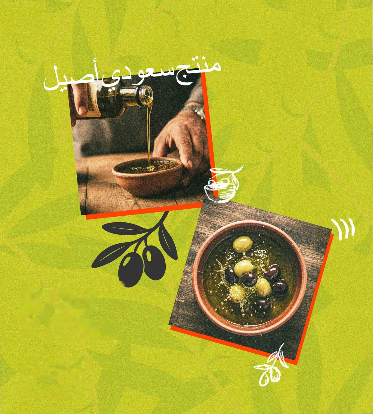
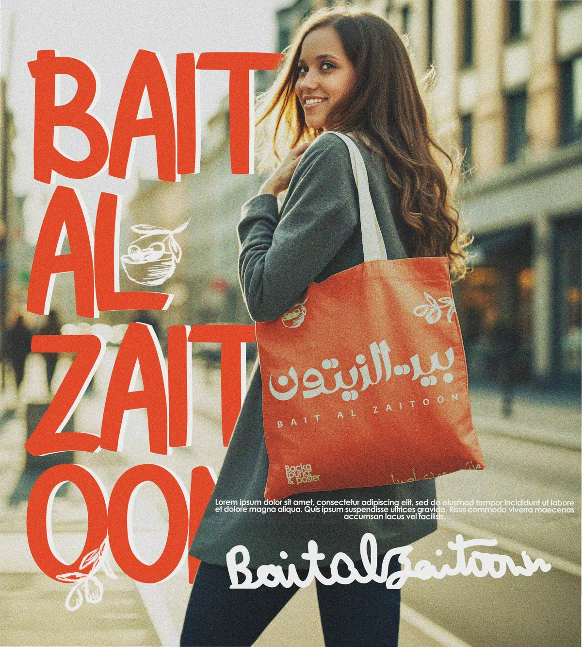
In campaign work the mark sits on a solid red panel over photography of the grove, so the brand always feels connected to where the oil actually comes from.
Conclusion
Bait Al Zaitoon now has a mark that works in both languages at once, and a look that stays warm whether it is on a shipping box, a shop sign or a window.
Brandlic's Contribution
- Brand Strategy
- Arabic & Latin Logotype
- Pattern & Illustration
- Packaging Design
- Signage & Environmental