L’été Cool
BRANDING

CLIENT
YEAR
L’été Cool
2023
OVERVIEW
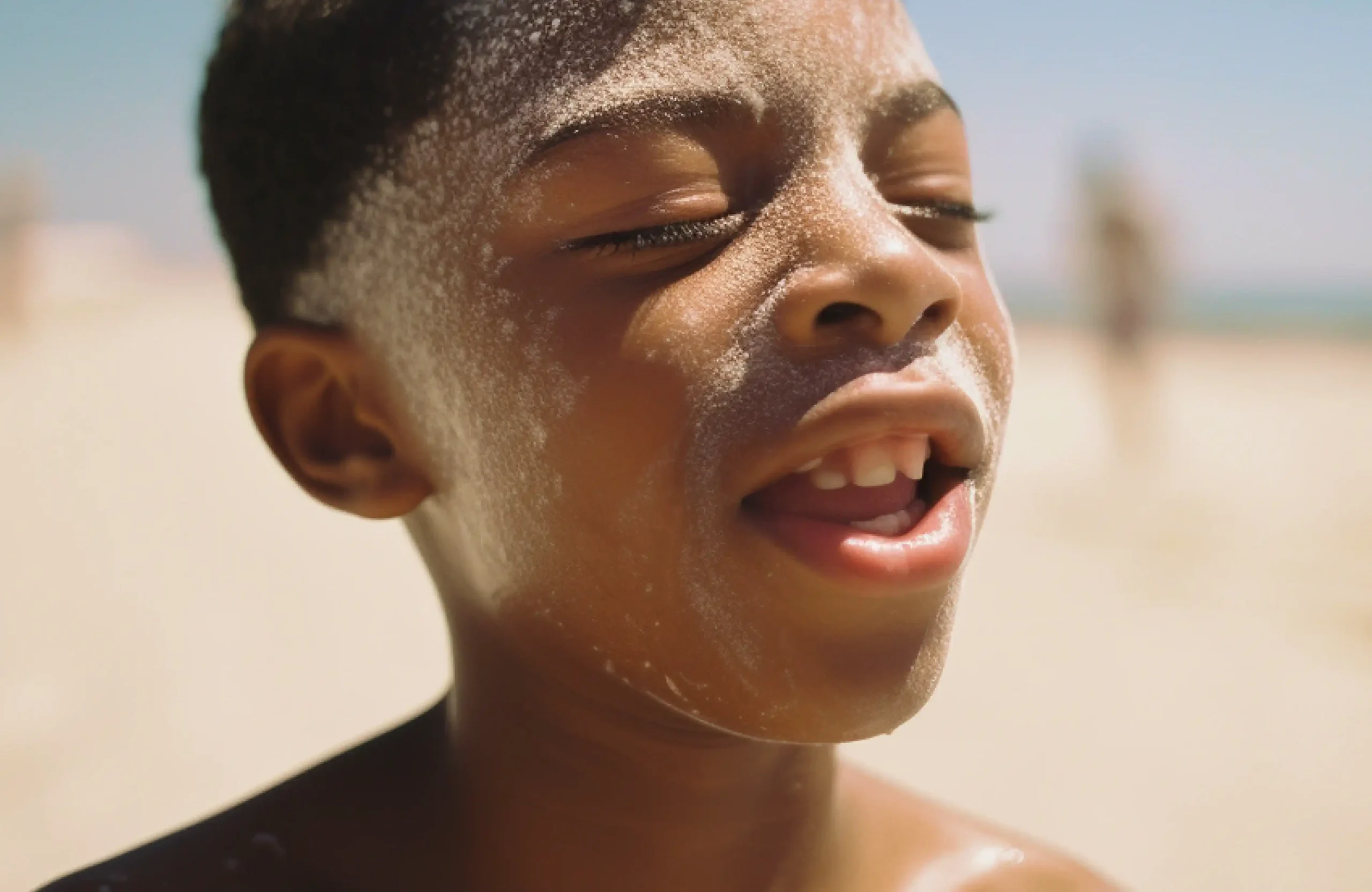
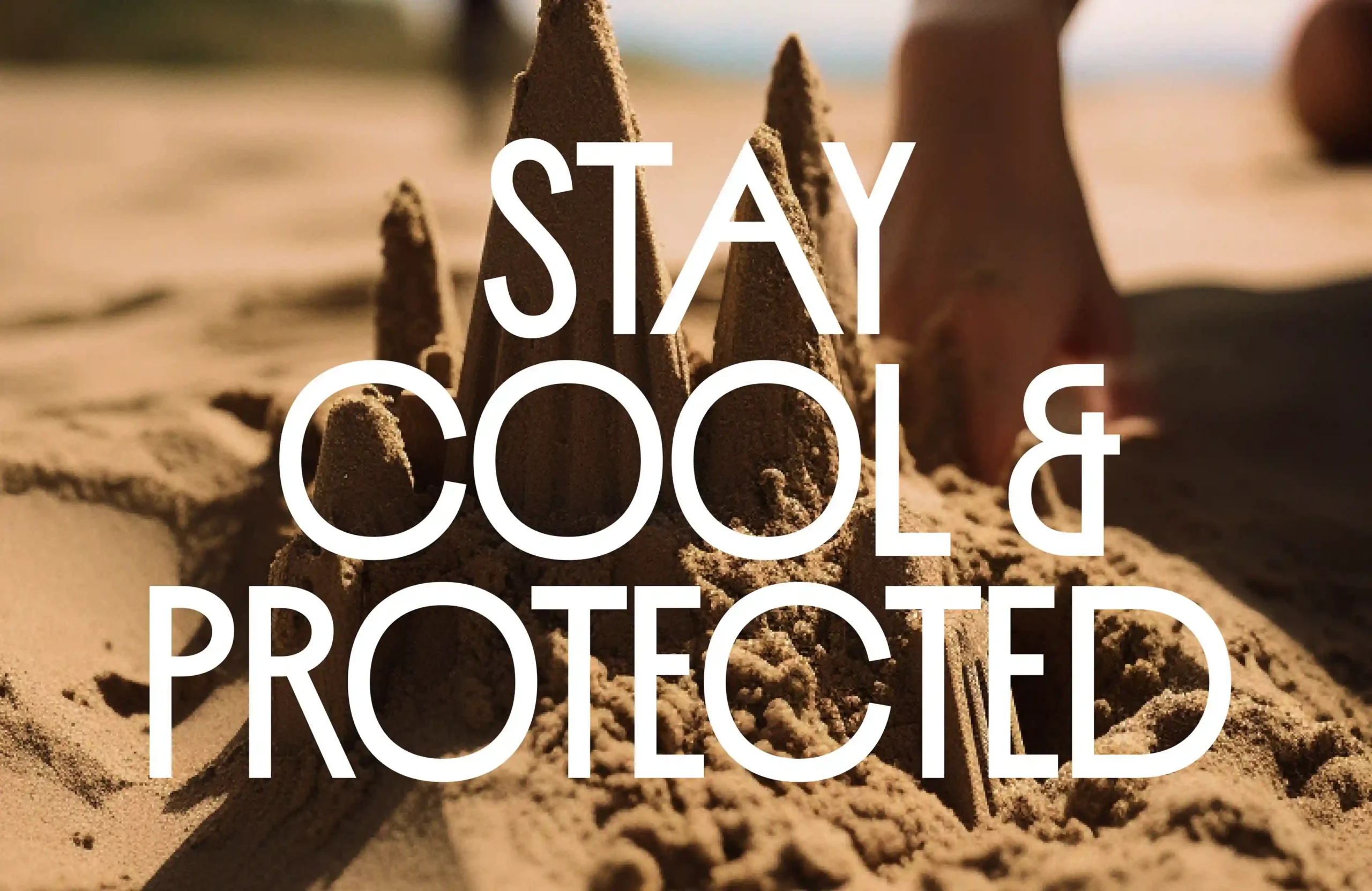
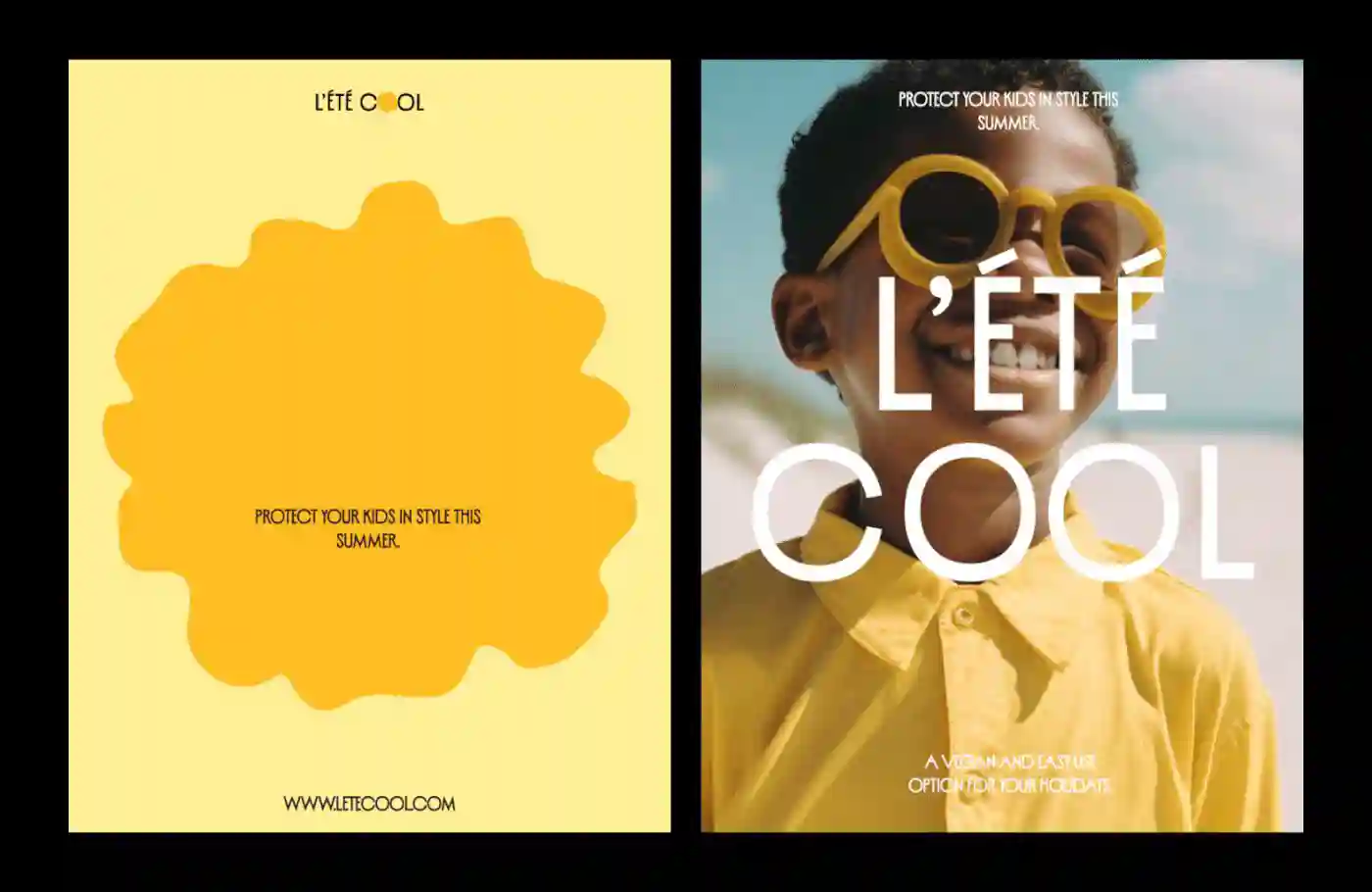
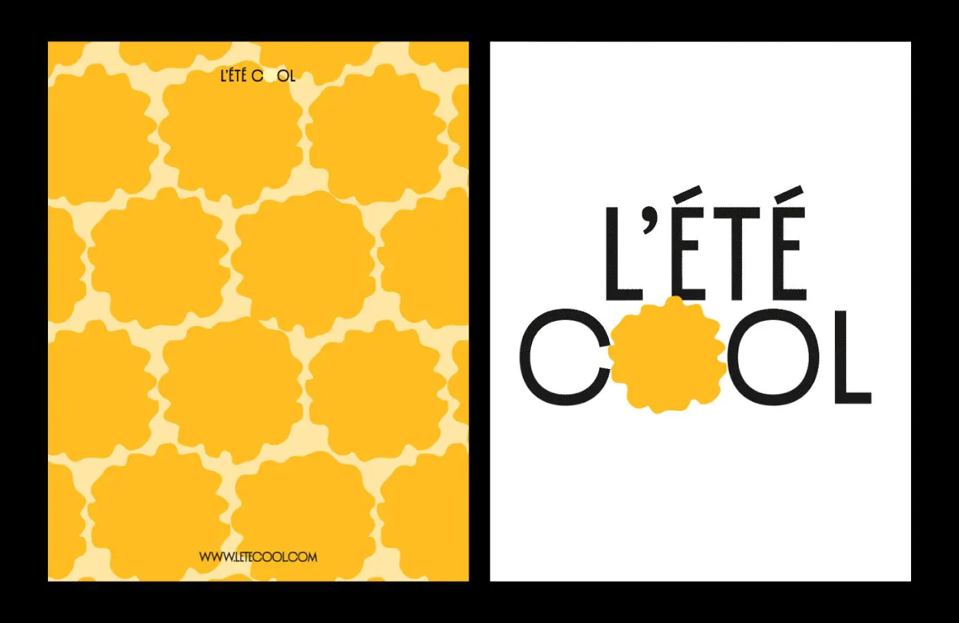
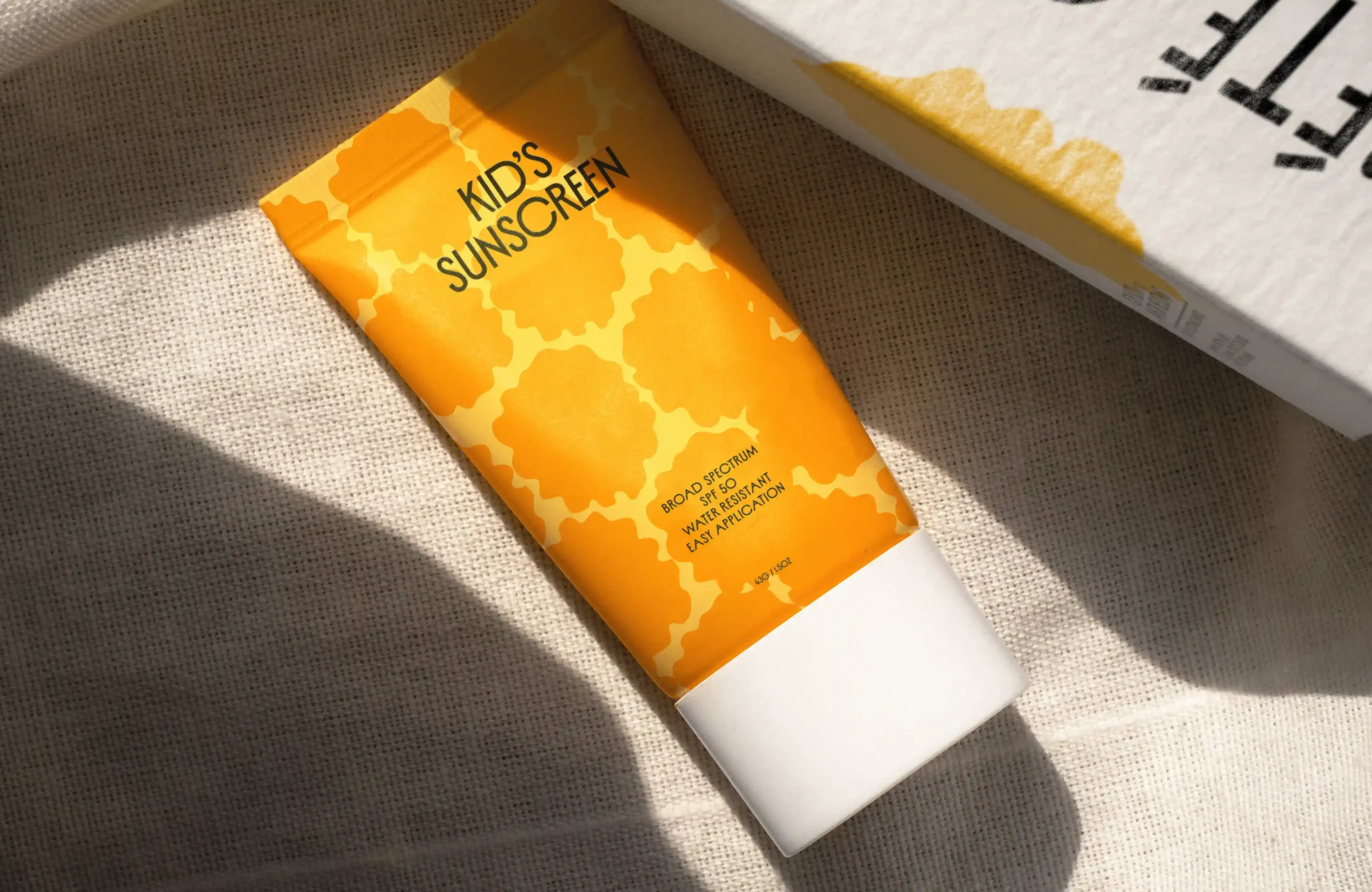
L’été Cool is a sunscreen brand specially crafted for kids, focusing on playful aesthetics and a sunlit, vibrant color palette. The objective was to create a brand identity that reflects warmth, fun, and the protective essence of sunscreen.
CHALLENGES & APPROACH
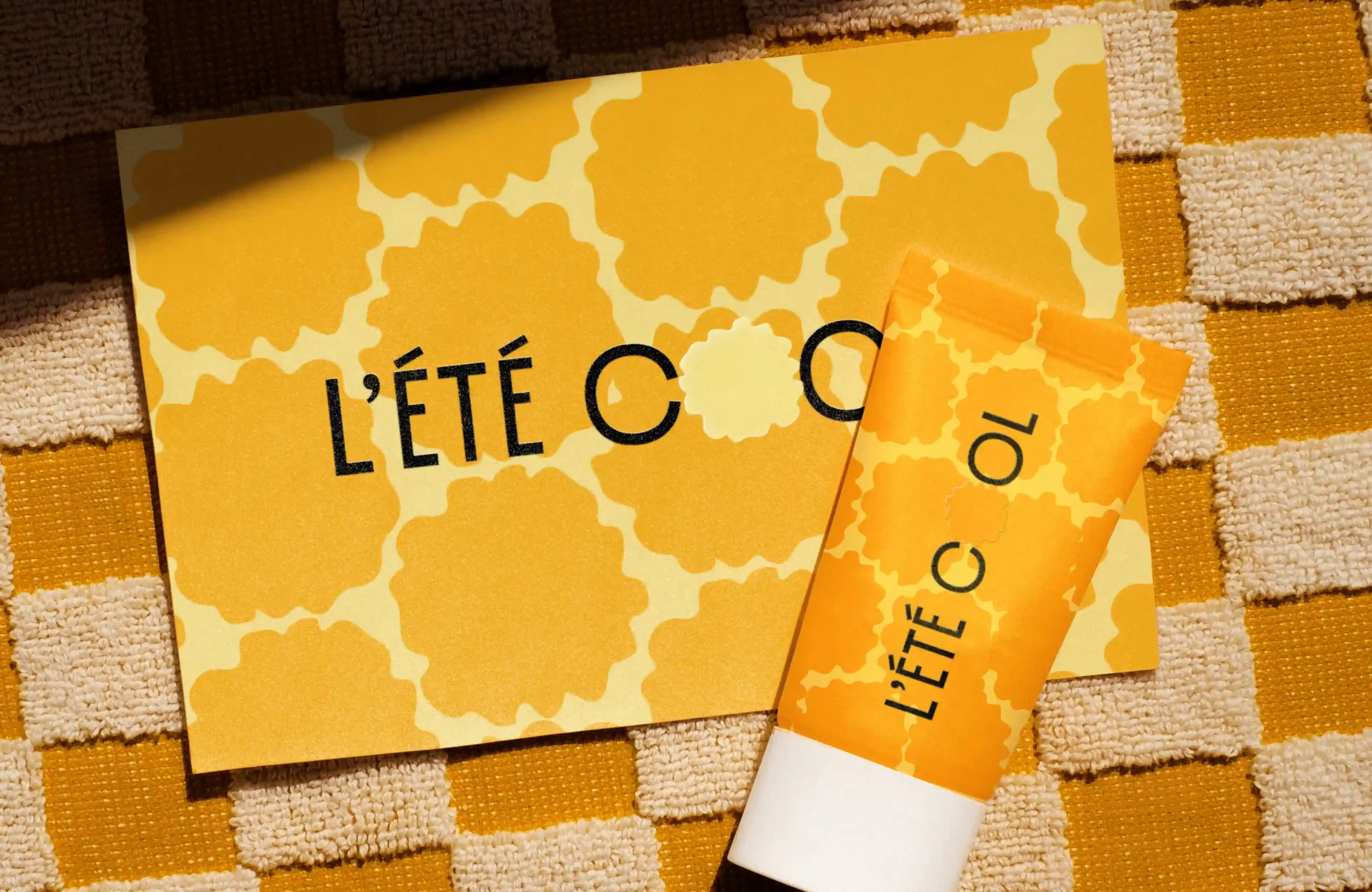
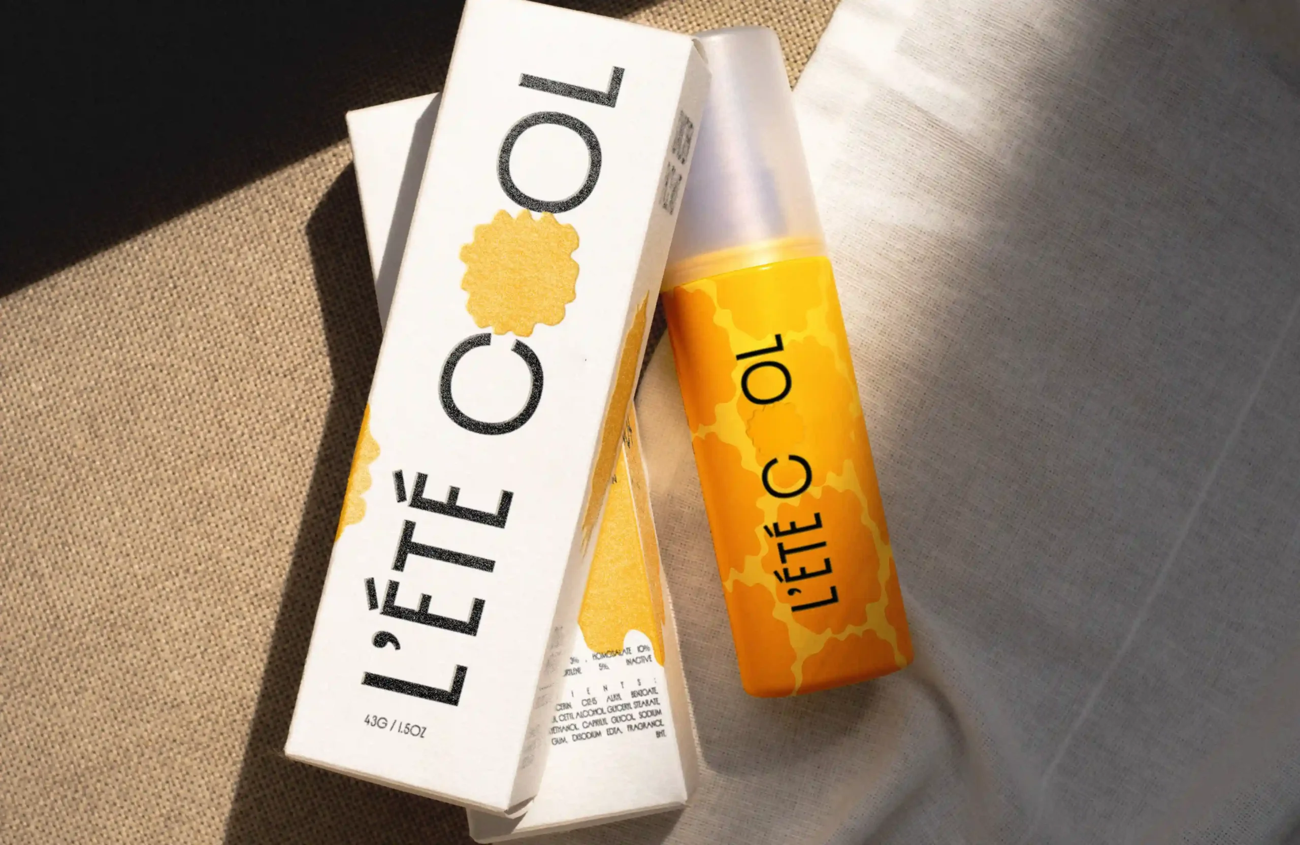
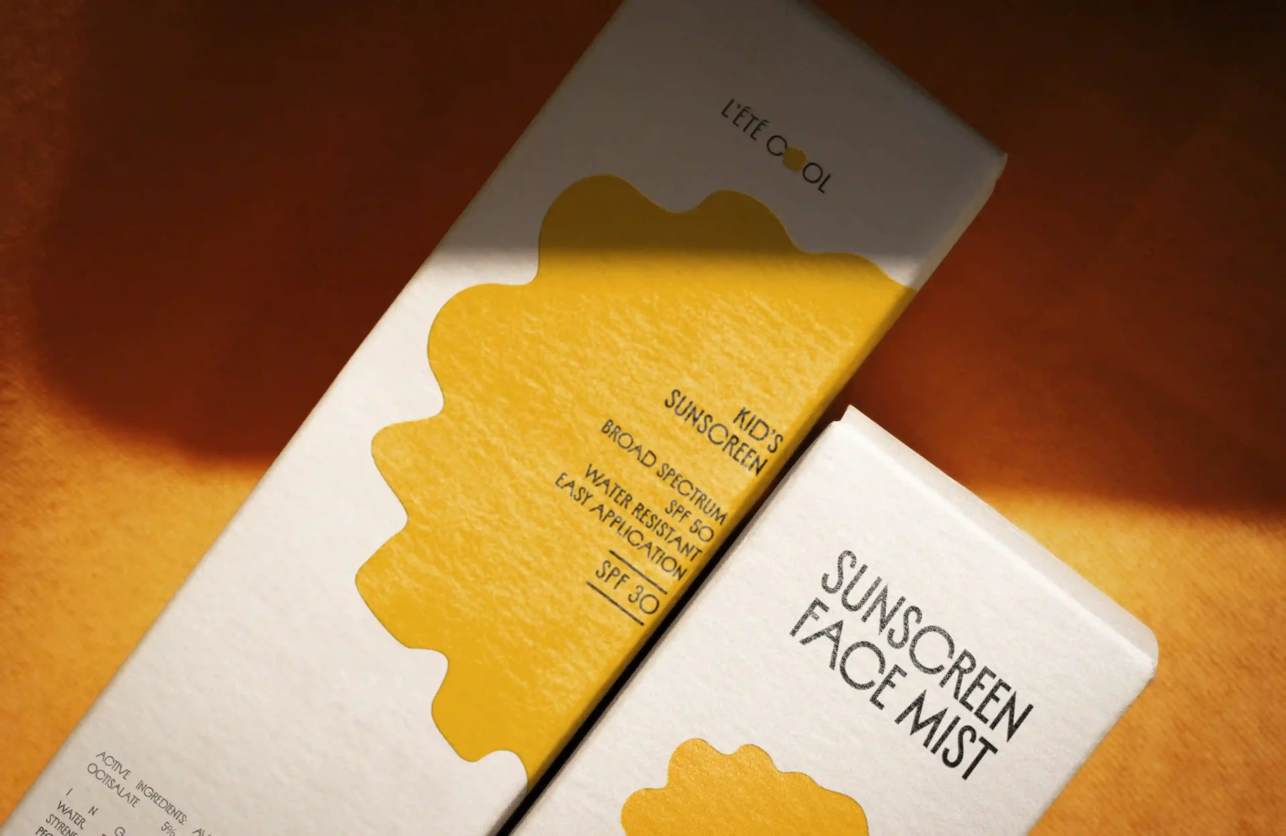
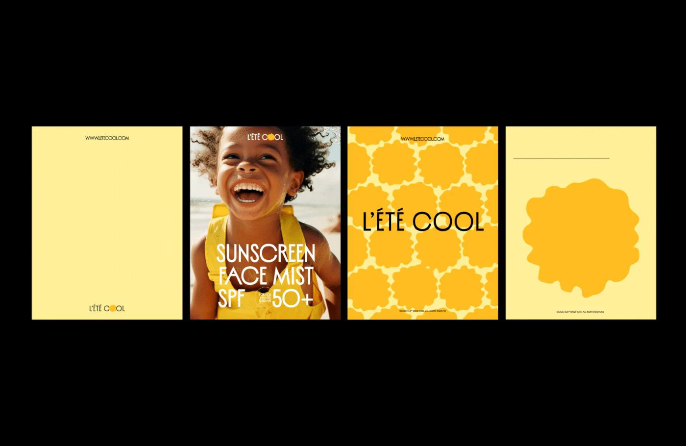
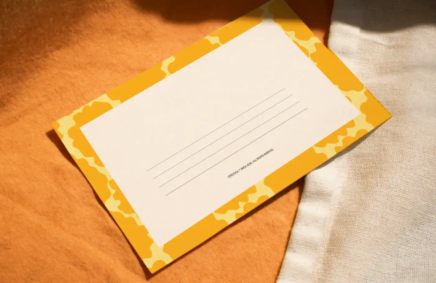
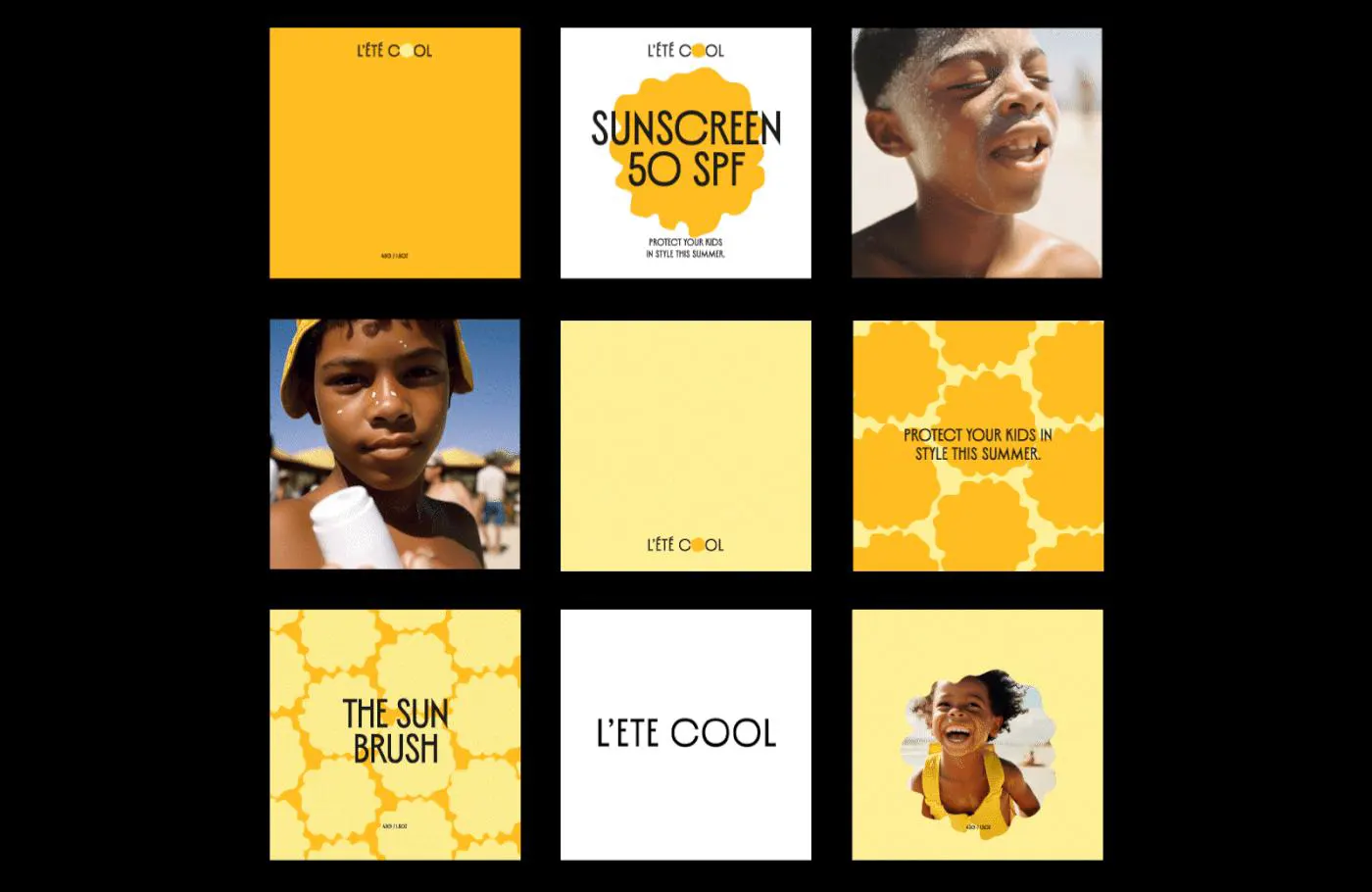
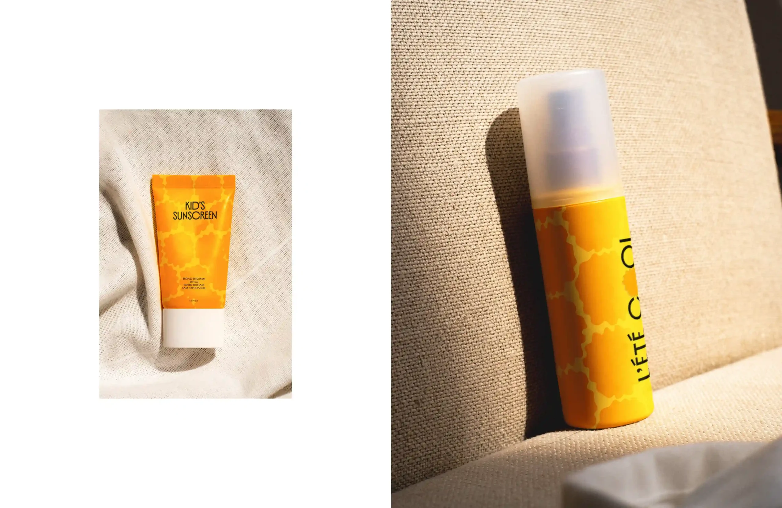
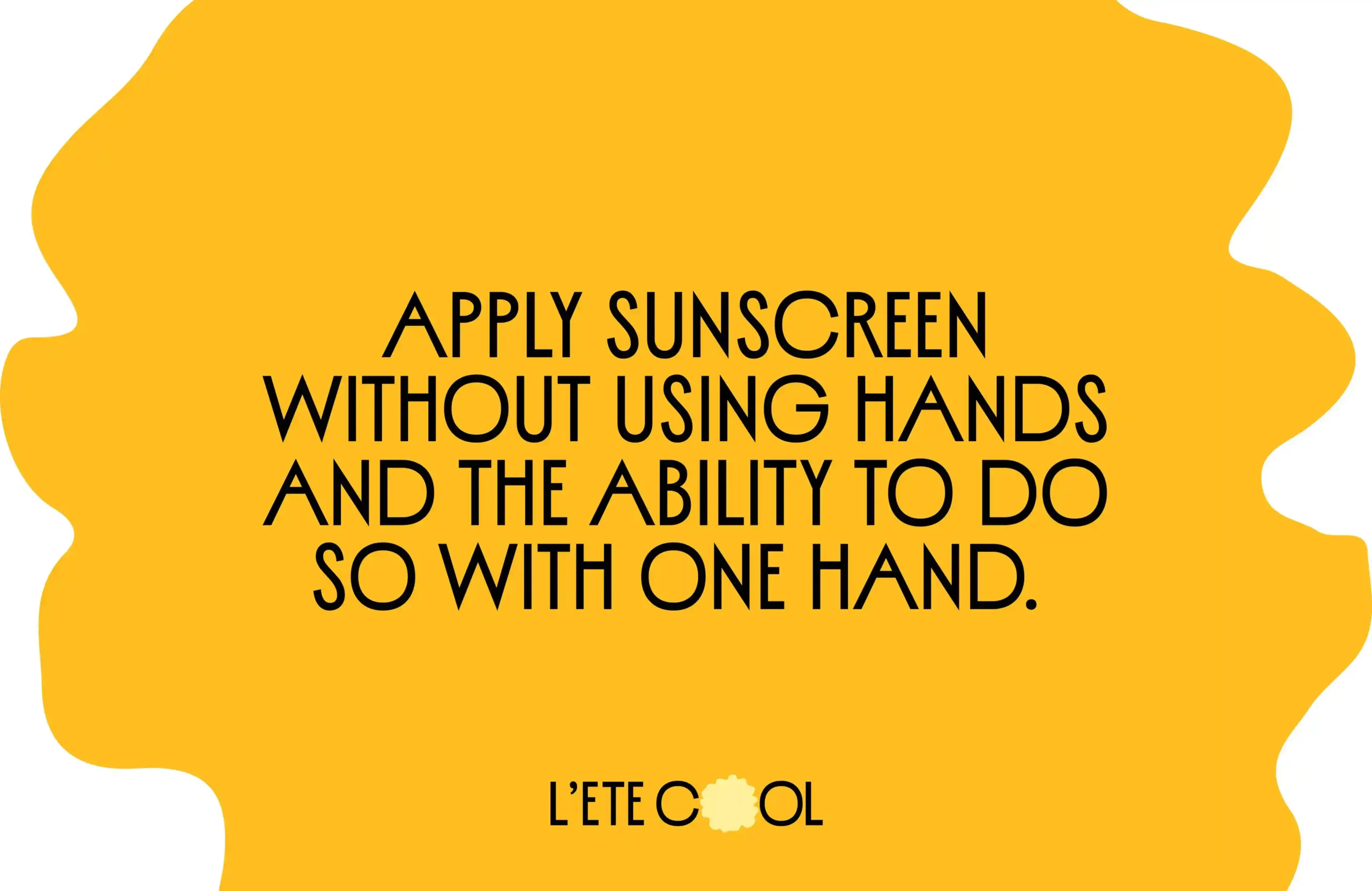
The primary challenge was to balance a playful, kid-friendly vibe with a sense of trustworthiness and efficacy for parents. We used warm yellow tones and whimsical shapes reminiscent of sun patterns to establish an inviting, sunny feel. The typography was chosen to be approachable yet distinct, with clear readability to communicate the brand’s name and purpose effectively.
THE RESULT
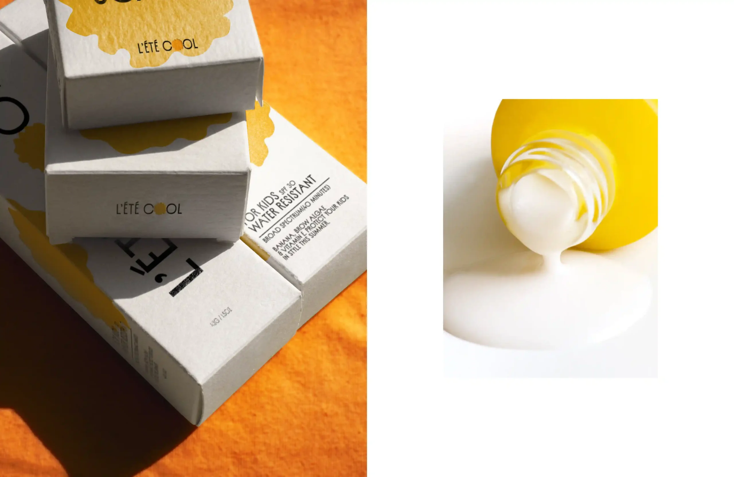
The final branding captures the essence of summer with a visually appealing, cohesive look. The bold colors and patterns are memorable and engaging, making L’été Cool easily recognizable. The result is a brand that resonates with children and parents alike, combining fun visuals with a reassuring, protective appeal.
