Well, October’s already here! The month launches with determined momentum, and the new typeface releases showcase this drive and aspiration beautifully. From influences rooted in Danish architectural heritage to pixel-driven explorations embracing creative limitations, this selection reveals how type foundries are expanding horizons in unprecedented ways.
A prevailing theme among these typography trends 2025 centers on balancing methodical construction against expressive personality. Multiple launches illustrate how strict structural frameworks—whether through geometric patterns, historical nods, or modular approaches—can spark distinctive character instead of constraining creativity.
Whether your project calls for a sans serif typeface with authentic warmth, a statement font celebrating architectural grandeur, or a flexible system bridging serif and sans-serif aesthetics, continue reading.
1. Crit by Element Type
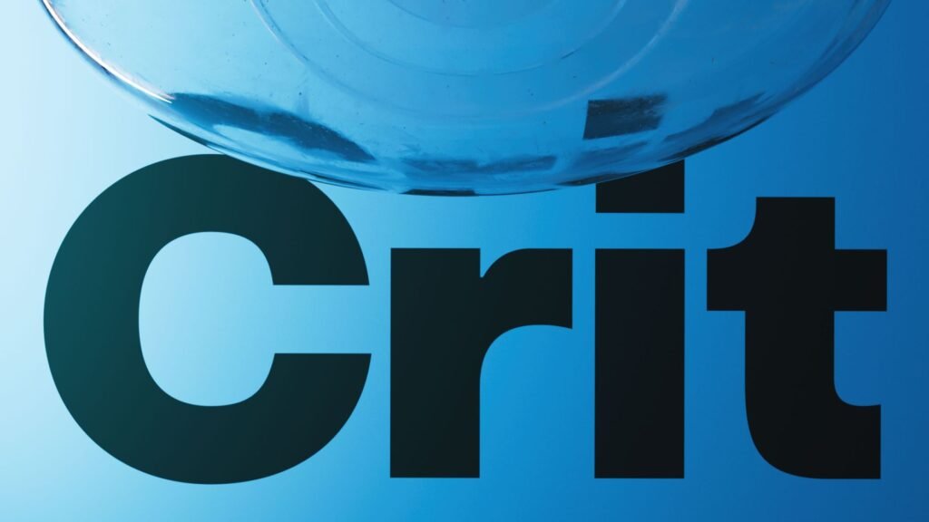
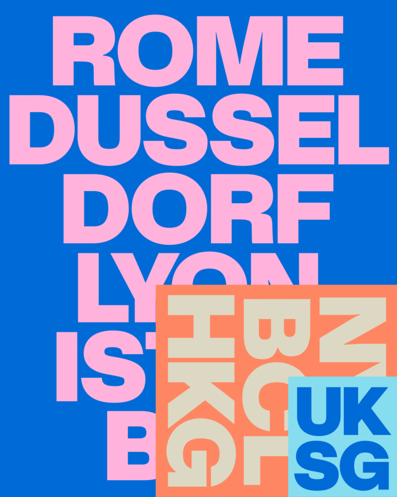
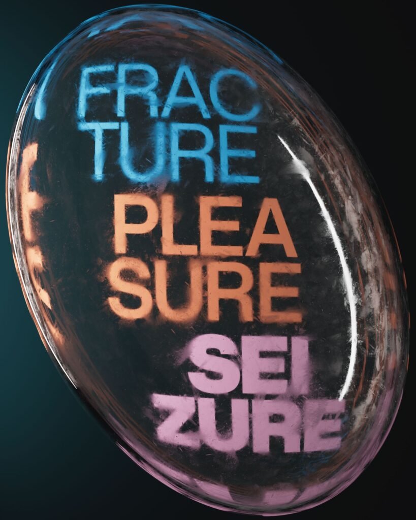
Crafted by Doğukan Karapınar and İbrahim Kaçtıoğlu, Crit reimagines classic grotesque sans models with a modern lens, delivering an eight-weight modern font family with corresponding italics that respects mid-20th century phototypesetting heritage while meeting today’s design demands.
The typeface channels an epoch when foundries such as Helvetica and Akzidenz-Grotesk saw interchangeable use in phototype compositions, embracing that practical versatility while weaving in nuanced formal refinements.
Crit’s personality surfaces through meticulous proportional decisions—an elevated x-height paired with abbreviated ascenders and descenders yields compact, legible text maintaining sharpness across diverse uses. Heavier weights transition counters toward squarer geometries to avoid excessive mass buildup, while ligatures emerge selectively to enhance readability.
These understated formal modifications show how current grotesque design can inject personality while preserving the neutrality that rendered historical models so adaptable. What emerges is a reliable, harmonious typeface operating both as dependable workhorse and unique voice.
2. Grundtvig by REY Graphic
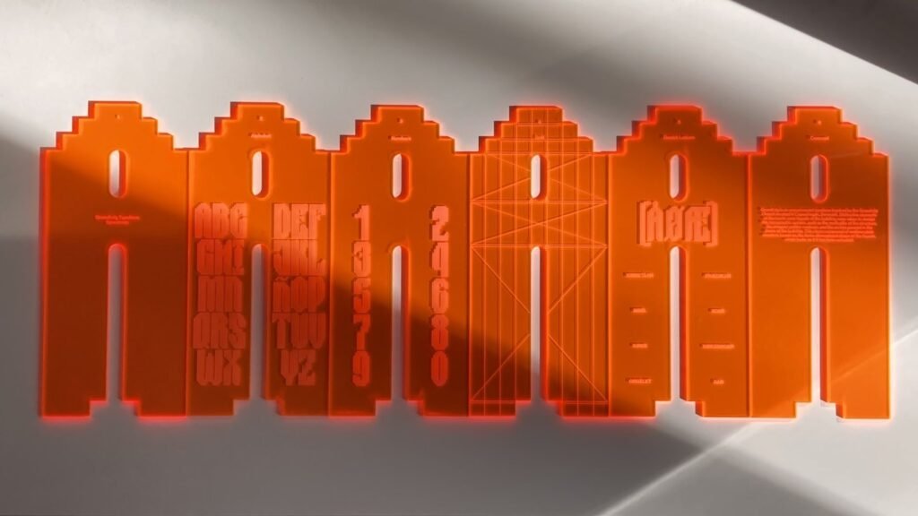
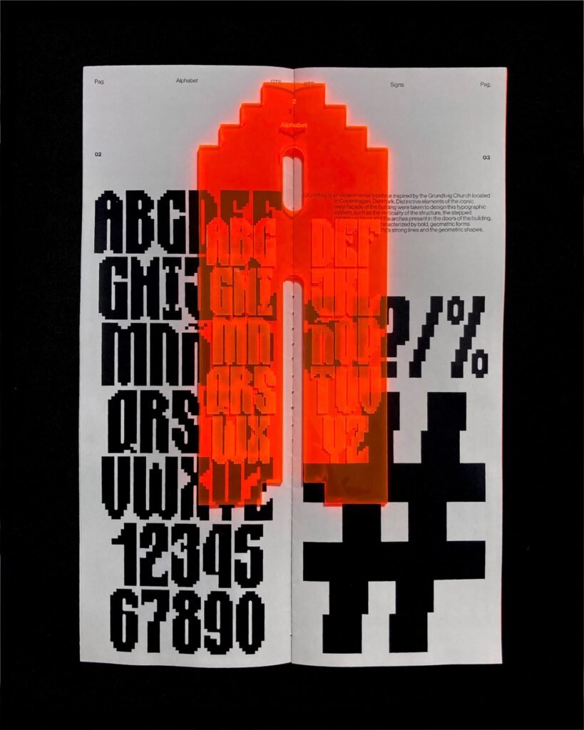
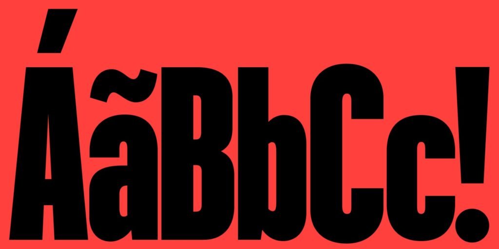
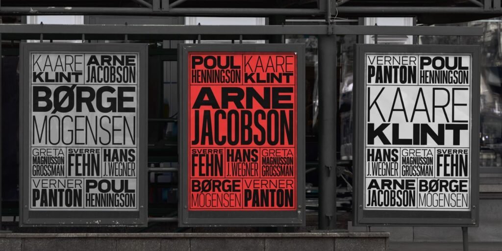
Reinaldo Camejo’s most recent experimental project takes cues from Copenhagen’s celebrated Grundtvig’s Church. Developed during Reinaldo’s Master’s studies at ELISAVA, this experimental font extracts signature elements from the church’s striking western facade—its soaring vertical emphasis, tiered gables, and curved entryways—transforming them into geometric letter constructions.
The typeface’s essence derives unmistakably from this architectural foundation, featuring assertive, geometric shapes that mirror the structure’s commanding lines and monumental scale. Yet instead of pursuing literal representation, Camejo has concentrated the church’s core visual vocabulary into a unified typographic framework balancing structural coherence with expressive intensity.
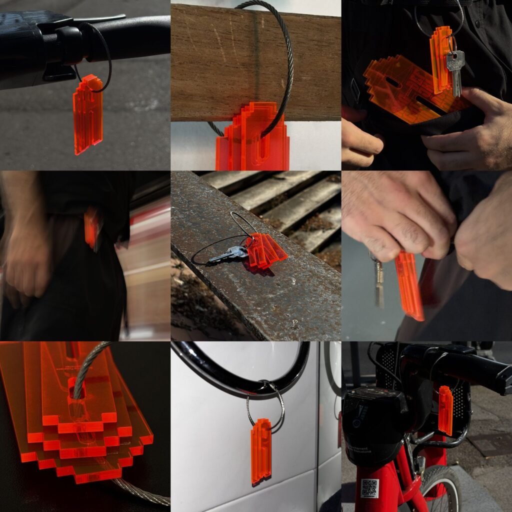
Since debut, Grundtvig has attracted worldwide acclaim, securing distinguished honors including ADG Laus, ADC*E Awards, and LAD Awards. After the official launch, partnered with 6TM Magazine, Camejo has expanded a suite of physical specimens, comprising the award-winning original, a condensed Mini variant, an editorial Booklet format, and a keychain edition.
3. Perfektta by Displaay Type Foundry
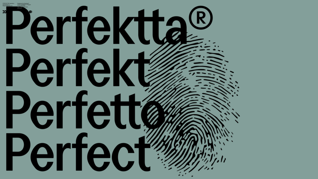
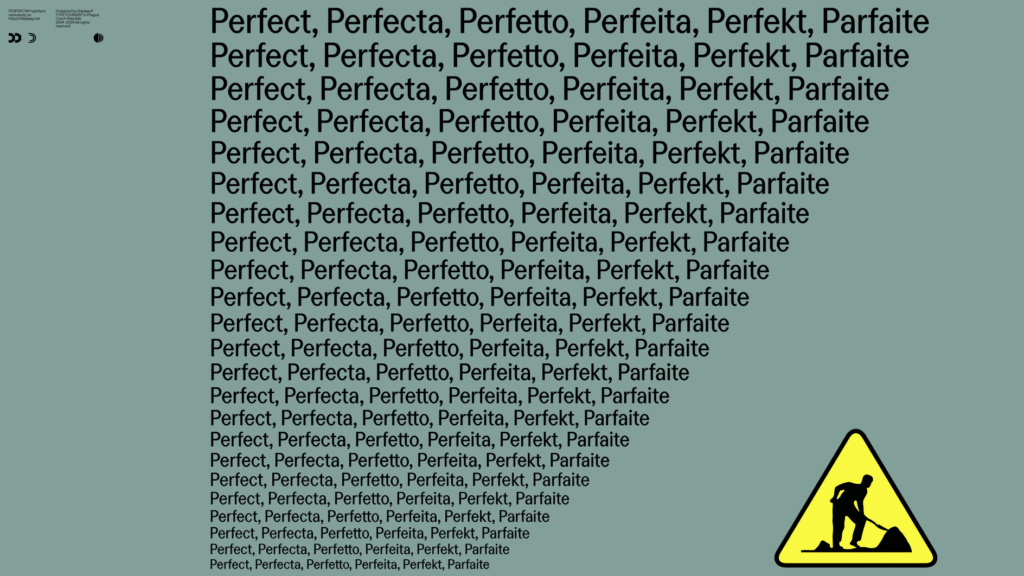
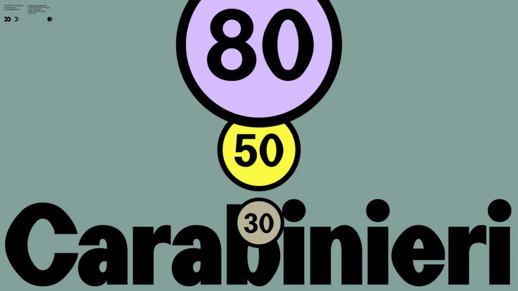
Drawing from a photograph of an Italian road marker in Sardinia, Perfektta honors beauty discovered within imperfection. Martin Vácha’s creation originated with attraction to an unusual zero form, believed resulting either from Italian craftsmen struggling to cut flawless ovals from foil, or straightforward creative pragmatism.
This diamond-shaped zero established the groundwork for a sans-serif collection featuring condensed proportions and pronounced stem contrast. Additional inspiration emerged from Alfabeto Stretto, the Italian road sign lettering, which similarly exhibits an unconventional zero.
The title, Martin explains, references “the flawed construction contrasting with certain perfect forms”—generating productive friction in the ultimate aesthetic.
4. Season by Displaay Type Foundry
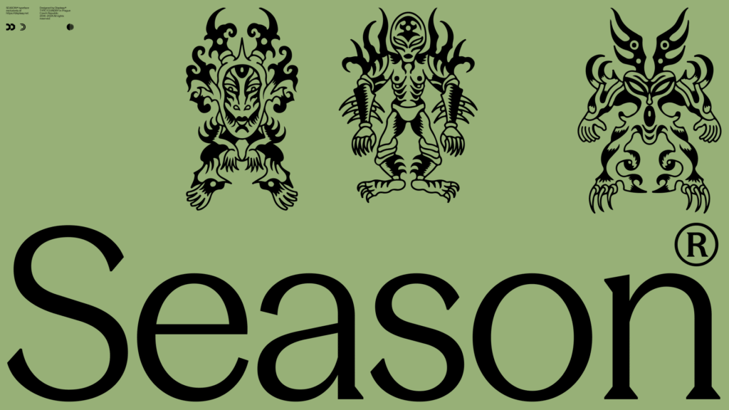
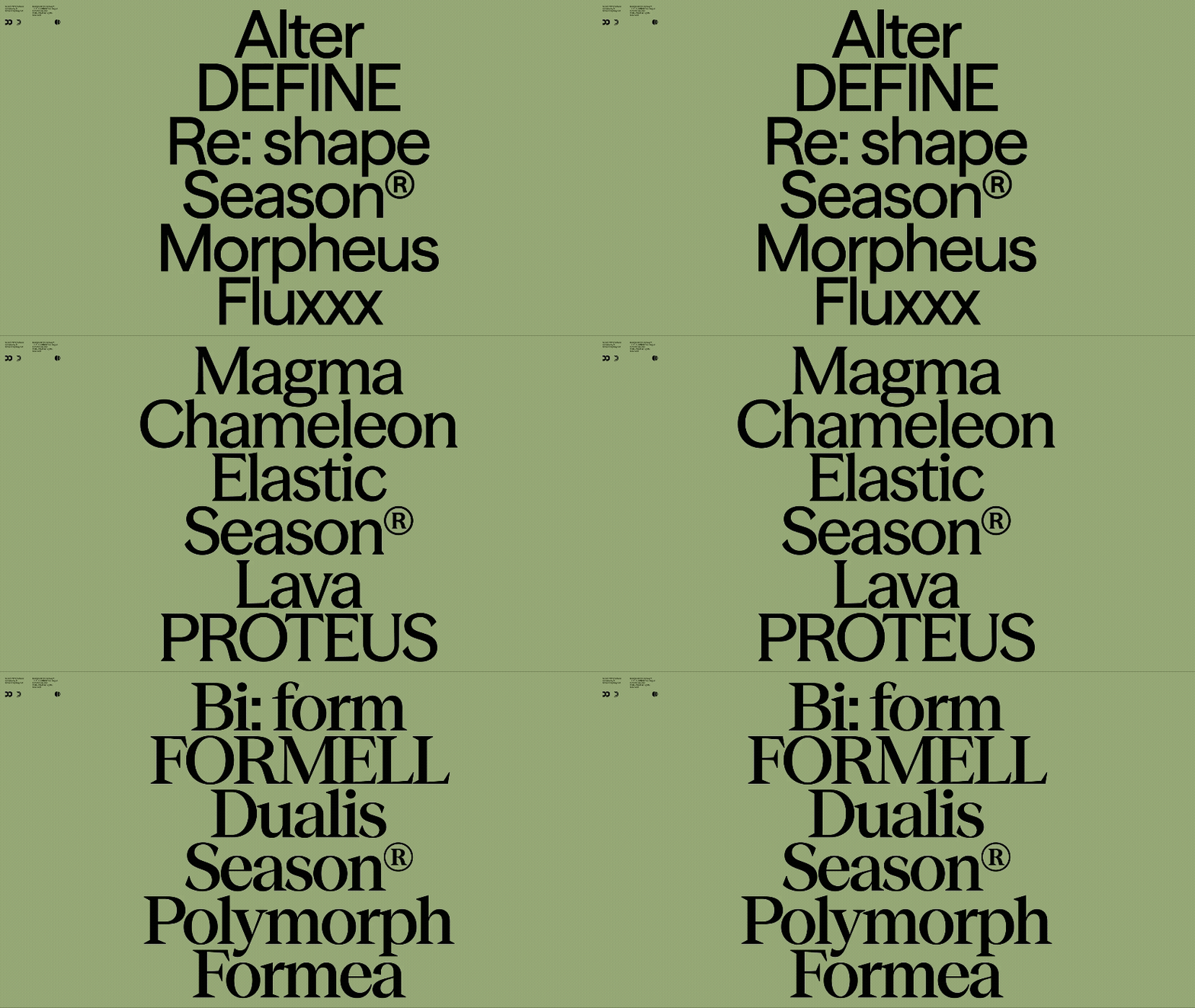
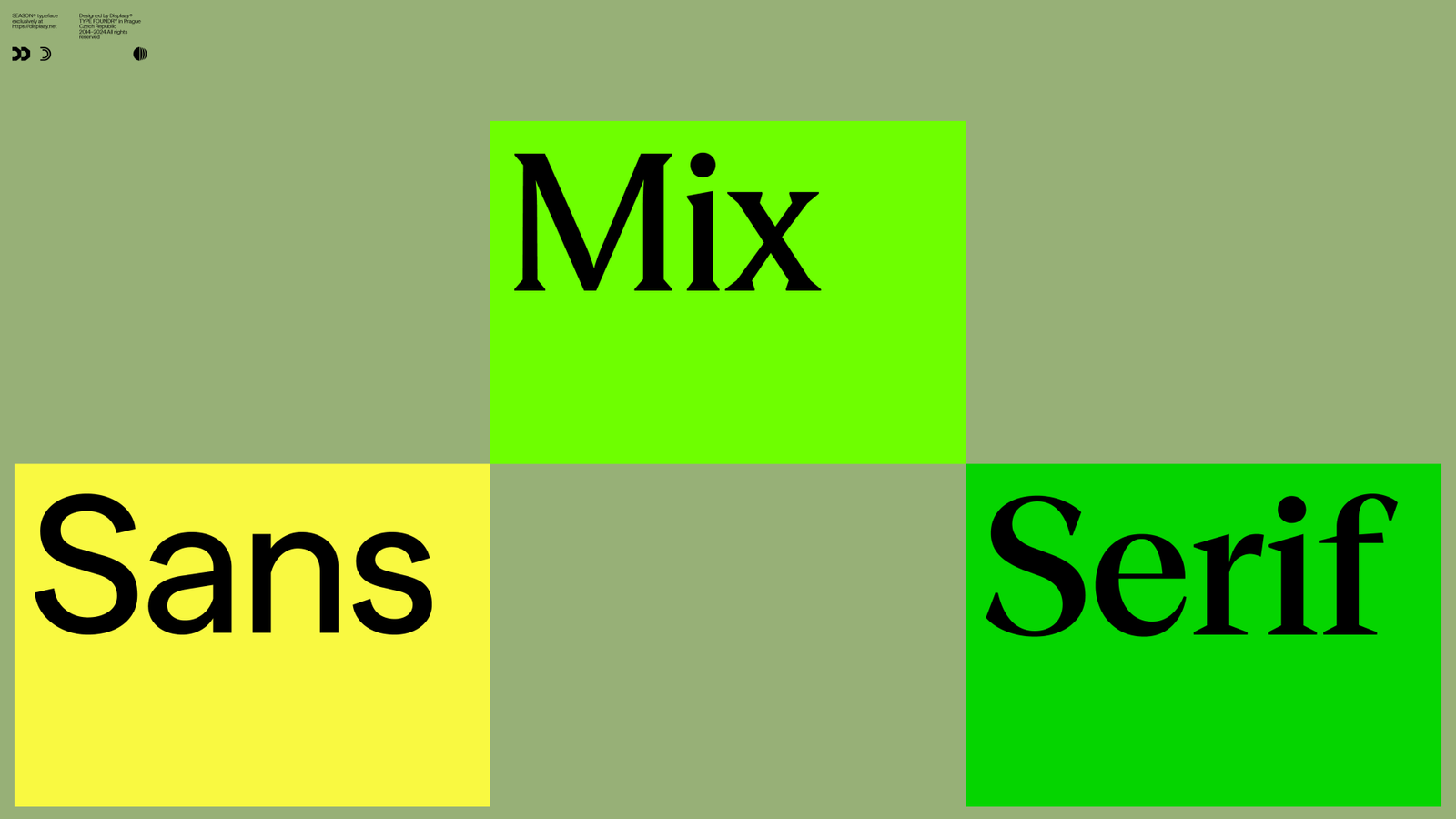
Martin Vácha’s Season tackles typography’s persistent dilemma: choosing between sans-serif and serif styles. Rather than forcing designers into this essential selection, Season presents a cohesive structure that flows seamlessly between both realms through variable font design technology.
The concept investigates transformation as creative approach, presenting sans-serif evolution as design instrument rather than either-or decision. Each “season” maintains excellence and personality while inhabiting different positions across the serif continuum, enabling designers to calibrate typographic voice matching precise contextual needs.
This methodology reflects contemporary movement toward adaptability and contextual responsiveness. By treating the serif/sans-serif division as spectrum rather than barrier, Season facilitates more sophisticated typographic choices, particularly beneficial for brand ecosystems demanding both commanding serif presence and streamlined sans-serif performance.
5. Pranzo by Dalton Maag
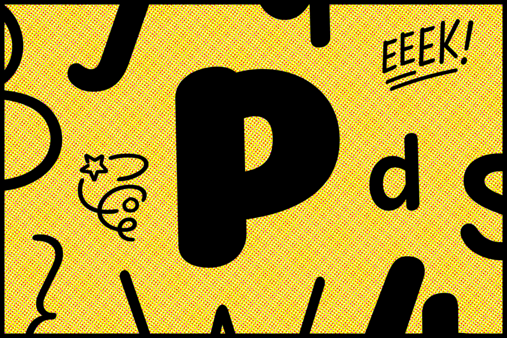
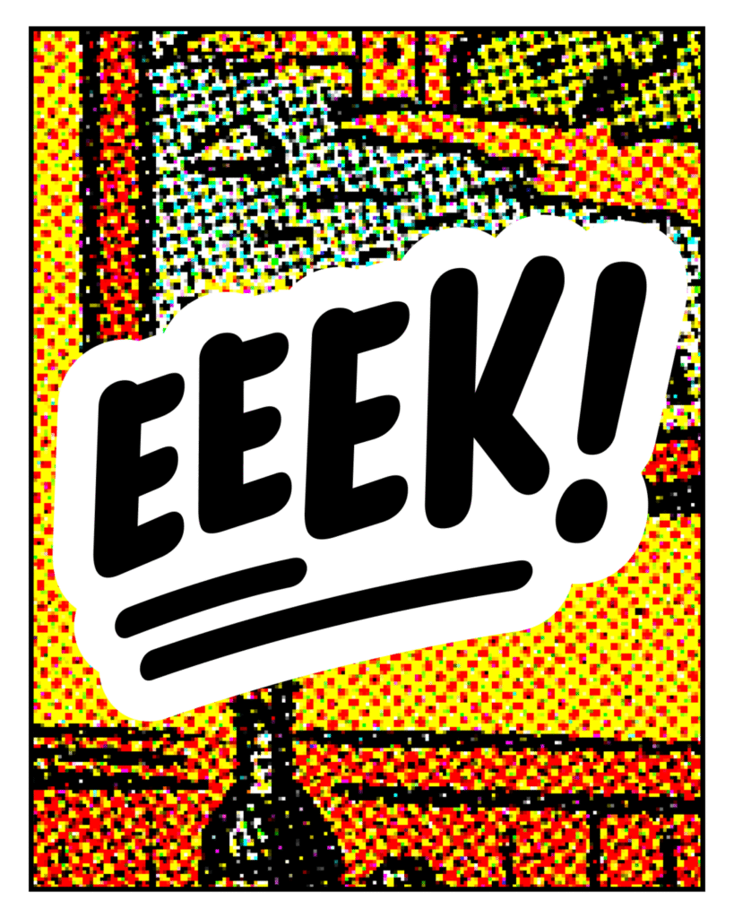
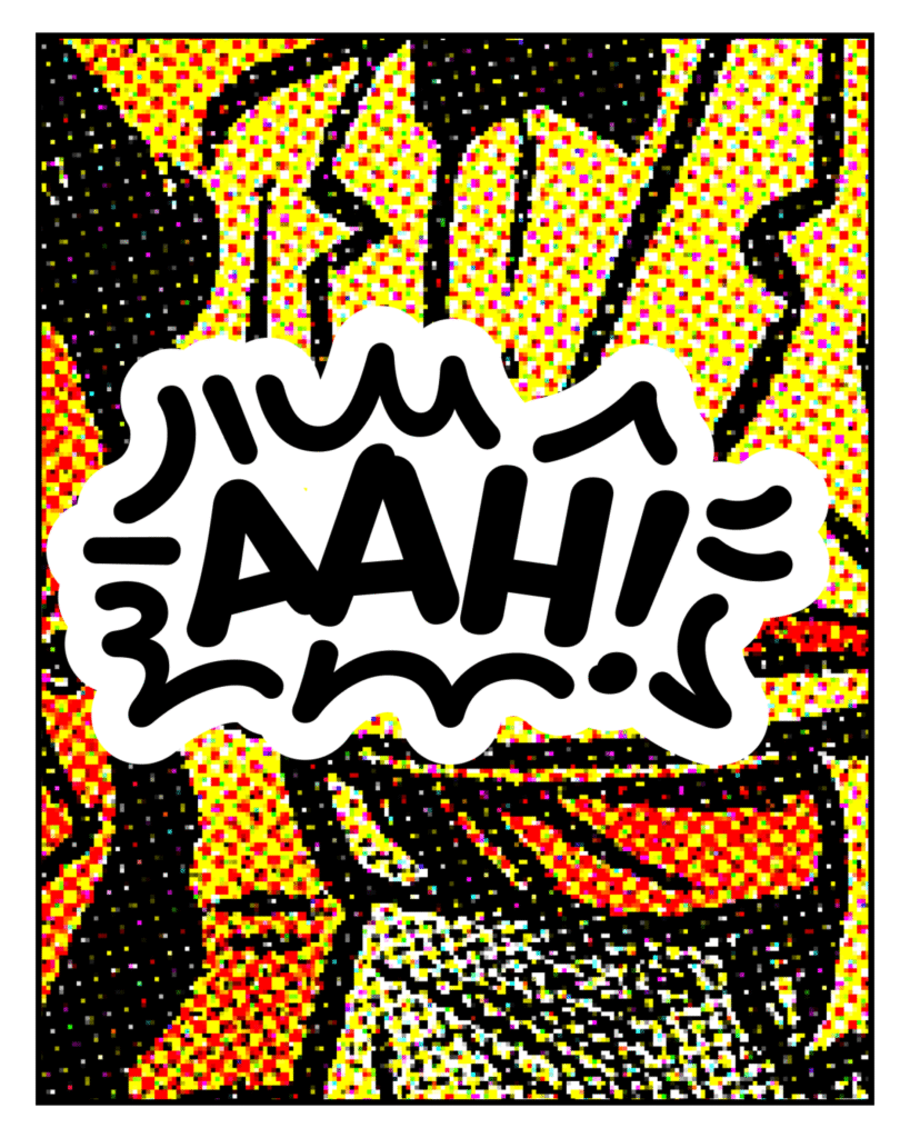
Created by Samar Zureik and Hanna Donker, Pranzo establishes itself as the definitive comic book typeface, delivering extraordinary versatility through three comprehensive variable font design axes spanning every conceivable narrative tone and visual intensity.
This transcends merely a display face with comic applications, instead offering a thorough typographic ecosystem engineered specifically for sequential art’s distinct requirements.
Pranzo’s three variable axes construct expansive design territory: weight spans from whispered Hairline to roaring Black, slant travels from rebellious Backslant through assertive Italic, and width extends from accelerated ExtraCondensed to relaxed ExtraExtended. This methodical structure permits precise typographic voice adjustment, letting designers synchronize letterform intensity with narrative substance.
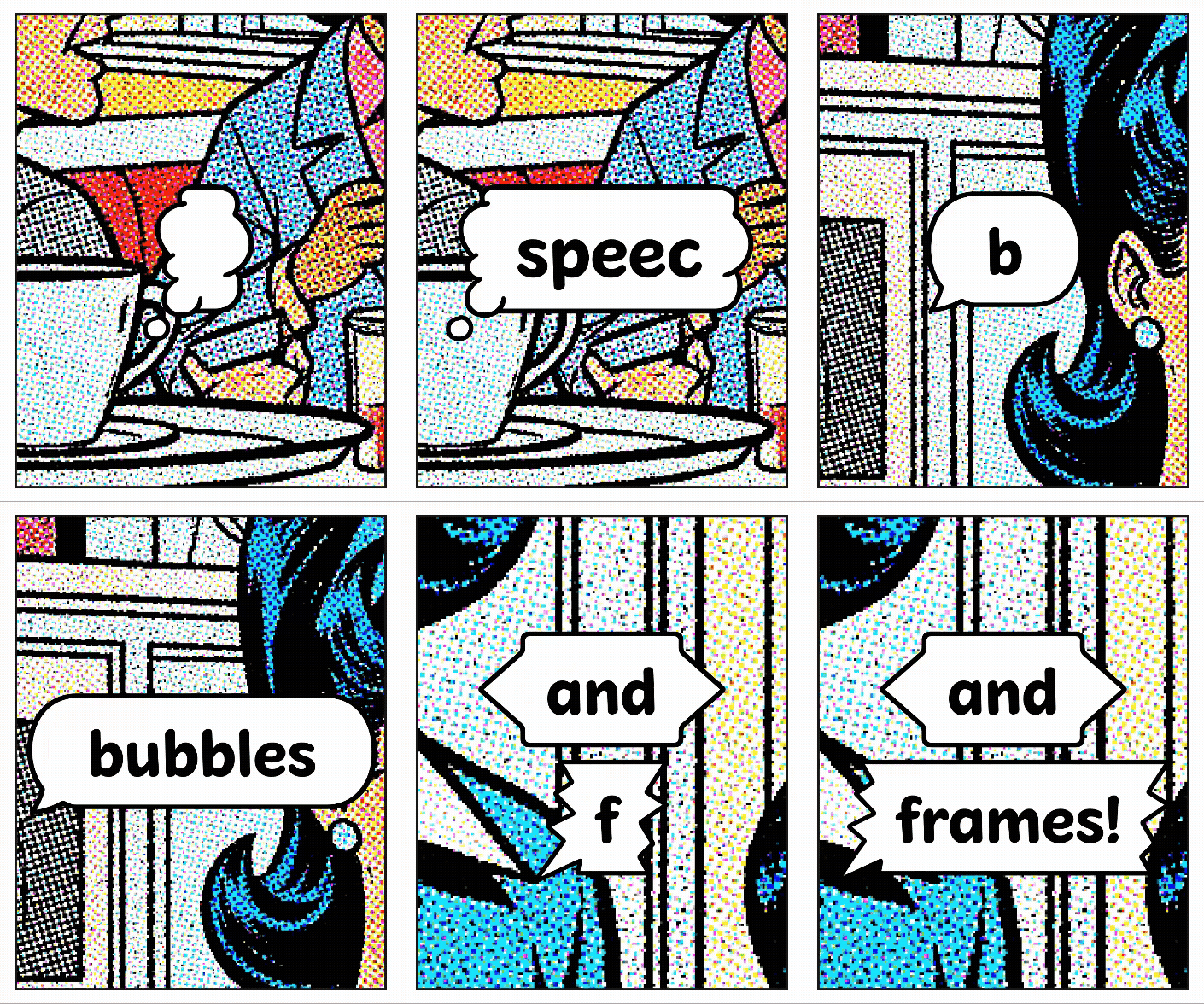
The typeface incorporates vital comic elements—symbols, frames, speech containers, and thought bubbles—accessible throughout every weight and style blend. This integration reveals how contemporary type creation can address specialized media demands while maintaining wider applicability.
Pranzo’s character balances casualness with authority, expressiveness with legibility, forming a flexible yet unified system supporting traditional comic arrangements and modern graphic design contexts.
6. Jovie by Dalton Maag
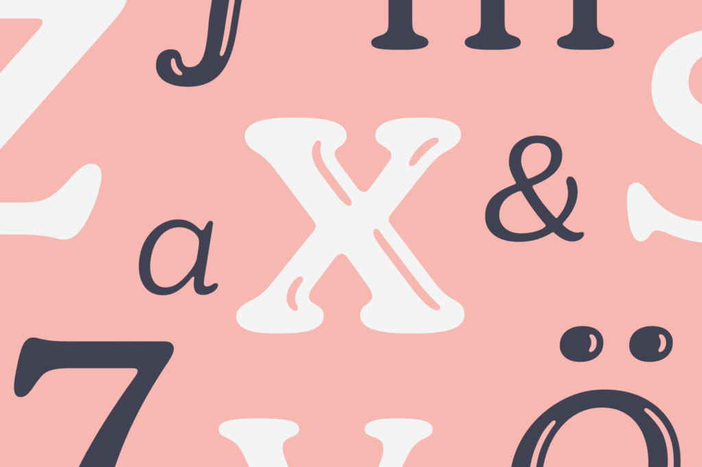
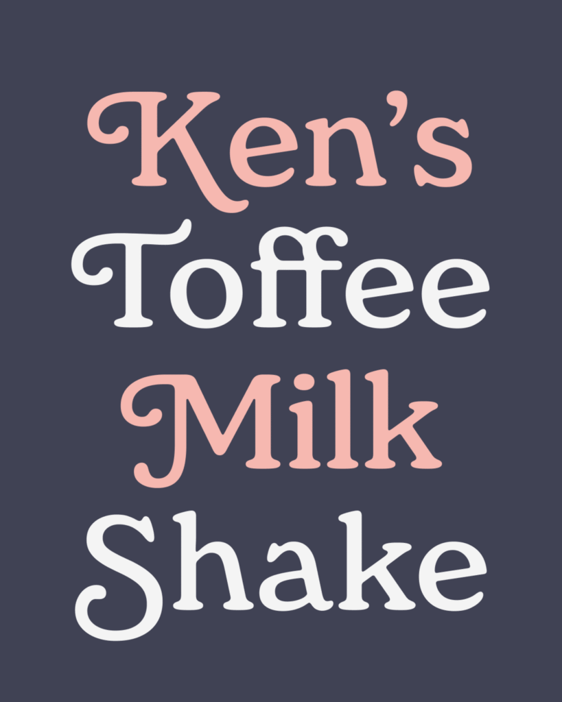
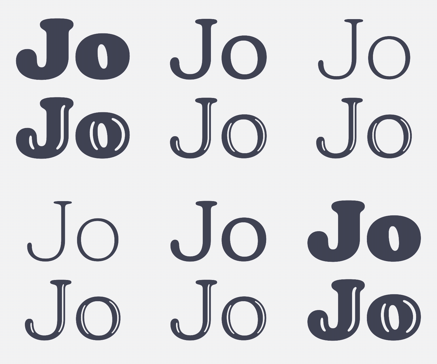
Franziska Hubmann’s Jovie demonstrates how soft-serif design achieves both coziness and sophistication through considerate variable font execution. The typeface features an expansive weight axis, spanning from Hairline to Black, positioning it as adaptable solution for projects demanding both refined text configurations and striking display implementations.
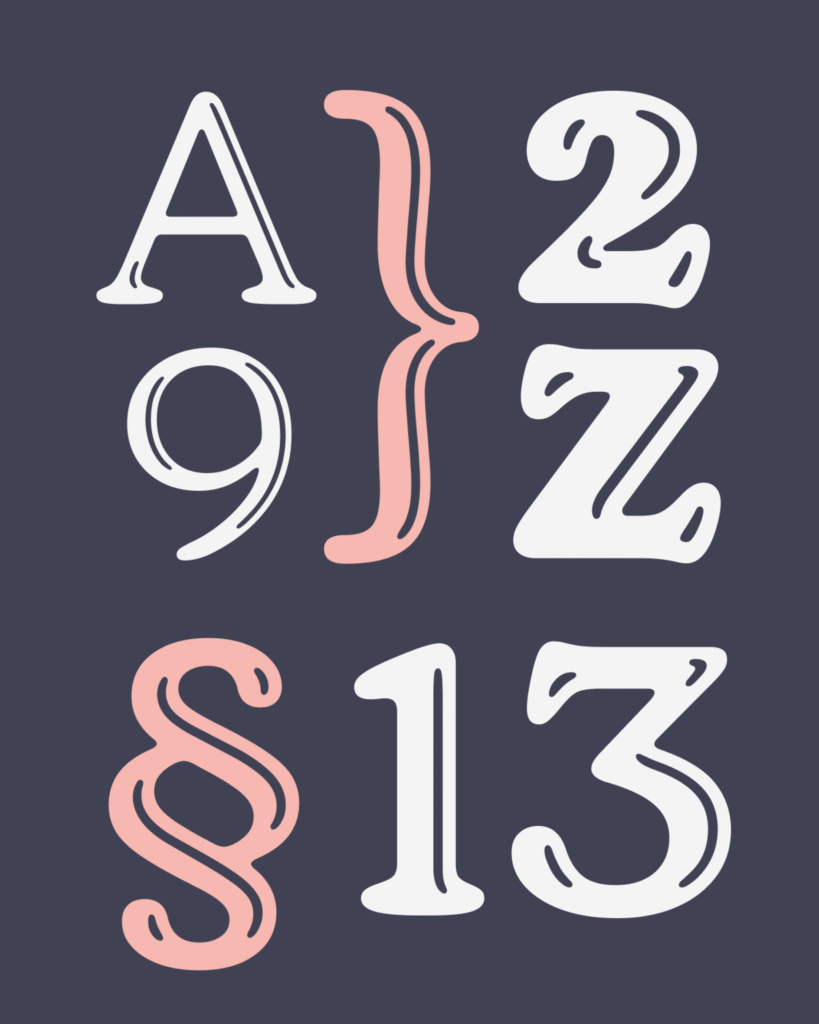
Jovie’s character surfaces through its soft-serif methodology, which moderates conventional serif authority with contemporary accessibility. Animated italics, vivid alternates, swashes, and ligatures furnish designers with abundant typographic resources, while sustaining consistent family connections across all variations.
Including a decorative Glow style in Regular through Black weights, complete with complementary italics, pushes Jovie’s spectrum into more experimental domains.
Overall, Jovie succeeds in connecting text and display needs, providing warmth and sophistication across varied design situations while accommodating over 790 languages for international implementation.
7. LL Supreme by Lineto
Arve Båtevik’s LL Supreme presents neither restoration nor redesign of Paul Renner’s Futura, but contemporary reinterpretation of its core philosophy: building refined typography exclusively from straight edges and circular arcs. This strategy prioritizes Renner’s foundational principles over historical duplication.
The initiative arose from practical necessity when Cornel Windlin encountered difficulty locating appropriate digital Futura versions for Vitra’s communications. Rather than accepting compromised digital conversions, Lineto pursued its own interpretation, eventually leading to Supreme’s total reconstruction from geometric foundations.
Each weight received individual drafting rather than interpolation, granting separate cuts distinct identities addressing their particular formal demands. This approach counters contemporary inclinations toward systematic interpolation, instead celebrating unique qualities emerging when each weight receives dedicated focus.
Historical stylistic alternates honor Renner’s original vision while serving contemporary digital specifications.

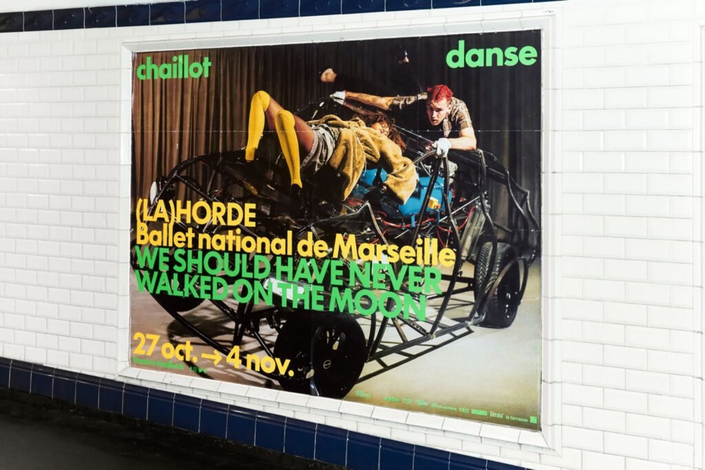
8. Lintel Next by The Northern Block
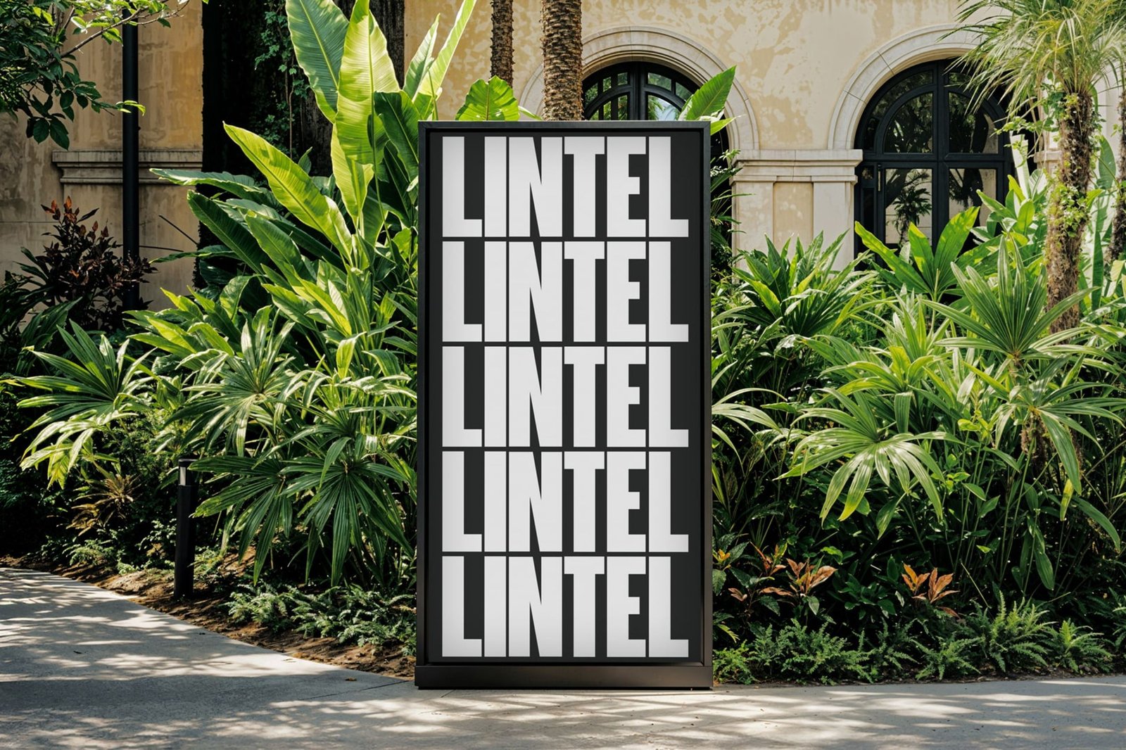
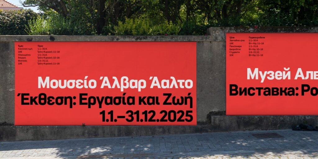
Advancing the heritage of the Lintel typeface, featured in video game Mafia III, Lintel Next derives architectural inspiration from Finnish designer Alvar Aalto. It functions as commercial workhorse sustaining cultural and technological flexibility while conveying narratives with precision and warmth.
Following 18 months of development, directed by Tasos Varipatis, every character from original Lintel received redrawing for enhanced consistency and legibility. The family now encompasses five additional widths—Compressed through Extended—with 12 intermediate layers guaranteeing seamless transitions without compromising the signature pill-shaped curves and balanced letterforms.
Supporting 1,222 characters per style with extensive OpenType capabilities and coverage for Greek and Vietnamese languages, Lintel Next excels at harmonizing geometric accuracy with human-centered approachability. An excellent selection for branding, editorial, or UI design applications.
Looking for expert support in branding, design, or packaging? Discover how Brandlic turns creative ideas into powerful brand experiences. Explore our services →
