Discover this month’s most exciting typography releases from renowned foundries, featuring everything from playful display typefaces to sophisticated brand identity solutions.
Published: June 2025
Looking to refresh your design toolkit? The world of New Typefaces 2025 continues to evolve with remarkable innovations. Typography’s ability to grab attention, express character, and build unforgettable brand experiences remains unparalleled. While change shouldn’t happen just for novelty’s sake, embracing fresh Typography Trends can transform your creative work.
June’s typography releases showcase an incredible variety in contemporary type design. From charming unicase letters that appear molded from clay to refined geometric sans-serifs honoring mid-century design principles, these Modern Fonts prove that designers consistently discover innovative approaches within classic frameworks.
This month’s selections address every design challenge. Each typeface represents a distinct vision, embodying extensive craftsmanship and creative innovation from the field’s most forward-thinking creators.
When planning your next project’s visual impact, consider exploring these typographic gems. In today’s saturated visual landscape, selecting the perfect typeface could be your key to establishing a memorable Brand Identity.
1. Clearly by Big Fog Foundry
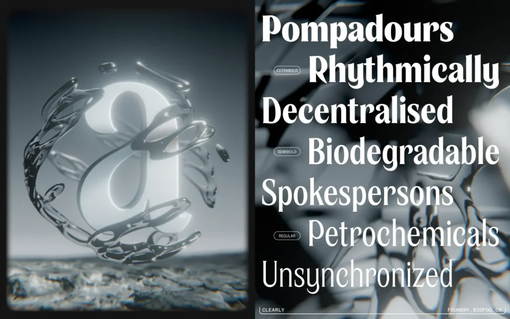
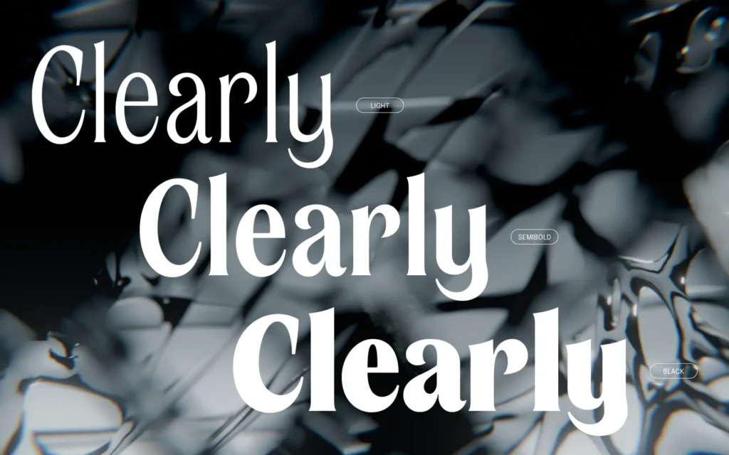
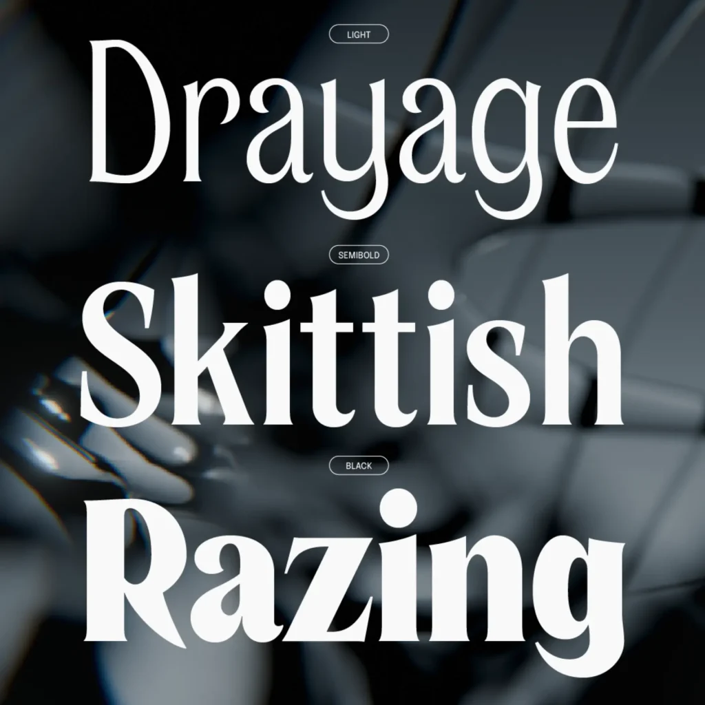
Brian Dove’s Big Fog Foundry presents Clearly, a flared Display Typeface designed for headlines and prominent applications. Originally launched as a single lightweight in 2023, it now offers a complete seven-weight family spanning Light through Black.
Clearly achieves fascinating emotional balance. Gentle curves in certain letterforms provide warmth, counterbalanced by crisp terminals throughout. This creative tension produces a typeface that adapts across diverse contexts while preserving character, delivering exceptional versatility for display applications.
Taking cues from Old-style and Victorian serif traditions, plus their modern interpretations, Clearly maintains sophistication while staying memorable. The condensed proportions give lighter weights both strength and delicacy, while heavier weights showcase increased contrast. The creator suggests using Clearly at medium to large scales for book covers, logos, decorative metalwork, and—with playful irony—memorial service branding.
2. FL Rare by Contemporary Type
FL Rare represents one of the premium offerings launching Contemporary Type’s selective font marketplace. Following years of presenting cutting-edge typography to their substantial Instagram following and co-hosting the Inscript typography festival, this platform now curates typefaces combining superior quality, contemporary aesthetics, and innovative design thinking.
Created by Alex Slobzheninov, formerly of &Walsh, FL Rare exemplifies these principles: a streamlined grotesque enhanced with delicate handwritten influences. Clean forms, closed apertures, and minimal contrast position it within functional sans-serif territory, yet surprising details suggesting pen strokes provide distinctive character unusual for this category.
3. Gilway Paradox by Art Grootfontein
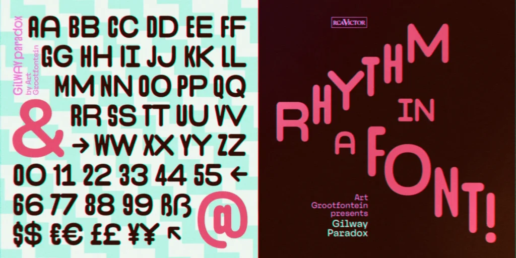
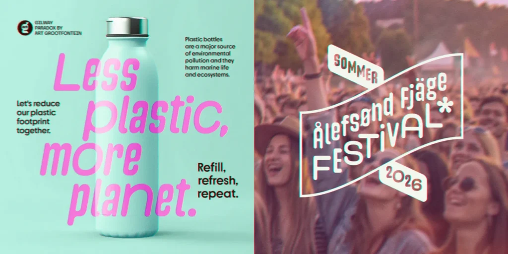
Type designer and illustrator Art Grootfontein introduces Gilway Paradox: a groundbreaking sans-serif featuring unique dual-width construction that generates visual rhythm and energetic movement. Its standout capability allows instant width switching through OpenType features, unlocking endless creative opportunities.
This adaptable, rounded typeface harmonizes warmth with dynamism, offered in three weights (Light, Regular, Bold) plus corresponding italics. Each style maintains playful sophistication suitable for diverse uses, including branding, editorial design, packaging, and fashion applications.
Gilway Paradox complements Grootfontein’s existing Gilway collection, a spirited rounded condensed sans-serif featuring four styles with shadow options. Supporting over 30 languages—covering major European tongues plus Afrikaans, Swahili, Filipino, and Zulu—this typeface delivers both visual distinction and international accessibility.
4. Exat by Hot Type
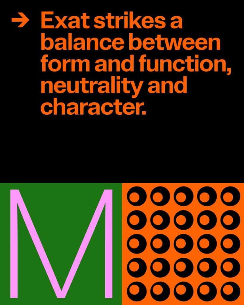
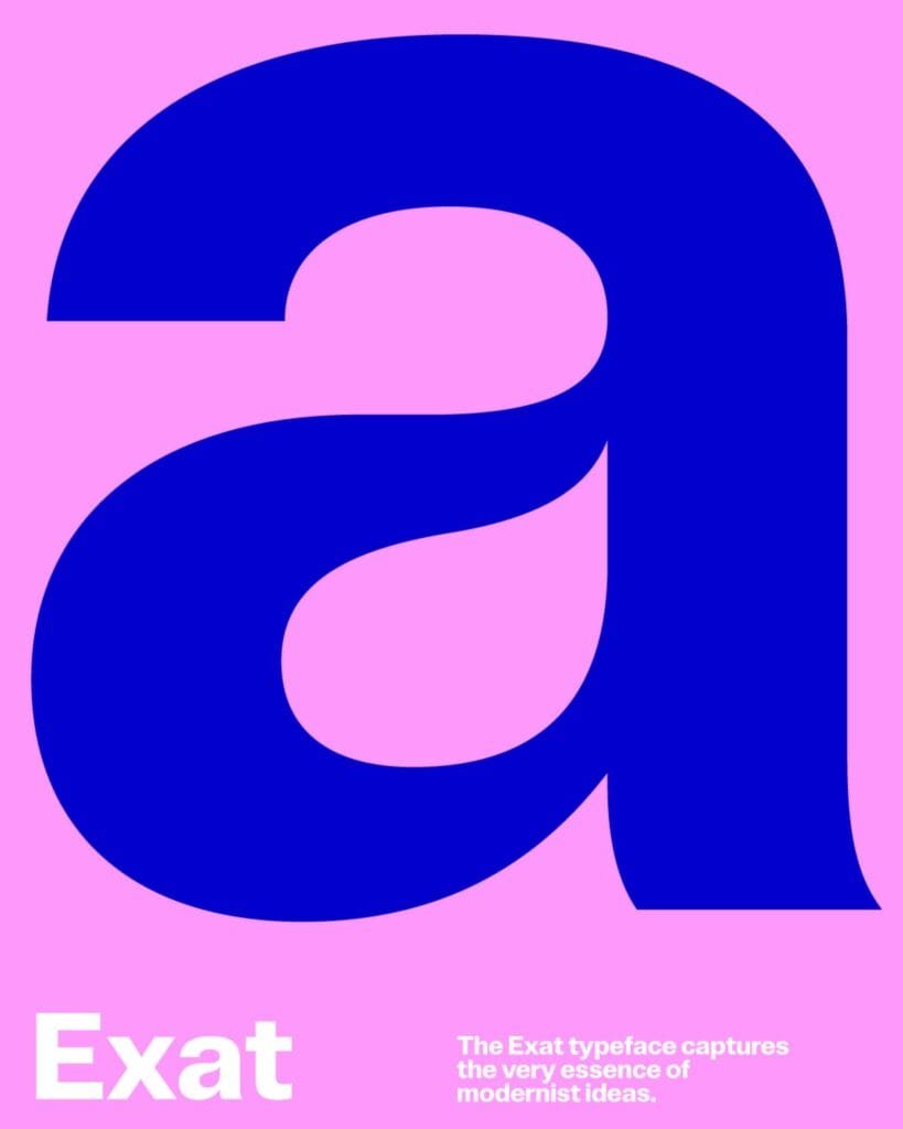
Exat stands as an ambitious creation from Marko Hrastovec’s Hot Type foundry, honoring EXAT 51, the groundbreaking Croatian art and architecture movement from the 1950s. Drawing from this influential collective’s modernist principles, Exat embodies International Style essence while offering remarkable width and weight variations.
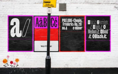
Development began by redrawing a single “a” from Ivan Picelj’s self-published “Edition a” art publications, which used modified Helvetica. From this foundation, Hot Type built a comprehensive typographic system balancing form with function, neutrality with personality.
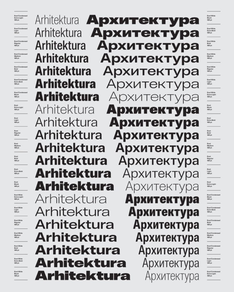
Exat includes an remarkable 21 styles spanning three width categories (Condensed, Normal, Wide) and seven weights (Extra Light to Black), all available as variable fonts for ultimate flexibility. Each style contains 1,715 glyphs, featuring multiple numeral options, extensive currency symbols, circled and squared characters, mathematical symbols, arrows, and decorative elements.
5. ABC Solar by Dinamo
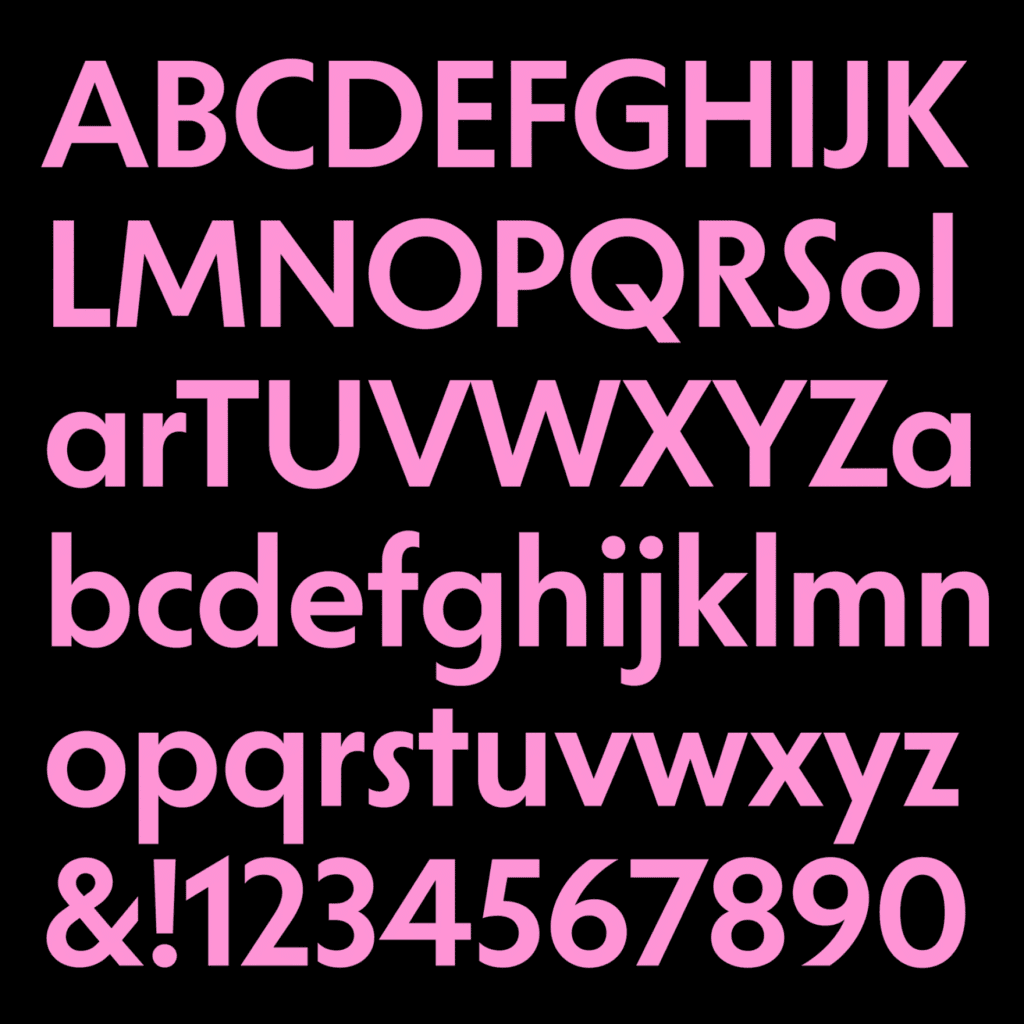
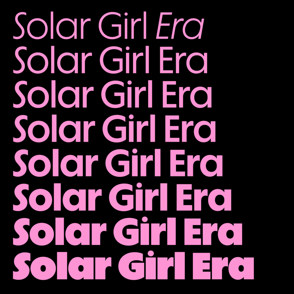
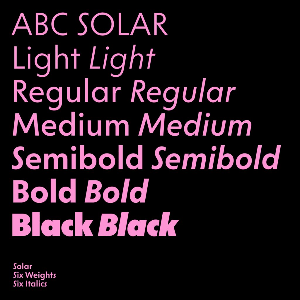
ABC Solar represents a highly adaptable geometric sans from Berlin’s Dinamo Typefaces, blending influences from legendary early 1900s typefaces including Kabel, Vogue, Metro No. 2, Johnston, Erbar-Grotesque, and Futura. Rather than simple revival or direct tribute, this contemporary interpretation establishes its own typographic identity.
Solar’s defining feature involves its circular forms, particularly the nearly perfect round capital O. While certain letters use simple construction (single-story ‘a’ and cross-shaped ‘t’), open counters and straight terminals in letters like ‘c’ and ‘s’ break geometric rigidity to introduce fluidity.
Eight stylistic sets reference various geometric and humanistic designs from the early 20th century, enabling dramatic appearance modifications. The family divides into two branches: Solar for optimal legibility and functionality, and Solar Display for impactful headlines. With comprehensive weight ranges and matching italics, ABC Solar provides outstanding versatility while maintaining distinctive character.

6. FH Oscar Pro by Typografische
FH Oscar Pro joins founder Fatih Hardal’s refreshed collection at Typografische. This neo-grotesque combines early grotesque structural principles, like Akzidenz and Breite Grotesk, with softened geometry through rounded corners that minimize visual stress and improve readability.
Created for cross-platform versatility in digital and print environments, FH Oscar Pro provides complete language coverage for Latin, Greek, and Cyrillic alphabets. Its carefully selected stylistic alternatives make it especially suitable for editorial projects and interface design.
This typeface demonstrates Typografische’s philosophy of modernizing classic forms. FH Oscar Pro successfully merges typographic neutrality with distinctly human elements, creating a flexible system that retains personality without compromising practicality.
7. Honeymoon by Dinamo
Currently exclusive to Dinamo’s “Early Access” initiative, Honeymoon explores experimental script typography territory. This unconventional typeface merges two opposing ideas—monospaced structure and flowing script characteristics—producing something genuinely original.
Presented as a “authentic Dinamo-style monospaced Script for our community and collaborators,” Honeymoon incorporates romantic elements like single-width uppercase alternatives, elaborate flourishes, and celebratory character variations. Design team Fabian Harb and Arnaud Chemin, with Hugo Jourdan handling production, created a typeface that defies conventions while maintaining unity and functionality.
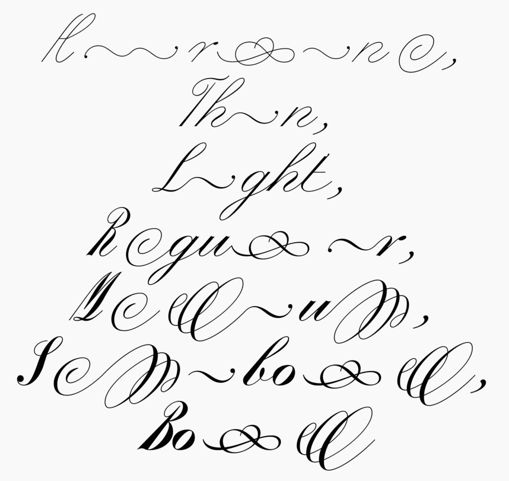
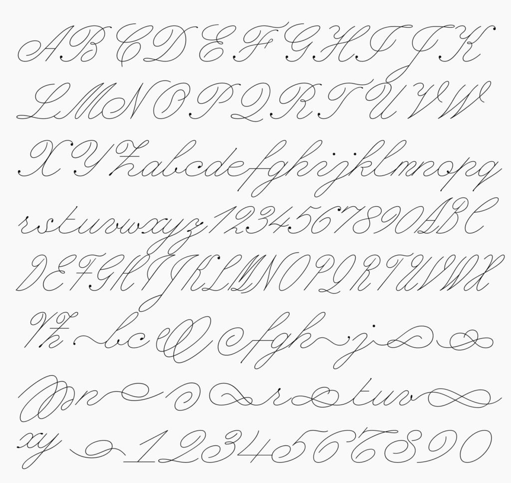
The restrictive monospaced framework creates compelling contrast with expressive script fluidity, yielding a typeface that feels both methodical and enthusiastic. For designers wanting something completely different, Honeymoon provides an exciting alternative to traditional script choices.
For more information on branding, graphic design, illustration, product design, or packaging design, Typefaces visit Brandlic.
