A charming blend of cats, eggs, and cozy mornings brought to life through thoughtful design
There’s a particular joy associated with slow, easy mornings—the kind where sunlight pours through the café windows, everything feels warm, and even the clatter of cups sounds comforting. Meowlette, a breakfast café concept built around cats, coziness, and morning cheer, wanted to bottle that feeling. But capturing warmth, humor, and personality in a single identity is harder than it sounds. How do you create a brand that feels as inviting as a quiet morning, yet lively enough to stand out in a crowded market?
That was exactly the question Brandlic was asked to answer when tasked with crafting Meowlette’s visual identity. This wasn’t simply designing a logo or choosing a color palette. It was building a world—one where the friendliness of a breakfast café meets the quirkiness of cats, wrapped in a visual language charming enough to make people smile before they even place an order.
The Brief
Meowlette’s founders envisioned a space built on two pillars:
morning warmth and feline playfulness.
They wanted a brand that:
- Felt fun, cool, and cozy
- Blended breakfast energy with charming cat character
- Used illustration to create an emotional connection
- Could thrive across packaging, signage, social media, and merchandise
In short, they wanted a brand that not only looked beautiful but also felt alive. Something friendly, whimsical, and instantly recognizable.
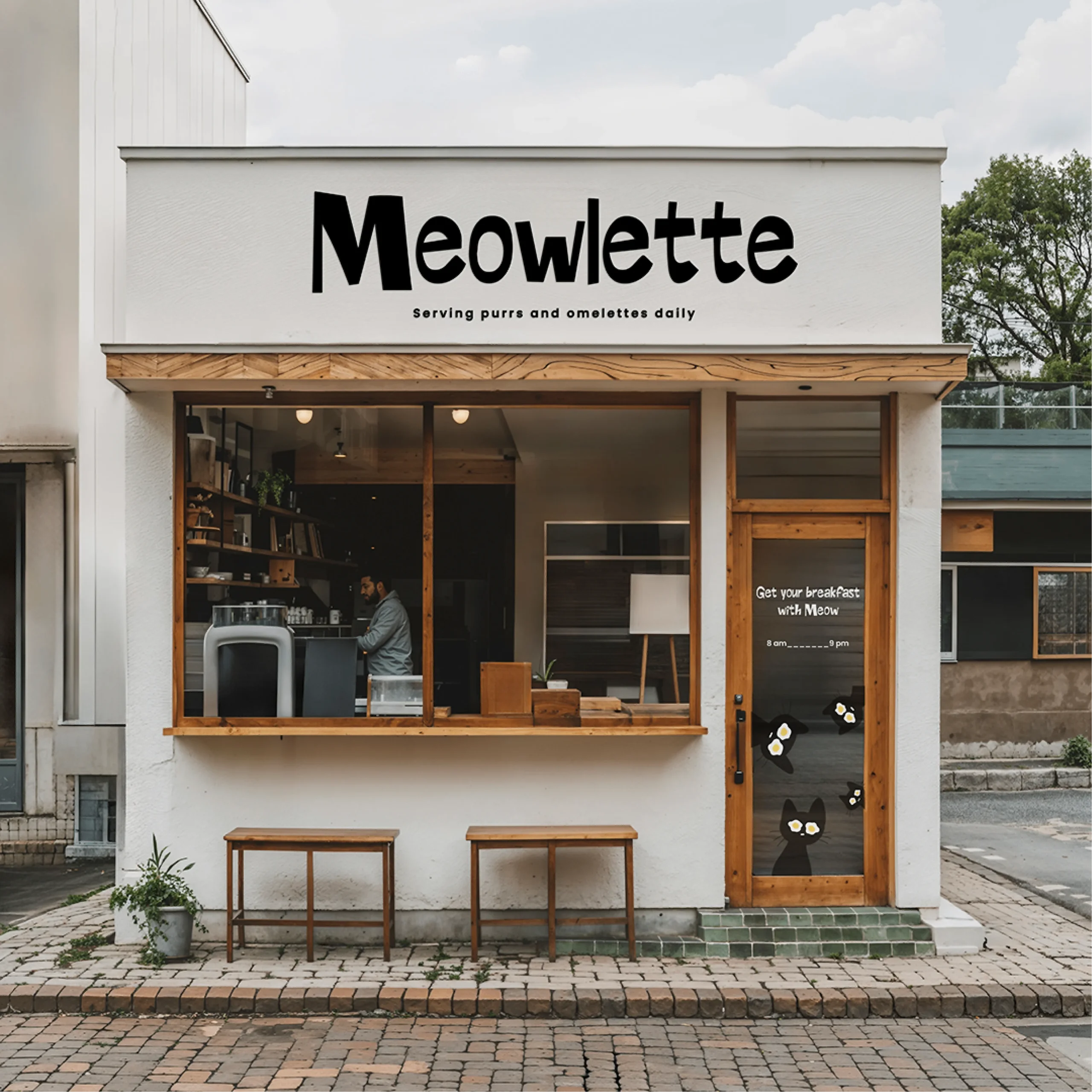
Brandlic began the project not by sketching, but by studying the emotional qualities of morning cafés: the soft tones, the friendly language, the comfort found in something as simple as a warm omelette. Meowlette’s vibe had to reflect that same sense of ease and charm, but through the lens of playful characters and storytelling.
The Concept
The heart of Meowlette’s identity is built around a simple but powerful idea:
What if breakfast had the personality of a cat?
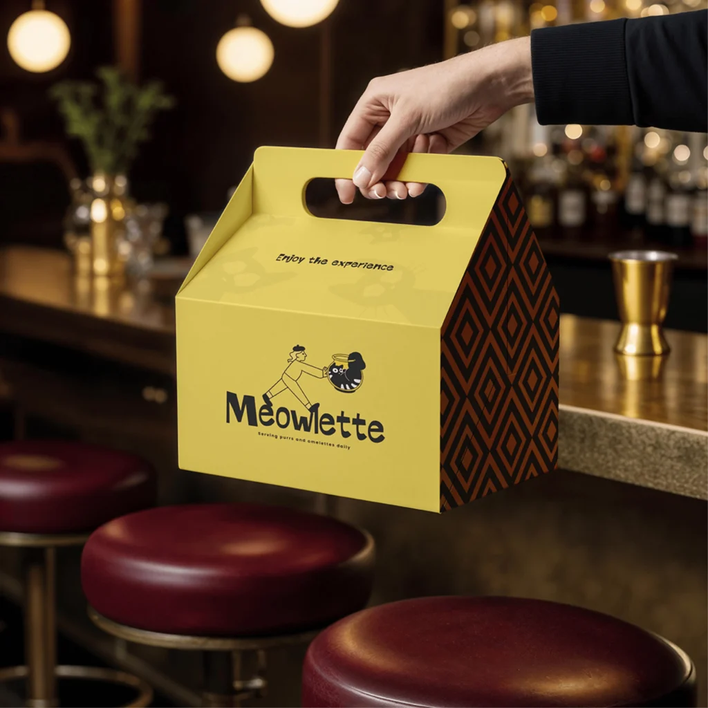
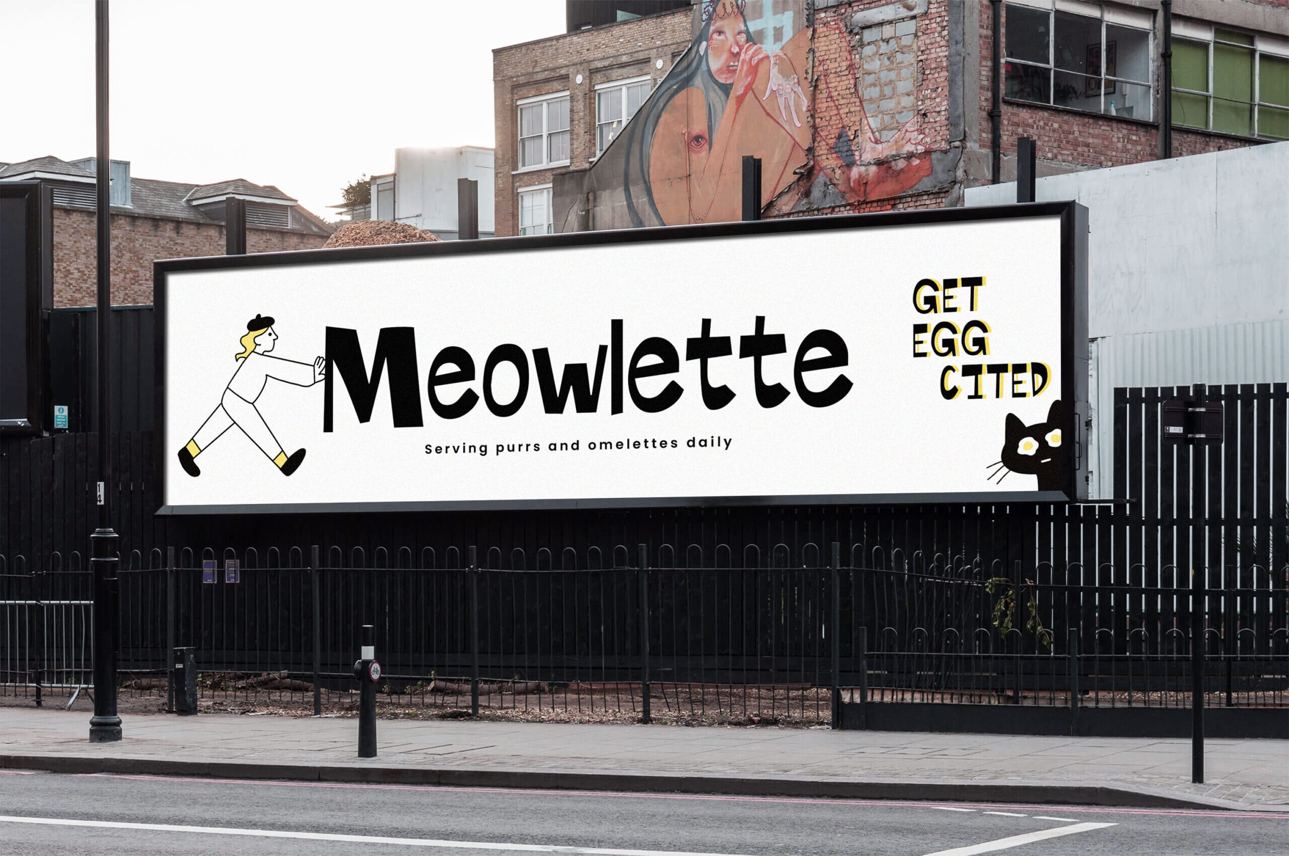
The solution emerged through character-driven design. Illustrator Laiba crafted a set of quirky, expressive cats paired with a cheerful human character who interacts directly with the brand’s typography. In one of the standout visuals, the character pushes the “M” of Meowlette—a gesture that transforms the logo into a living scene rather than a static mark.
This approach created an immediate narrative. Instead of merely showing food or cats, the identity expresses a playful relationship between the characters and the brand itself.
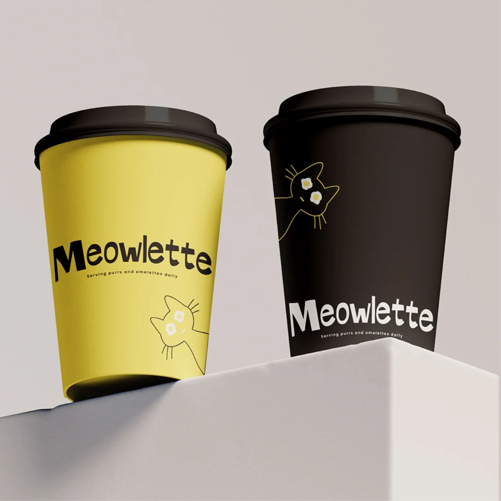
But illustration alone wasn’t enough. To fully express that morning energy, the visual system needed a color that carried emotional weight. The choice was obvious: a bright, sunny egg-yolk yellow. Paired with black accents and warm neutrals, this palette evokes the freshness of morning light while reinforcing the café’s focus on breakfast.
Design Execution
Where Meowlette shines is in how the design elements work together to build a complete brand universe.
Illustrations
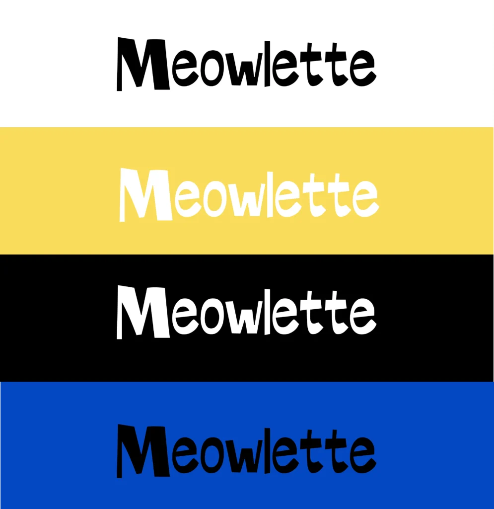
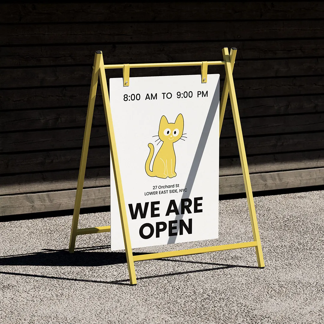
Laiba’s style—clean lines, soft expressions, and playful body language—gives the brand a personality that feels both cozy and mature. The cats aren’t too cute; they’re expressive in a way that appeals to adults, students, families, and anyone who loves a character with charm.
Typography
The Meowlette logotype features bold, soft-edged letterforms that feel handcrafted, slightly quirky, and warm. The imperfect shapes add personality, echoing the café’s relaxed atmosphere.
Color Palette
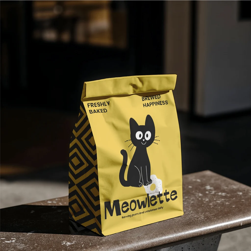
The dominant yellow represents sunshine, eggs, and warmth—three elements tied deeply to breakfast rituals. It creates instant recognizability, especially in packaging and large-format applications.
Brand Applications
The identity extends seamlessly across:
- Packaging: A bright yellow box with bold geometric sides—designed to be instantly shareable and eye-catching.
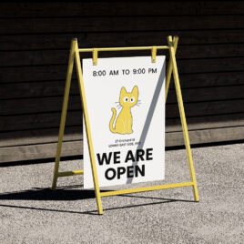
- Billboards: Character illustrations pushing and interacting with type add humor and movement to the otherwise clean layouts.
- Digital content: Short messages like “Get Egg-cited” reinforce the brand’s playful voice.
- Interior and merchandise: Patterns and characters work as repeatable assets without losing charm.
Every touchpoint feels consistent, warm, and visually engaging.
Why This Branding Works
Meowlette succeeds because it goes beyond visuals—it tells a story. It taps into universal feelings: morning comfort, shared humor, the joy of characters that feel alive.
The identity works because it:

- Bridges cozy café culture with illustrative storytelling
- Uses color psychology to evoke warmth
- Balances fun with clean, modern aesthetics
- Creates a world customers want to engage with
- Feels flexible enough for global audiences
It’s an identity that doesn’t rely on trends. Instead, it relies on emotional truth: people love characters, warmth, and experiences that feel personal.
Conclusion
Meowlette is more than a visual identity—it’s a morning mood captured through design. Brandlic’s approach, combined with Laiba’s expressive illustrations, creates a brand universe that feels joyful, comforting, and alive.
In an industry where many cafés lean toward minimalism, Meowlette stands out by embracing personality. It proves that great branding can be simple, warm, and deeply expressive—especially when the story starts with something as timeless as breakfast and as charming as a cat.
Looking for expert support in branding, design, or packaging? Discover how Brandlic turns creative ideas into powerful brand experiences. Explore our services →
