In today’s design landscape, where AI-generated content has become commonplace, the field of type design remains a domain where human craftsmanship and creative innovation continue to flourish. This month brings a remarkable collection of new typefaces that showcase the dedication and skill of contemporary type designers.
These new releases—ranging from versatile editorial workhorses to striking display options—offer designers fresh tools for creating distinctive brand identities across various applications. Each typeface tells its own story, reflecting both historical influences and forward-thinking approaches to letterform design.
Let’s explore ten noteworthy typeface releases that demonstrate how typography continues to evolve while maintaining its essential role in visual communication.
1. The Sita Family | Order Type Foundry
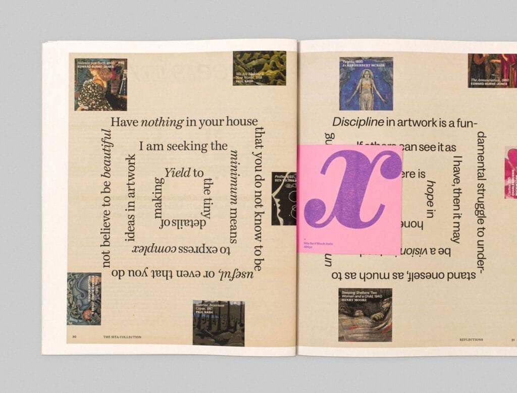
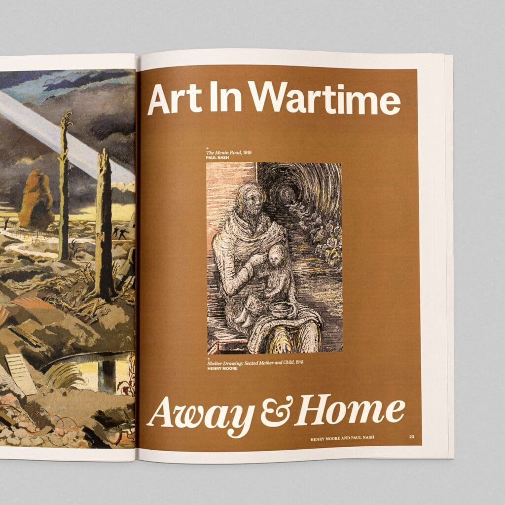
Order Type Foundry’s debut superfamily represents a significant achievement in typographic versatility. Designer Edouard Berard has created a cohesive system consisting of Sita Serif and Sita Sans, each available in four weights with corresponding italics.
What makes this family particularly innovative is Berard’s approach to the relationship between serif and sans-serif forms. Rather than compromising the defining characteristics of either style, he’s created two distinct but harmonious families that share fundamental proportions and structure. This enables designers to switch between styles while maintaining consistent visual rhythm and weight distribution.
Drawing inspiration from traditional Scottish typography, Sita balances historical references with contemporary functionality. The result is a typeface system equally suitable for digital interfaces and printed publications, offering designers a coherent typographic voice with considerable expressive range.
2. Unie | Big Fog Foundry
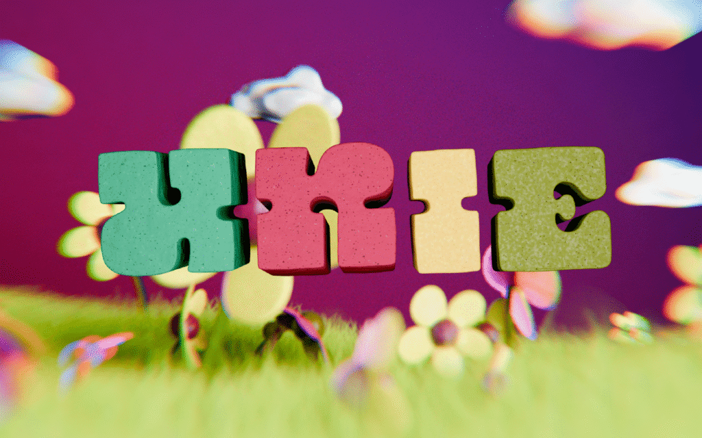
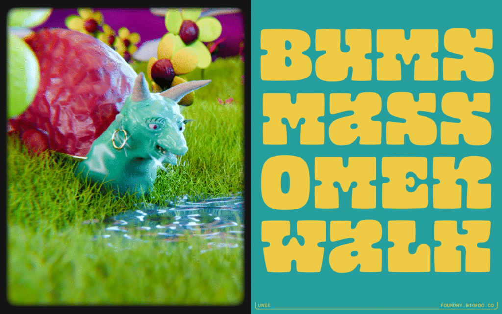
Launched alongside the new Big Fog Foundry in April, Unie brings a refreshing dose of personality to the typographic landscape. This unicase design by founder Brian Dove combines geometric precision with playful, organic qualities.
The typeface features chunky, almost square letterforms with softened edges that invite creative applications. According to Dove, Unie possesses a tactile quality “like it was sculpted from Play D’oh” and seems to emit a cartoon-like “honk” when squeezed.
This whimsical character makes Unie particularly effective for applications requiring immediate emotional connection—think brand identities for children’s products, festive packaging, or social media campaigns with a cheerful tone. As part of Big Fog’s mission to create type that balances enjoyment with functionality, Unie excels when used boldly at larger sizes.
3. Lamington | Rain Foundry
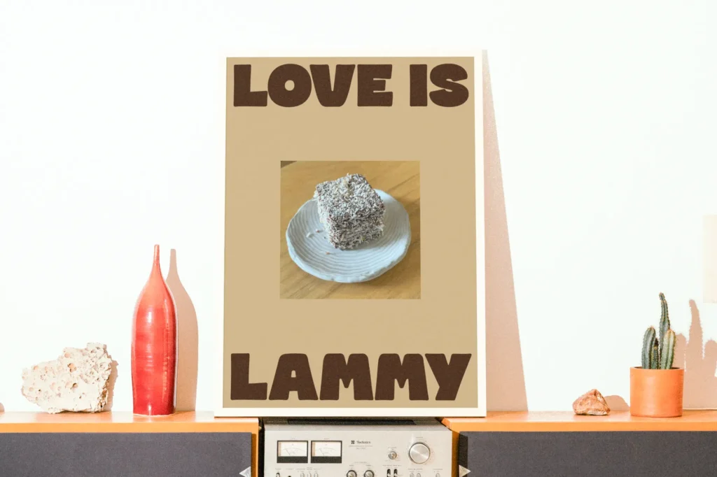
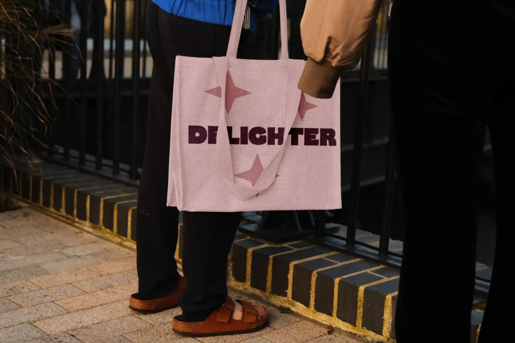
Sydney-based Rain Foundry introduces Lamington, a display typeface with a distinctly Australian flavor. Designer Carl drew unexpected inspiration from lettering spotted on apparel while enjoying the beloved Australian dessert that gives this typeface its name.
Lamington captures a carefree spirit through its distinctive characteristics: square-like proportions combined with a soft, spongy texture and generous spacing between characters. These qualities evoke the warm, inviting nature of its namesake treat, making it ideal for headlines and identity work requiring a friendly, approachable personality.
For its creator, Lamington represents more than just another commercial release—it marks a rekindling of passion for letterform design. “I rediscovered that joy must be at the heart of any creative process,” Carl explains, a sentiment clearly reflected in the typeface’s expressive character.
4. Only Yours | Rosetta Type
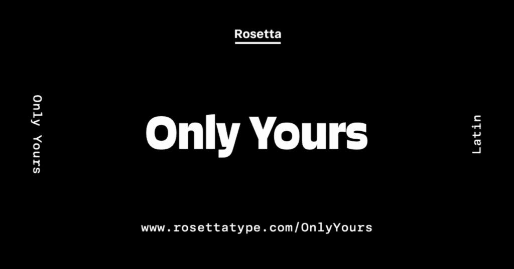
Rosetta Type introduces a groundbreaking concept in typeface licensing with Only Yours. This innovative system challenges traditional notions of typeface ownership by offering exclusive variants to individual customers.
The system generates nine unique variants daily, each featuring distinct combinations of characteristics from an extensive design space. Once purchased, that specific variant becomes unavailable to anyone else, ensuring complete typographic exclusivity—described by the foundry as “an NFT that actually serves a purpose.”
This approach offers designers something increasingly rare in today’s digital landscape: truly unique visual assets that can’t be replicated by competitors. For brands seeking to differentiate themselves through distinctive typography, Only Yours represents a fascinating new possibility in establishing visual identity.
5. Marsam Text | Typonym
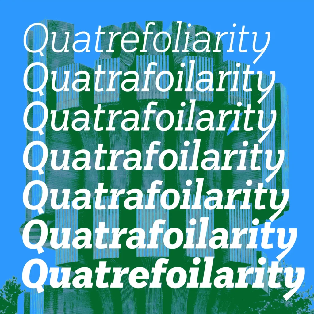
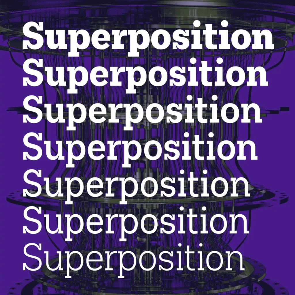
Designer Evan Deterling’s Marsam Text demonstrates the meticulous craft involved in adapting a display typeface for editorial use. Rather than simply scaling down the original Marsam slab serif, Deterling has completely reimagined the design with text applications in mind.
The result features semi-condensed proportions that improve text flow while creating more balanced paragraph composition. Nearly every glyph has been redrawn to maintain readability at smaller sizes, avoiding the awkward proportions that often plague display fonts when adapted for body text.
Comprising 14 styles, Marsam Text offers exceptional versatility for editorial designers working with multi-level hierarchies. Its space-efficient design makes it particularly valuable for newspaper and magazine layouts where maximizing content within limited space remains crucial. Despite these practical considerations, Marsam Text maintains enough distinctive character to function effectively in larger display applications as well.
6. Intervention | Applied Systems Design Studio
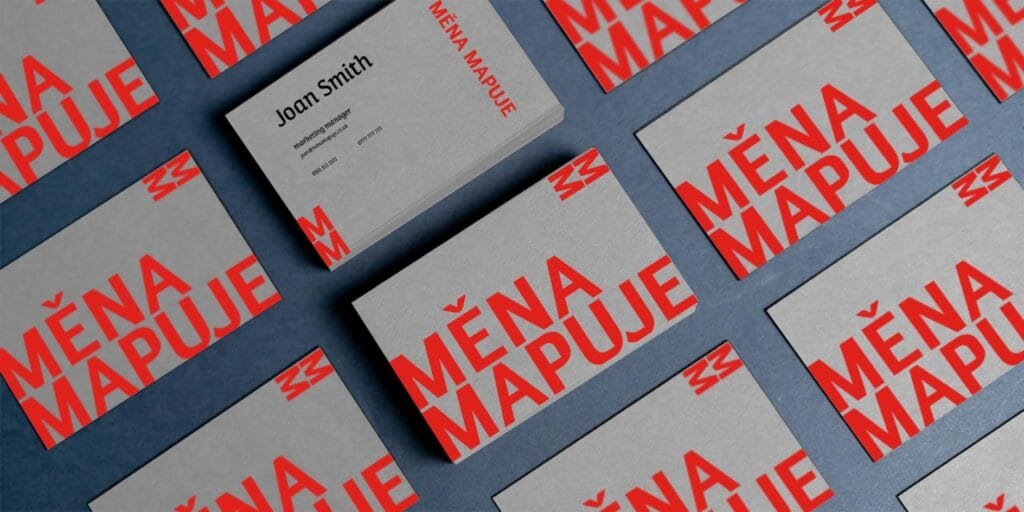
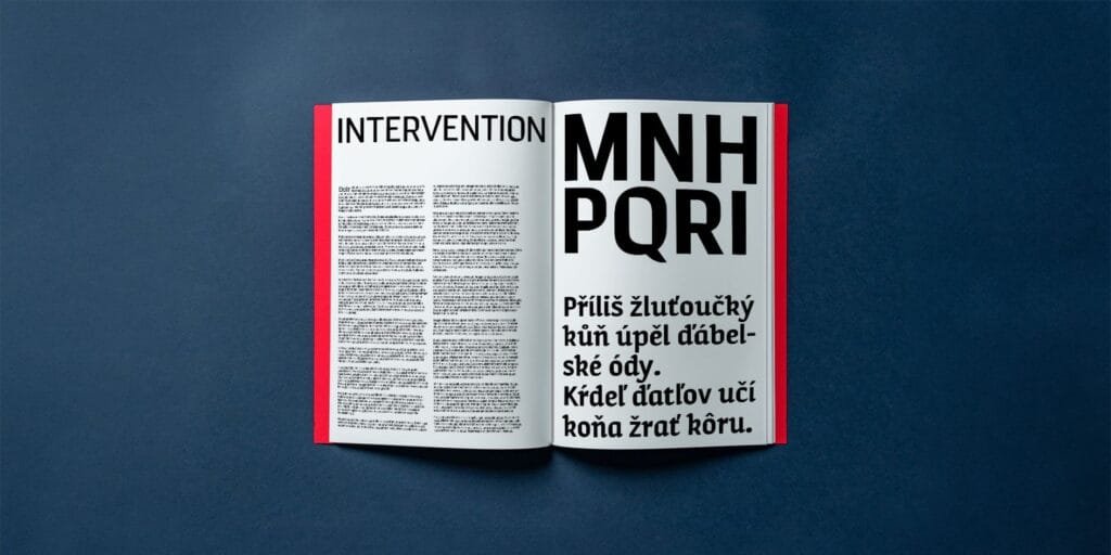
The relatively new Applied Systems Design Studio (launched November 2024) presents Intervention, a display typeface deeply rooted in Eastern European Constructivist design principles. Originally developed for Taktiky Studio’s Prague exhibition “Čekání Proměny,” which explored urban transformation through site-specific installations, the typeface itself embodies the concept of deliberate intervention in established systems.
This contextual foundation gives Intervention a distinctive personality that bridges historical reference and contemporary application. Initially supporting Czech, Slovak, and English, the commercial release has expanded language coverage while maintaining its conceptual integrity.
As part of Applied Systems Design Studio’s growing catalog, Intervention demonstrates the foundry’s commitment to creating typefaces with both visual distinction and conceptual depth. Its architectural quality makes it particularly effective for cultural institutions, exhibition materials, and brands seeking to communicate progressive values.
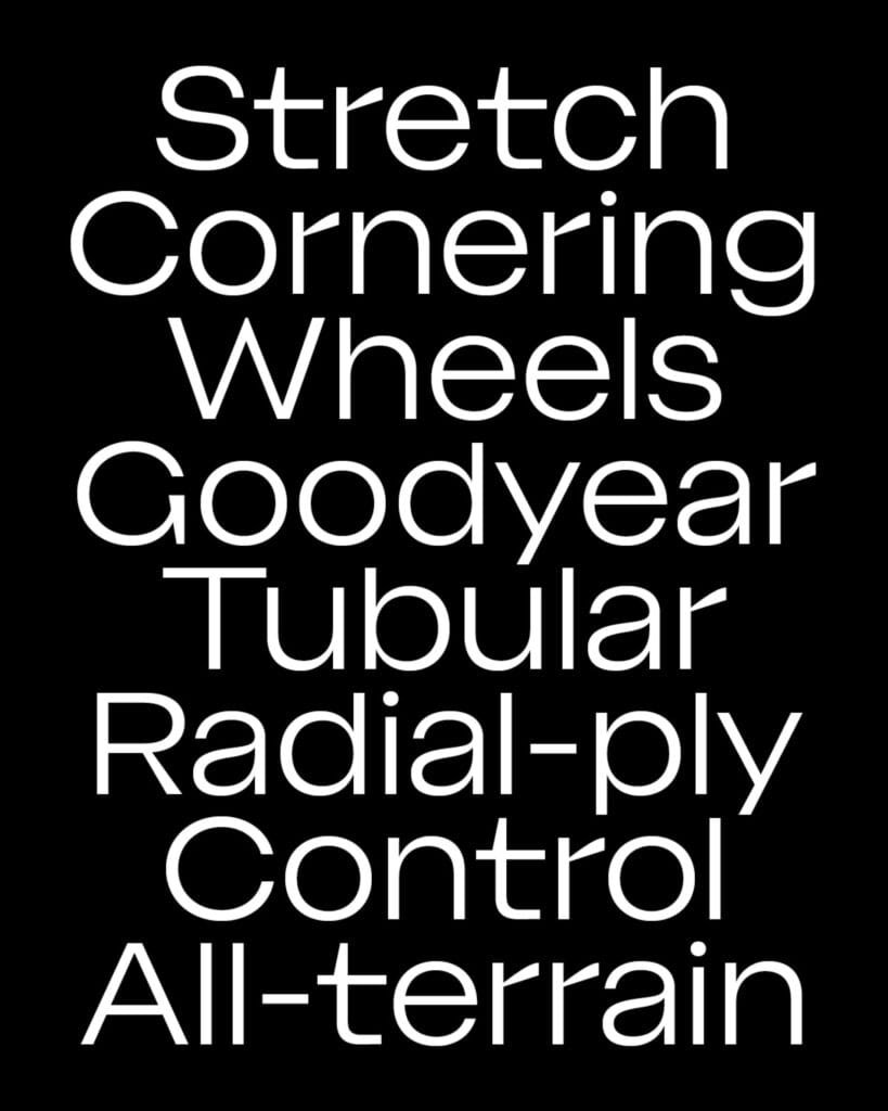
7. Indiana | 205TF
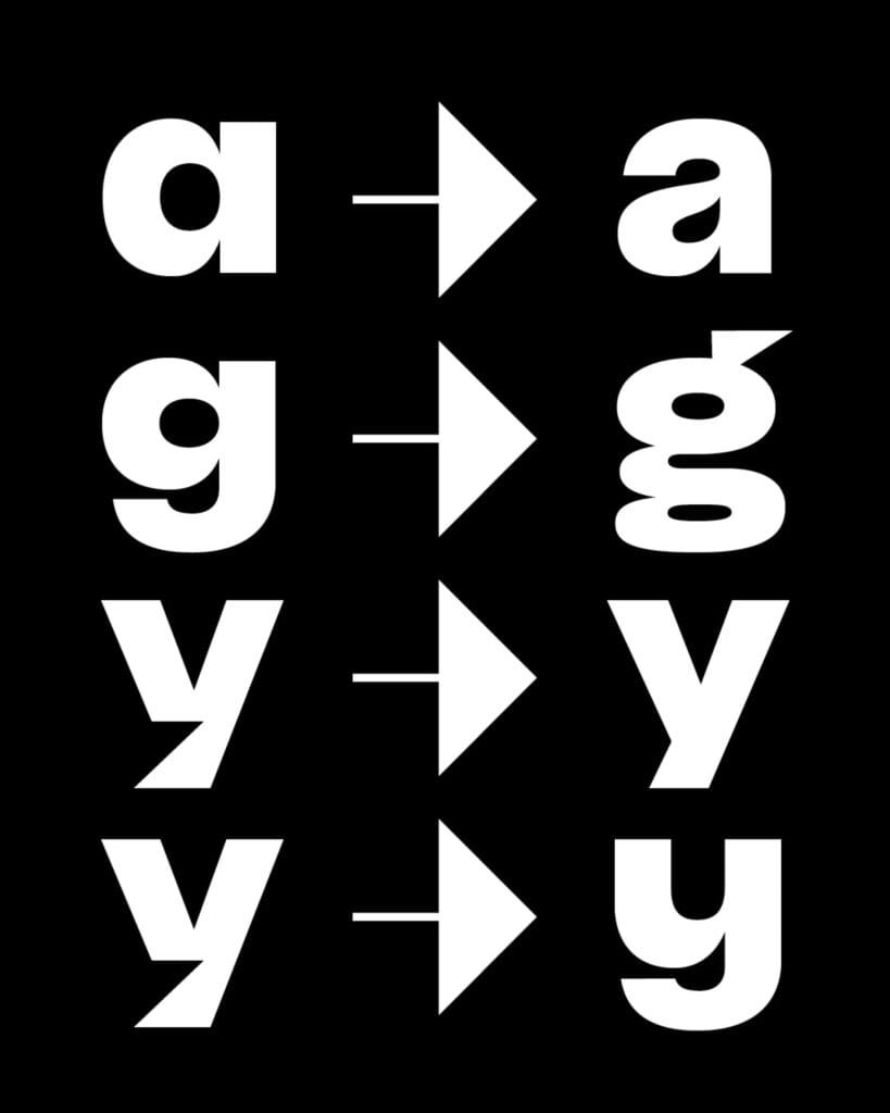
Malou Verlomme’s Indiana for 205TF embodies productive contradiction—a typeface that reconciles seemingly opposing design principles. Its development process embraced constraints that might typically be considered incompatible, resulting in a design that feels both distinctive and highly functional.
Taking inspiration from pneumatic engineering, Indiana balances flexibility with structural integrity, creating a visual rhythm that manages to be both energetic and composed. Its notably short ascenders and descenders maximize vertical space efficiency, giving text blocks a dense yet readable quality.
The family includes six carefully graduated weights from Thin to Black, each with corresponding italics. An extensive range of stylistic alternates provides designers with considerable flexibility in expression—from refined modernism to more experimental applications. This versatility makes Indiana suitable for diverse projects from corporate communications to cultural branding.
8. FH Lecturis | Typografische
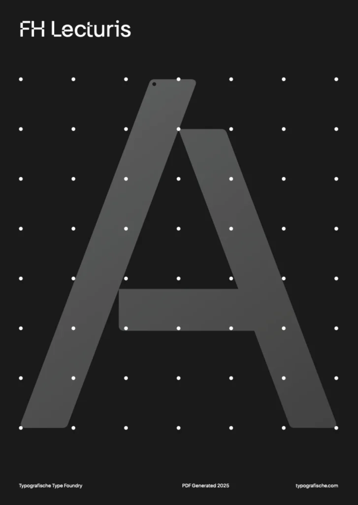
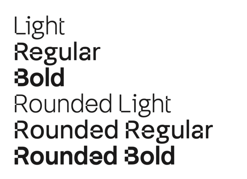
FH Lecturis forms part of Typografische’s recently refreshed catalog under Fatih’s direction. This neo-grotesque draws inspiration from two significant influences: Wim Crouwel’s systematic approach to grid-based design and the structural clarity of Akzidenz Grotesk.
What distinguishes this release is its thoughtful balance between mechanical precision and subtle organic qualities. Its fundamentally modular structure is humanized through careful optical adjustments and softened terminals, creating a productive tension between systematic order and approachable warmth.
This balance makes FH Lecturis particularly effective for institutional identities and editorial systems where consistent structure must coexist with engaging communication. Its excellent performance across various scales demonstrates Typografische’s commitment to creating typefaces that serve practical needs while maintaining distinctive character.
9. ALT Nadrey | ALT.tf
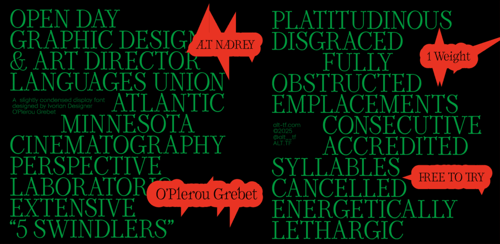
ALT.tf, which evolved from the Femme Type initiative, continues its mission of promoting diversity in type design with ALT Nadrey. This significant release represents a collaboration between Ivorian Coast type designer O’Plérou and artist Obou Gbais, bringing much-needed representation to a field where African designers remain underrepresented.
Described by its creator as a “typographical expression of love,” ALT Nadrey draws inspiration from 1990s poster typography while incorporating contemporary sensibilities. Its relatively narrow proportions combine with rounded forms and subtle serifs to create a sophisticated warmth that works across various applications.
The name “Nadrey”—meaning “My heart” in Bété, O’Plérou’s native language—reinforces the typeface’s connection to cultural identity and personal expression. This release exemplifies ALT.tf’s commitment to amplifying diverse voices in typography while delivering versatile design tools with distinctive character.
10. Sofia Pro | Mostardesign
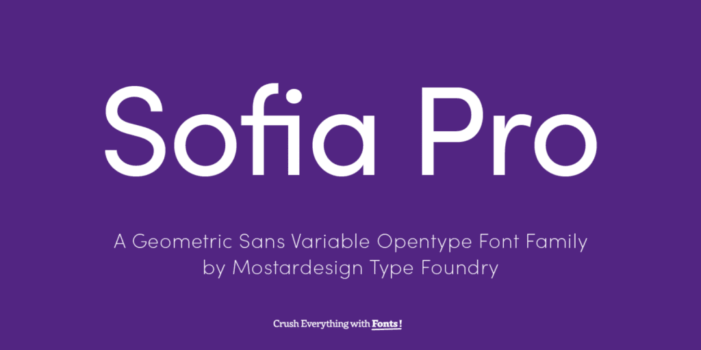
Fifteen years after its initial introduction, Olivier Gourvat’s Mostardesign presents a comprehensive update to Sofia Pro, one of contemporary typography’s most widely recognized families. This revival marks a significant moment for a typeface that has achieved remarkable ubiquity through adoption by global brands including Pepsi, TikTok, and Unilever.
The updated family expands dramatically to include 64 styles across four width variations: Normal (100), Narrow (90), Condensed (80), and Compact (70). Available in variable format, this release offers unprecedented flexibility while preserving the approachable personality that made Sofia Pro so successful globally.
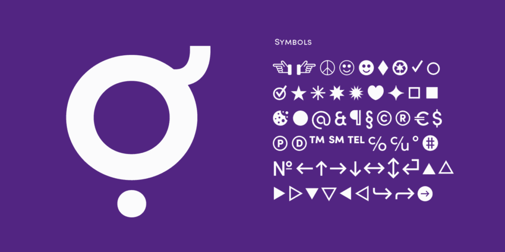
Language support has been extended to include Cyrillic, Greek, and Vietnamese, enhancing its utility for international brands. In a commendable initiative, Mostardesign is offering Regular and Light styles at no cost to qualified environmental nonprofits, reflecting the foundry’s commitment to supporting climate action.
For more information on branding, graphic design, illustration, product design, or packaging design, Typefaces visit Brandlic. For packaging production, visit Packlic.
